Plasticiet originated from an idea that was formed during a field trip in India. Here Marten & Joost - the designers and founders of Plasticiet - saw various micro-economies popping up based on local demographic waste streams such as cotton clothes, plastic bottles and metal parts. All in their own unique way the craftsmen there were able to find their own unique translation of these waste materials into something functional and recognisable with added value. They then made these products available for other local industries resulting in personal revenue and providing means of production for other craftsmen, keeping both industries thriving on a small scale.
When Marten & Joost were trying to find solutions for people’s and industry’s disposed of plastics, looking back at the idea they studied in India they knew that the outcome should not be a final product. Inspired by the primal beauty and longevity of natural stone they aspired to create a sheet material that would inspire other creators to build objects that can last. To make a waste material appealable they underwent a thorough research on how to give their plastic products a distinct super-natural marbled or terrazzo appearance, for if the material isn’t beautiful it won’t sustain.
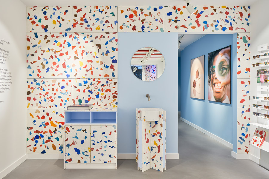
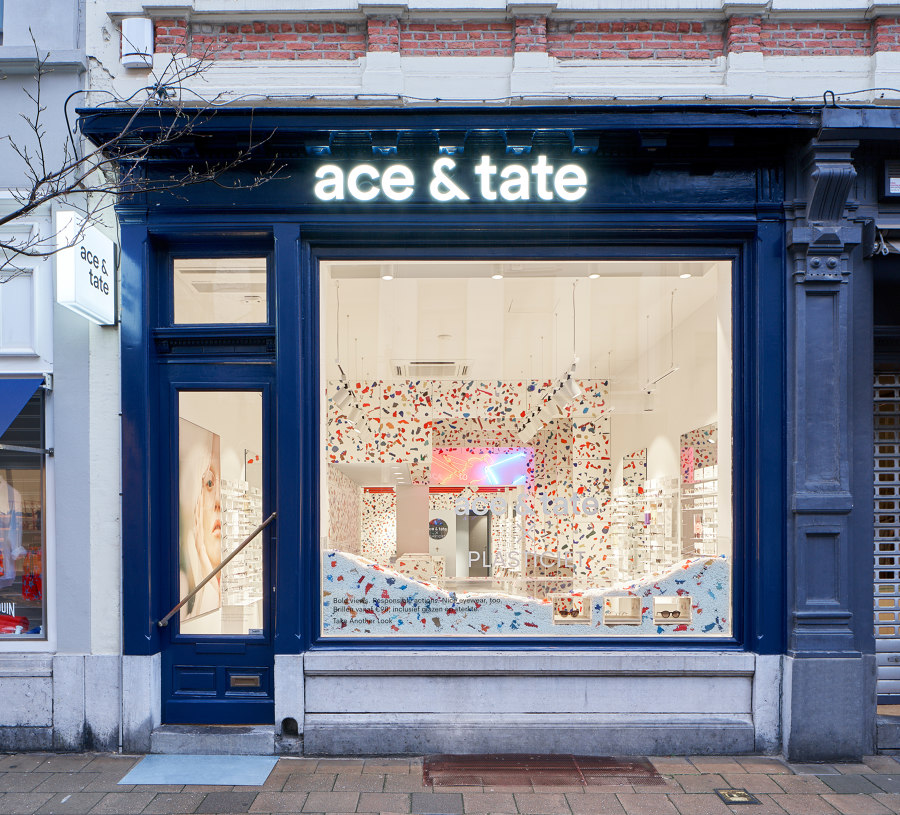
The Antwerp Ace & Tate store was approached in the same manner. Local demographic plastic waste streams were analysed questioning what are they, where do these plastics come from, what stories do they hold and how can they be of added value again in Antwerp? Plasticiet found a collaboration with Suez who collect bulky domestic products in the local periphery. These broken and discarded products that were likely used by visitors are crushed to be reused again instore in the centre of Antwerp.
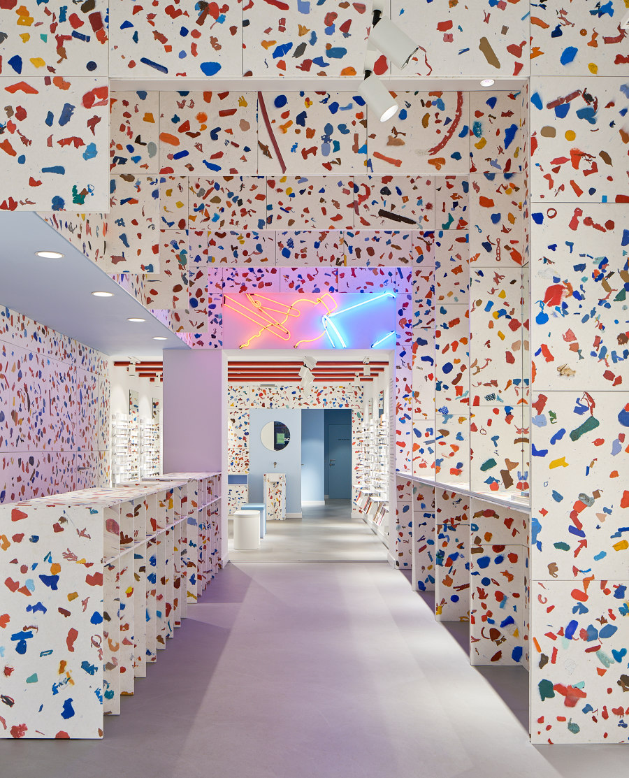
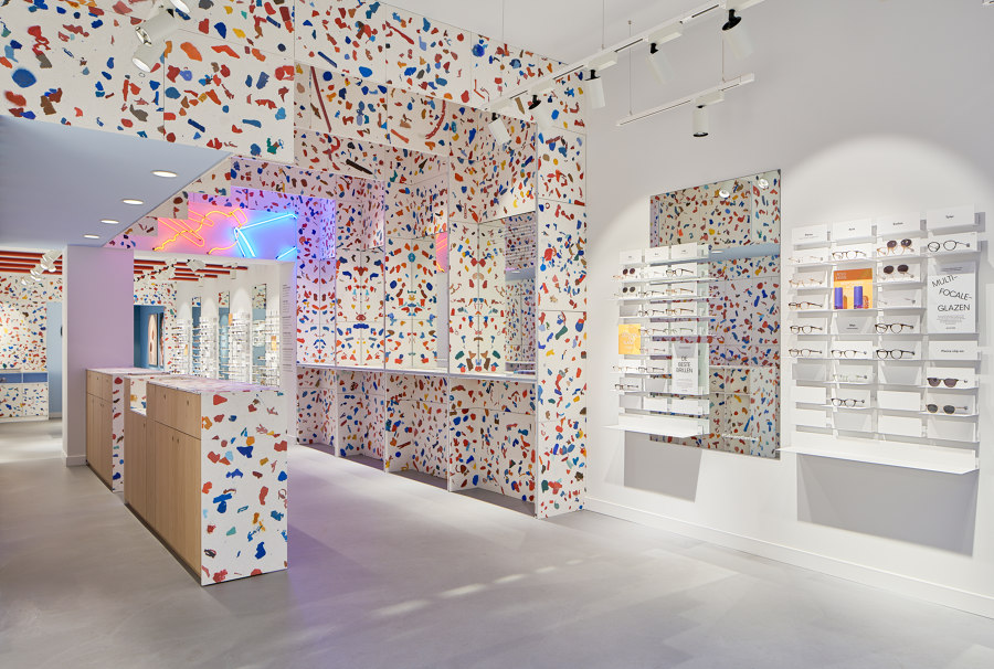
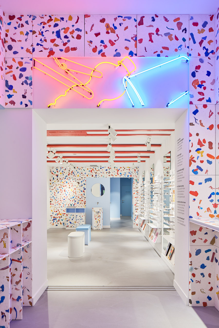
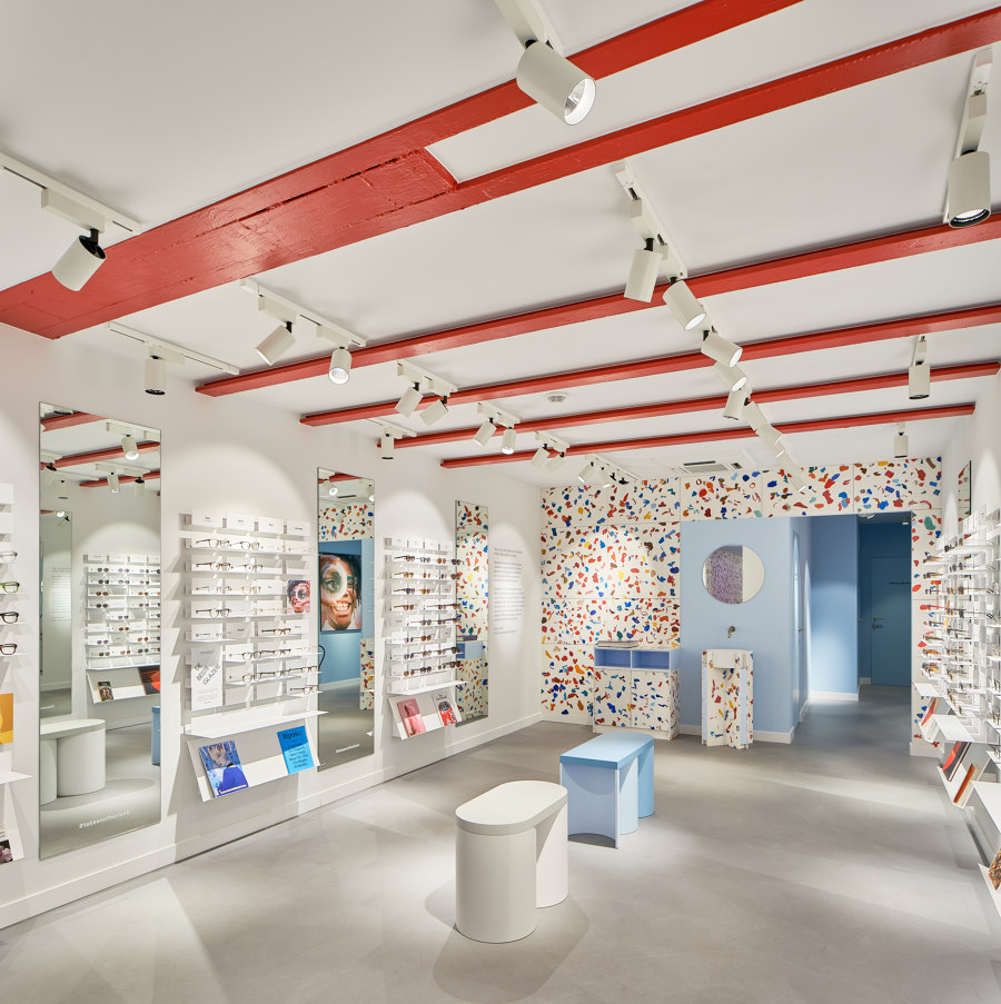
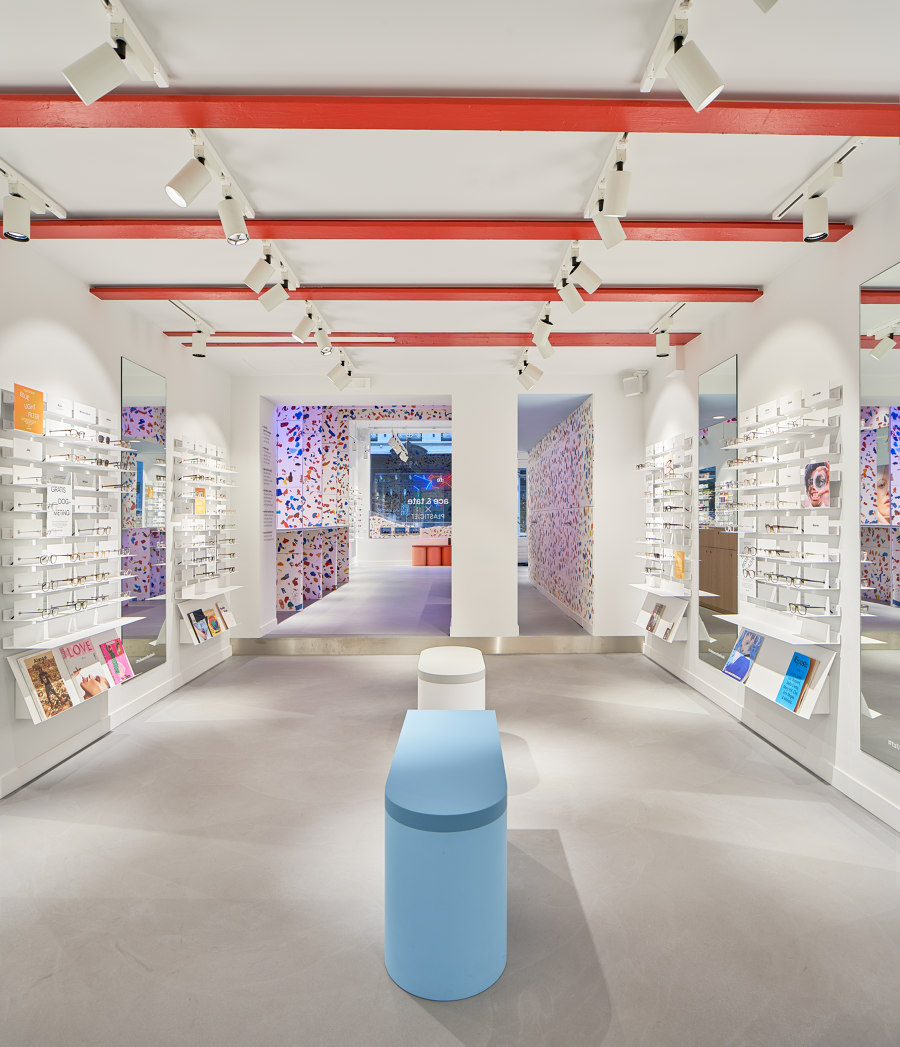
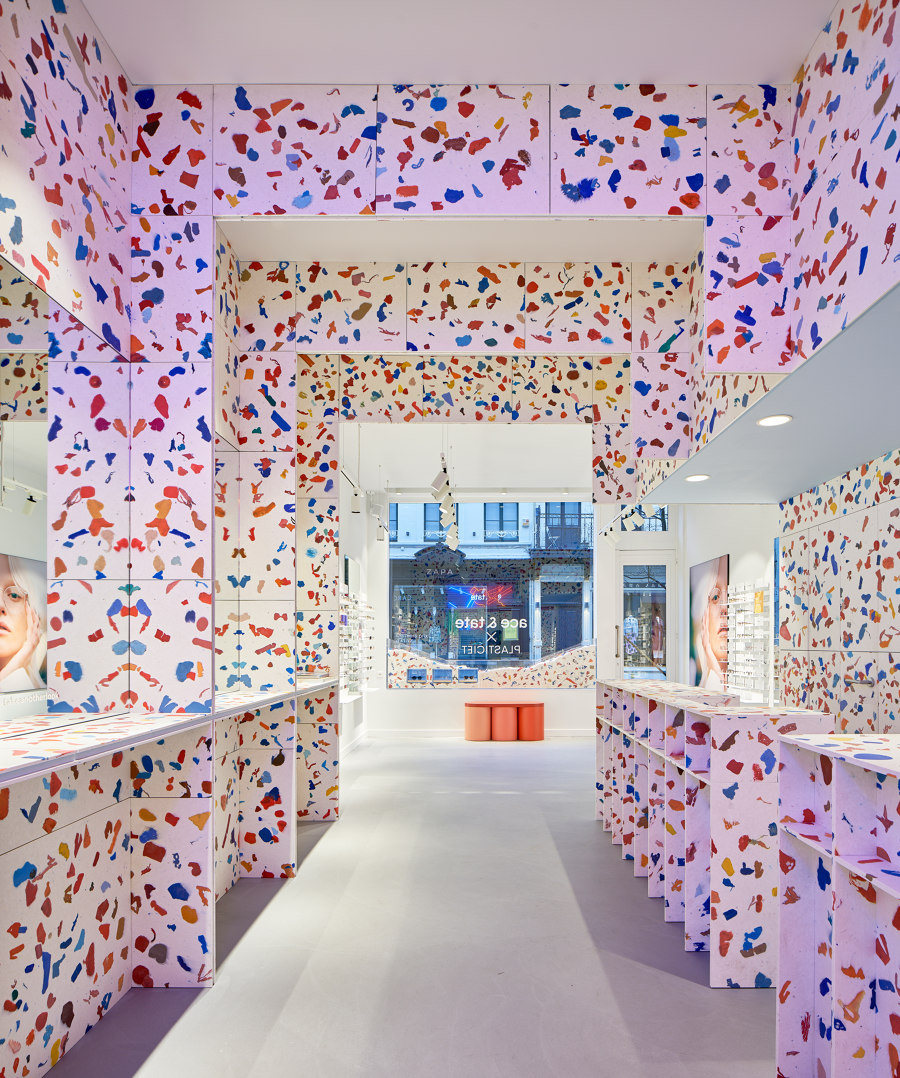
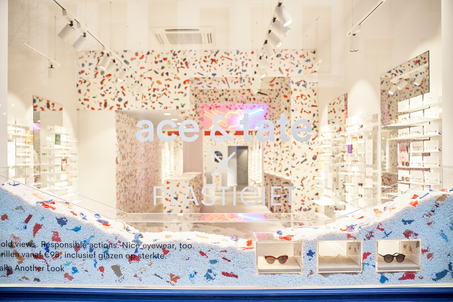
Marten & Joost were inspired by the clean though playful eyewear stores by Ace & Tate. Often used colours are deep blue and bright red on a white base. To emphasise the repetition of the coloured flakes the viewers are first guided through a space with solely glasses on display after which they are guided through the plastic arches. Here the pattern and beams’ repetition combined with mirrors allow the viewers to indulge completely into the recycled world. As a whole the area is majestic, but is spacious enough to give room to the beholders who want to find those recognisable pieces in the plastic fantastic world. The space then opens up again into a more serene environment where they can comfortably find the eyewear that suits them best.
We worked closely together with Lili de Goede, who at that moment was one of the interior designers at Ace And Tate. She was very enthusiastic towards the style of our exhibition presented at Design District and Interieur BE back in 2018 so we wanted to keep that vibe alive. Next to that the store needed to tell a story so we decided we wanted to use local waste of Antwerp, not just because it might be recognizable for the residents but also because of Ace And Tate’s aspiration to grow into a more sustainable business.
With these things in mind we wanted to create a calm, serene space combined with the booming colours that they love at the glass wear brand. To create the waste’s narrative we decided that the inspiration needed to come from religious and sacred places - buildings that tell a story - so that the store would almost feel as a recycling temple. Because the flaked sheets are so wild it was even more a necessity to keep the design repetitive and calm. The close collaboration with their store designer made it sure that we wouldn’t deviate from their store concept too much. We implemented lots of mirrors to give a more spacious feeling and to increase the repetition in the design.
There is a major shift going on in retail design at this moment. The first company that reached out to us for retail design was just over two years ago. Many are still reluctant to work with recycled plastic, and others just cautious; they’re first prototyping pop-up stores or flagship stores to see if it is a feasible means. I think however that just implementing recycled plastics or other recycled/sustainable materials is not necessarily the answer. What’s also extremely important is the way they deal with it afterwards.
What if a store goes bankrupt or changes their interior, what happens then? It might well be deposited into the same garbage container all the same. Next to that I hope that the brands behind retail don’t just use it as a way of convincing their customers that they are sustainable while in the background the fashion industry remains one of the most polluting industries in the world. I think Ace And Tate therefore is a nice example, they’re open towards the public that they aren’t a sustainable brand at this moment but they’re really trying to improve their industry and inspire other brands to go the same direction. We’re happy to see that so many brands are using more recycled and sustainable options and hope they continue so that this current trend will become the standard.
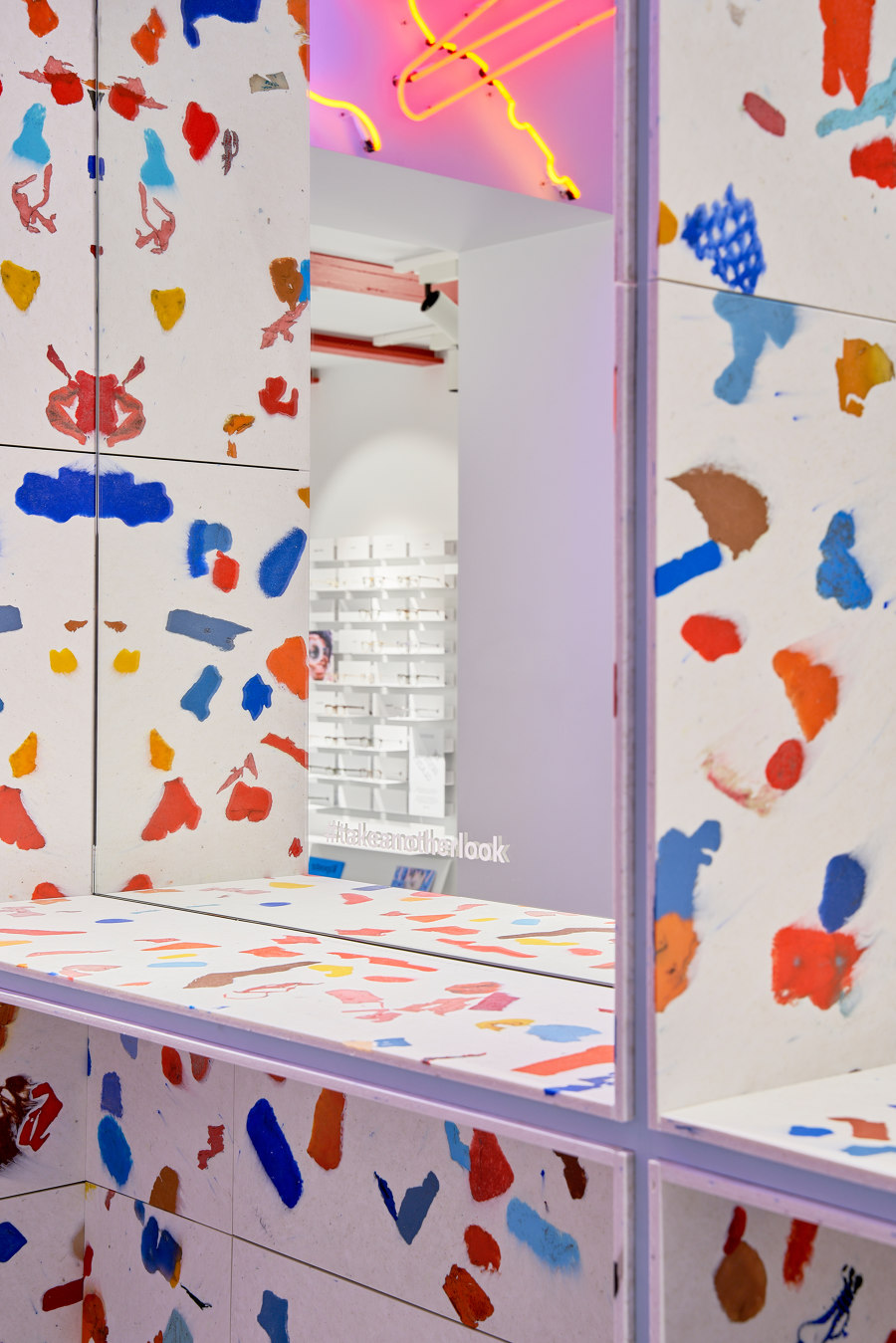
The recycled plastic used for the Ace&Tate store in Antwerp in polyethylene, a most common material that finds many uses in industrial and construction appliances as well as domestic products such as food packaging, kitchen ware and toys. All the coloured chunks visible in the store are collected from the bulky waste of Antwerp’s periphery separated from other types of plastic by a machine developed by Suez who partnered up with us for the realization of this project. The polyethylene was shredded to large pieces that were hand sorted in red, blue and orange, colours that are often used in the visual expression of Ace&Tate’s stores.
Compared to the white base material – which used to be food packaging – the reclaimed plastic from Antwerp becomes less fluid allowing the pieces to retain their shape in the melting process. This way some of the chunks remain their initial shape and the viewer can indulge into finding products they know, or on the other hand they can completely utilise their own interpretation and visualise recognisable shapes. I like to quote Studio Swine, one of my favourite designer duo to emphasise our vision: “Sustainability without desirability is not sustainable”
For the cladding, arches, counters and sink Plasticiet recycled near 1000 kilograms of plastic. Throughout the world many plastics are still being ‘thermally recycled’ which means no more than waste incineration which by itself emits carbon and the material of course vanishes from the world. Each kilogram of recycled plastic avoids around 1,2kg of carbon emission compared to virgin material. By applying it instore the recycled plastic finds a long term home and can be recycled again in the future. We want to inspire others to find long term appliances for materials that are reusable or recyclable rather than misusing the world’s precious materials by readily disposing of them.
Design Team:
Plasticiet
