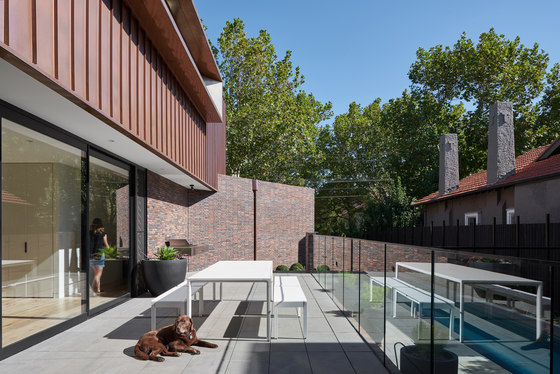
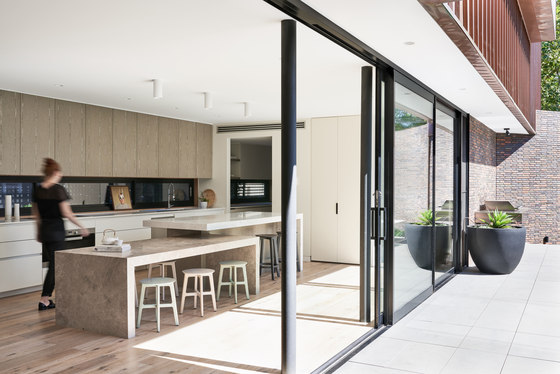
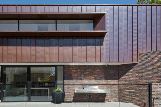
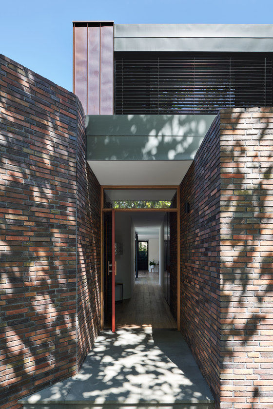
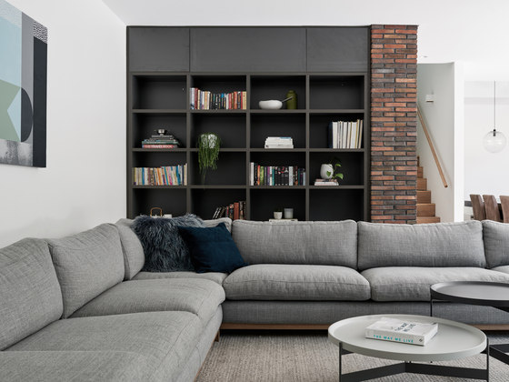
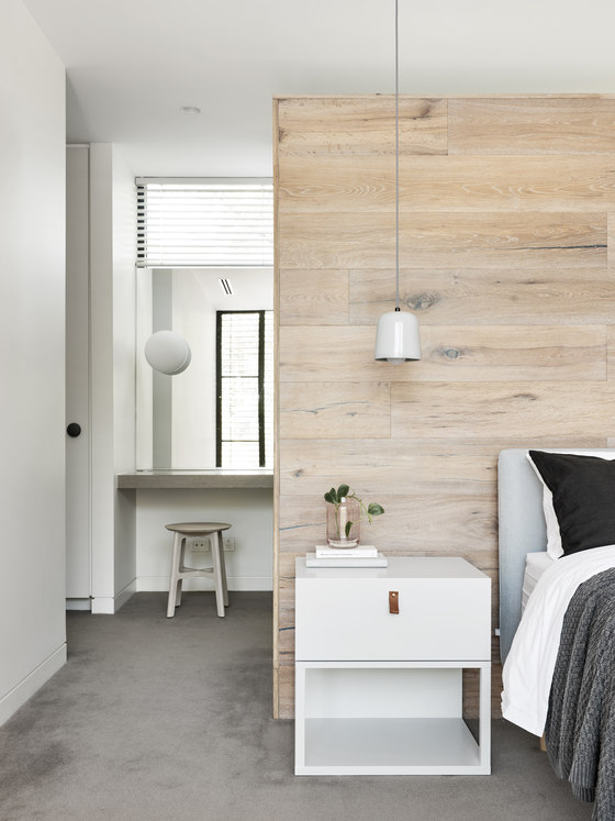
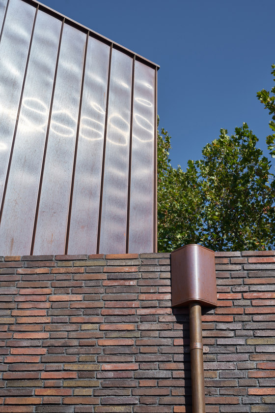
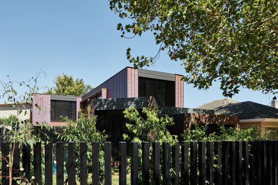
A contemporary three-level family home in a quiet street fringed with Plane trees and period bungalows. The living levels comprise two L-shaped volumes offset from one another to create private and open north-facing living spaces. Built for longevity, the house is clad in hand-pressed Danish bricks and naturally weathered copper.
What is the conceptual framework of the project - including underlying principles, values, sustainable initiatives, core ideas and/or philosophy?
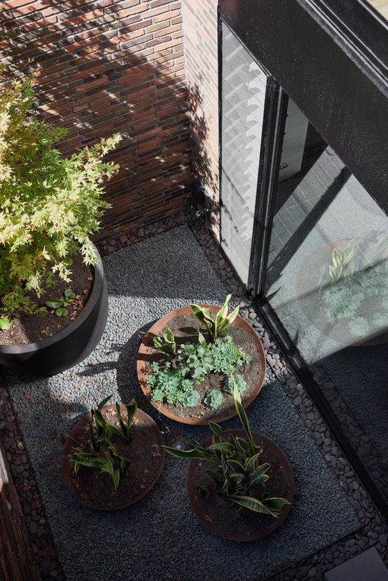
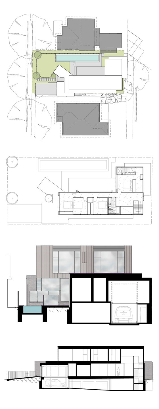
The clients were clear about their accommodation requirements. These included bedrooms and play areas for their three children, outdoor garden space, provision for numerous hobbies including gym, lap pool, motorbiking and multiple car storage. This was achieved by introducing a large basement area over most of the site, with deep soil areas retained for gardens and planted courtyards.
The focus was on:
- Maximising northern light to living spaces, with an unbroken flow from inside to outside.
- Window openings, which take advantage of views out to tree canopies.
- Using materials with a timeless quality based on the client’s wishes to create a family home for the long term.
- Light and natural ventilation including sunken courtyards and cross ventilating pathways to all rooms.
- Formally the building is contemporary modernist in shape and detailing. Two complementary volumes of brick base and floating copper upper storey for bedrooms, which are stacked, shifted and, for the downstairs study, diagonally rotated.
- Materials chosen are robust and maintenance free, yet domestic and homely.
What contribution does the design make to the lives of the inhabitants?
On a recent visit to the completed house, the naturally cool temperature inside was evident despite the heat of the summer’s day. There was also a great sense of privacy and seclusion. The combination of hand-made Danish bricks and weathered copper is strikingly beautiful and the copper has already darkened significantly due to the proximity to the water. The return of brick walls to the inside helps the sense of bringing the outside in, and gives a greater relationship to the courtyards and plantings contained within.
What is the relationship of the built form to the context of the project?
The building lies within a flood zone, so we were battling with the need to raise the ground floor significantly above the natural ground line, which impinged on the neighbouring houses. The mass of the building was pushed to the south west, helping alleviate overshadowing issues. The grey and red tones of the Petersen Bricks, matched with the burnished orange copper perfectly complement the neighbouring bungalows, with their orange tiled roofs. Landscaping which sits on both sides of the steel picket front fence helps give the house and gardens a sense of participation with the streetscape.
Program resolution - how does the functional performance match the clients' brief?
The successful zoning of the building was a key to a positive outcome. The upper level needed to be the private zone accommodating all bedrooms and wash areas. Whilst the clients are keen entertainers we wanted to disguise the stairwells linking to the other levels rather than giving them any prominence. The central level/ground level is the public space linking the terrace and pool areas with the home office near the front door for easy access. The basement allows for the increased acoustic insulation between the ground floor so that the gym and media rooms can operate at full volume!
Cost/value outcome - how effective were the decisions related to financial issues?
The client’s expertise is in managing plumbing trades on large commercial projects. This combined with extensive project management experience on building numerous family homes kept the project on budget and delivered well within time. Quality was controlled with the client’s hawk eye on site twice a day for the blistering six-month build duration. The only disappointing trades were the ones which were chosen on price over recommendation. Pleasingly though, the client was focussed on the highest quality in material selections and treated the house as on for the ages, and for their family’s accommodation for the long term.
Pleysier Perkins
