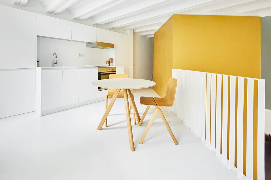
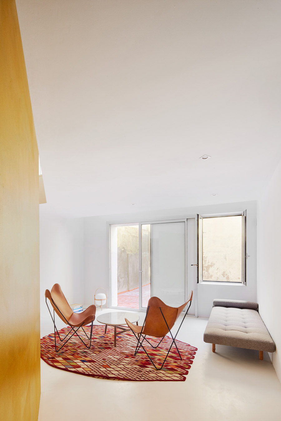
The starting point was two independent dwellings on top of each other on the ground floor and mezzanine of a modest, old apartment building between dividing walls in the heart of the Raval (Barcelona). Both dwellings were in an absolute state of neglect and disrepair. The client's requirement was to concentrate the main living spaces on the mezzanine floor and expand them on the ground floor with other spaces with more diffuse functions that could be used as living room, study, work area...
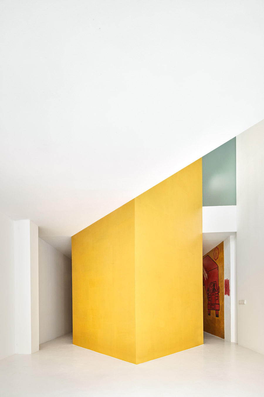
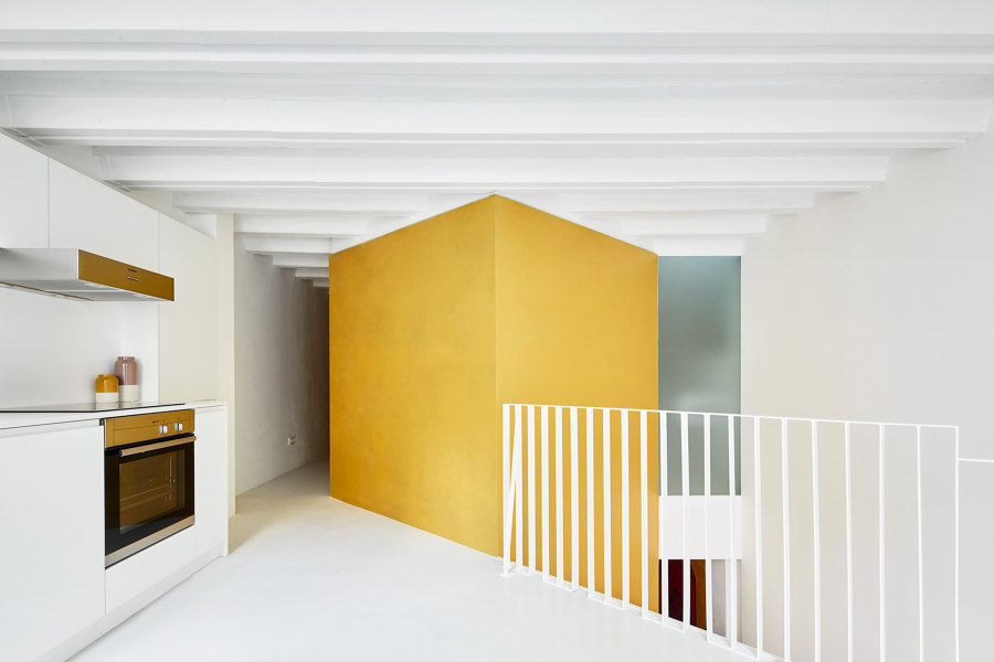
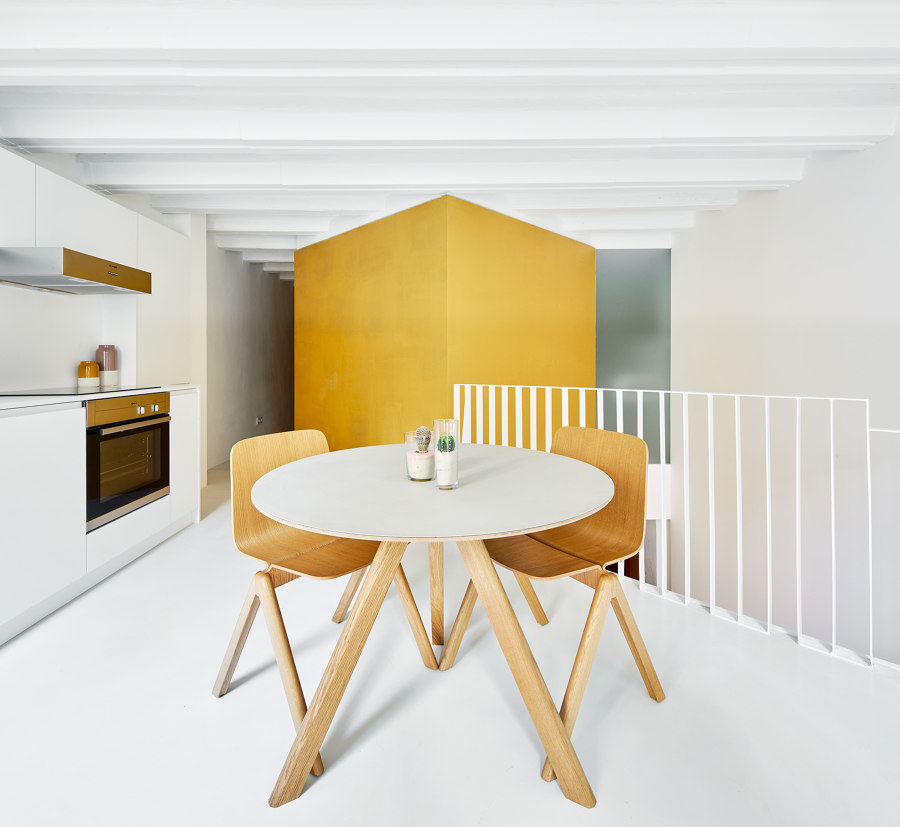
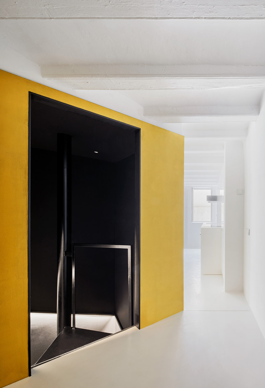
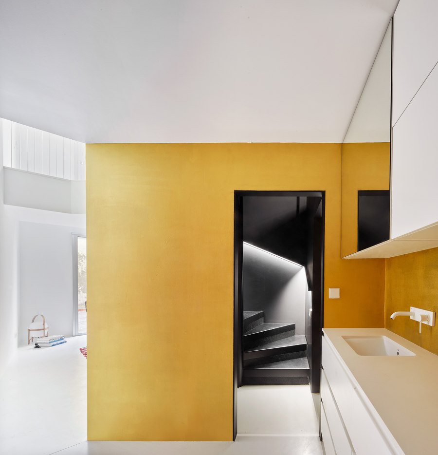
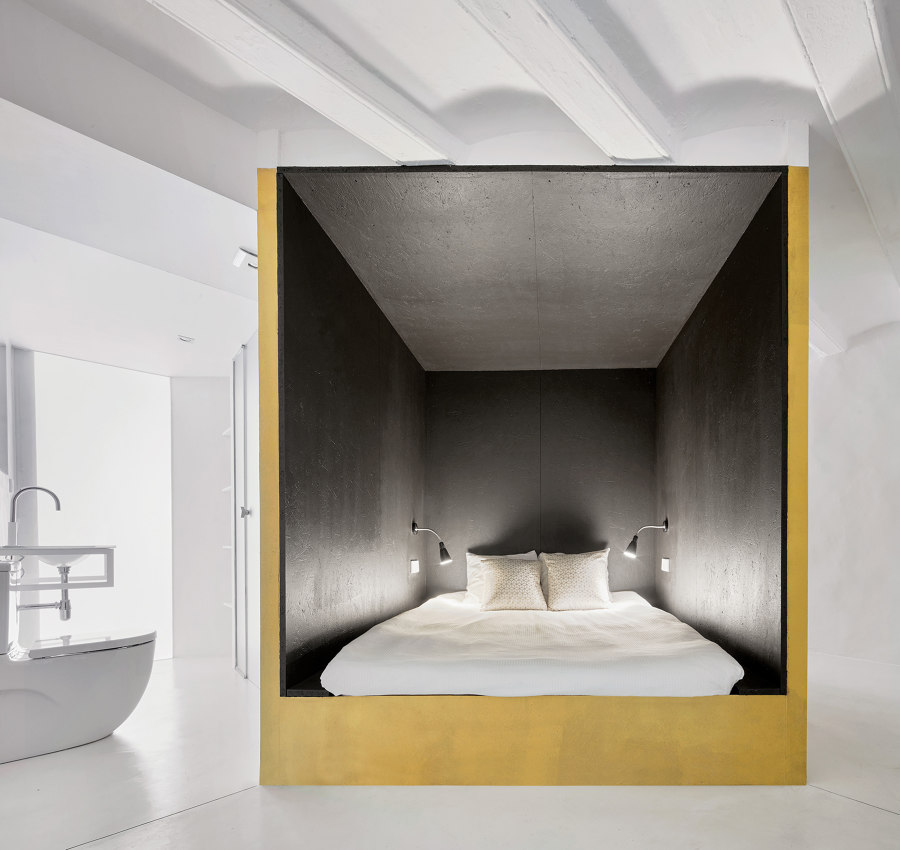
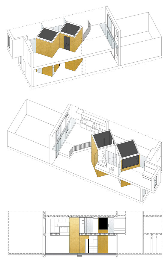
The proposal is clear and direct: in the middle of the space, insert two 2-meter side squares rotated 45º over the dominant axis, their vertices overlapping without touching the original walls, and extruded through both floors. A simple and resounding arrangement in which two ideal shapes, two perfect extruded squares, are imposed on the existing irregularity and arrange all the floor space without the need for any other means or elements. One of the squares will hold the stairs communicating both floors, and the other will house the bedroom on the upper floor and the toilet and office spaces on the ground floor.
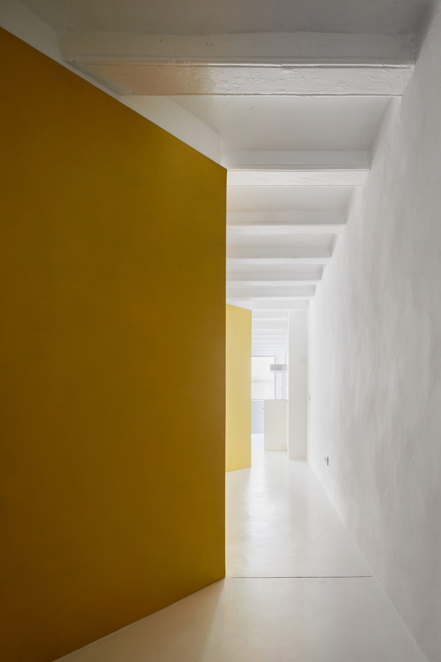
The very rotation of these squares results in the specialization of the space around it without needing any additional doors or enclosures (except those that provide the required privacy to bathrooms and bedrooms), since the new volumes, as they approach and move away from the perimeter walls, define these areas. The proposal's emphasis runs parallel to the sought-after inner spatial complexity and a firm intention to underplay the different areas and circulation.
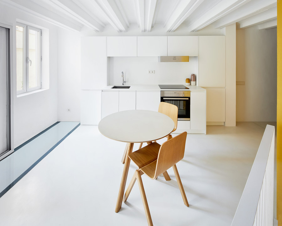
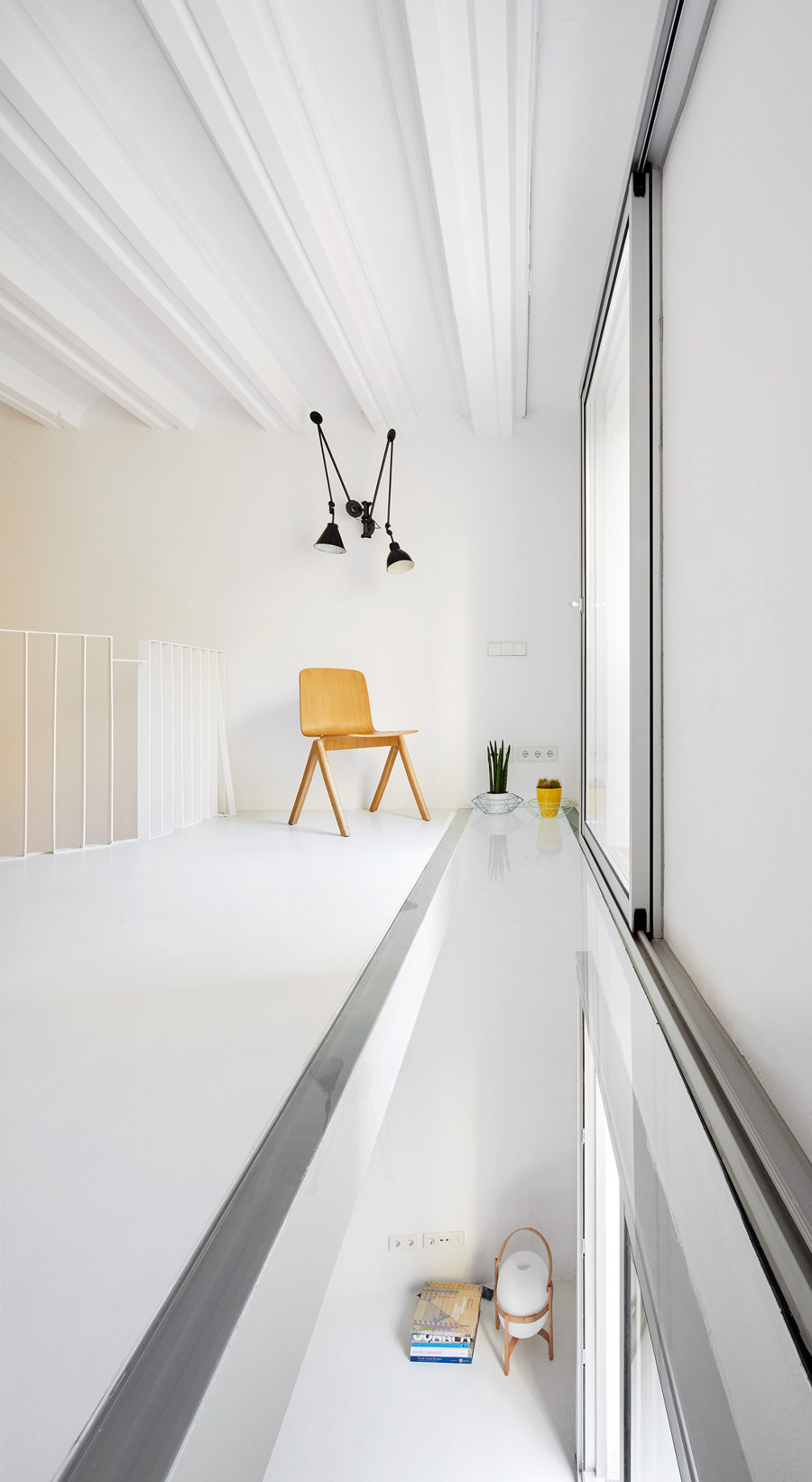
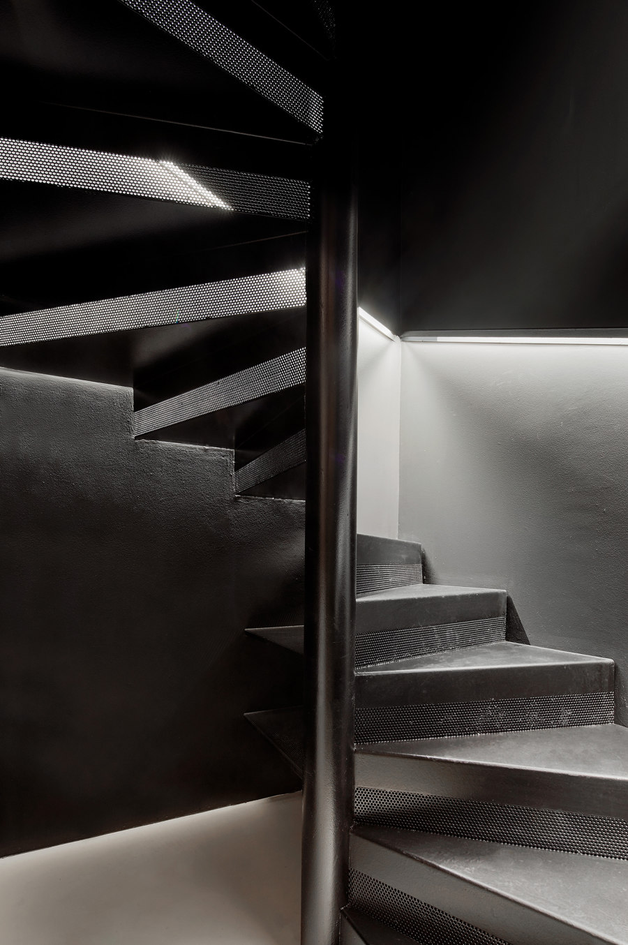
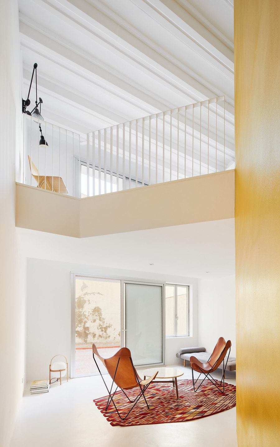
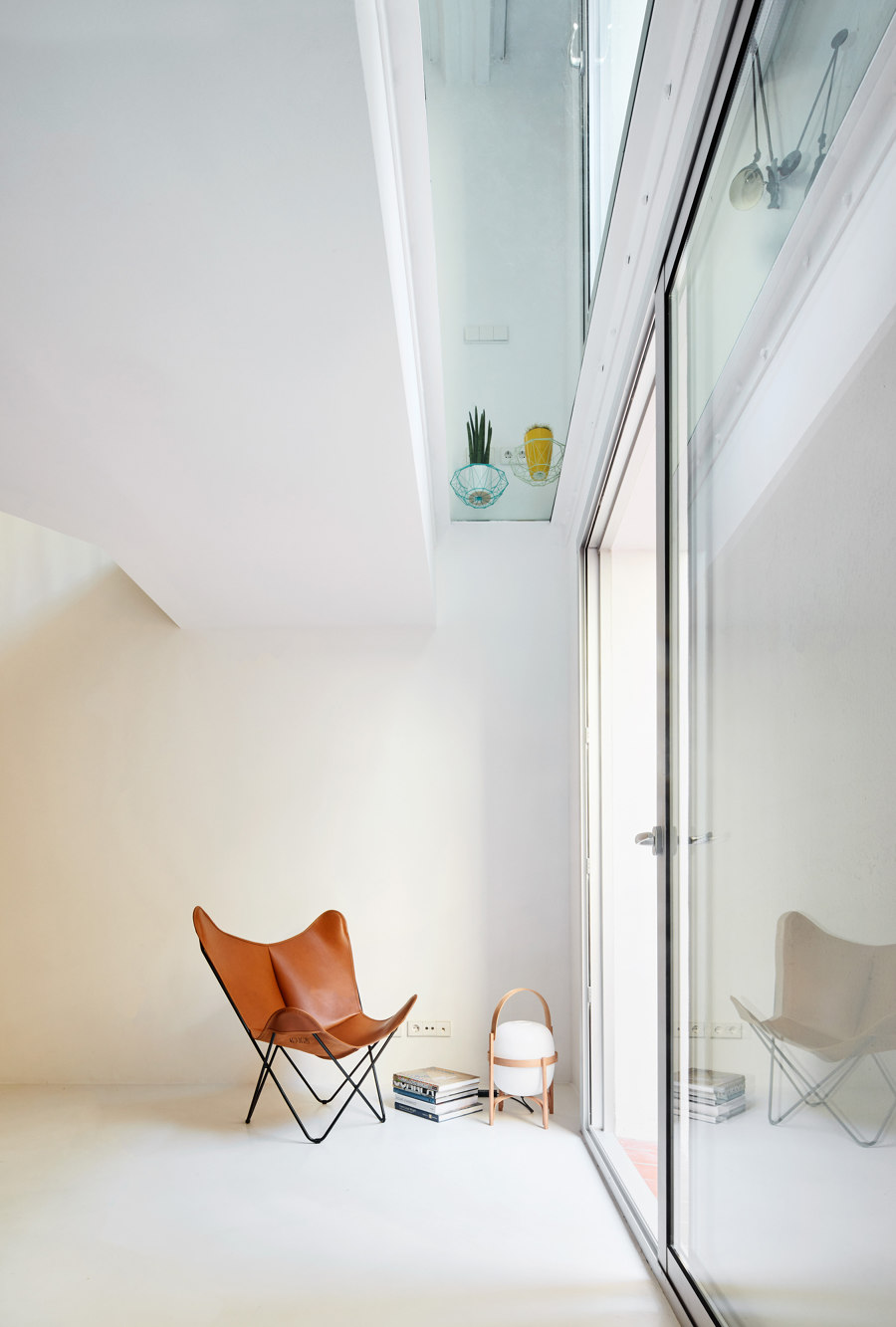
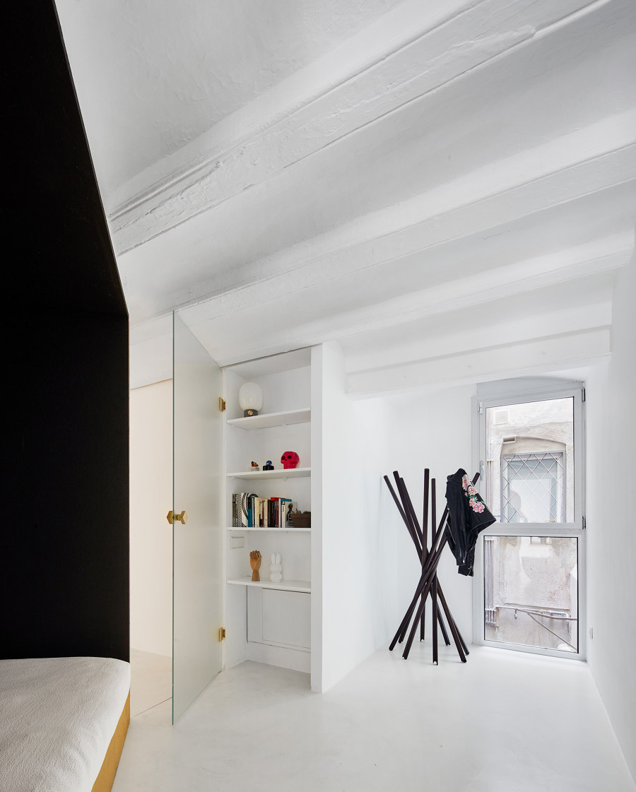
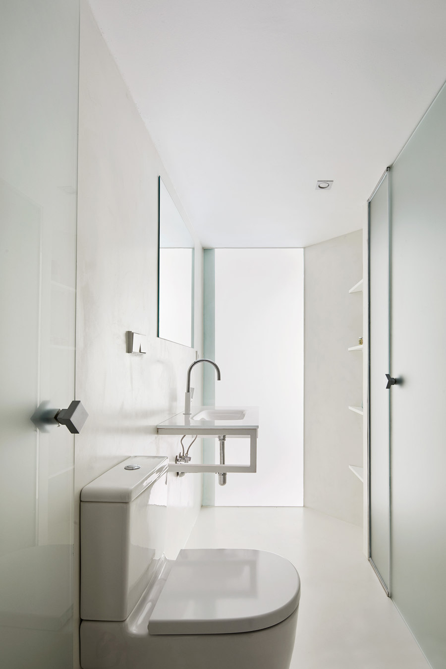
Thus, the stairs are enclosed in one of the volumes, and their spiral pattern aims to disorient and conceal to surprise at the landings; for the same purpose, there are multiple axes of symmetry that double up circulation and enhance the spatial experience, for example, at the landing on the ground floor with two possible exits, or all those axes that are placed at the squares' vertices; the enclosed bathroom area on the upper floor, the most isolated and private of the whole, mirrors and unfolds its negative space, a double-height empty area linking both floors; the highly reinforced top floor structure is cut off before touching the façade to reach it with a glazed floor pane, linking both floors, and thus isolating the existing façade wall, including the outer sliding carpentry are placed in that wall’s interior plane; no element touches the volumes, which are read independently inside, ending just before they touch the ceiling; lights, door knobs, shower heads, drains ... all elements replicate the 45° turn with respect to the surface where they are inserted ...
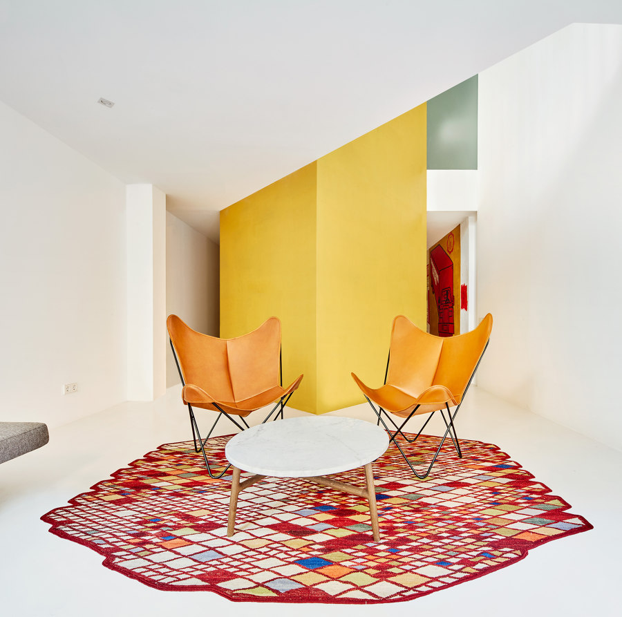
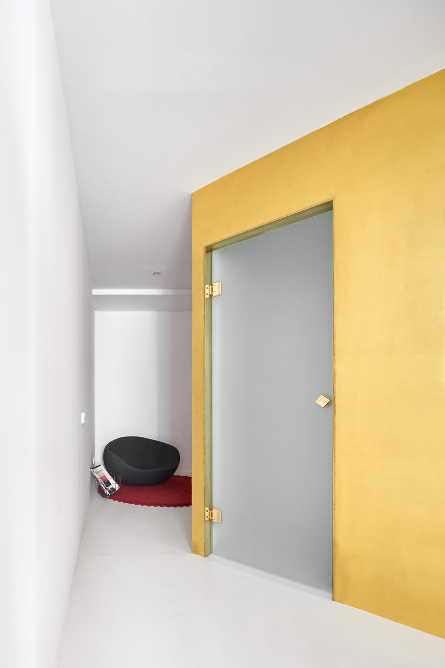
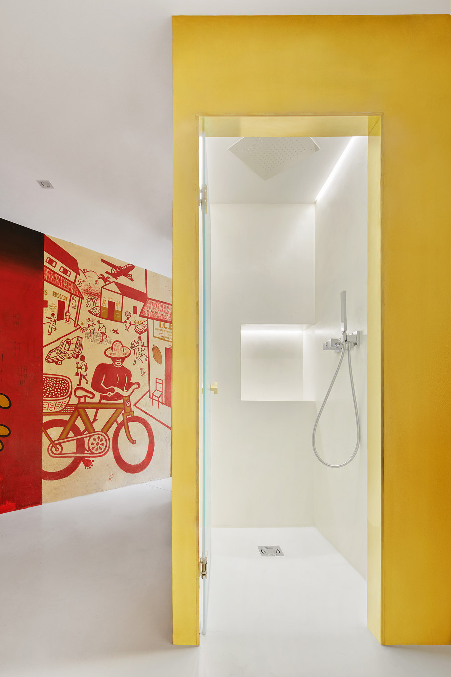
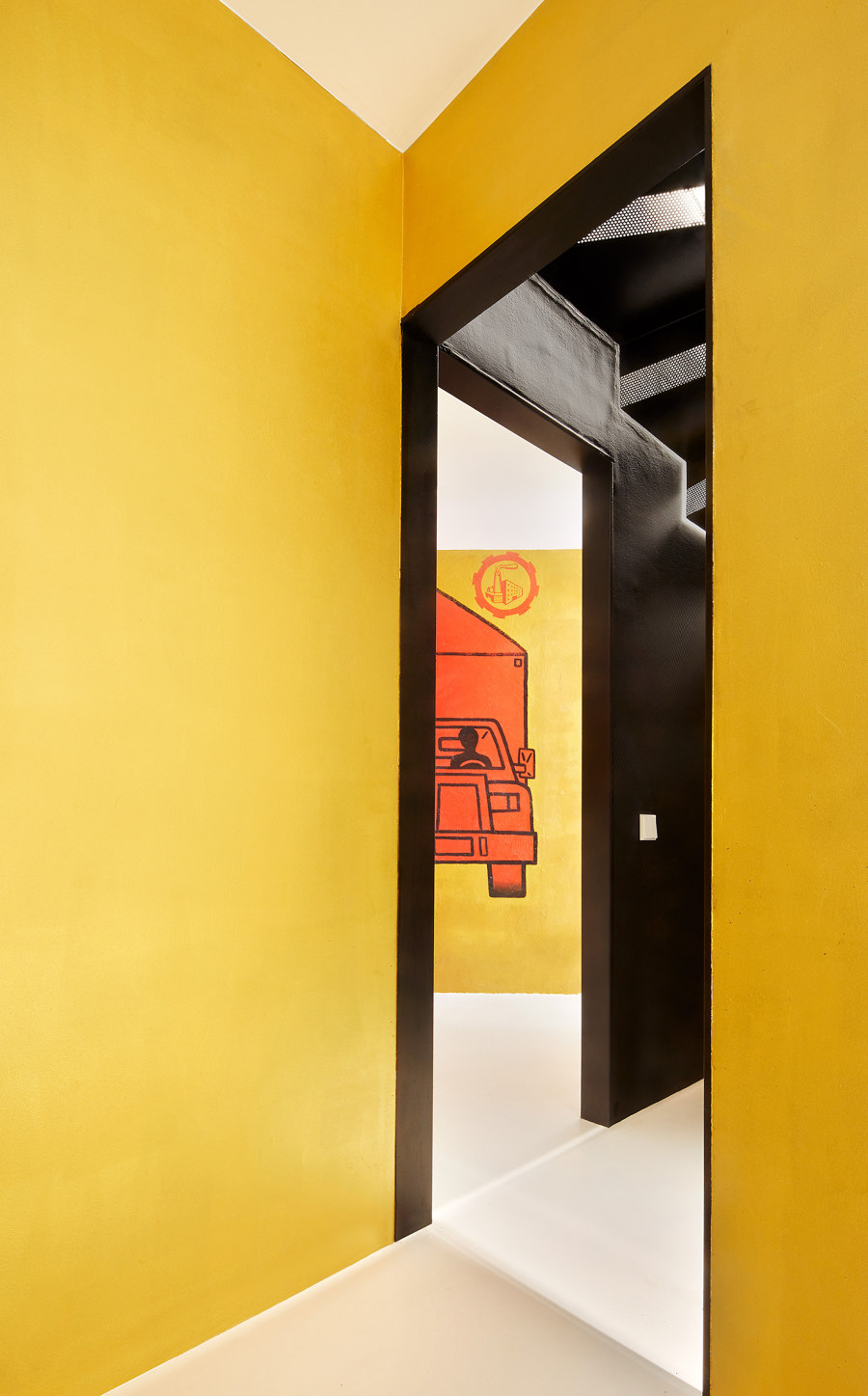
The treatment of colors and materials highlights the two extruded volumes, which are coated in glossy, gold finish paint mixed with gold powder and varnished, surrounded by white cladding (microcement and paint) covering and coating the existing perimeters. The inside of the staircase, dug into one of the volumes, is a dark world of black contrasting with the exterior whites, just as the bed area in the bedroom, excavated into another of the volumes and covered with painted OSB wood boards and varnished in black.
The door frames (all glass) and openings are either brass or black steel, depending on the area to which they give access; hinges and handles are also brass or chrome ... The material and color code always matches the nature of the element where it is applied, whether existing or new, either inside the squares or outside. From the outset, the structural intervention required overhauling the foundation, high precision in placing the central squares, as well as the precise cutting of the existing wooden beams for the openings and double heights.
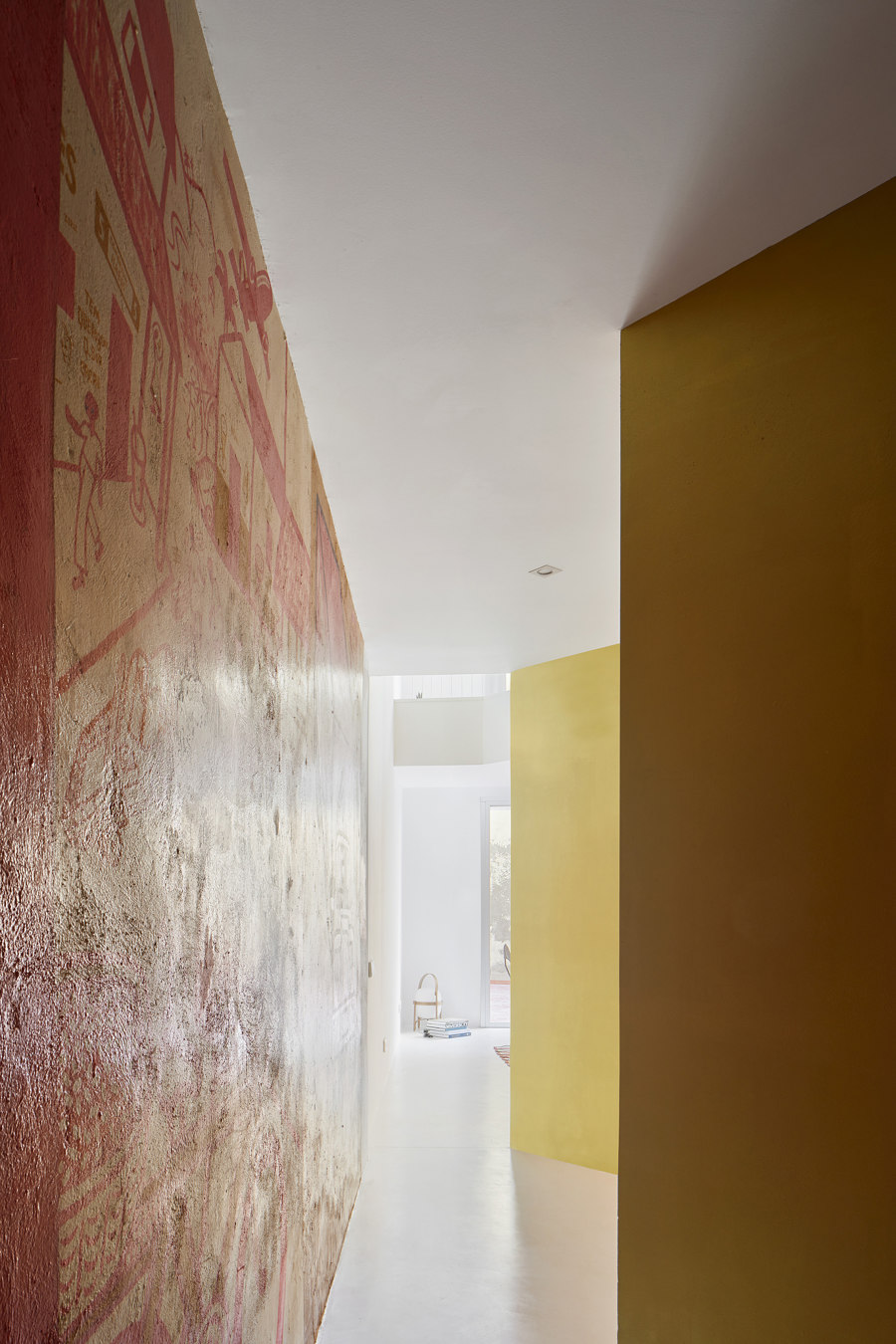
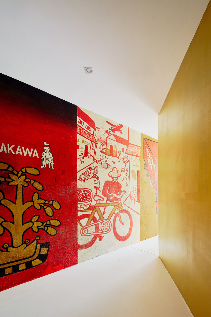
The cut wooden beams either rest on the new steel porticos or lean on the lower wing of the new beams, always for the purpose of allowing the clean extrusion of the squares. The duplex is equipped with underfloor heating with a highly efficient air-therm system. On the ground floor, three existing paintings of Brazilian origin have been preserved, and the proposed inside circulation places them right at the stairs exit. These paintings are the reason the client, of Brazilian origin herself, initially decided to buy these two properties and undertake the project.
Raul Sanchez Architects
