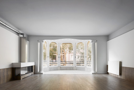
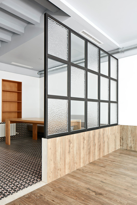
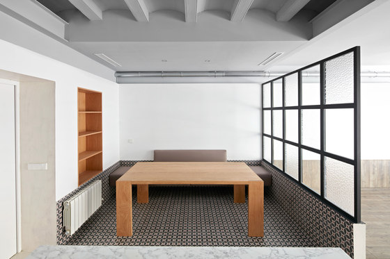
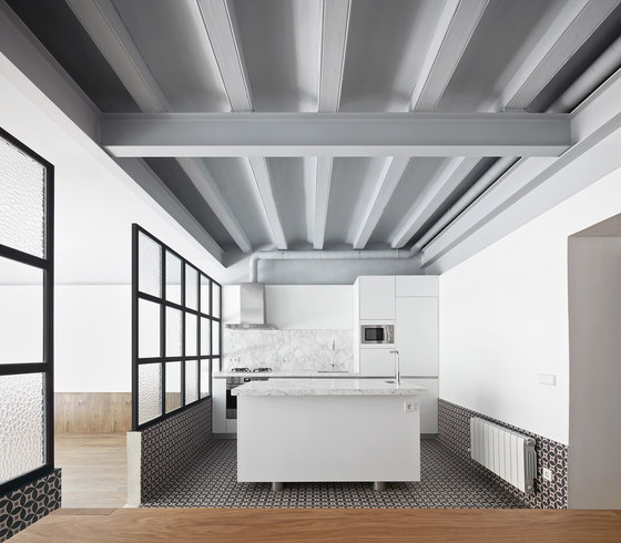
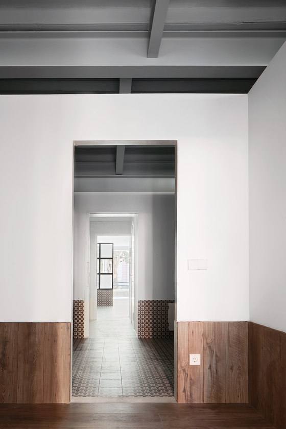
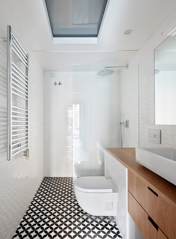
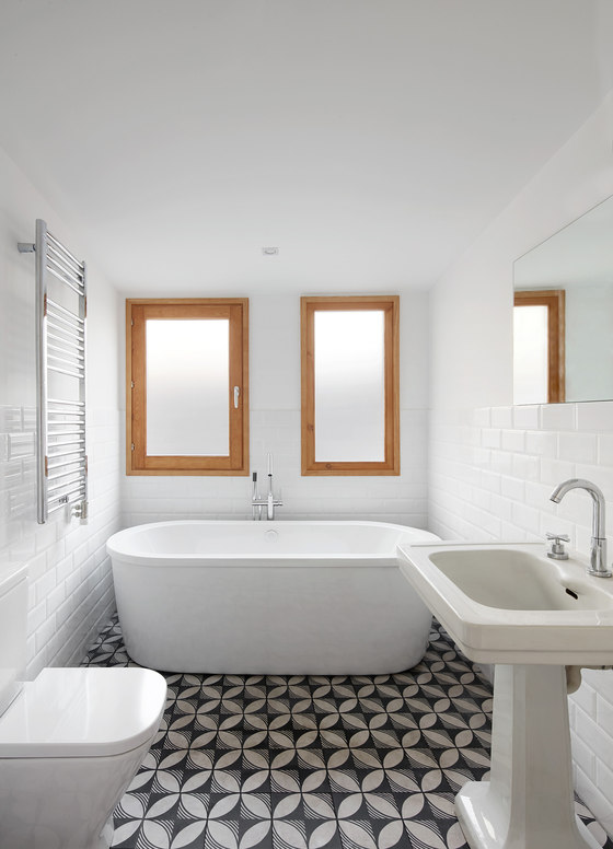
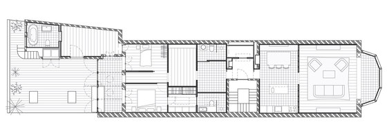
The project takes place in a long, narrow and stately apartment whose façade connects to the access street via an elegant bow-window and to a large but not very attractive interior courtyard through a gallery. In between, 140 square meters to resolve more or less conventional housing requirements. Two key strategies drive the design as a whole. The first is that there are no hallways between rooms; they connect directly via an enfilade of sorts.
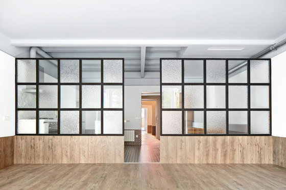
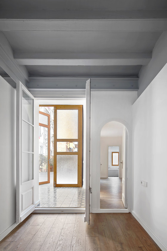
This gives rise to a series of intermediary spaces that lack a defined code or function, which transforms them into potential play, reading, storage rooms, etc. These spaces which serve as a backbone to the dwelling don’t even feature doors, and their partitions fall short of the ceiling, making them, as it were, rooms within an original container space.
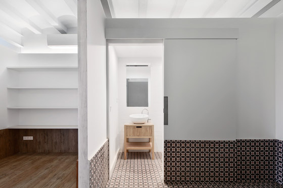
The second decision is structuring all rooms on three sections, based on three levels. A top level - the original wooden beam and ceramic vault ceiling - runs throughout the house and is painted grey. Nothing breaks up this level, since partitions do not reach up to the ceiling. Running from 60 cm to 230 cm and painted white, an intermediary level encompasses and structures the rooms, closing in the space even though there are no doors and the partitions don’t reach the ceiling.
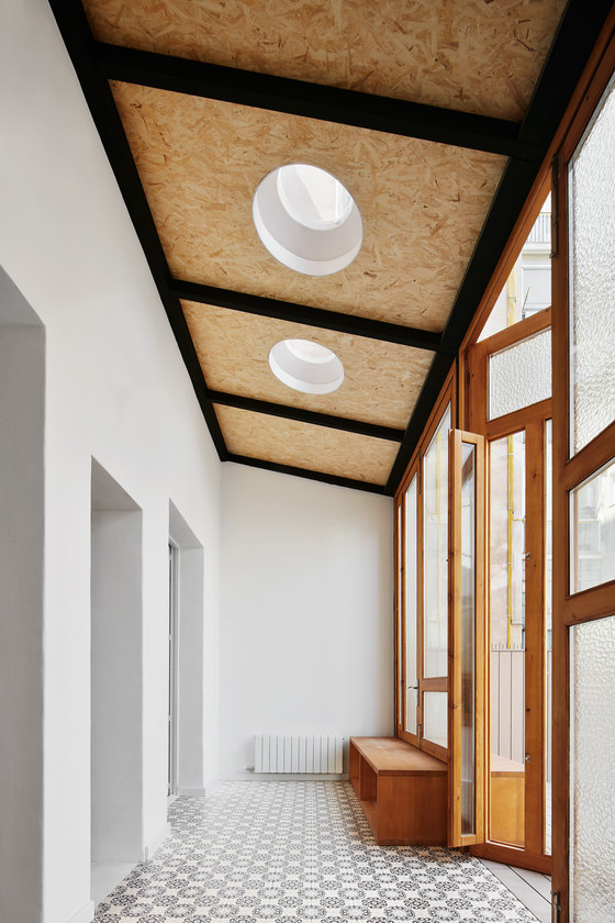
The lower level, running from the floor to a height of 60 cm, features flooring rising up the partitions in distinctive contrast for each space, while maintaining symmetry with the entrance - tile for wet rooms, wood for living rooms and bedrooms, and a new type of tile for outdoor-facing rooms, the street-side bow-window and the gallery connecting to the courtyards. The thresholds linking the rooms feature a new material, white micro-cement, which likewise covers the partitions in the entrance, which was re-arranged to clearly establish the public spaces facing the street and the private spaces facing the inner courtyard.
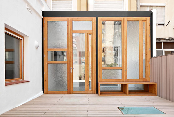
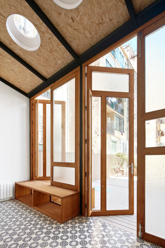
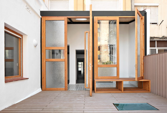
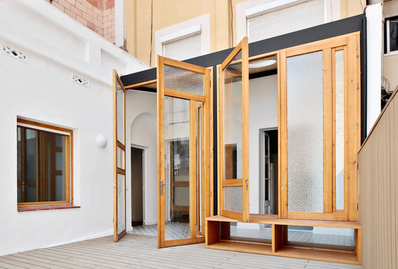
The entire interior space is thus organised as a series of rooms which are set off but connected and which always connect to the two exits to the outside, through which light penetrates into more interior spaces, creating a beautiful light gradation. Spaces which require more privacy follow a similar pattern but with greater privacy. The gallery leading to the courtyards was completely demolished and was re-built (both structurally and in terms of building materials) using enormous wood doors featuring different cuts and glasses of various transparency that manage to illuminate the interior despite its unfavourable orientation while blurring the unappealing view.
RAS Arquitectura
Engineering: Mares Ingenieros
Structure: Diagonal Estructuras
