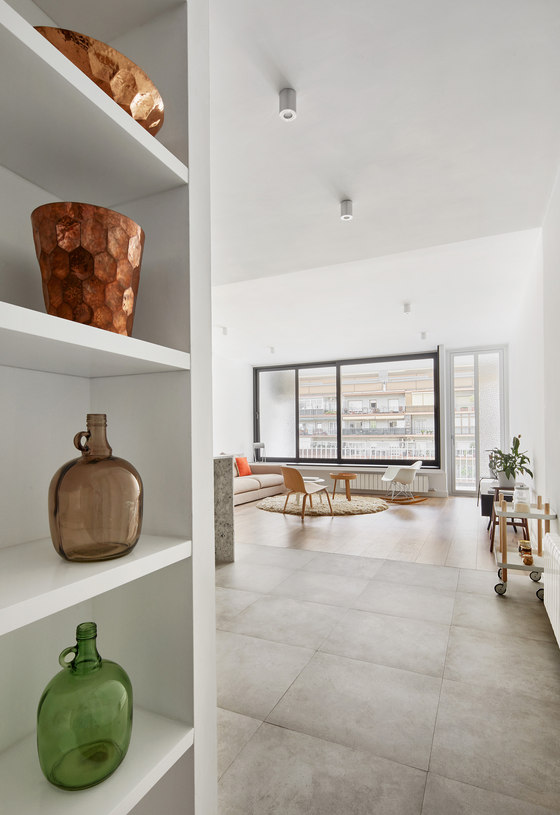
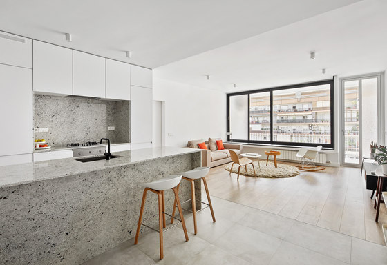
From its current state, an unattractive distribution and complete lack of functionality, the project picks up from what the client explains is his way of life to create a completely renovated interior.
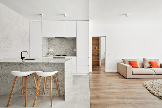
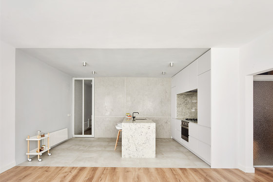
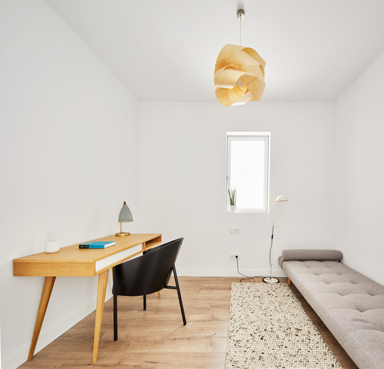
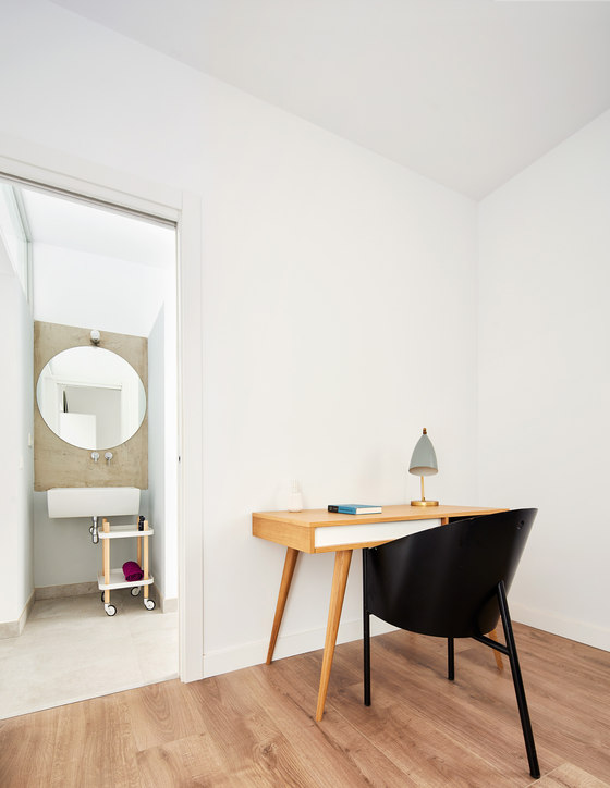
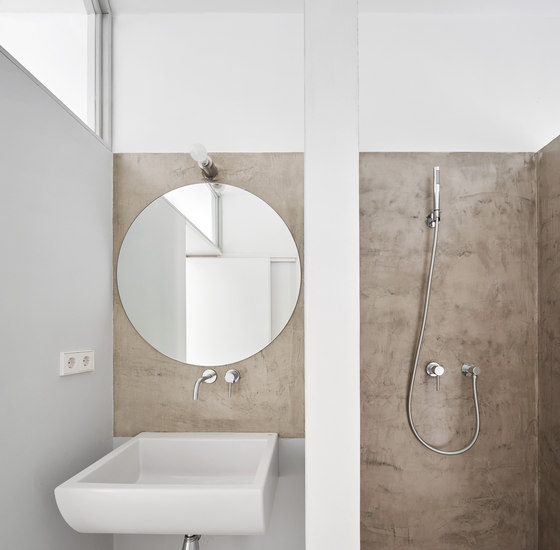
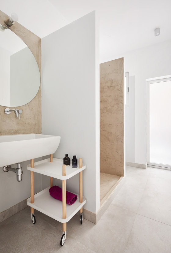
Starting from the building's construction and structural constraints in which the apartment is inserted, based on load-bearing walls with a clear and defined bay structure, the project proposes three large program blocks: a first access-related block, where the entrance, the guest bathroom (from which you access the laundry room) and the guest bedroom are located; a second block housing the master bedroom and the adjoining walk-in closet and bathroom; and a third block that is a single large space where we find the kitchen, the dining room and the living room, and which, in turn, acts as a swivel joint between the two other blocks.
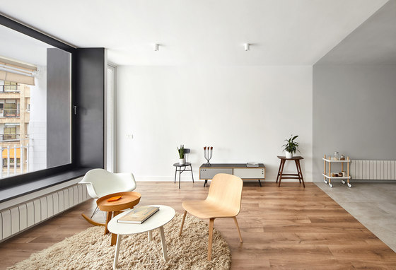
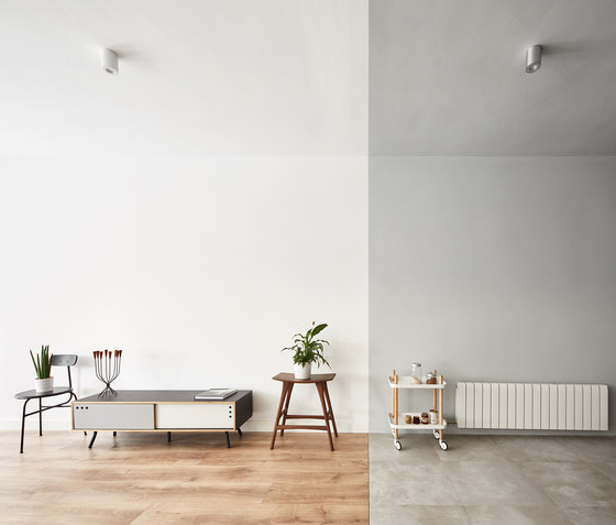
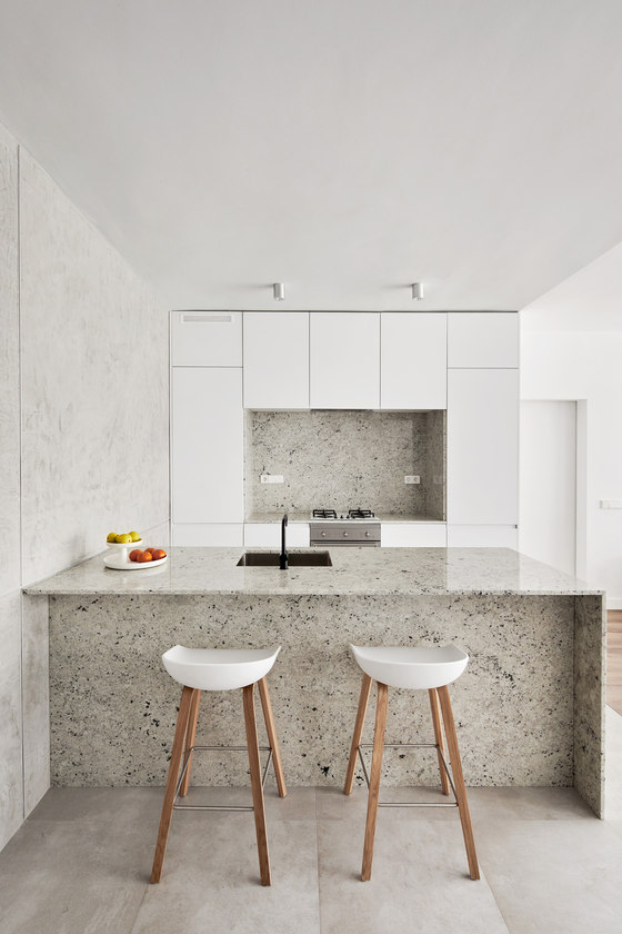
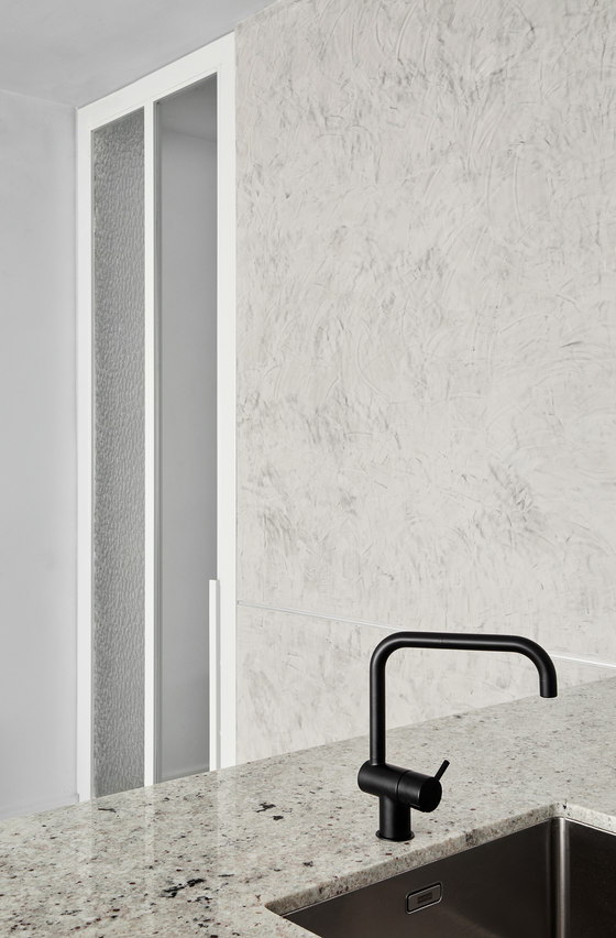
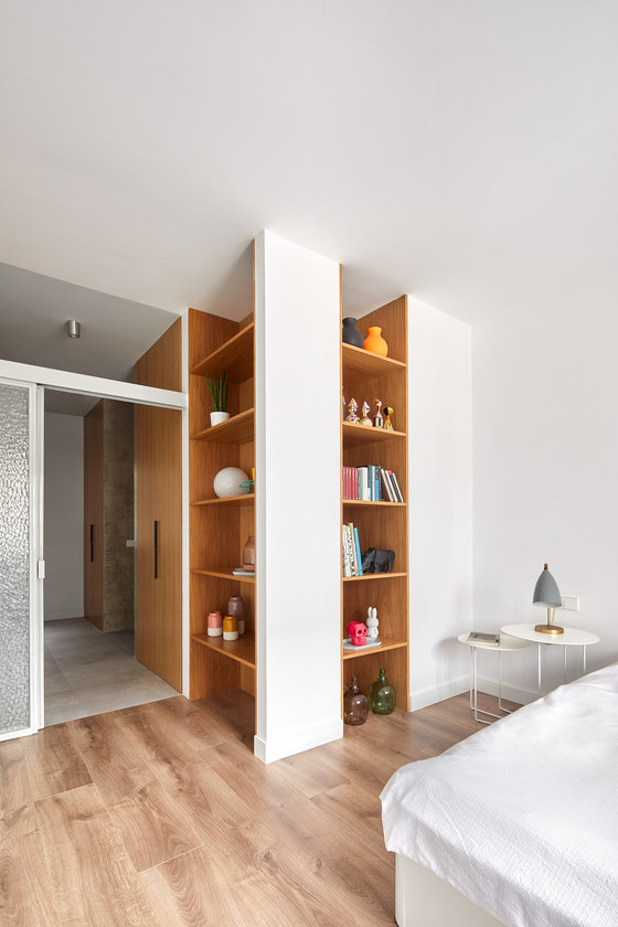
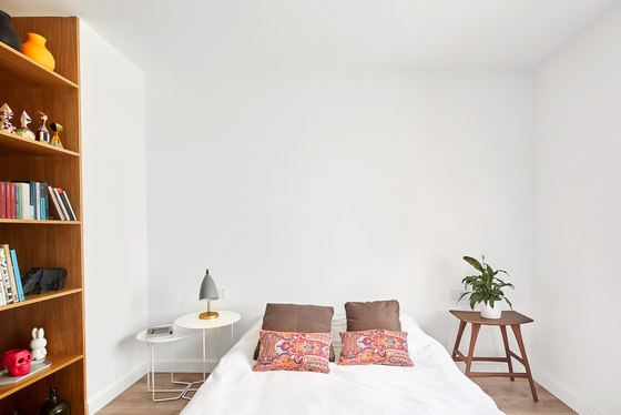
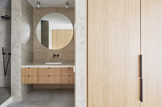
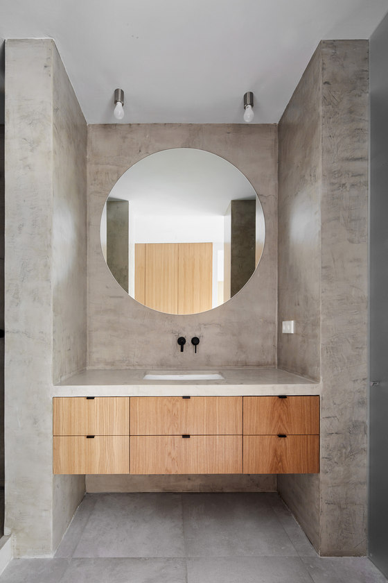
Each of these blocks includes a service space and a living space, and the relationship established between these two spaces is based on a change of material code, suggesting an intangible separation of planes. Service spaces are covered in gray materials, whether stucco or wall and ceiling paint, stoneware floors, and granite or microcement on impervious surfaces. By contrast, living spaces are completely white with parquet floors.
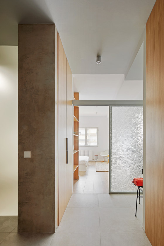
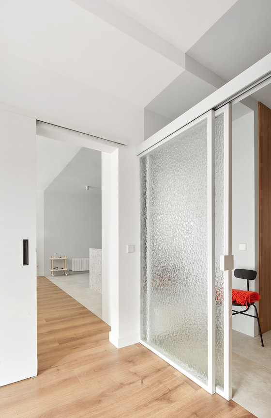
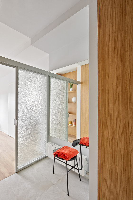
Thus, it is the material code that establishes the position of each function, even when the rooms are completely open and communicated, as in the case of the living room-kitchen-dining room. In the master bedroom, the separation with the walk-in-closet-bathroom is achieved with the same material code in the same intangible plane, which extends through the kitchen-dining-living space through the load bearing wall, and with two iron and textured glass sliding doors, lacquered in gray, and placed to provide greater privacy but without segregating the space, since these sliding doors do not touch the ceiling.
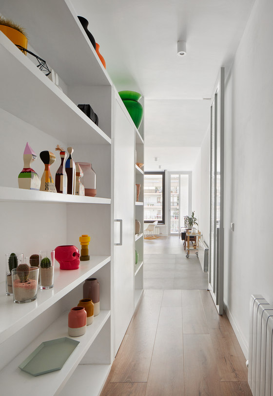
The guest bedroom and bathroom each has its own independent access, but they are connected to facilitate their use en suite. The circulation areas have suggested rather than materialized paths. An axis connects the entrance with the balcony, but this axis first blends into the entrance hall configuration in a large closet with flush doors and later disappears when it reaches the kitchen-dining space.
The door to the lobby is twins with the door to the balcony, and the width of the lobby is repeated in the turn of the black lacquered wooden bench on the balcony, so that the axis of circulation is indicated, but without the need to build a corridor. Even the balcony's ceramic tile changes direction following this blurred corridor. The relationship between the living room and the balcony is achieved through two large black-lacquered sliding windows, this color used to introduce a new space, the balcony.
They are placed above a bench that extends in the same way in and out doors, so that when the windows are open, the balcony and the living room are closely connected; or when closed, they act as bench, table, bookshelf ... on both sides. Glass of different transparency and texture combines to blur a less than attractive interior patio. In summary, from the client's predetermined conventional organization, the project proposes adding layers of complexity to the interior experience of the house, adding ambiguity to the classic labels of each room, as well as to the way they relate to each other, so that all this will eventually translate into greater spatial richness.
Raul Sanchez Architects
