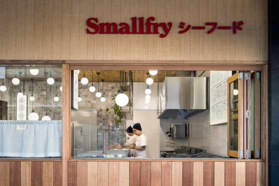
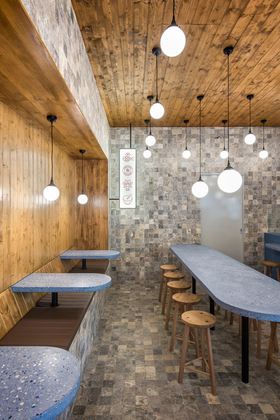
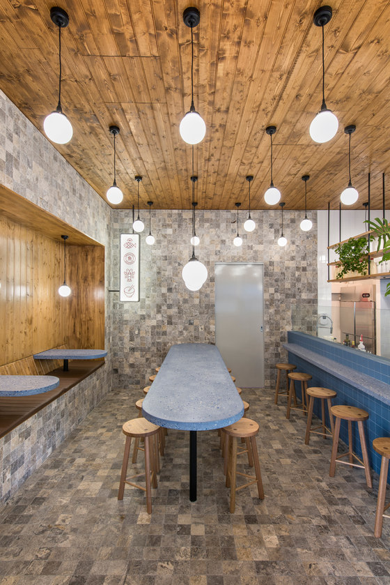
Smallfry Seafood is an off-beat, inner city fish and chipper with a Japanese twist. This casual venue brings warmth and homeliness to a cold, concrete-filled environment. The design draws upon nostalgic ‘fish shop’ vibes but re-frames them in a modern, textural and immersive space.
What was the brief and what did the site require?
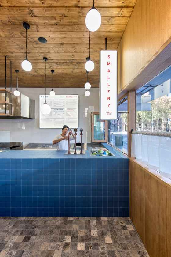
The brief called for a takeaway seafood bar, serving the 9-to-5 office worker for lunch and dinner, directly to the street and to a small dine-in crowd. The client knew that he wanted ‘something different’, something that would stand out against other venues in the area and unlike other typical seafood bars. The small site needed to work at maximum efficiency, with a service point to the street key to the operation of the business.
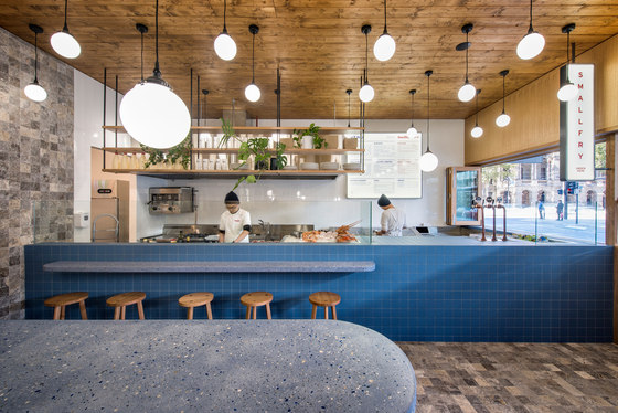
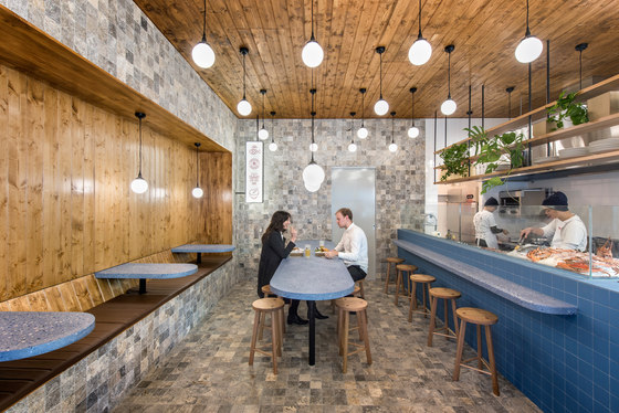
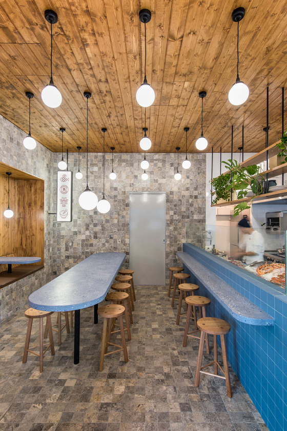
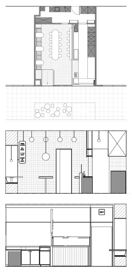
The front of house space is divided into two - a sterile and clean service side; and a textural, inviting space for customers. The venue is casual, but refined, considered and unique. Efficient back of house operation and service to the street was prioritised. The kitchen layout was designed in close collaboration with the client and chef to ensure maximum efficiency throughout prep, cooking and service to the interior and street.
How is the project unique?
Smallfry combines absolute rationality in its program, with a unique and considered approach to materiality and the phenomenological experience. The finishes and form show sophisticated development of a concept that is rooted in the familiar aussie fish and chip traditional, with a modern, refined reframing.
The space embraces the unique culinary history, whilst referencing the origin of the produce and acknowledges the operators own cultural background and unique approach to this familiar meal. The materiality considers the tactility and experiential qualities of the ocean, whether eating a casual dinner by the beach, or swimming underwater amongst phospherants.
Colour and texture reference these moments and experiences of the ocean, creating a strong, yet almost intangible link to another place. This consideration shows a dedication to concept and authenticity, raising the focus on design and the experience of dining above the usual.
How does the project enhance the hospitality offering?
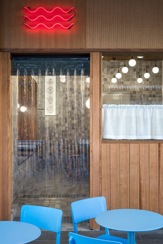
The timber façade creates a stark contrast to the commercial streetscape of cold, concrete and steel. The design draws people towards the warm, inviting space; a place for patrons to tuck into, or hide away. Curtains obstruct the view from the street, creating intrigue externally and seclusion internally.
The fit-out embraces the seafood offering whole-heartedly. Subtle references to seafood institutions like the Swan Oyster Depot in SF are brought into a space that is largely influenced by the textures, colours and experience of the ocean. The design appeals to the slightly familiar fish and chip design precedents, but also channels a subliminal, less in-your-face oceanic influence.
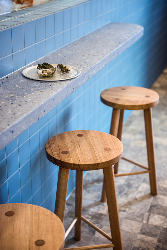
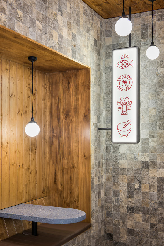
Grey travertine, blue terrazzo, oak and stained pine create an ‘oceanic’ palette, whilst the light-boxes nod towards the famous Japanese seafood markets, tying into the heritage of the owners and the Japanese twist on the menu.
Sans-Arc Studio
