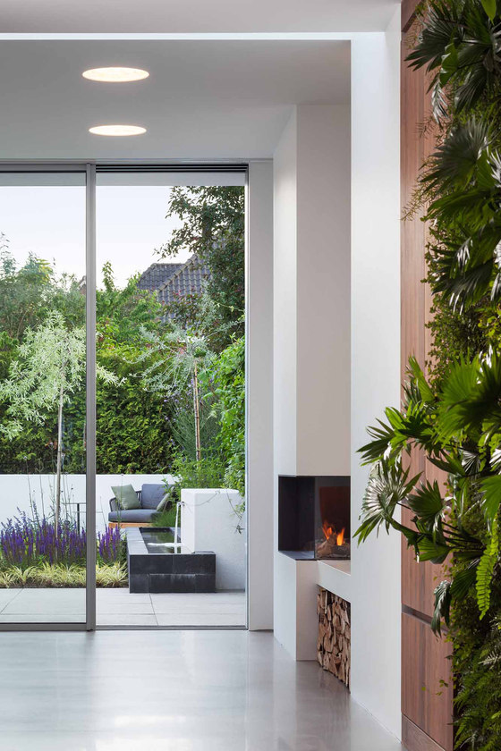
One unusual feature in the architecture of the extension is the corner fireplace, which sits very far forward within the room. This means that the air circulating from the panel towards the inside is heated, and is thus distributed evenly throughout the r

One unusual feature in the architecture of the extension is the corner fireplace, which sits very far forward within the room. This means that the air circulating from the panel towards the inside is heated, and is thus distributed evenly throughout the r
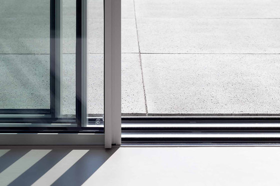
×The floor was cast in a material that seems to flow into the outdoor terrace area. Thus, the light grey stone has the impression of being a reflection of the interior floor which continues to the green of the domestic garden.

The floor was cast in a material that seems to flow into the outdoor terrace area. Thus, the light grey stone has the impression of being a reflection of the interior floor which continues to the green of the domestic garden.
×cero complements linear design in construction
Elegant transparency in a light-flooded extension
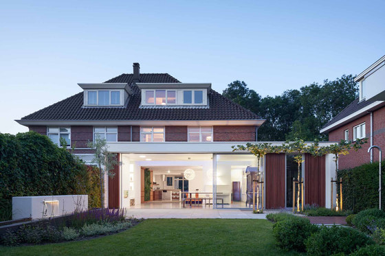
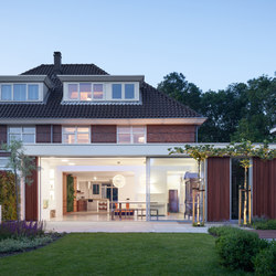
Isn't it great to give free rein to your own ideas? The client from The Hague designed the extension to her family home herself, skilfully creating a contrast to the Dutch brickwork architecture, while simultaneously expanding upon the existing structure in a modern way. The two structures fit together to form a whole, which focuses on a central theme: merging the indoors with the outdoors.
The clean-cut lines of the extension stand out at the very first glance. The floor was cast in a material that continues to flow into the outdoor terrace area. Thus, the light grey stone floor gives the impression of being a mirror image of the interior which leads to the green contemporary garden. To create the perfect illusion, the transition from indoors to outdoors is completely linear and continuous. The real task for the client was to find a window system that could complement the fluid transition between the outside and the inside, which was so important to the look and feel of this extension. Together with her husband, the client spent a long time searching for the right glazing solution for their home. They were both clear as to what was required: the feature glazing should be completely transparent and allow as much natural daylight to flood into the living room as possible – ideally, the window should be virtually invisible and lie seamlessly in a flush fitted floor track. Finally, after much searching, they discovered cero, the sliding window, whilst visiting a recent trade fair.
The cero sliding window
The couple opted for a sleek three-panel design, which can be opened and closed, except for one element, either manually or automatically. cero rests on three slide rails which have been recessed into the floor. The panels can be moved in both directions either to the left or right allowing the Indoors and outdoors to be visually separated only by the line of the completely flat embedded guide rail. The open plan living room naturally blends into the patio area which extends effortlessly into the garden where the linear architecture of the building is re-imagined once again in the pavilion on the opposite side.
Breaking light and spatial barriers
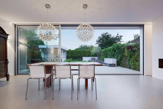
By opting for cero, the clients have chosen a virtually frameless glazing solution: the slim 34 mm profiles are barely the width of two fingers. The large-area glass panels create a light and airy feel. In the building itself, this airiness is highlighted not only by the fully glazed and opening façade, but also by the integrated transom light. The extension continues right into the main house, with daylight naturally allowed to brighten the far depths of the room. The gap between the existing building and the extension has been bridged using a feature skylight window which in turn allows this area of the living space to maximise the amount of available light with stunning effect from above.
The elegant white interior evenly reflects the daylight which floods in throughout the room. One unusual feature in the architecture of the extension is the corner fireplace, which sits forward and proud within the room. This means that the air circulating from the glazing towards the inside is immediately heated, and distributed evenly throughout the room. The straight lines of the extension are blurred subtly by two lamps above the dining table, which shine evenly in all directions thanks to small light elements, enveloping the room in soft light in the evening hours.
Impermeability, barrier-free living and burglar resistance
The best design is often characterised by a clear form that merges into its actual function. And that's exactly the case with cero: the sliding window not only makes it possible to enjoy unbelievably large-scale glazing, but also offers the major convenience of a premium product for home construction and modernisation. In a contemporary building project, three points in particular are important when it comes to choosing a window: first the energetic impermeability, which cero achieves at passive house standards, then the barrier-free accessibility of the transitions, which is regulated by European standards that the cero sliding window more than accomplishes, and last but not least, the burglar resistance tests according to European standards, which cero has passed with flying colours.
Design: Margreet Keijer
The client from The Hague designed the extension to her family home herself. The two structures fit together to form a whole, which focuses on a central theme: merging indoors with outdoors.

The client from The Hague designed the extension to her family home herself. The two structures fit together to form a whole, which focuses on a central theme: merging indoors with outdoors.
×
