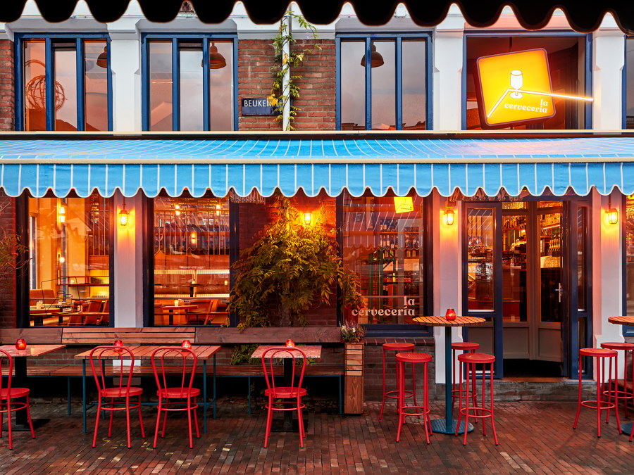
In the green neighborhood of Amsterdam east, the warm ‘pincho bar’ La Cervecería, has opened its doors to the public to bring the warm side of Spain to the Dutch capital.
This Spanish-inspired bar has been designed by Studio Modijefsky, which, using a traditionally southern color palette and a lively juxtaposition of modern patterns, created a cozy space for locals to feel on holiday and for southern internationals to feel home. The interior references to typical “cervecerías”: places where Spaniards go to spend their after-work time in the company of colleagues and friends, to enjoy “cañas” and “pinchos” in an informal environment.
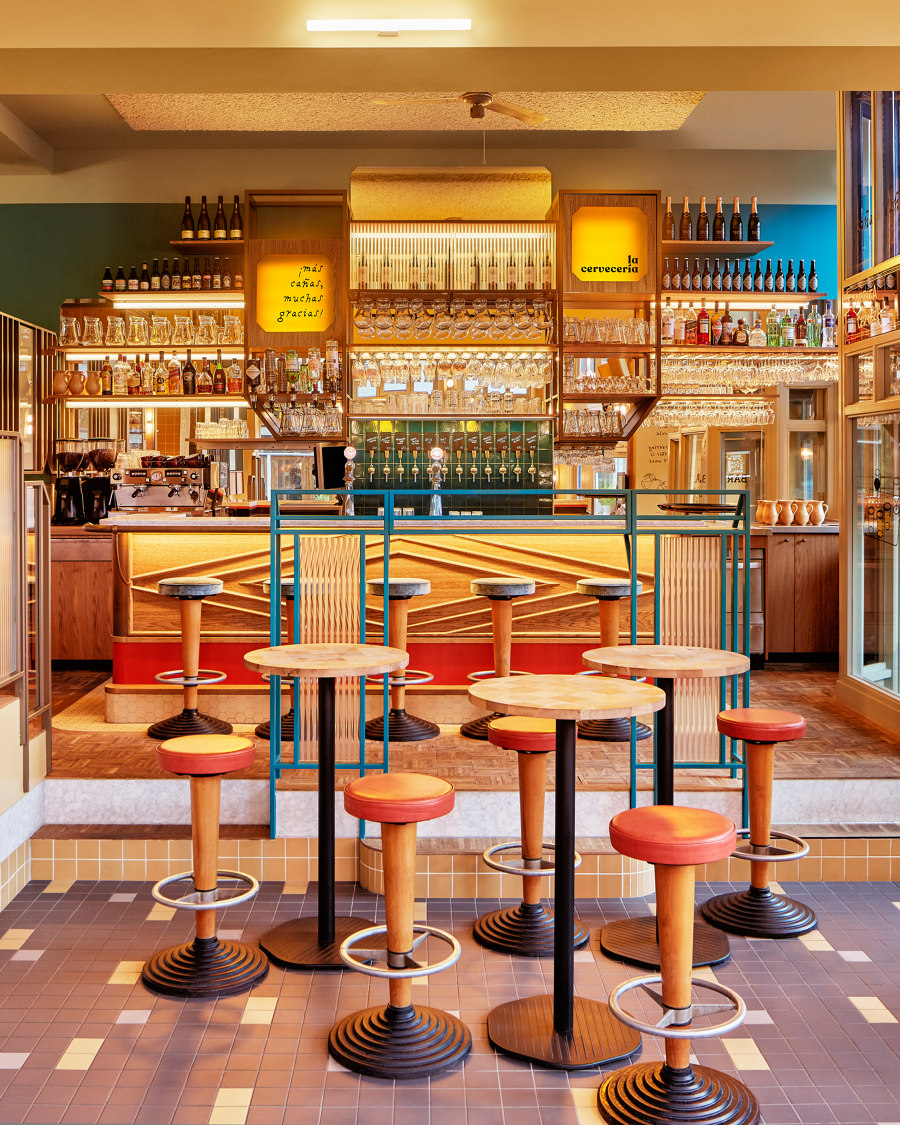
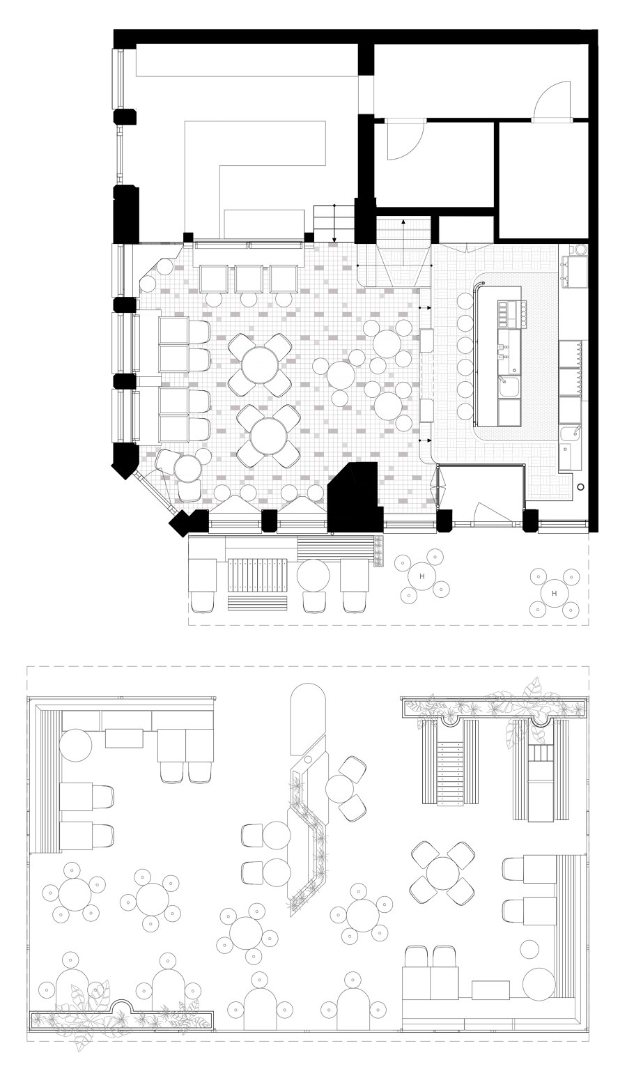
As you enter the space, the interior immediately appears friendly, welcoming and vibrant. A dynamicity is created by the definition of different settings: whether you want to spend the night sitting at the bar, gather at a high table, or intimately dine, La Cervecería appears as the ideal place for it.
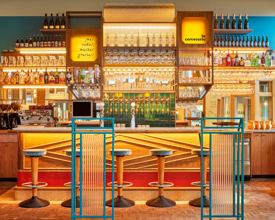
The interior recalls the traditional Mediterranean canteen, thanks to a distinct colorful palette, with the addition of a modern touch which is able to link southern tradition to the contemporary Amsterdam hospitality scene. The masterly use of warm colored oak wood, inclined mirrors, wooden profiles with an old-fashioned feel, bronze railing and modern floor patterns, results in an extravagant composition of elements, which is ultimately in perfect balance.
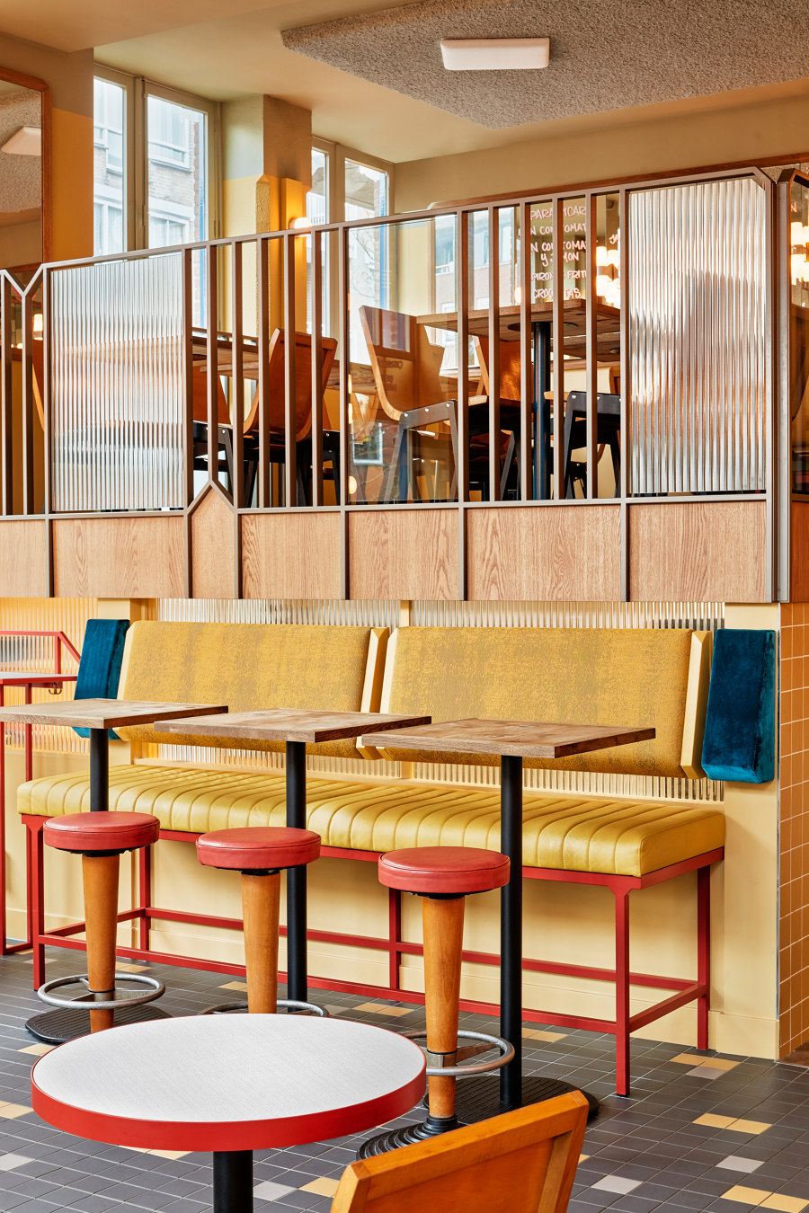
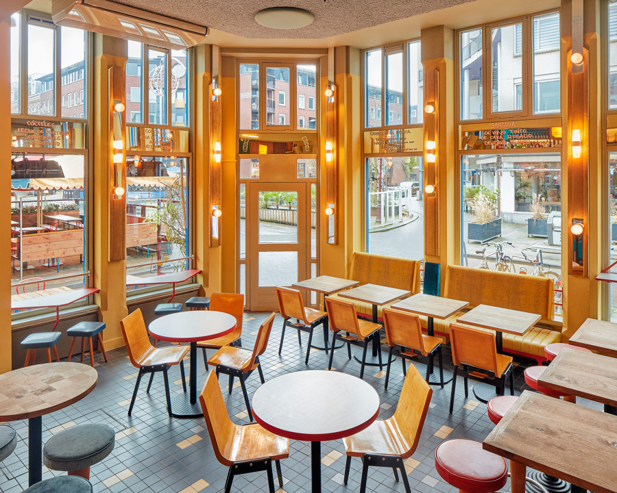
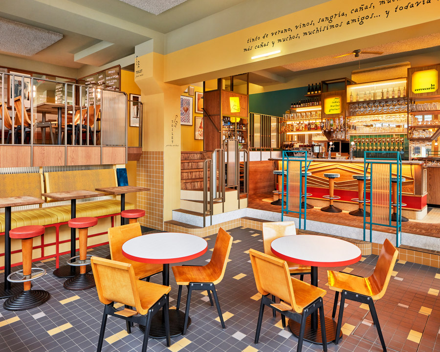
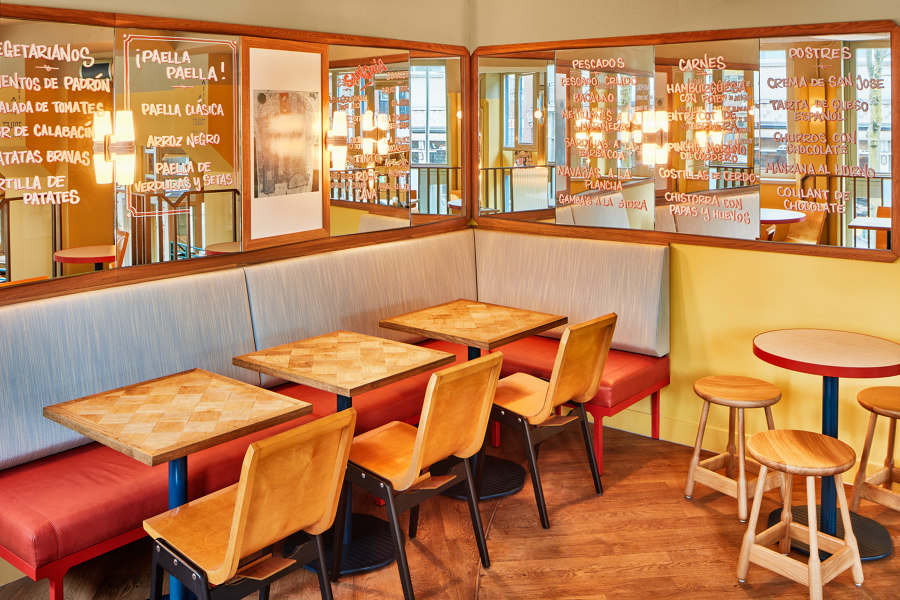
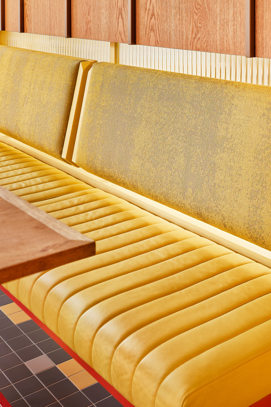
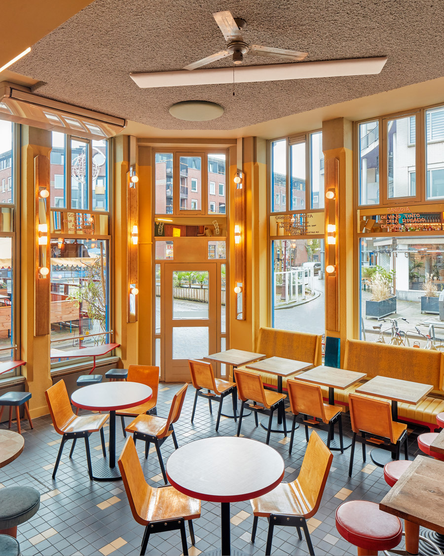
La Cervecería’s interior is divided in three main areas; as you enter the space, you face the dining area, which is a mix of low and high sitting, round and square tables, placed on a graphic tiled floor. On two sides, a high and a low bench, define the space with their warm looking yellow textiles and leathers. The design of each piece is a reference to the columns of the building, whose corners are smoothed by a 45degrees trim.
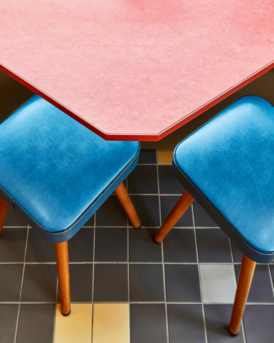
Yellow-shaded wooden chairs complement the colors of the dining area. Next to them, custom made tabletops animate the environment with a textile-like finish and wooden checkered patterns. The verticality of the space is emphasized by upholstered panels featuring vintage light fixtures, which décor the columns until the ceiling, enhancing the double height.
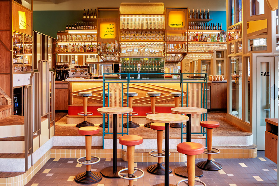
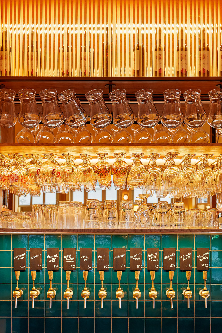
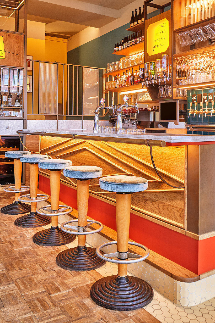
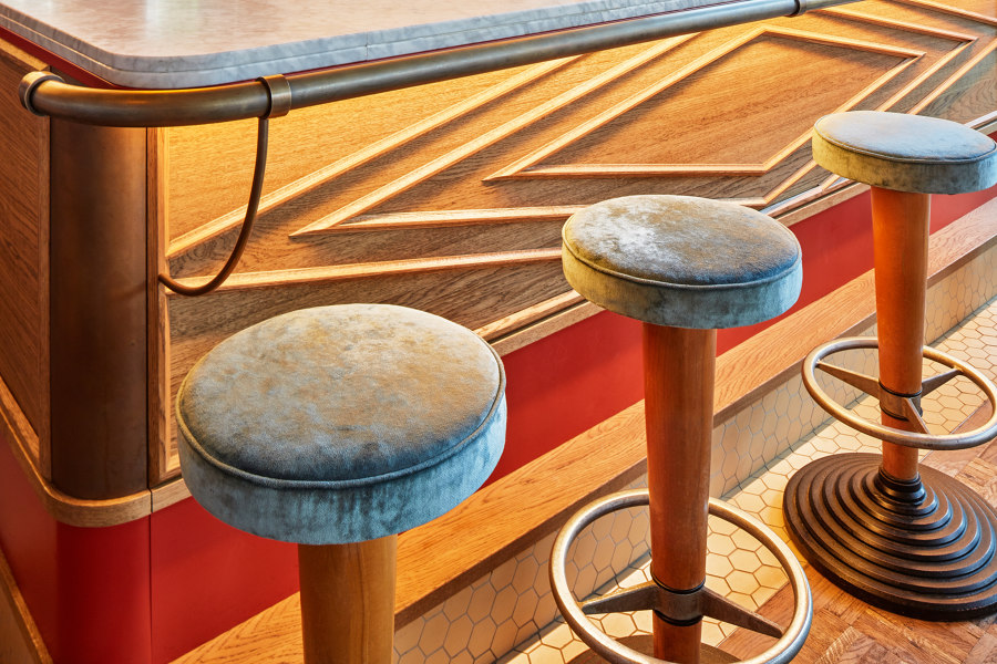
Looking to the right, you will find the majestic front bar, standing on a pedestal. The use of aged brass, softly-toned yellow tiles and Carrara marble, all enriching the wooden base, recalls elegant bar counters of old southern cafes, and it is finally freshened up by a red powder coated steel plate that embraces it, adding a special layer. The back bar stands there almost as an apse, a triptych made from wood and brown steel, whose three-dimensionality is dramatically emphasized by the lightboxes, the mirrors and the glazed dark green tiles. This is where all the beers are displayed and served.
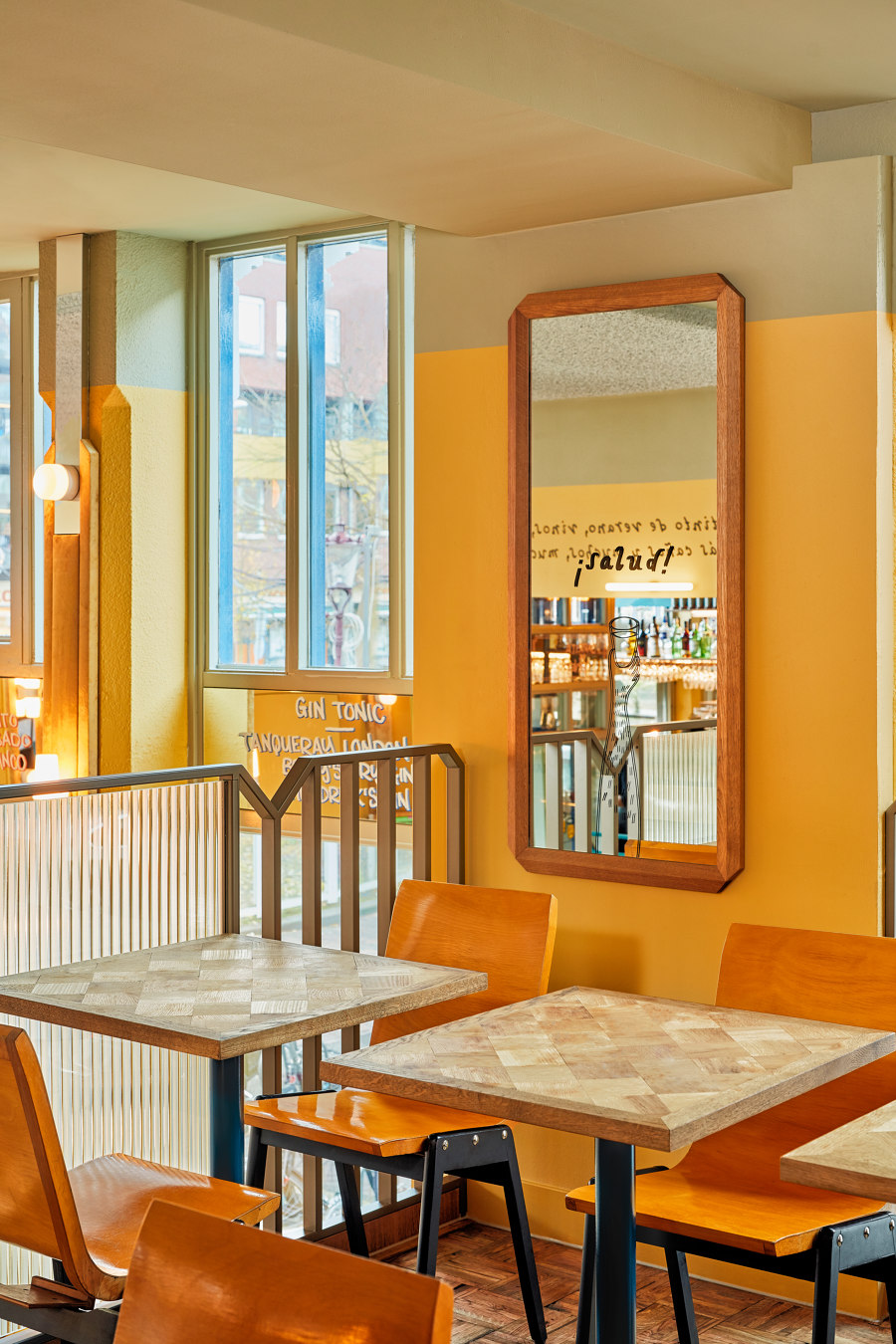
The last area is the mezzanine, overlooking the ground floor and the kitchen. On the background walls, oak frames disrupt the visual paths by using mirrors in the principle of folding doors, reflecting the space in different directions and unifying it at the same time. Here, a funky corner bench, with its red leather and yellow-blue textile, dominates the surrounding wooden environment with its character. The tables are defined by the same checkered pattern found at the entrance, visually connecting the two spaces.
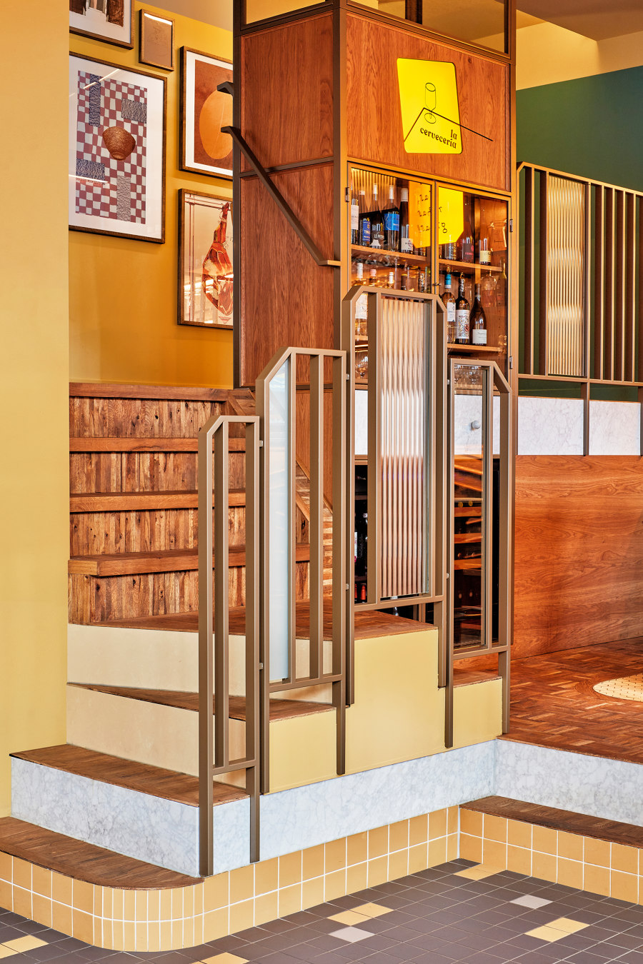
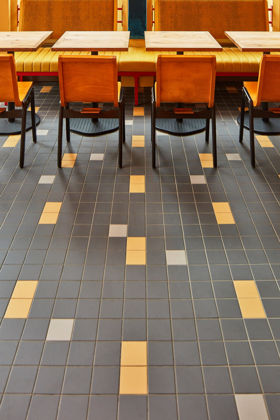
The three above mentioned areas are cleverly connected by mainly three elements: the railing, the flooring, and the graphic layer. The floor changes at each level of the space; the first encounter is a black tiled surface, on the ground floor, which contains couples of yellow tiles, and sparks of grey appear in an apparently random order. This pattern naturally directs the eye through the space, bringing your attention to the steps, whose materials change as you go up, from yellow tiles to Carrara marble, ending up on the wooden chessboard floor contoured by an oak edge. The bar area is defined by the small and elegant yellow hexagonal tiles, which fold into a step on top of which the front bar stands.
A carefully placed staircase connects the three spaces, a podium opened to three directions and which directs visitors upstairs, to the mezzanine. Wood here is the absolute protagonist. A big vitrine stands at the sides of the steps, showcasing dozens of wines and Spanish products. Once up, a diagonal restored wooden floor meets patches of the chessboard floor mentioned before.
The railing elements stand in the middle of the volume. They have a classic connotation defined by the modern Modijefsky touch, with vertically striped glass insertion in bronze powder coated steel frames. These are detailed by forty-five degrees corners and triangular shapes that break the rhythm of the vertical lines.
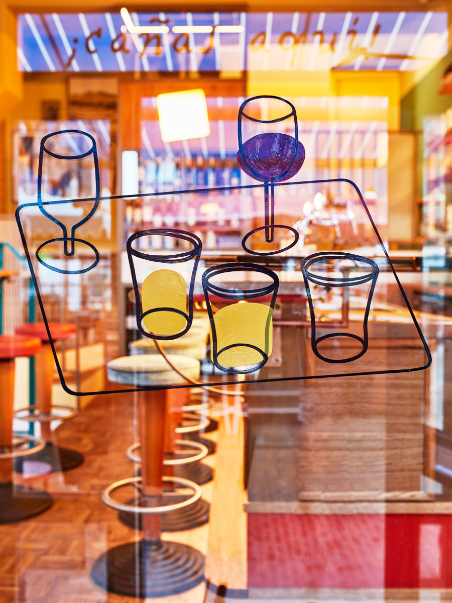
They create a game of transparencies and opacities which impacts the spaces without disrupting the fluidity in between them. Last but not least, a subtle but strong graphic layer sits on top of this entire scenery, bringing a fresh and funny touch to the table. Fine illustrations of a hairy chubby guy and parts of his body, lay around the space, stealing a laugh at a first glance. Funny details, phrases, Iberic menu items and small descriptions, bring you to the world of ‘cervecerías’, and give the guests all the instruments to be teleported to the other side of Europe.
Design Team:
Studio Modijefsky: Esther Stam, Moene van Werven, Agnese Pellino, Christel Willers and Zahra Rajaei
Client: De Drie Wijzen uit Oost
