Fotografo: Jürg Zimmermann

Fotografo: Jürg Zimmermann

Fotografo: Jürg Zimmermann
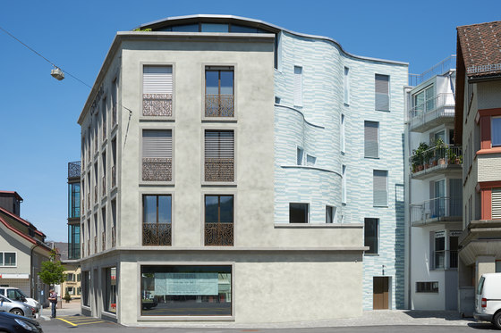
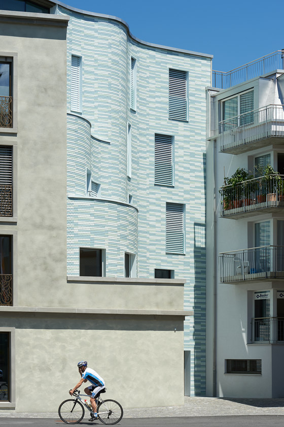
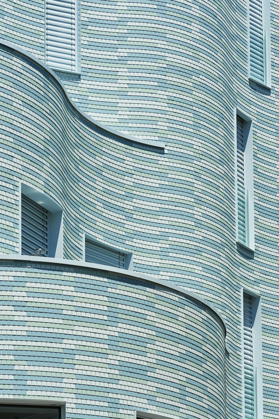
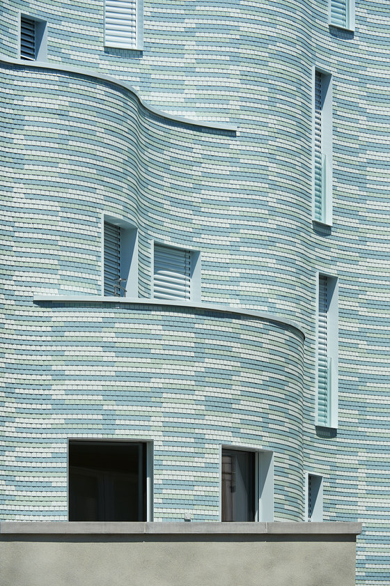
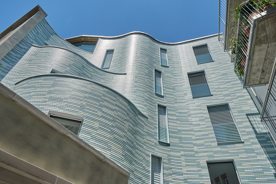
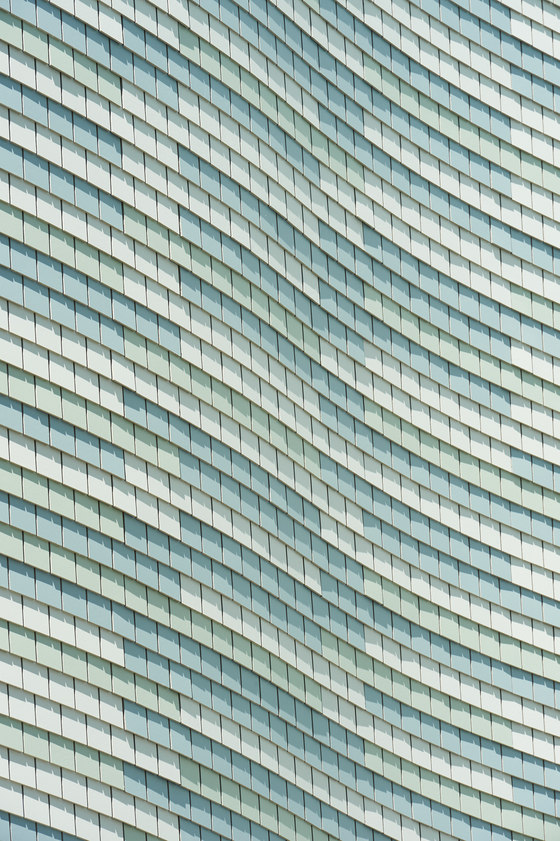
At first glance, the “Central” house in Einsiedeln is confusing. It seems as though one is standing in front of a cut-open structure from whose interior, a greenish curtain billows in the wind. But in fact, the building has two faces: towards the street it displays a concrete façade, on the backside, a flowing, undulating, garment. The new “Central” house stands in a prominent spot in the heart of Einsiedeln, directly adjacent to the “Zwei Raben” culture and congress center, a former orphanage, poorhouse, and hospital from 1859 that was converted to an event center in 1977. The “Central” also conforms to the new conception of Dorfplatz, the village’s main square, which the community initiated in 2015: in accordance with the region’s overall policy, Einsiedeln hereby wants to upgrade the village center and make it more attractive. The architectural office Unger and Treina thus also understood its task for the “Central” as one of creating quality living spaces and attractive sales areas, and at the same time, accommodating the exposed situation in terms of urban development. The building thus defines itself as the pivotal point of the village square: the representative façade embraces a backside with an undulating layout. The architects emphasize the figure with bays, with which they accentuate the corner between Dorfplatz and the main street, Hauptstrasse. Serving as counterpart on the backside are terraces, which are carved into the curved geometry. Glamorous versus village character The architects further emphasize the house’s two faces by organizing their layouts differently. On the façade towards the square are three top floors above a base, set over which is a recessed, fully glazed top floor. To highlight the seemingly random course of concave and convex curves of the back, the architects blurred the division of floors by offsetting the windows. They proceeded in a similar way with the materialization. The visible sides are carried out in concrete while the back is clad with Swisspearl small format. And there, too, the sense of the two faces is revealed. The one—refined by paintings in the bow front glazing and decorative balcony railings—represents the site’s sophisticated and sacral character. The other recalls the rural village character of days gone by. Different interpretations Originally, the architects attempted to walk the fine line between village and city by means of wooden shingles, which would have contrasted the representative urban front. But then the reference to rural tradition would have become overly didactic and hardly appropriate for the present day site. The idea of having the shingles designed in a modern material inspires various interpretations: from a turning outward of the interior space to a green façade and garden terracing through to a soft, flowing dress. The natural analogy arises through the choice of colors—a light grayish-blue, delicate mint green shaded grayish green. An association with billowing embroidery fabric is evoked by the repetitive rhythm; which although seemingly random, is nonetheless based on a particular pattern within which the various colors are distributed.
Architects:
Unger & Treina AG, Zürich
GENERALUNTERNEHMUNG: Josef Diethelm, Freienbach
FASSADENBAU: Beda Holzbau AG, Egg

Fotografo: Jürg Zimmermann

Fotografo: Jürg Zimmermann

Fotografo: Jürg Zimmermann

