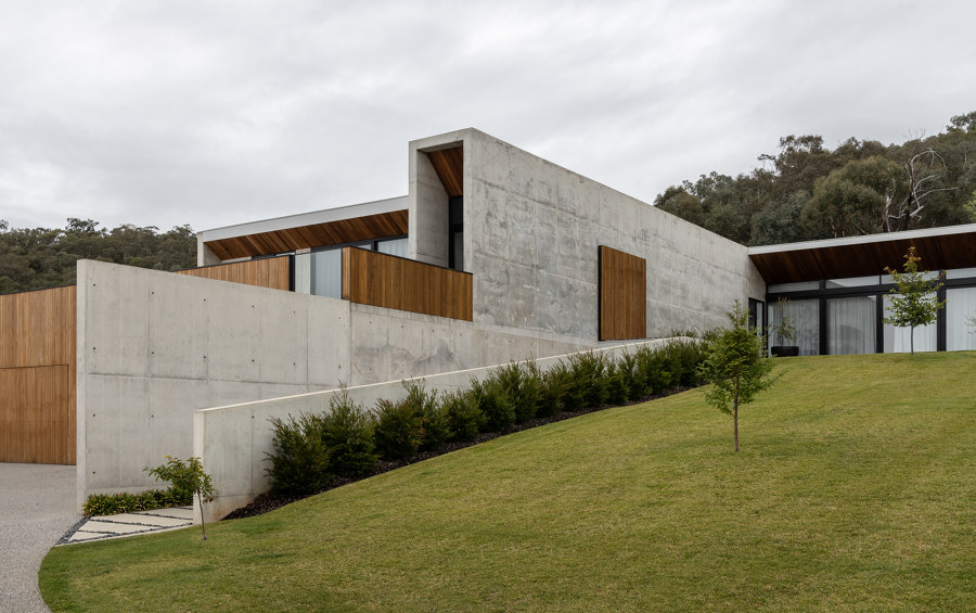
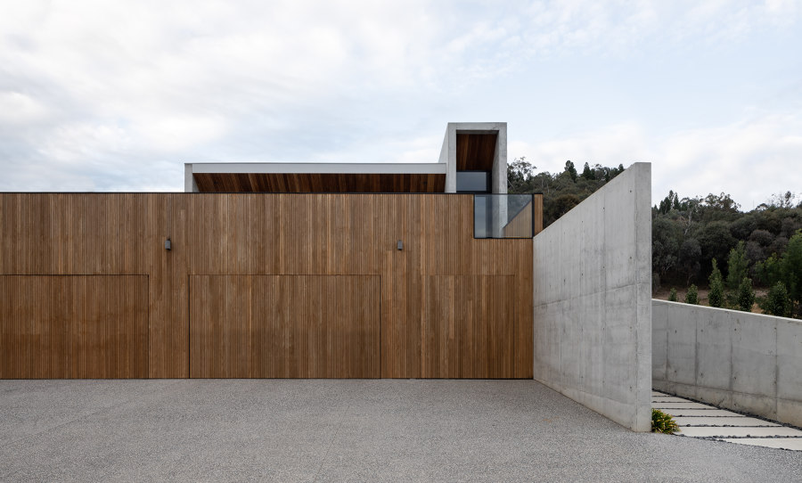
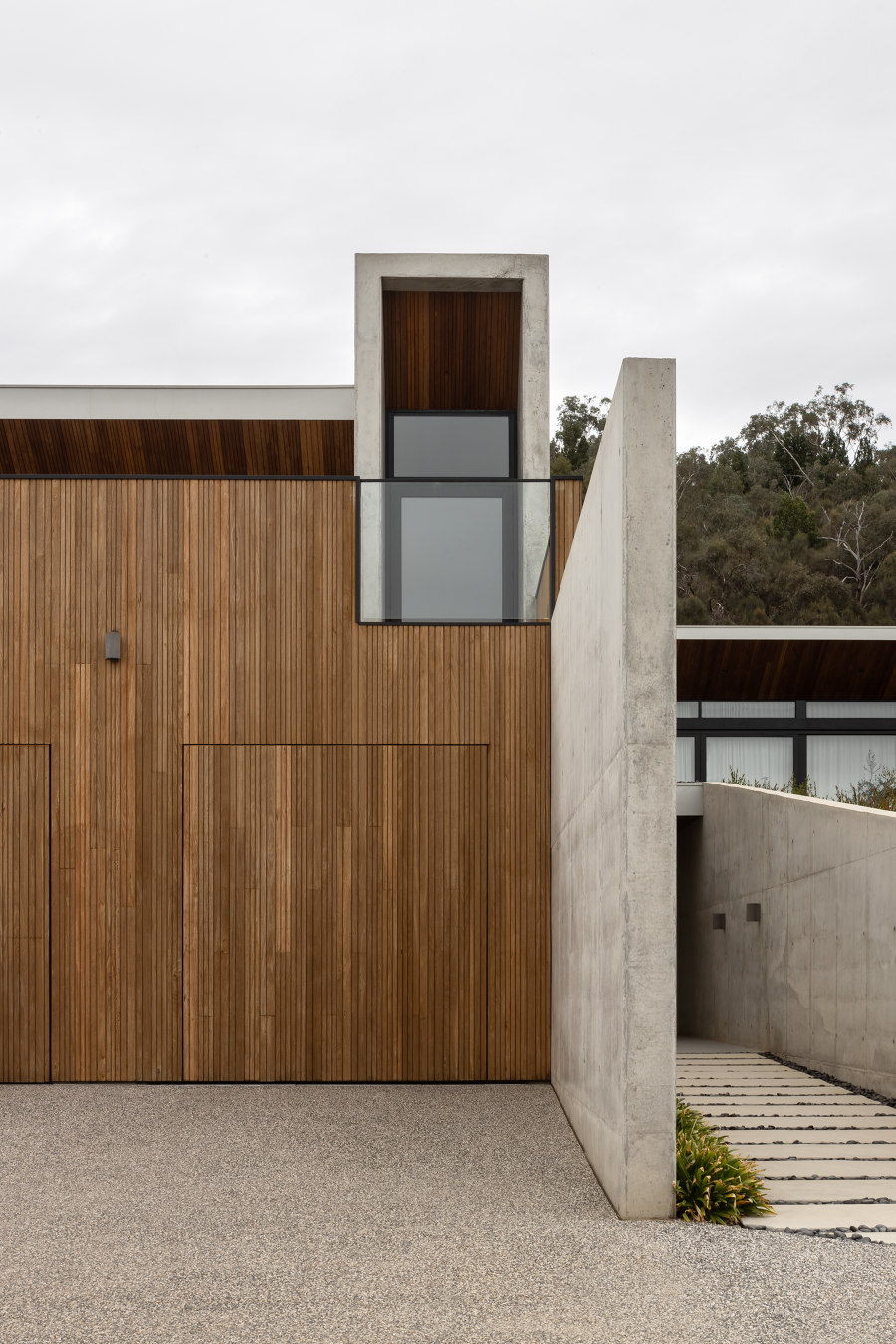
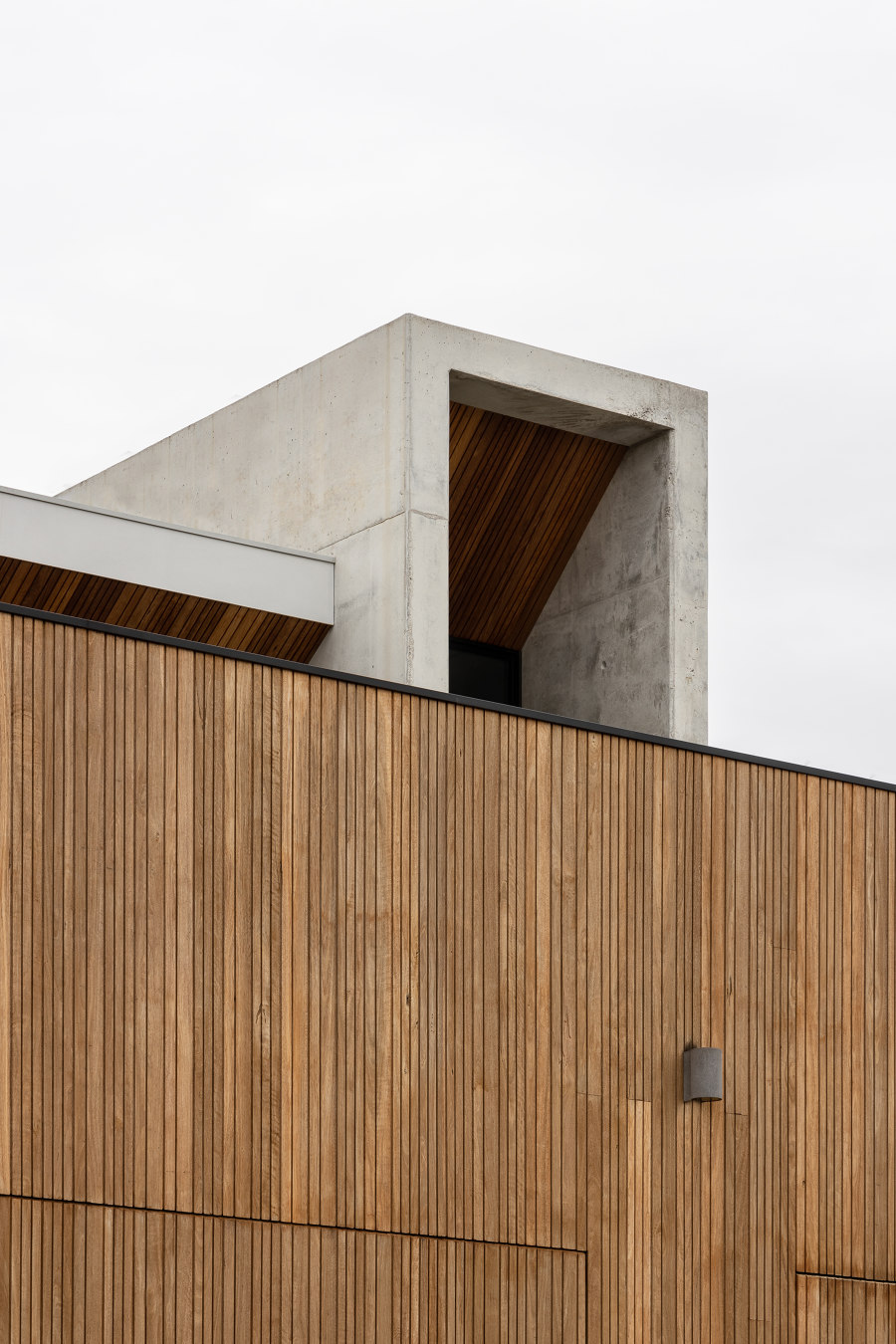
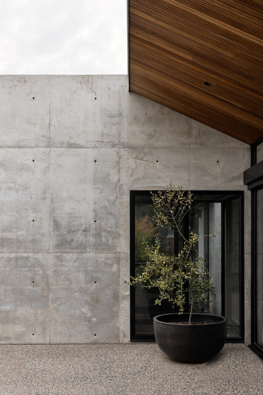
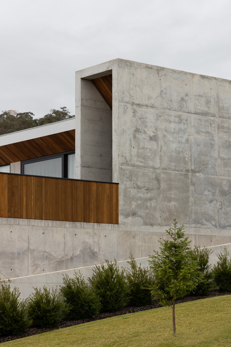
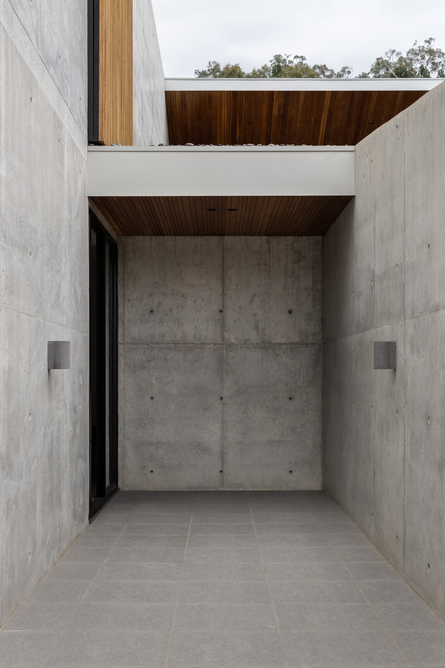
When our client had nominated Concrete as their preferred and the principal material for their home, we were thrilled to be able to drive our team’s knowledge to explore a new construction methodology and design sensibility. With the entry into the site from the west, and the client’s request for a 5-car garage, we began to wonder, “how could we conceal such a large garage and not make the house feel like it’s about the vehicles?” Furthermore, designing a home with a southern backyard while also wanting to capture views and light to the north, can be challenging in the southern states of Australia. But for Blade House, we were fortunate to have a large, elevated site that inspired us to think about the layers and an extruded program.
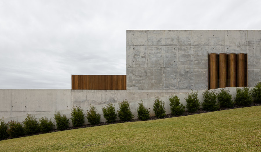
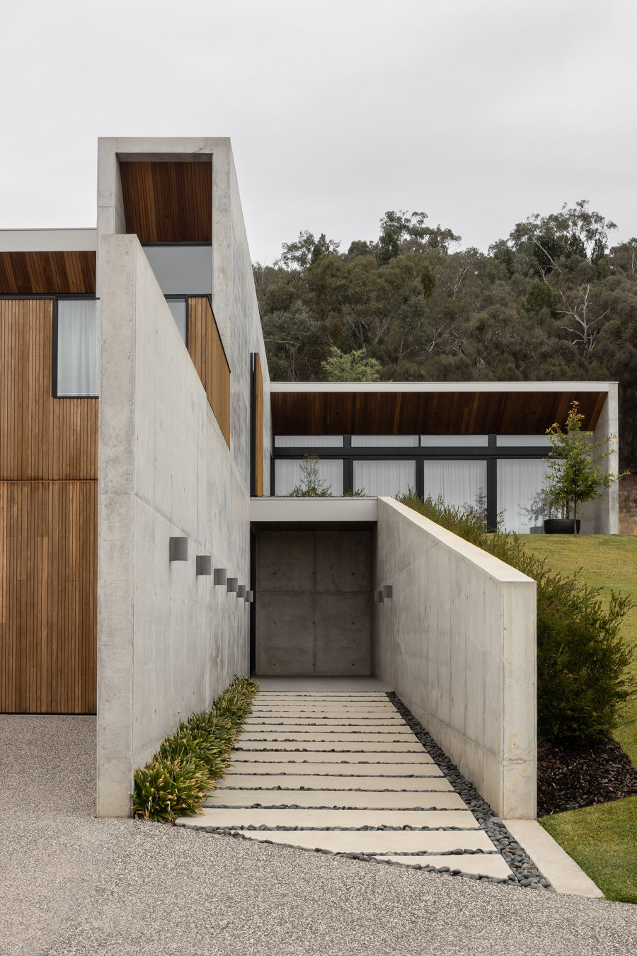
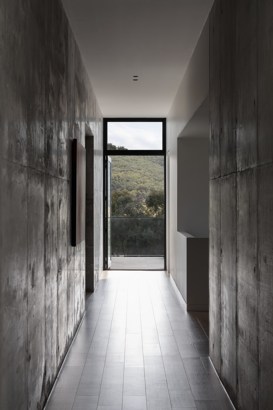
And so, the narrative began. By using alternating heights to large concrete blades, we used a human-scale blade to sit in the foreground to a larger blade – which guides the pedestrian into the subterranean tunnel-like entry, while hiding the parking area. Once inside, the user enters a double-height space that draws you up to the main level where the concretes presence becomes overwhelming and remarkable. The concrete runs north to south, connecting the northern main bedroom wing to the southern living and dining pod. This large spine is accentuated via an increased ceiling height and only broken in the center via the entry stair and the additional bedrooms and wet areas. The purpose of this was more than a central connection – but a way to remind the clients of the location by capturing views from both spectrums.
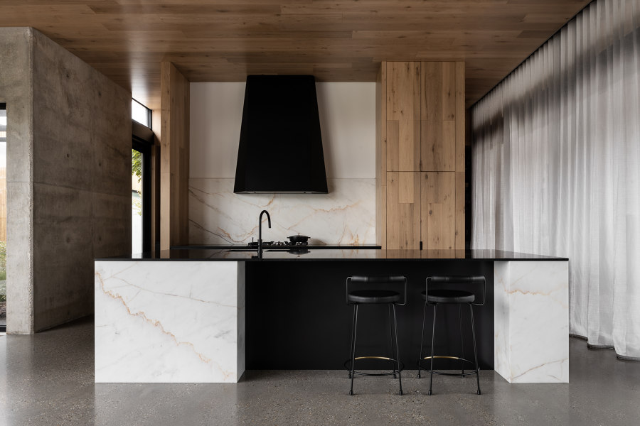
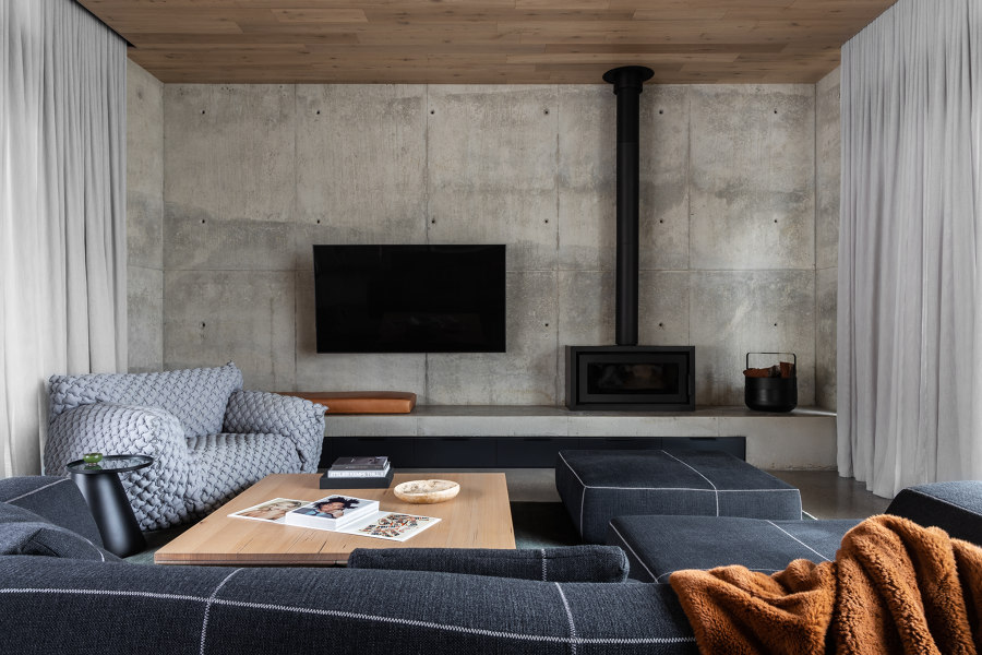
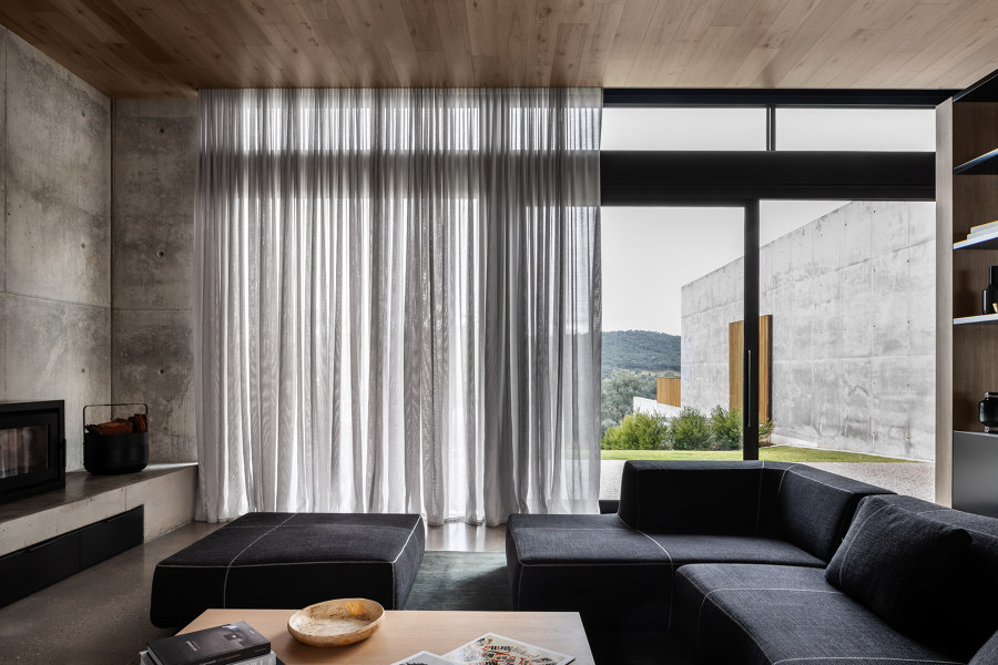
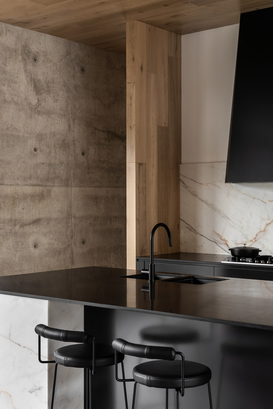
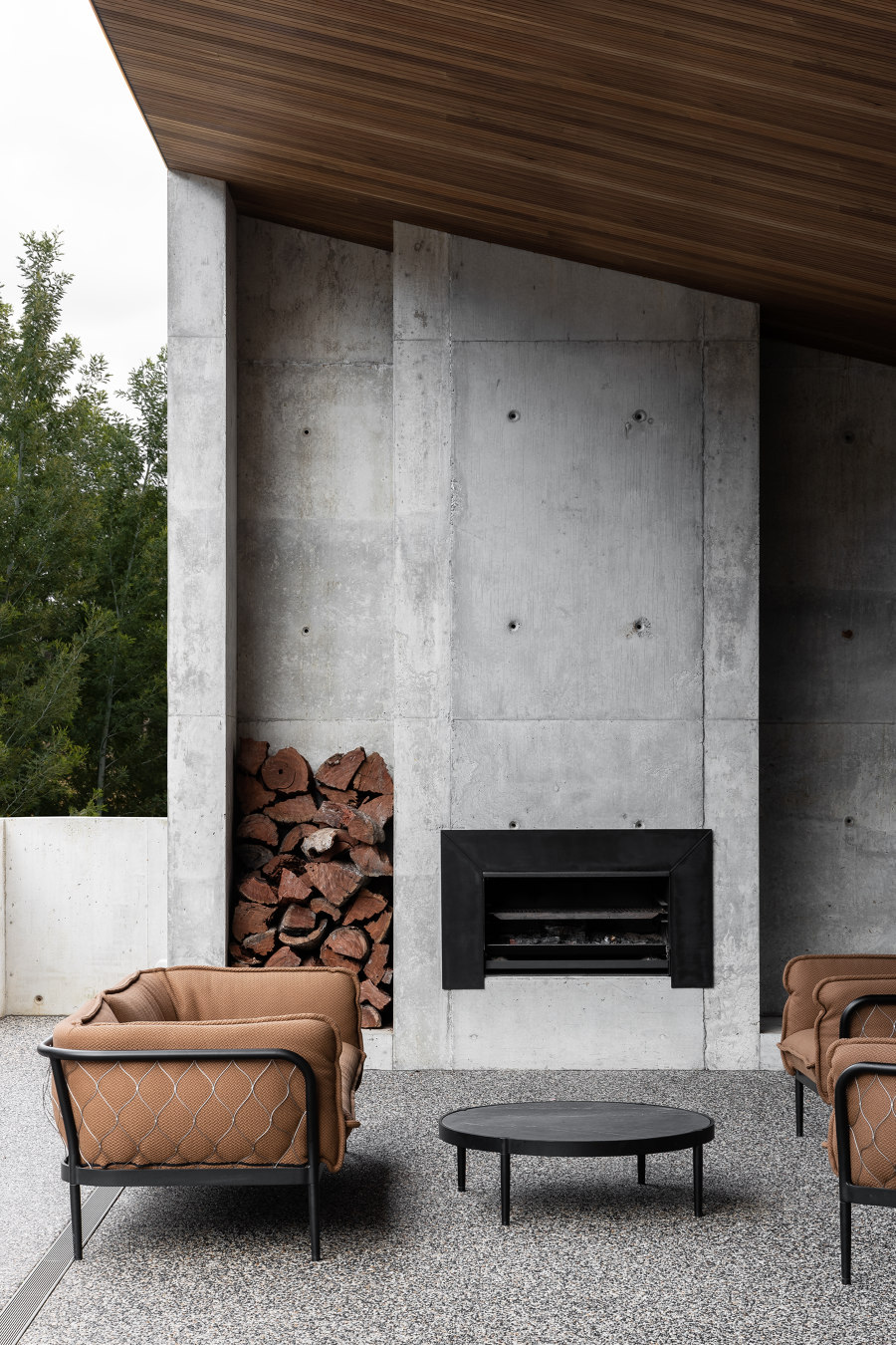
The living space is glazed on both sides to connect to the northern views and the southern yard. A north-facing winter terrace draws in warm natural light, while the summer terrace, is an entertaining dream, complete with an external fireplace, and raised terrace overlooking the pool and forest beyond. Internally, the concrete walls continue as the primary material and expression, merged with warm timber tones, and soft layering of textures to ensure the spaces feel calm and inviting against the concrete’s robustness.
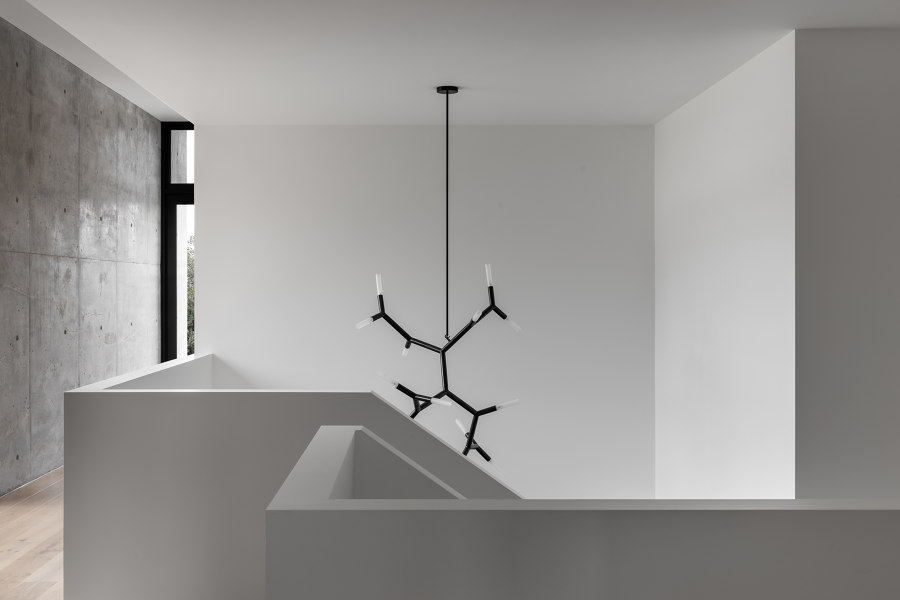
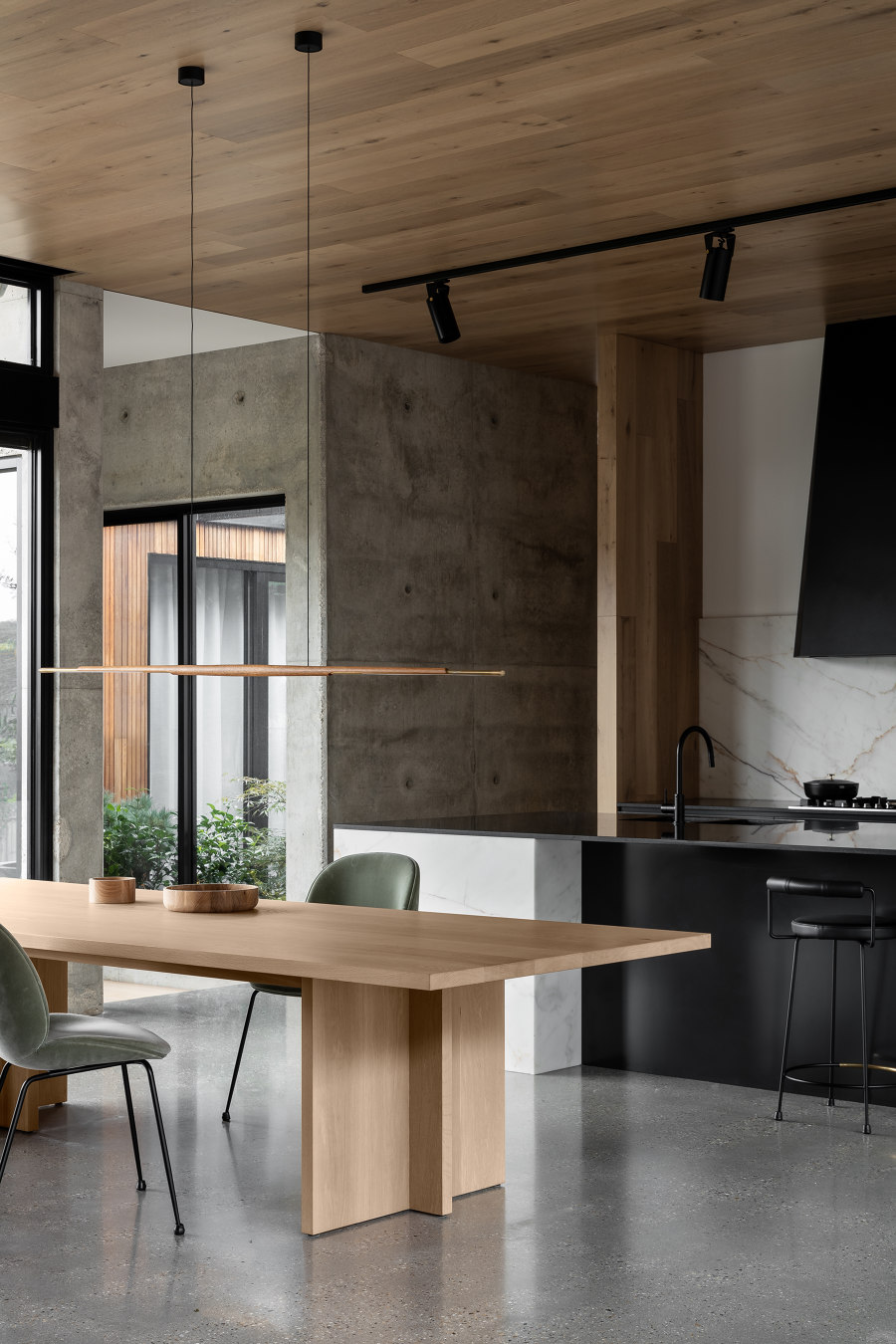
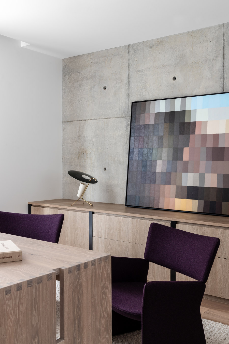
One of the most exciting things about the project was specifying and sourcing locally made pieces to compliment the design. Over the custom dining table crafted by furniture makers, Christopher Blank sits a delicate pendant by Adam Markowitz. This continues in the study where a custom desk by Daniel Poole looks towards the BCAA pendant by Christopher Boots - All Melbourne-based artisans. Working closely with the clients who also built Blade House, became a true collaboration, and highlighted the importance of trust and sincerity between all parties. The project became a journey and exploration of materials and gave Tecture the opportunity to provide an outcome that reflects our strong philosophies of minimalism and clean lines, on a much higher level.
