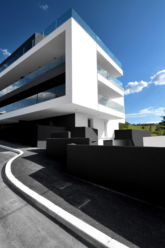
The aim of the project was to revitalize a dismissed industrial area with a residential building. The challenge was to work within the parameters of good design and a low budget to provide the city with quality architecture while respecting the commercial space requirements of the client.
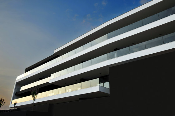
The resulting project provides a substantial architectural impact with respect to the smaller buildings of the area that are characterized by a broad range of building styles. The decision to use a traditional structure allowed the architects to focus their design energy on the details and the finances on finishing material, which afforded the pursuit of innovative design. The complex characteristics of the site required a comprehensive and functional solution, taking into account the slope of the lot. The resulting building is composed of superimposed layers, developed longitudinally. Each ‘layer’ has a specific designated use: the first level is reserved for parking, the second level contains more parking in addition to outside living space, and the remaining levels are dedicated to the 28 residential units. A system of ramps and pedestrian walkways unifies the structure and provides pedestrian and vehicular access to all levels.
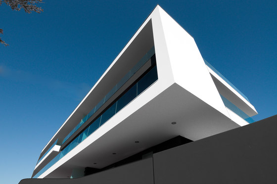
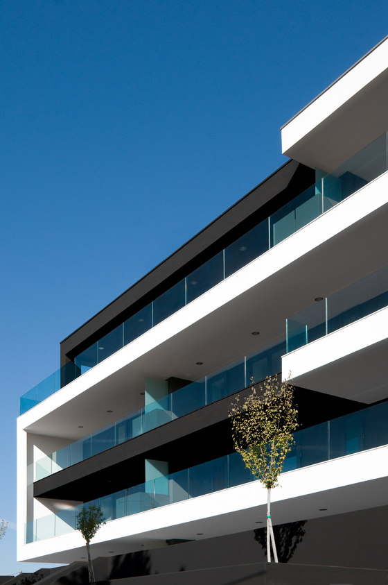
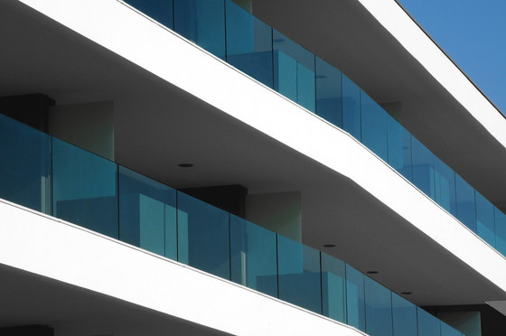
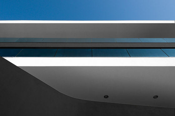
The elevation integrates with the surrounding area while maintaining a strong architectural identity. Wide balconies run the entire length of the building to emphasize the horizontal progression of the structure while providing access to the rear residential units. As a play on depth, two bands enclose the structure in a unique graphic gesture, providing order to an otherwise fragmentary façade and serving as the identifying symbol of the building. In short, it is deep overhangs that characterize the building’s front: the articulation of interior spaces is therefore completely free of the constraints that can result from the positioning of openings in the façade. This imparts the advantage of being able to make even significant planimetric variations during the project’s execution, without compromising the final aesthetic result.
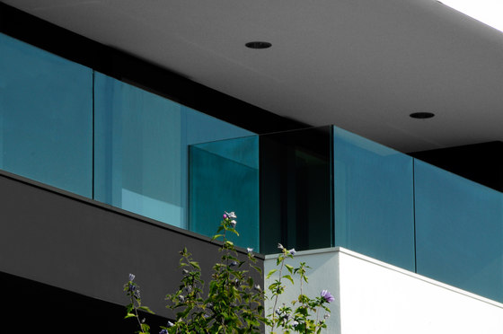
The balcony system (summarized in the double C essay) guarantees each housing unit the most ample exterior space possible, while also keeping it private and protected. Thanks to an integrated system of R.C. brackets and laminar wood beams, overhangs have been achieved of up to 320 cm, playing a fundamental role in the bond of the two longitudinal fronts, and even concealing the presence of the double-pitched roof – a presence required in respect of local regulatory constraints. The glass parapets’ transparency compensates for obstacles to the entry of light created by the considerable overhangs, and the material’s “discreetness”, kept clean of visible posts or structural elements, does not interfere with the protagonist role of the wide beams that define the façade. That same lighting is an integral part of the architectural system; it defines the three-dimensional texture of the façade without ever interfering physically with the parapets or with the interior spaces.
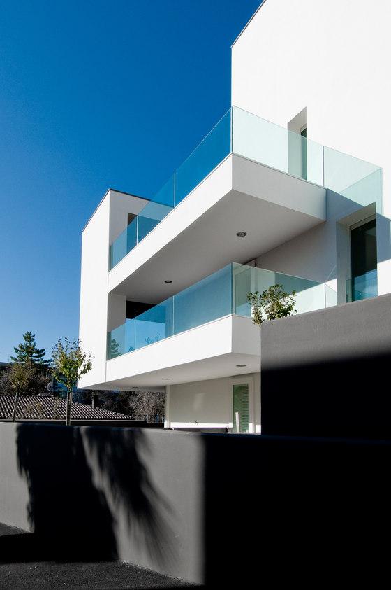
Vertical walls, deliberately set back with respect to the level of the overhangs, cross the longitudinal fronts: conveniently positioned so as to divide the housing units, they form, in reality, an integral part of a facilities management system that “frees” the interior of the building from the age-old problem of the passage of columns and drainage pipes. Everything runs along the outside of the housing space, following paths laid out within the false ceiling of the balconies. Glass partitions complete the task only partially performed by the masonry walls of separating adjacent properties. The milk-white glass panels ensure privacy without competing with the dominant design of the façade. In part anchored to the back wall, they utilize the weight of the soil in wooden flower boxes in front as a support element: the weightlessness of the design thereby derived thus blends into the façade with discretion and elegance.
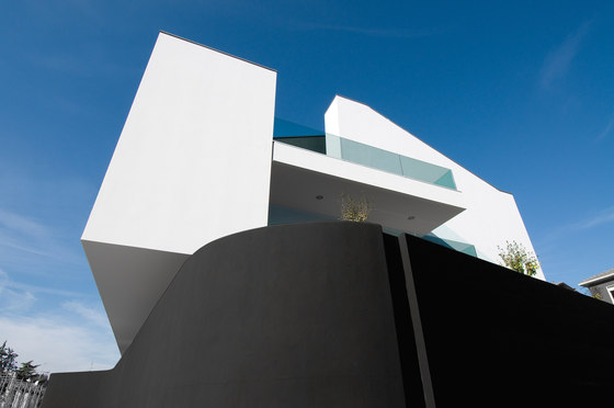
Standing finishes level with the exterior and opening out onto the ample balconies need not compete with the arrangement of interior spaces. The decision to give them the same colour as the surface on which they are anchored has clear mimetic purposes. The side façades, instead, absorb the presence of the double-pitched roof: they reinterpret it, playing on the façade’s double heights, and they distort it, bringing balance back to the proportions of the front elevation. The connection to the ground, meanwhile, distances itself from the strict, conceptual planning of the main structure. Surfaces and setbacks, curved walls, and intersecting spaces finally unburden themselves at the building’s feet and in the interplay of corner solutions.
Tisselli Studio Architetti
