Aesop NEWoMan Shinjuku di TORAFU ARCHITECTS | Negozi - Interni

Fotografo: Takumi Ota

Aesop NEWoMan Shinjuku di TORAFU ARCHITECTS | Negozi - Interni ×
Aesop NEWoMan Shinjuku di TORAFU ARCHITECTS | Negozi - Interni

Fotografo: Takumi Ota

Aesop NEWoMan Shinjuku di TORAFU ARCHITECTS | Negozi - Interni ×
Aesop NEWoMan Shinjuku di TORAFU ARCHITECTS | Negozi - Interni

Fotografo: Takumi Ota

Aesop NEWoMan Shinjuku di TORAFU ARCHITECTS | Negozi - Interni ×

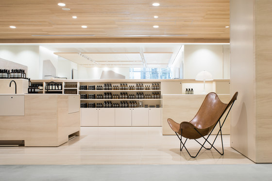
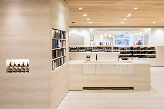
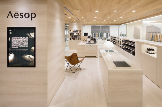
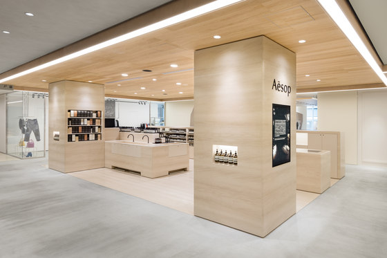
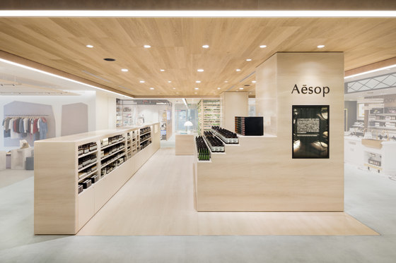
We performed the interior design for a store by Aesop, an Australian skin care brand, located in NEWoMan Shinjuku. With its 4.9m width and 9.2m depth square plane, the project area offers a space surrounded by passageways with two pillars at either end of the space.

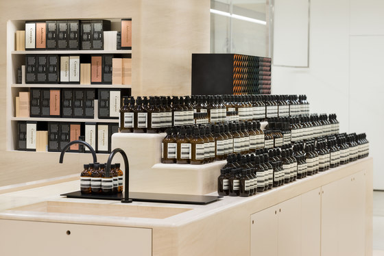
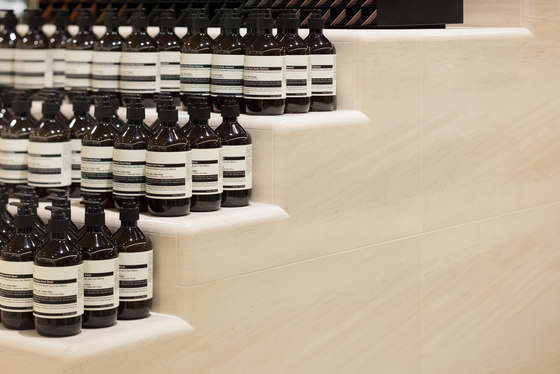
In order to independent the wall-less space visually, we proposed to use limestone as a main material, which has a presence. This pale, tactile material is used for flooring, pillars and fixtures, which appear to be sculpted from a single mass. The joints are set in a three-dimensional grid, framing the 108 pieces of limestone in an exacting manner. A large sink unit is combined with a pillar that provides tiered display shelving; the limestone’s subtle hues are contrasted by Aesop’s amber containers.

Even located within a busy mall where many people come by, we sought to create a store that emphasize Aesop's brand image using stone which is stately material.

TORAFU ARCHITECTS
Aesop NEWoMan Shinjuku di TORAFU ARCHITECTS | Negozi - Interni

Fotografo: Takumi Ota

Aesop NEWoMan Shinjuku di TORAFU ARCHITECTS | Negozi - Interni ×
Aesop NEWoMan Shinjuku di TORAFU ARCHITECTS | Negozi - Interni

Fotografo: Takumi Ota

Aesop NEWoMan Shinjuku di TORAFU ARCHITECTS | Negozi - Interni ×
Aesop NEWoMan Shinjuku di TORAFU ARCHITECTS | Negozi - Interni

Fotografo: Takumi Ota

Aesop NEWoMan Shinjuku di TORAFU ARCHITECTS | Negozi - Interni ×
Aesop NEWoMan Shinjuku di TORAFU ARCHITECTS | Negozi - Interni

Fotografo: Takumi Ota

Aesop NEWoMan Shinjuku di TORAFU ARCHITECTS | Negozi - Interni ×