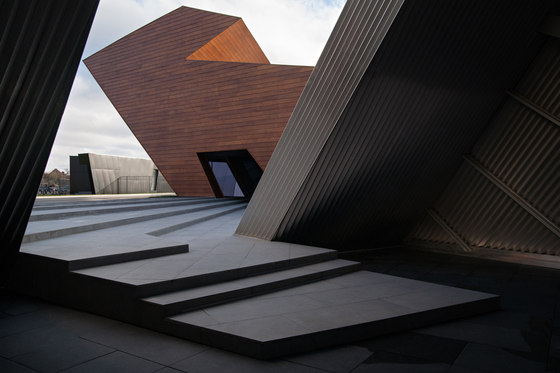
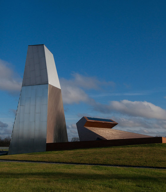
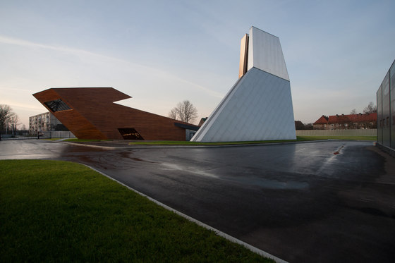
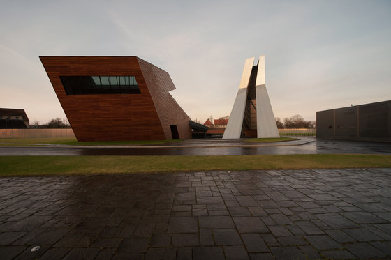
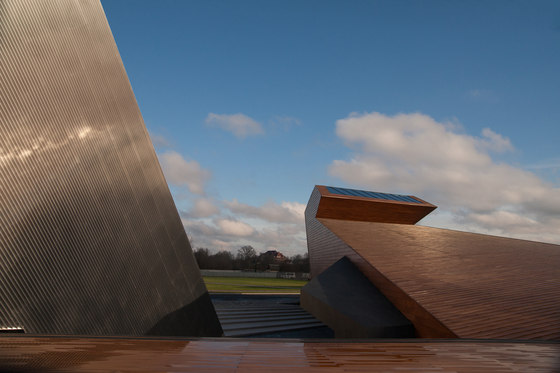
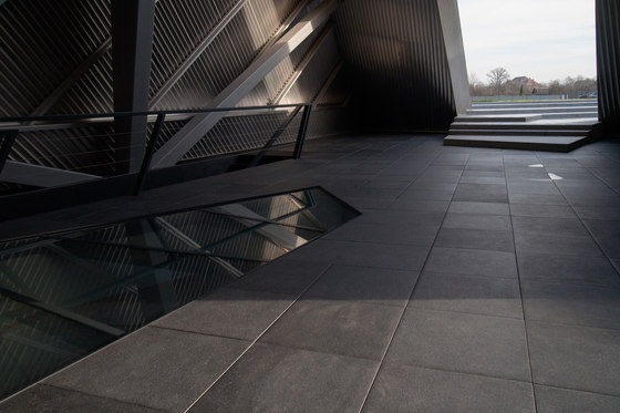
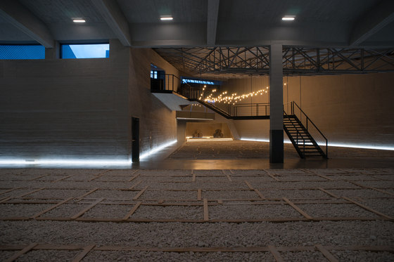
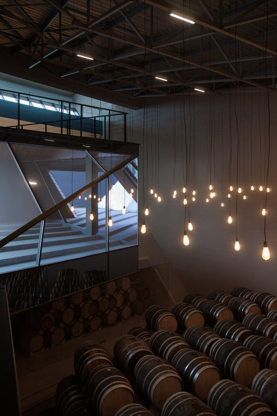
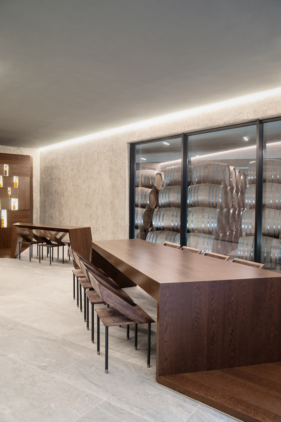
This complex is located in an old German town in the Kaliningrad region, which was severely damaged during World War II. The modern brandy distillery was built on an empty lot next to a railroad. The mandate was to build a warehouse, which apart from its primary function of storing brandy barrels would serve as a public space and reception hall. It would be a symbol of creation and rebirth, demonstrating the role of the distillery in the life of the city. Through exploration of all project elements, the task evolved into the creation of a highly symbolic architectural ensemble.
Based on the fact that brandy ultimately comes from grapevines, rich in Christian symbolism from the Tree of Life to the Blood of Christ, the architects incorporated several literary symbols into the design, which would conjure up images of harmonious interaction among different symbols and signs. In some cases the symbols would be opposites, but would form stable pairs that give rise to a new symbol. Internal and external, male and female, low and high, closed and open, wood and metal – these are just some of the paired symbols that inform the shape of the buildings.
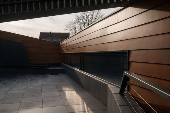
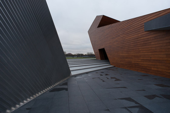
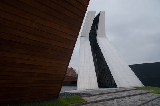
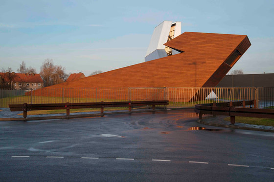
The low wooden warehouse building embodies the symbolic image of Mother Earth as a nurturing and childbearing woman. It is tightly bound to the earth, grows into and from it, protects and preserves the life within. It is a Yin sign – deep, cool, low and internal.
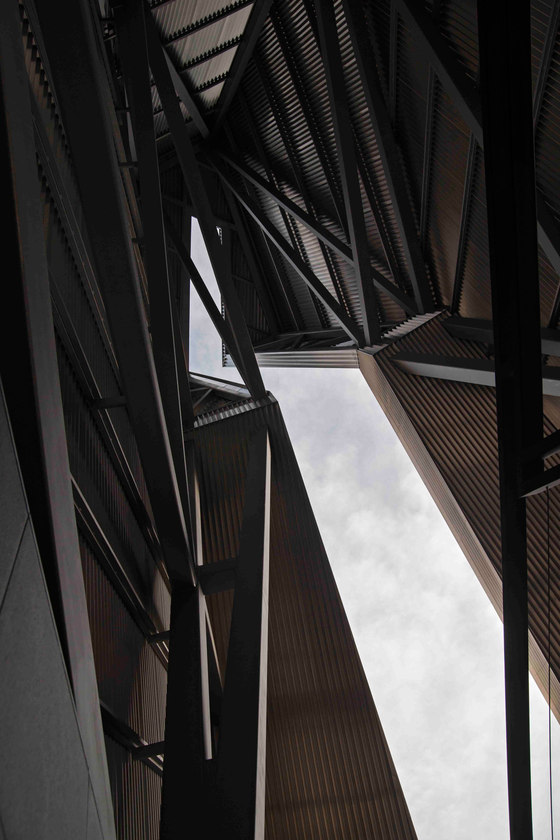
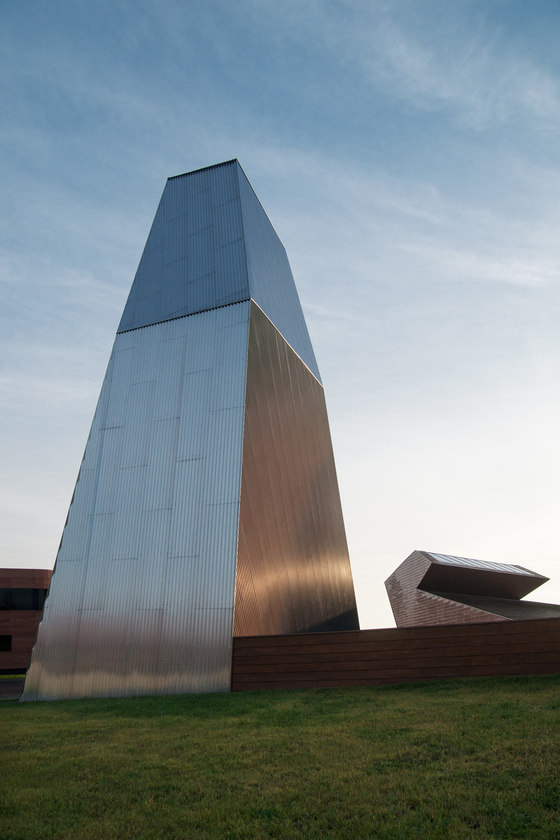
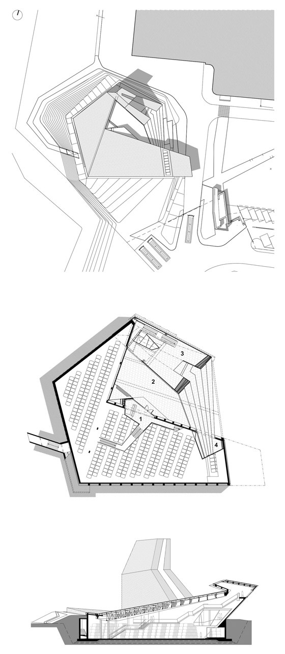
A tall volume made of metal soars skyward. It is associated with light, mind, externality and masculinity. It is flexible, mobile and open. The low part of the volume turns into a ladder, which in triangular form connects to the horizontal volume, allowing visitors to look inside the warehouse without entering. At the same time, the other end of the wooden block also enters the high volume as a triangle. In this web, the elements generate space between and inside themselves, jointly organizing the space around them.
Both buildings were designed on the same geometric principle, linking them to the main building and the geometry of the site as a whole. The horizontal and vertical lines both arise from the complex geometric scheme determining the volumes of the buildings. The third object is a clock house. It marks the beginning and the gate to the following stage of the project, the park.
Architects from the firm of TOTEMENT/PAPER proceed from the idea that architecture is only a tool to give shape to the concept – the External form of the Internal. One without the other is either empty or unseen, which means it is not present in the here and now. In their practice they often use the approach of mutual work and collisions of contrasts – high/low, heavy/light, solid/ transparent, dynamic/static, female/male, external/internal – in order to provoke contact, make positions closer, dictate the terms of exchange, begin a collaborative game, and represent the movement of penetration, changes and the birth of something that has been missed so far.
The Alliance 1892 project is no exception. The feminine principle, embodying the notions of preservation and nurturing, used depth, darkness, naturalness, earth, heaviness and fullness, in contrast to the masculine ideas of presentation, show, producibility, rigidity and emptiness. As a result, “He” and “She” become mates who give birth to architectural form in space. Moving around and between, far and near, one can see how these two forms move closer, merge, stand motionless for a fraction of an instant, then disconnect to play their part in a fascinating dance.
Totement/Paper
Lead architects: Levon Ayrapetov, Valeriya Preobrazhenskaya, Diana Grekova, Yegor Legkov.
Lead structural engineer: Harutyun Sahakyan
