Fotografo: © Jacoby Architects
Vanceva® red offers a guiding light at Utah Schools for the Deaf and the Blind.
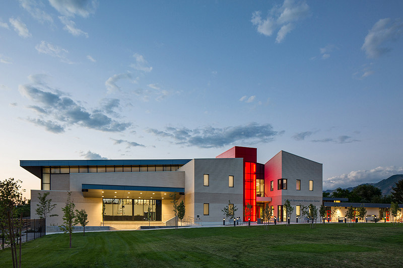
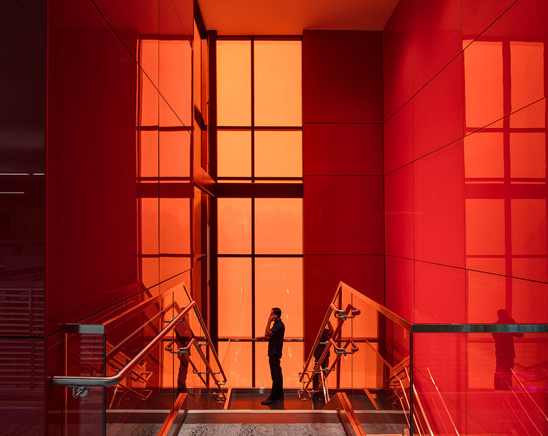
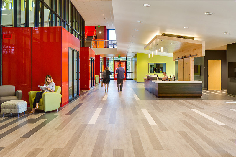
The Salt Lake Center for the Utah Schools for the Deaf and the Blind, which won the 2018 Vanceva® World of Color Interior Award, provides education, therapy, and services for varying levels of sensory, behavioral, physical, and cognitive abilities. The new 50,000-square-foot, $14 million facility was designed and programmed by Salt Lake City’s Jacoby Architects. The liberal use of bright, glowing red glass adds a stunning pop of color—in the stairwells, throughout the clubhouses, and on the exterior, where a striking red staircase is visible from the street.

Fotografo: © Jacoby Architects
Jacoby Architects have a broad background in educational design. The main challenge they faced with the Utah Schools for the Deaf and the Blind was creating a facility that provides the deaf and the blind students with technology and design to enhance their learning experience. The overall color canvas is light with high contrast accents of bright red illuminated features that create landmarks throughout. Aside from its prominent visual effect, the bright, glowing red glass helps low-vision children and the public find their way through the education center to the front doors and clubhouses.
Providing navigational points of reference and clear wayfinding, in and out of the building, was a necessary design concept when developing the form and selecting materials. Believing that color is a powerful tool with the ability to impact minds and moods, Jacoby Architects selected red glass made with Vanceva interlayers as a focal point. Red because it draws attention. Glass because it takes advantage of natural lighting.

Fotografo: © Jacoby Architects
According to a juror, “The project’s success is based on its very elegant composition and spatially interesting approach. It would be interesting to walk up the red staircase.”
The education center’s primary use is for instructing and providing therapy for children in the deaf and the blind communities. Every part of the design was taken into consideration from the perspective of the user groups to ensure that the building would function in a way to optimize learning, growth, communication, and safety. The finished design not only meets those goals but exceeds them as students are improving at greater rates than they were in their previous building.
“We awarded this project top honors because of its thoughtful use of light and color to inspire, delight, and help users navigate the building” said another juror. “The poetic and pragmatic criteria which guided the design process was evident.”
Architect
Jacoby Architects

