Bauhaus meets Natural Design
Project: Dermatology Practice
Open for new ideas and with Bauhaus associations in mind, the client approached the practice to the architects in late autumn 2008. Regarding a clear design line and bright rooms, and a functional room organisation the concept fully met the requirements for the design principles of classic modern architecture. In accordance with the practice’s dermatological main area, this approach was combined with inspirations derived from the skin’s structure. The skin’s cell structure served as model for both the design vocabulary and the colour concept.
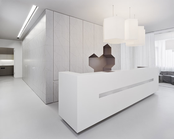
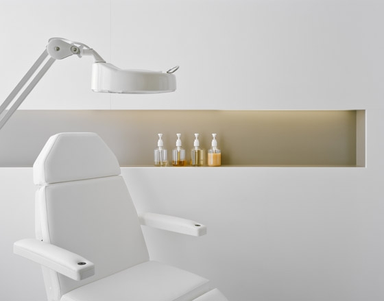
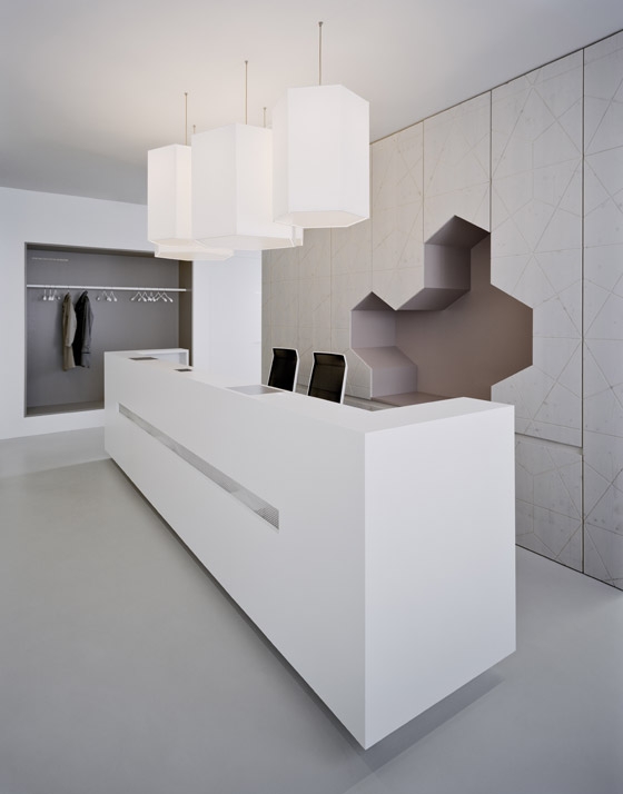
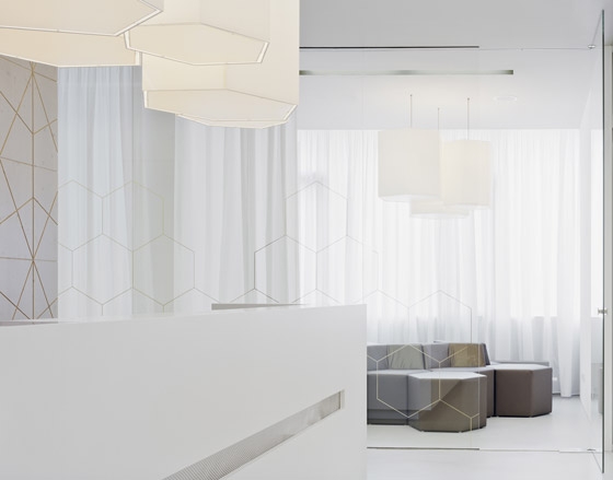
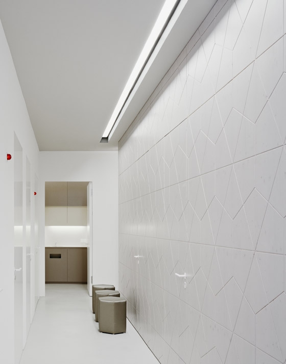
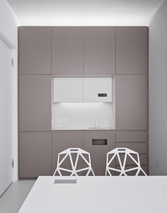
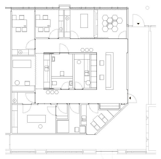
The practice is accommodated in a new medical centre and offers perfect preconditions with regards to its urban location and the infrastructure. The practice’s spatial organisation is oriented along the given conditions of the ground floor. Because daylight enters the practice rooms only from the southwest, the waiting zone, treatment rooms and the beauty department are located on this side. The architects generously opened up the internal façade in the entrance area of the medial centre to allow more daylight to enter the practice and design an inviting entrance situation. In order to use the practice’s 170 square metre floor area as efficiently as possible, the architects opted for an inner functional core accommodating a laboratory and toilettes as well as a reception desk adjoining the core at its front side towards the entrance The treatment and operating rooms are arranged around this central core; thanks to the 1.50-metre wide corridors these rooms are accessible barrier-free and ensure a highly functional workflow in the practice due to their positioning. The muted colour range (white, beige, black, and a warm calming grey shade) in combination with white, room-high curtains generates a calming atmosphere. This harmonious impression is emphasised by elegantly concealing all technical details: Lighting systems and ventilation slots are integrated into black ceiling slits; all doorframes are plastered over. The built-in functional furniture in the treatment rooms discreetly hide unattractive working appliances, refrigerators as well as soap and disinfectant dispensers.
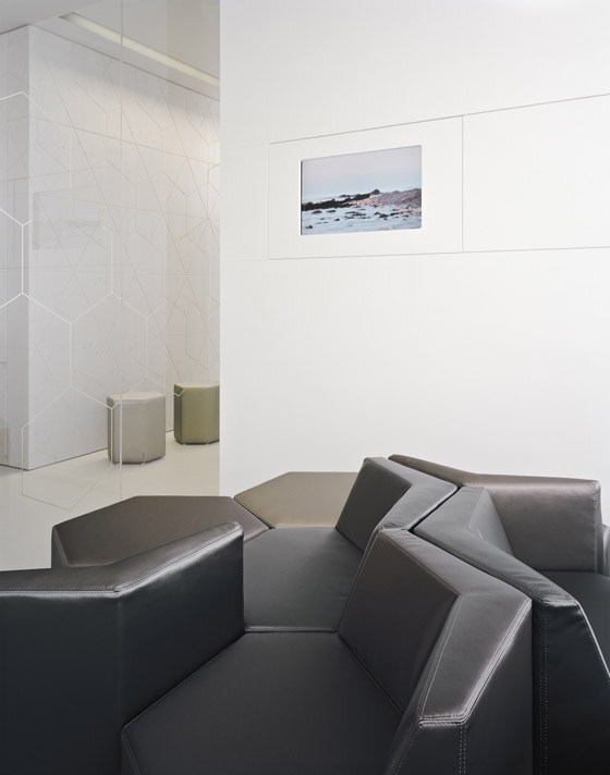
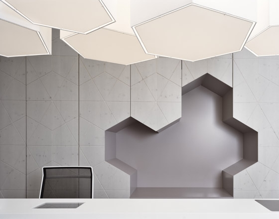
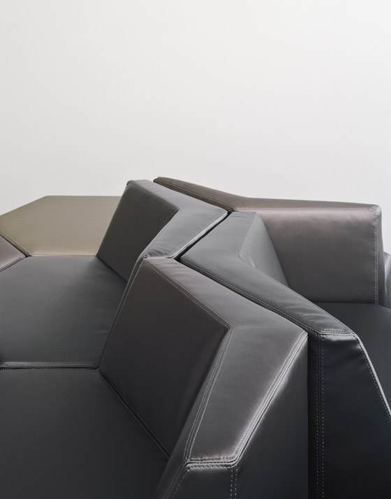
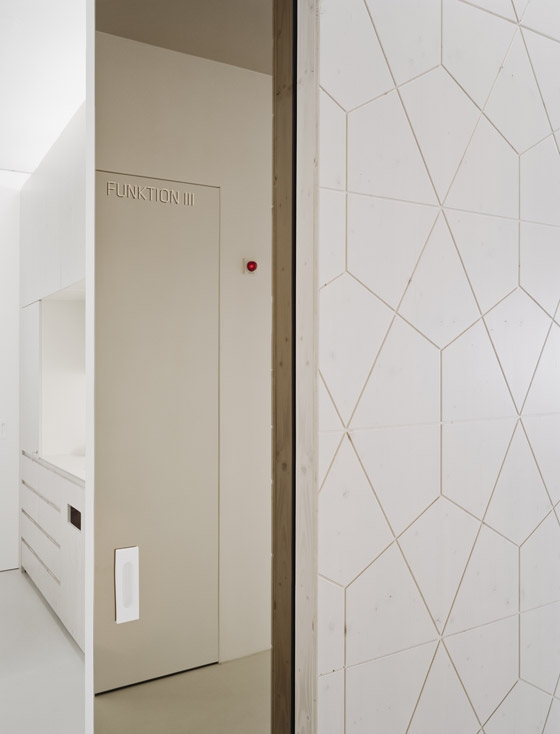
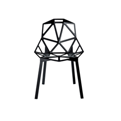
The most striking design element however is the recurrent hexagon motif, which is reminiscent of the skin’s cell structure. The core for example is finished with a white-grey varnished spruce wood cladding with a CNC-milled surface showing this pattern. This graphical element was also translated into three-dimensionality: the architects specifically designed a prominent pendant luminaire consisting of four hexagons and hexagonal pieces of furniture covered with metallically shimmering fabric for the waiting area. The practice interior is harmoniously rounded off with matching furnishing such as the patients’ chair “Chair one” by Konstantin Grcic, which just as the entire practice awakens associations with nature.
This integral design could only be achieved on the basis of the client’s extraordinary trust in the commissioned designers. He was always enthusiastic and allowed a comprehensive implementation of the design from the graphic concept to furniture designs to the selection of flowers and accessories.
