PONY House
Victoria, 2021
Progetto di
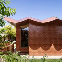
WOWOWAWOWOWA PONY is an agile alteration and modest addition to a 1960’s apricot brick home. Our Clients came to us with open minds just wanting a renovation that suited the house – we leaned in hard, and the conversation quickly become about how their personal aesthetic could be brought alive through the design. As well as providing much-needed additional space, there was an extensive reconfiguration of the existing internal spaces. The kitchen and part of the original living room were reorientated into an open plan kitchen, dining, central bathroom, and walk-in pantry and two of the children’s rooms were squeezed into the existing rumpus.
The kitchen and living area are truly the heart of the home, spilling out into both the front and the rear wings and connecting out into the garden. From the central living, you get views of both the street and the pool. The new children’s wing provides an equal amenity to each child, each room has the same allocation of both storage and study area, with windows overlooking the strip garden to the side of the house. The adult’s area can be closed off from the rest of the house, when moments of respite, or quiet ‘working from home time’ is required. Each axis has the capacity to be closed from the next, allowing a separation of the noisy living spaces from quiet ‘adult’ areas and children’s study zones.
WOWOWA PONY is the hardest working piece of architecture we have done. It is a mutual love letter from our Clients to us and us to our Clients. A true collab. The design was heavily inspired by our vibrant clients and their energetic family of six. Reflecting their personal aesthetic through form, materiality, and colour, the interiors are an accretion of small moments of delight that allow a family to find a quiet moment alone or come together.
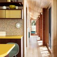
Centered on 766m2, the plan was arranged along a double-axis - a prominent post-war design driver to increase connection to the garden – creating a front, back and central courtyard. Our design exaggerated the existing axial plan through a clip-on colonnade. Being near the beach the structural design, cladding and construction methodology for the roof form, was not dissimilar to the construction of a boat, with keel, bow and stern. The ‘keel’ is expressed down the length of the colonnade, like the belly of a whale, with nautical references carried through detailing; brass fittings, porthole windows and timber decking to both ceiling and floor.
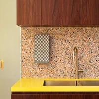
The kitchen feels generous with the banana-yellow bench space and seating for all kids. The dessert-inspired colour palette draws in the client’s mid-century furniture pieces and the mix of timber species echoes the eclectic art and object collection. Playful colour combinations were used in the ‘wet areas’, whilst the main bedroom offers a moment of respite incorporating calm tones and materials.
Though WOWOWA PONY packs a punch, with glorious finishes and details that bring moments of delight throughout the home, the real smarts of the project reside in the joyous union of multi-disciplinary design areas; interior design, architecture and landscape architecture, that culminate in spatial qualities and materiality of the clip-on colonnade. The hardworking colonnade is the innovation in this design. Not only does it provide a connection to the outdoors, two bathrooms and four bedrooms, but it also increases the amenity of the home, without an expanse of additional space. It’s a daybed, a bookshelf, two break out spaces that provide seating for each of the children and a clothes drying room, dispersed throughout and nestled within the undulating form and soft, structural columns.
“The six of us have room to breathe together and as individuals when we need to be separate. Everyone’s lives are a little easier, allowing us to relax and enjoy time together more. The hallway and light makes being or feeling outside easy and with the kitchen/family room we have the welcoming house we wanted for our and our children’s friends. Everything finally has its place – clothes, washing, toys, books, games, food...small pleasures such as dedicated space for four school bags and an ironing board. It makes us smile everyday through its colours, details and references from throughout our lives.” CLIENT
Galleria del progetto


