Book smart: Kinzo
Scritto da Alun Lennon
05.02.20
Interior-architecture office Kinzo discuss their latest project in Berlin for publisher Suhrkamp, and how instagrammability is not how they gauge success
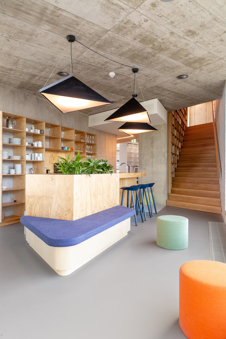
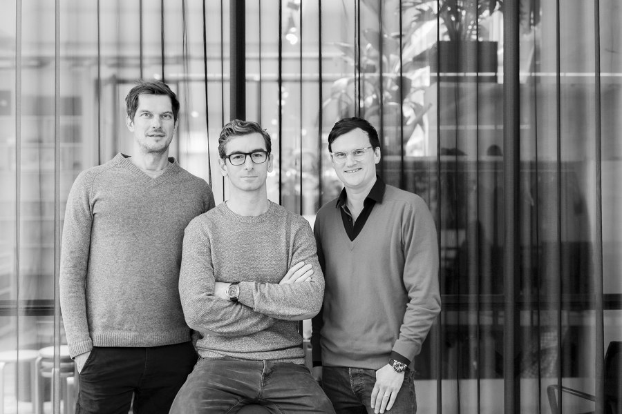
Kinzo, the Berlin-based architectural office founded in 2005 by Chris Middleton, Karim El-Ishmawi and Martin Jacobs, can read its clients like a book – and no bad thing when it comes to one of their most recent customers, German Publishing House Suhrkamp. Developing a deep understanding of the customer’s individual requirements is key to the Kinzo philosophy as well as to the holistic approach it takes to interior architecture and design. We spoke to two of its founders, Chris and Karim, about the Suhrkamp project in the heart of the Berlin as well as their thoughts on the future of office design.
You recently completed a project for publisher Suhrkamp’s new HQ in Berlin. What brief were you given?
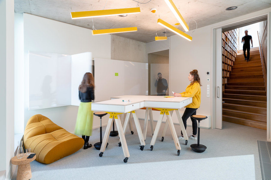
The renowned German publishing house Suhrkamp was looking for a spatial concept that would reflect the publisher’s identity. The project called for a tailor-made solution that would be simple and elegant while utilising a small budget and which would fit 135 employees and thousands of books.
What were the most difficult challenges the project posed – both foreseen and unforeseen – and how did you resolve them?
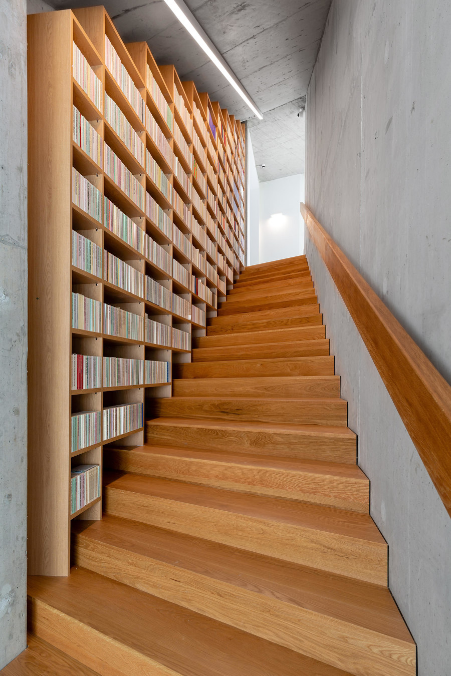
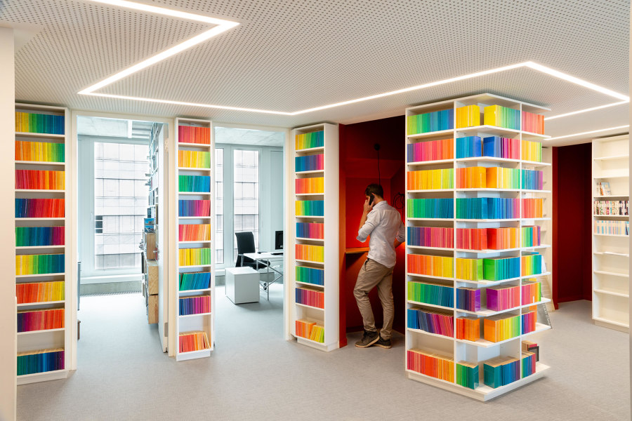
One of the main challenges was to integrate thousands and thousands of books! Our vision was a house, which rests on multi-story high stacked volumes instead of walls and columns. As emotional and atmospheric building blocks, the books should form the supporting structure and at the same time be the daily working instrument. Accordingly, shelves had to be built, many shelves – these had to fill almost every free space on the walls while simultaneously replacing them.
'For us, projects are less about their instagrammability and more about a deep understanding of our clients'
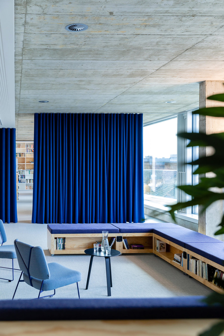
But how could Suhrkamp’s enormous book collection find enough space on the limited wall space? A new concept for the entire building plan provided the answer: We divided the floor plan and let the walls meander through the six floors of the building in the form of a zigzag, like an inner facade. This idea not only created more wall space and thus sufficient shelf space, but at the same time optimised the area of the rooms and created small niches – usable for all employees as retreat rooms for spontaneous meetings, communication islands, think tanks or telephone booths.
Which current trends in office design most excite you?
Frankly, we are quite careful with trends. For us, projects are less about their instagrammability, less about #newwork and more about a deep understanding of our clients, their individual culture and the users. Design should not be an end in itself – our approach is a holistic one.
Photos: © Sebastian Dörкen
© Architonic
