More in Store: New Retail Architecture
Scritto da Alyn Griffiths
London, Regno Unito
21.05.17
With your heart's desire a click away, brick and mortar retailers are appealing to that which cannot be quenched online. Featuring texture, tech, colour and a whole lotta cool these recent retail projects are an ode to the senses.
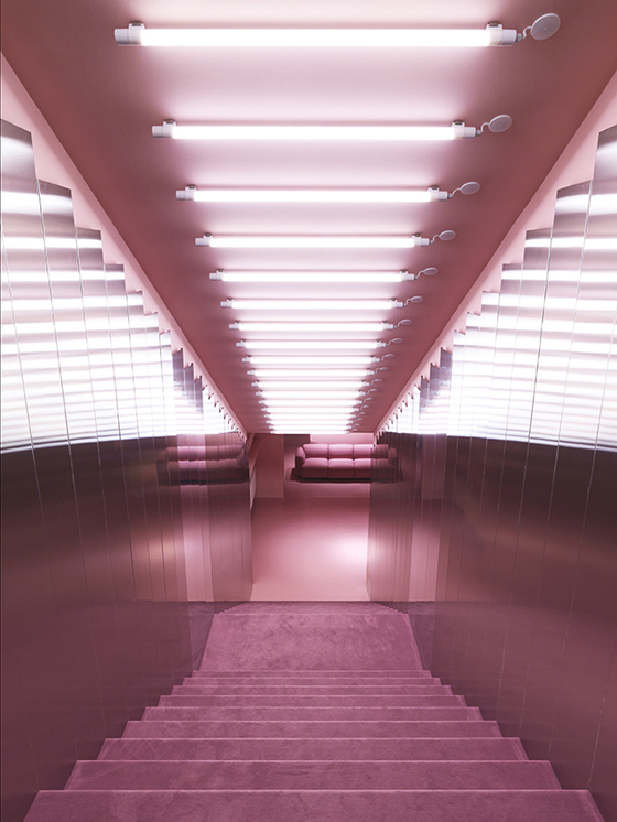
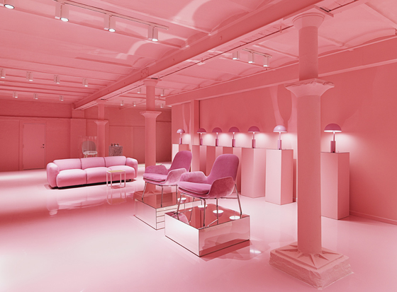
Normann Copenhagen’s flagship store in Copenhagen – designed by Hans Horseman und Britt Bonnesen – contains a basement gallery with a pink theme that invites customers to experience its products in an immersive setting. Photo: Jeppe Sorensen

Normann Copenhagen’s flagship store in Copenhagen – designed by Hans Horseman und Britt Bonnesen – contains a basement gallery with a pink theme that invites customers to experience its products in an immersive setting. Photo: Jeppe Sorensen
×The retail revolution brought about by online shopping has had a profound effect on the architecture and design of the high street. Both established and emerging brands are seeking out new ways to encourage shoppers to visit their outlets in order to optimise this valuable real estate.
Designers are increasingly being tasked with developing retail environments that reward those who do make it off the sofa and into stores. Their role is to provide experiences that are different to those available in the digital realm. The best examples use space, colour, texture and interactive elements to transform shopping into an event that stimulates the senses and immerses consumers in the world of the brand.
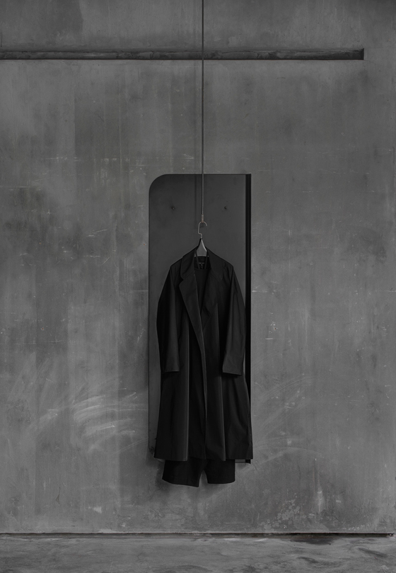
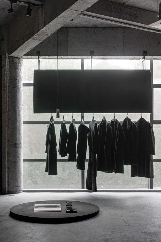
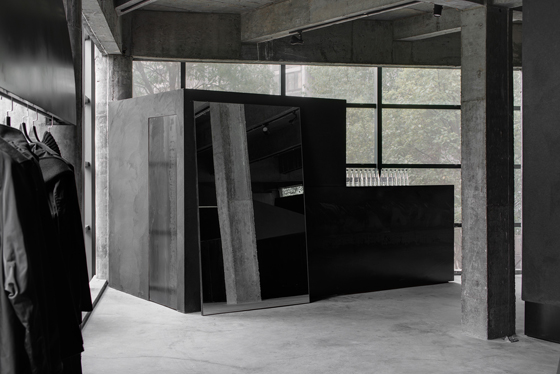
The monochrome treatment of AN Design’s concept store for Chinese fashion label Heike in Hangzhou, China is achieved using a black marble powder that lends texture to the surfaces. Photos: Yujie Liu

The monochrome treatment of AN Design’s concept store for Chinese fashion label Heike in Hangzhou, China is achieved using a black marble powder that lends texture to the surfaces. Photos: Yujie Liu
×Demonstrating how a brand’s identity can be translated directly into a store interior, local studio AN Design created a monochrome space above a furniture store in Hangzhou, China, for fashion label Heike. The company’s predominantly black clothing informed a dark material palette that helps to create a moody space dominated by a series of geometric structures.
The carefully curated experience starts with an entirely black staircase that leads up to the concept store. The stairwell intersects with a dramatic wedge-shaped form containing a fitting room and display area for accessories. This volume and its conical supporting columns, as well as other freestanding elements, are rendered in a black marble powder that creates seamless surfaces with a soft, textural finish.
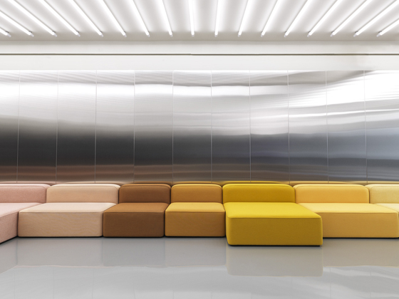
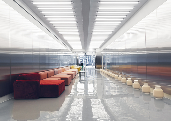
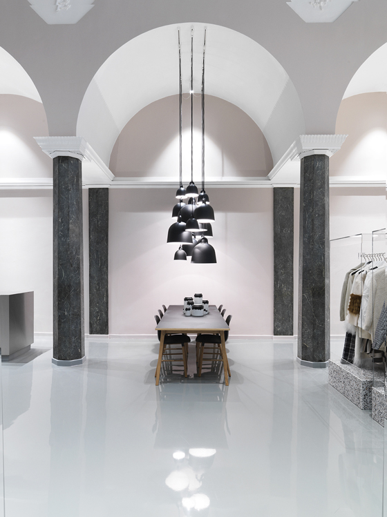
New interventions including an entrance corridor lined with metal panels contrast with heritage features at Normann Copenhagen’s showroom. Photos: Jeppe Sorensen

New interventions including an entrance corridor lined with metal panels contrast with heritage features at Normann Copenhagen’s showroom. Photos: Jeppe Sorensen
×Danish design brand Normann Copenhagen’s flagship store is located in a building with a rich and varied history (it was formerly a water distillery, a theatre, a sound studio and a cinema), but the company was keen to transform it into a space that communicates the brand’s identity to consumers in a compelling way.
The store is entered via a long hallway lined with panels of brushed stainless steel and illuminated by 160 fluorescent tube lamps. The industrial tunnel contains an 18-piece modular sofa and leads to an area called the Stage, where a material library is presented. The building’s heritage remains evident in the marbled beams, white stucco and bas-reliefs of the ballroom area, which also incorporates product displays comprising podiums made from contrasting contemporary materials. The final space is a subterranean gallery that can change over time. Its first edition features an entirely pink interior with products in varying hues contributing to the immersive space.
“The idea was not to just make a new furniture shop,” said designer Hans Horseman, who worked on the refurbishment with the company's brand manager Britt Bonnesen, “but to create a space that resembles the design DNA of Normann Copenhagen and showcases the visual identity of what the company is.”
Architect Li Xiang’s interior for the Zhongshuge bookstore in Shanghai’s Réel Mall borrows elements from city streetscapes to create an environment offering a range of distinct experiences. Photos: Shao Feng

Architect Li Xiang’s interior for the Zhongshuge bookstore in Shanghai’s Réel Mall borrows elements from city streetscapes to create an environment offering a range of distinct experiences. Photos: Shao Feng
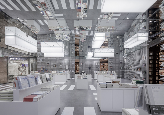
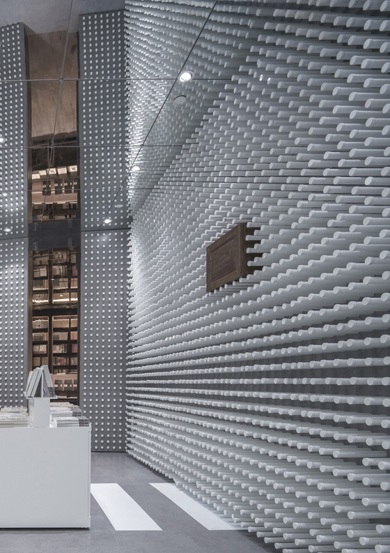
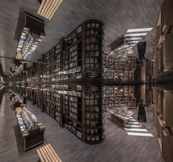
×Even shops within shopping malls can be given the designer treatment, as evidenced by the Zhongshuge bookshop in Shanghai’s Réel Mall, where local architect Li Xiang borrowed from the bustling language of the city to create a lively environment with different experiential zones. Zebra crossings on the floors guide visitors between the various book displays, while park benches illuminated by street lamps offer places to read and relax. Full-height bookshelves create walls around more intimate reading rooms intended to represent houses with varying characters. Mirrored ceilings extend the spaces vertically and help to enhance the experience of “walking through a real city of books”.
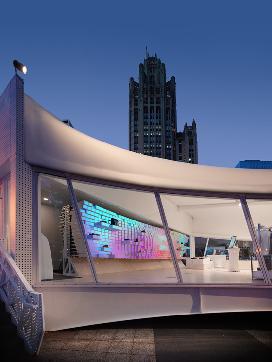
Interactive features including a display wall with inbuilt motion sensors at Designer Giorgio Borruso's ShopWithMe pop-up store in Chicago demonstrate how digital technologies could influence future retail spaces. Photos: Benny Chan/Fotoworks

Interactive features including a display wall with inbuilt motion sensors at Designer Giorgio Borruso's ShopWithMe pop-up store in Chicago demonstrate how digital technologies could influence future retail spaces. Photos: Benny Chan/Fotoworks
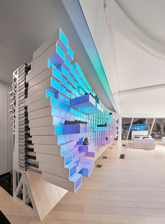
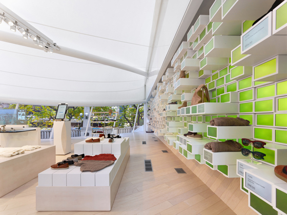
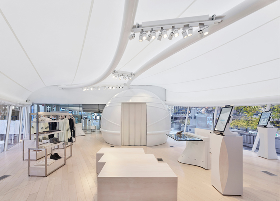
×The future of branded retail spaces will inevitably be linked to advances in purchasing and interactive technologies. The ShopWithMe pop-up store developed by California-based architect and designer Giorgio Borruso together with retail technology firm WithMe offers an insight into the ways in which technology and architecture might combine in the next generation of immersive retail environments.
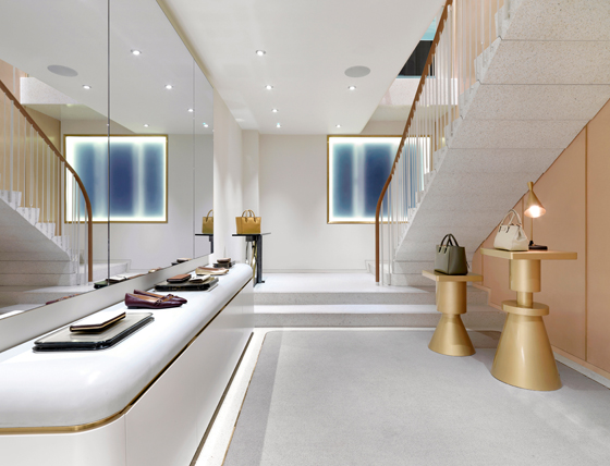
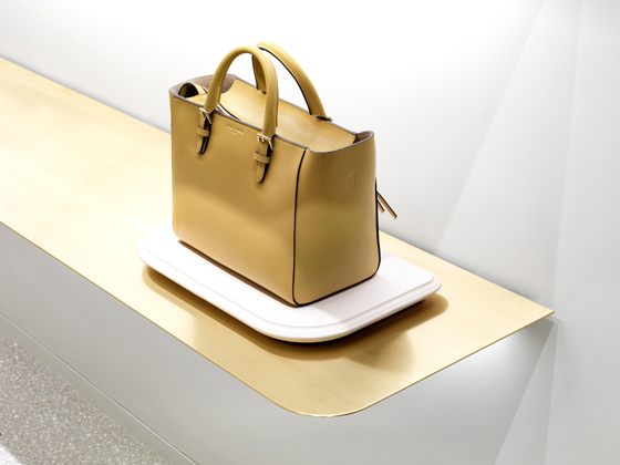
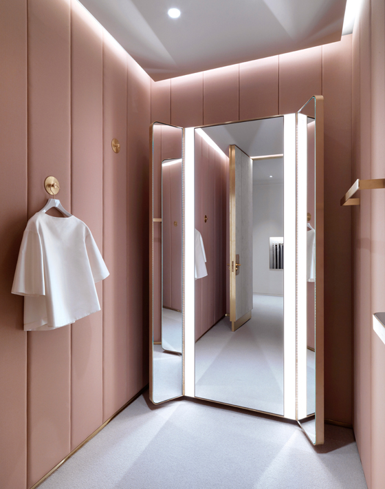
J&M Davidson in Mayfair, London evinces timeless glamour thanks to Universal Design Studio’s sharp eye. The material palette refers to the building’s terracotta-toned façade and bevelled edges recall exterior details. Photos: Charles Hosea

J&M Davidson in Mayfair, London evinces timeless glamour thanks to Universal Design Studio’s sharp eye. The material palette refers to the building’s terracotta-toned façade and bevelled edges recall exterior details. Photos: Charles Hosea
×Developed as a prefabricated unit made using modular components to enable easy assembly and disassembly in any location, the ShopWithMe store incorporates smart technologies and interactive features including drop-down changing-room curtains and shelves that slide out to present products to consumers as they pass by. The 1,000 shelves that make up the main display wall are fronted with small screens that function as programmable pixels. Both offline and online shopping is possible thanks to the inclusion of several touchscreens and interactive mirror displays in the changing rooms.
WithMe’s cofounder Danielle Jenkins described ShopWithMe as the “store of the future” and asked, “Why should a new store have to be physically built for every brand? At ShopWithMe we change the files not the fixtures to create a new experience.”
© Architonic
