Editors' Pick: the architecture and design stories we loved this month
Scritto da Architonic
Zurich, Svizzera
28.07.23
In this new monthly format, we bring you the must-see projects and articles you may have missed over the last four weeks on Architonic. Featured in July: adaptive reuse, wooden warmth (in more ways than one) and lots of colour.
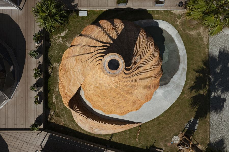
Sauna Sazae by Kengo Kuma & Associates. Photo: Keishin Horikoshi / SS Inc.
PROJECTS
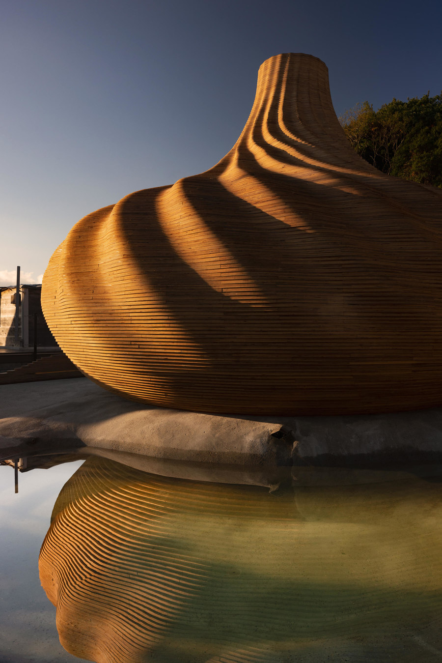
The organic wooden sauna 'SAZAE' is built at the center of the glamping facility 'SANA MANE' near the small inlet of Naoshima, Japan. It has countless folds like a shell, giving the surface an impressive shadow. Inside, the pleats are shaped gently to conform to the body and provide a comfortable sitting experience. Unlike a general sauna, despite the high ceiling, the temperature and humidity are kept at an optimum level by making full use of environmental simulations and designing forced ventilation airflow.
Valeria Montjoy, Senior Content Editor:
'This wooden sauna captivated me with its seemingly simple, shell-inspired geometry that, upon closer inspection, reveals complex and fascinating details. Meticulously crafted, over 150 layers of CNC-processed plywood stack up like an intricate jigsaw puzzle – a testament to both ingenuity and exceptional woodwork.'
Sauna Sazae by Kengo Kuma & Associates. Photo: Keishin Horikoshi / SS Inc.
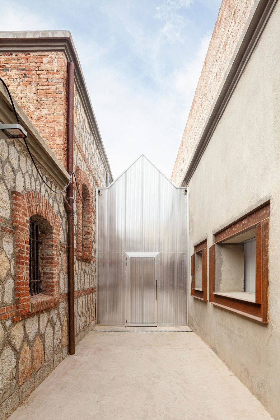
El Roser Social Centre is laid out in the old prison in Reus, a building listed as a Cultural Asset of Local Interest and included in the Inventory of Architectural Heritage of Catalonia. The facility is an innovative program in Spain. It comprises a shelter for the homeless, a soup kitchen, and a community space, bringing together all the social services of the city, which makes it the first comprehensive facility of its kind.
Daniela Porto, Content Operations Manager:
'The contrasts of old/new and traditional/modern – seen both in the materiality and the use of the space – is what drew me to this project. Not only does it demonstrate a beautiful and careful selection of what to maintain from the historical building, and how to complement it with clean lines and modern materials. But the 'transformation of a transformation' gives it a narrative of rebirth that turns an originally dark and even sinister building into a place for community and social conscience.'
El Roser Social Centre by Josep Ferrando Architecture and Gallego Arquitectura. Photo: Adrià Goula

El Roser Social Centre by Josep Ferrando Architecture and Gallego Arquitectura. Photo: Adrià Goula
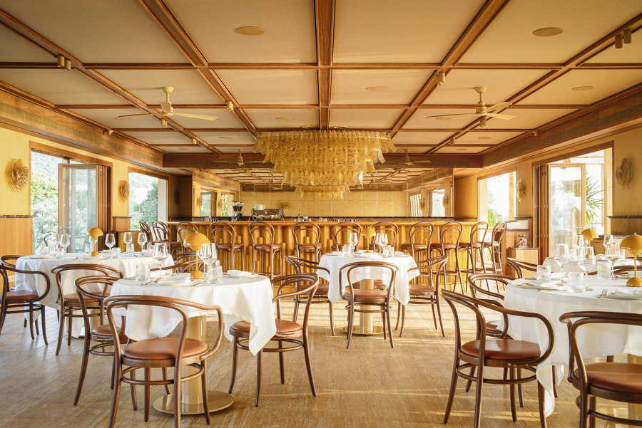
×Butler’s table Mediterranean restaurant, conceived by Carl Gerges Architects, pays tribute to the sun on one of the world’s most beloved coasts in Lebanon. Overlooking Batroun’s historic waterfront, the restaurant is imbued in warm tints and yellow accents that simulate natural sunlight. Light white tablecloths give off a classic Brasserie feel. Elegant irocco wood dominates the space from floor to ceiling, blending seamlessly with the terrace’s paneling.
James Wormald, Organic Content Editor:
'The contrast between the warm, sun tones of the Butler’s Table restaurant’s surfaces, steam-bent furniture and the simple white of its crisp white tablecloths instantly drew my attention to the project. I also loved the space as a luxurious representation of traditional Lebanese culture and architecture.'
Butler's Table by Carl Gerges Architects. Photo: Carl Gerges Architects
STORIES
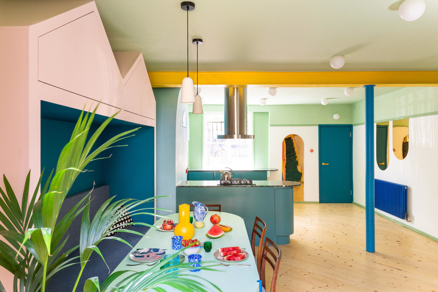
The growing interior trend of maximalism encourages us to fill our homes with colour, pattern and function, letting creativity flow free without rule or restriction. But it’s not as simple as just throwing everything together and waiting to see what sticks. The following products and surfacing techniques complement each other to bring previously lonely walls to life.
Enrique Tovar, Brands & Materials Content Editor:
'These strategies have been, for me, a great reminder of the versatility that exists in interior design. Whether through colours, decorative elements or patterns, this approach invites us to explore and rethink the way we understand spaces. It's valuable to keep in mind that there are always multiple visions to tackling a design problem, and while facing blank walls can be a little intimidating, it certainly presents a great opportunity.'
'14 ways to maximise interest on a blank wall.' Mo-Tel House by Office S&M. Photo: French + Tye
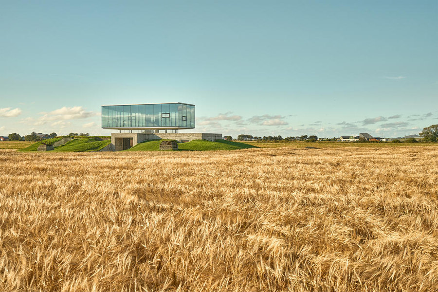
When planning much-needed social and cultural buildings for public use, instead of using new, virgin materials (or even recycled materials that need to be collected, stripped, reformatted and transported), there are plenty of pre-made sites already in place. All we have to do is see them. These adaptive reuse projects take disused buildings, forgotten projects and unloved environments and transform them into something new, bringing life, positivity and purpose.
Lucila Sarasola, Content Editor:
'The selection of these four projects reminds me of the power of transformation. From a former army training complex converted into a social and cultural hub to a former prison, now a school... We evolve, and so does architecture.'
'Time to make a change: when adaptive reuse begets positive transformation.' Pavilion Brekstad in Brekstad, Norway, by ASAS arkitektur. Photo: Kristoffer Wittrup

'Time to make a change: when adaptive reuse begets positive transformation.' Pavilion Brekstad in Brekstad, Norway, by ASAS arkitektur. Photo: Kristoffer Wittrup
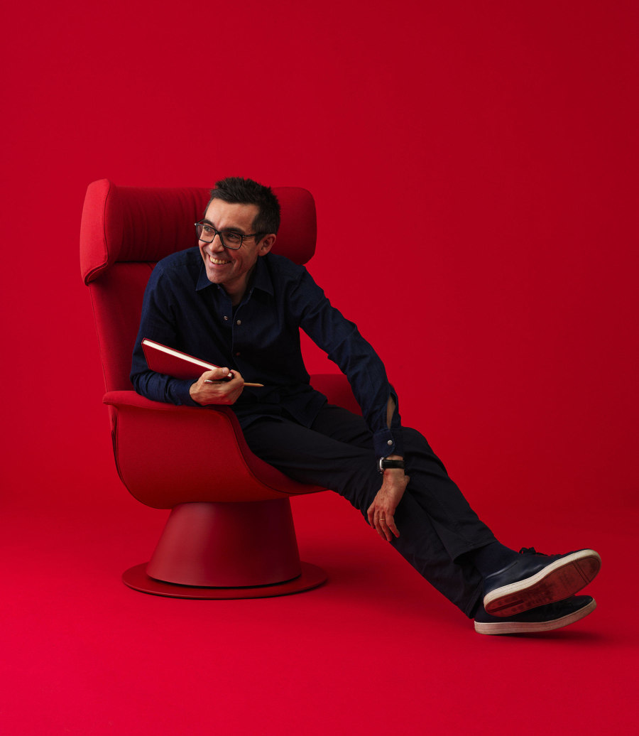
×Award-winning French designer Patrick Jouin's authenticity of approach and modesty of personality has resulted in a decade of distinctive furniture designs for premium Italian manufacturer Pedrali. His ‘Ester’ armchair you’ve probably sat on at least once, if you’re into fine dining – it's been specified for a slew of restaurants, hotels and boutiques internationally. We spoke with him, curious about what such a long-term collaboration with a producer looks and feels like.
Claire Brodka, Managing Editor:
'I found Jouin's honesty about what makes a good partnership super refreshing – he doesn't hold back. He also is a real romanticist about furniture, which is one of the reasons Pedrali and him work so well together. And I deeply relate to his aversion to overcomplicating things. Simplicity is key.'
Patrick Jouin x Pedrali: ‘I like to work with companies that actually produce.’ Photo: Thomas Duval

Patrick Jouin x Pedrali: ‘I like to work with companies that actually produce.’ Photo: Thomas Duval
ש Architonic
Head to the Architonic Magazine for more insights on the latest products, trends and practices in architecture and design, or find inspiration in a whole world of projects from around the globe through ArchDaily's architecture catalogue.
