Signs of the Times
Storia del Marchio di Simon Keane-Cowell
Glattbrugg, Svizzera
20.09.13
Feeling a little bit lost? It's no surprise, really. As populations grow, cities expand, international travel increases and we all work (and live) harder and faster, it seems that there are ever more new and complex terrains to navigate. Enter a number of highly considered wayfinding systems that help you make sense of the space around you.
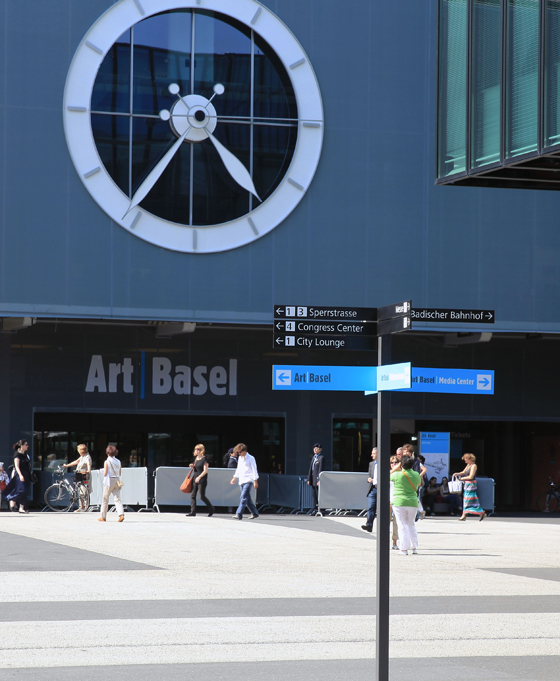
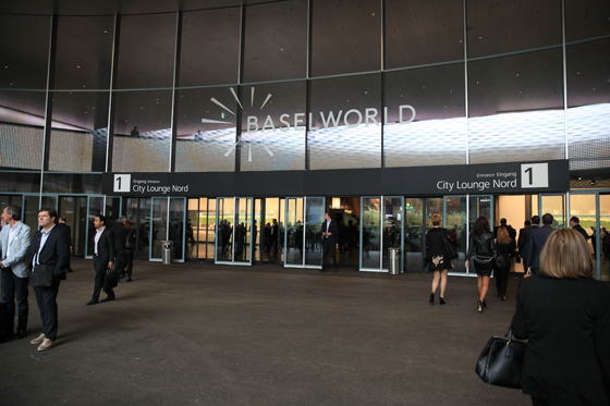
Messe Basel's new wayfinding system, comprising over 1,800 separate signage elements across five exhibition halls, was delivered by Swiss manufacturer BURRI public elements in collaboration with Frankfurt-based studio «unit-design»

Messe Basel's new wayfinding system, comprising over 1,800 separate signage elements across five exhibition halls, was delivered by Swiss manufacturer BURRI public elements in collaboration with Frankfurt-based studio «unit-design»
×The world’s population can roughly be divided into two camps. Boy scouts and the rest of us.
The former are armed with a finely honed set of path-finding skills, developed to ensure safe and effective navigation through the most inhospitable and confusing of environments, while we civilians rely on the legibility and logic of the public spaces that go to make up our designed world – and sometimes, especially when on unfamiliar ground, on a certain amount of luck.
Whether we are aware of it or not, we make our way through the public realm of the everyday – be it urban or interior, architectural space – as participants in a series of systems that have been designed, to greater or lesser extents, to shape our experience of what’s around us by at turns inviting and ordering us to move through space in certain, prescribed ways. A cynic might argue that such systems serve to regulate and control us, while a happy optimist might suggest they make modern life liveable.
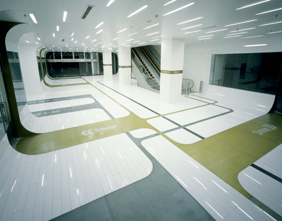
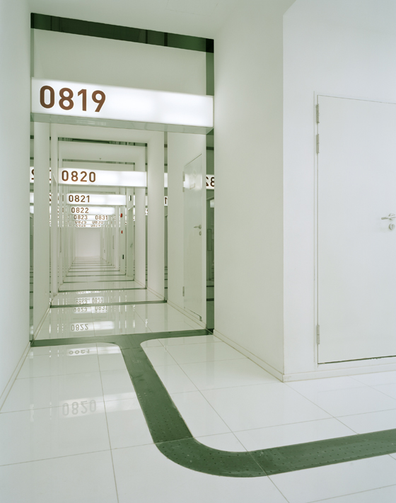
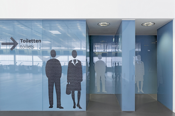
Information and directional signage fuses with its architectural host at the aptly named Signterior office/retail building in Shanghai. The wayfinding was designed by ujidesign of Tokyo; architecture by A-ASTERISK and A-I-SHA. Photos Nakaça & Partners

Information and directional signage fuses with its architectural host at the aptly named Signterior office/retail building in Shanghai. The wayfinding was designed by ujidesign of Tokyo; architecture by A-ASTERISK and A-I-SHA. Photos Nakaça & Partners
×Yet the fact of the matter is that we live in an increasingly digital age, one where we have become used to navigating our way through the proliferation of data out there thanks to highly structured information architectures, hierarchies and search paths. Offline, our level of our expectation with regard to how we encounter and experience the analogue world has grown to match this: we want to know where we can go and how to get there. This, coupled with a continued increase in international travel, which often sees us attempting to make sense of alien surroundings, sometimes where language is a barrier, has created a greater need for wayfinding systems that help us go forth with a healthy degree of confidence.
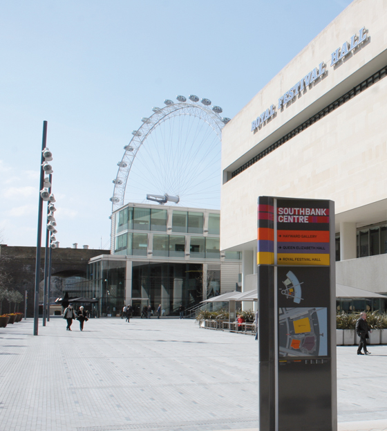
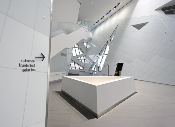
Wayfinding in dialogue with iconic architecture: fwdesign's system for London's Southbank Centre (top) and L2M3's directional signage for Daniel Libeskind's Bernaqua waterpark in Switzerland (above; photo © Florian Hammerich, L2M3 Kommunikationsdesign)

Wayfinding in dialogue with iconic architecture: fwdesign's system for London's Southbank Centre (top) and L2M3's directional signage for Daniel Libeskind's Bernaqua waterpark in Switzerland (above; photo © Florian Hammerich, L2M3 Kommunikationsdesign)
×Pointing us in the right direction is more than just a benevolent act on the part of our temporary hosts – be they cities, public buildings, cultural institutions or retail environments. The stakes are high: to do business, environments such as trade-fair halls and shopping complexes rely on visitors being able to navigate their way through the melee. Museums, meanwhile, offer cumulative cultural enrichment through a successful negotiation of their spaces. And brands, for example at their company headquarters, can exploit signage and orientation systems to reinforce their identity.
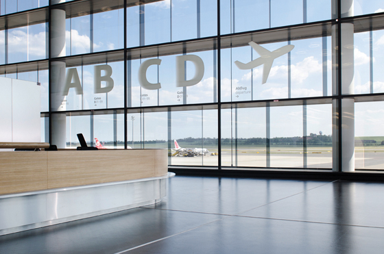
Wayfinding-design experts Ruedi Baur Intégral's signage system for Vienna Airport's Check-In 3 takes a sedate, yet playful, approach to communicating information. Photos Andreas Körner

Wayfinding-design experts Ruedi Baur Intégral's signage system for Vienna Airport's Check-In 3 takes a sedate, yet playful, approach to communicating information. Photos Andreas Körner
×With so much at stake, it’s little wonder that effective wayfinding projects demand an interdisciplinary approach in terms of their conception and execution; interior architecture, graphic design, product design and set design are all called upon to create spatial narratives for users to follow and understand. While buildings often attempt to make themselves legible to users with regard to how they should be moved through and negotiated, orientation systems, through a dialogue with the architectural spaces in which they are installed, serve to amplify this readability. Successful systems, however, don’t seek to draw too much attention to themselves. “Done right,” observes design critic and academic Per Mollerup, “nobody talks about them. Done wrong, they can spoil everything.”
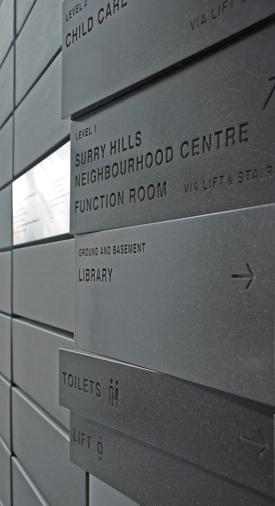
At the Surry Hills Library & Community Center in Sydney, design studio Collider's wayfinding becomes part of the architecture, signs articulated at various angles to underscore their directional intent. The building was designed by office FJMT

At the Surry Hills Library & Community Center in Sydney, design studio Collider's wayfinding becomes part of the architecture, signs articulated at various angles to underscore their directional intent. The building was designed by office FJMT
×_
Now you see it, now you don’t: Messe Basel and Zurich Airport
Martin Burri, owner of the Swiss manufacturer BURRI public elements agrees. When asked what the users of the new, total wayfinding system his company recently delivered for the Messe Basel fairgrounds make of it, his answer is simple: “They don’t consciously notice it. It merges with the architecture and is taken as a functional given. And that’s as it should be.”
The successful winning of an international tender for the development, production and installation of over 1,800 separate signage elements across the five large halls, saw the Zurich-based firm, with its track record in the realisation and physical implementation of product and graphic design for public spaces, collaborate with Frankfurt design studio «unit-design» to transform their restrained yet highly functional, bespoke signage and orientation programme into a family of 12 new, technically clever products, fit for purpose.
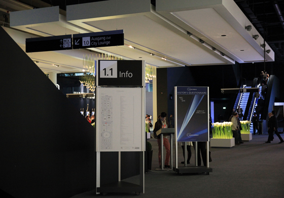
Messe Basel: a consciously restrained graphic language – one which doesn't compete with the often colourful branding of the venue's exhibitors – was developed by «unit-design» for the fairground's new wayfinding, manufactured and installed by BURRI

Messe Basel: a consciously restrained graphic language – one which doesn't compete with the often colourful branding of the venue's exhibitors – was developed by «unit-design» for the fairground's new wayfinding, manufactured and installed by BURRI
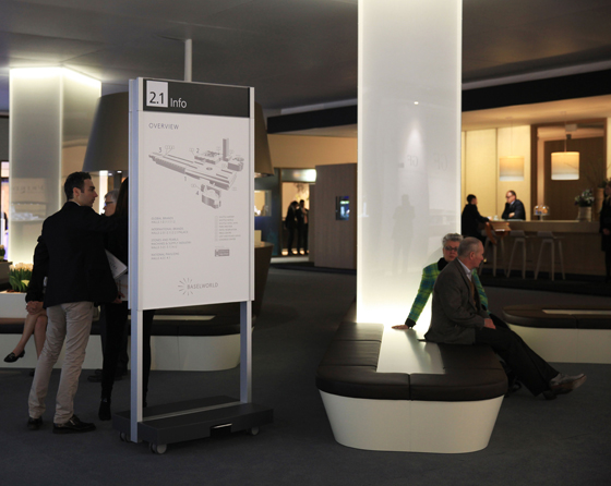
×Two key criteria for effectiveness in a project like this are, of course, legibility and relevance. For «unit-design», the challenge was to establish a graphic language that would operate on a number of levels: one that would perform well in a utilitarian sense, but also communicate a certain sophistication, working in a venue that sees some very high-end brands exhibit at such fairs as Baselworld and Art Basel, while, at the same time, not looking incongruous in a mid-market event like a sample fair. The solution? Restraint.
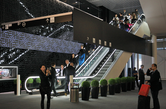
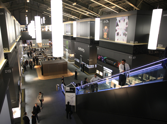
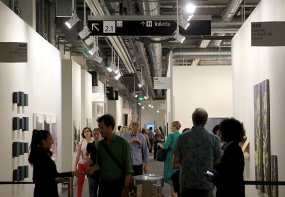
The Frankfurt agency’s solution, which deploys a monochromatic, reduced typography, is an exercise in Miesian ‘less is more’, making itself highly visible to different audiences by consciously distancing itself from the colourful visual landscape of brands around it. ‘Our approach for the visual expression was a clear and basic design language,’ explains «unit-design»’s Bernd Hilpert, ‘that could function as a background to the brands, while offering visual quality and detail.’
Graphic sophistication – in keeping with Messe Basel's often high-end clients, such as Art Basel and Baselworld – meets flexibility in its new wayfinding system, which is easy to reconfigure and add to, responding to an exhibition's particular needs

Graphic sophistication – in keeping with Messe Basel's often high-end clients, such as Art Basel and Baselworld – meets flexibility in its new wayfinding system, which is easy to reconfigure and add to, responding to an exhibition's particular needs
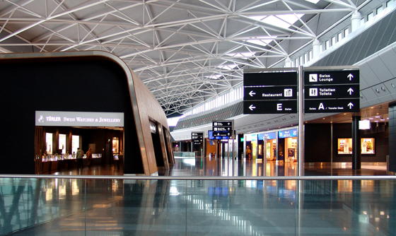
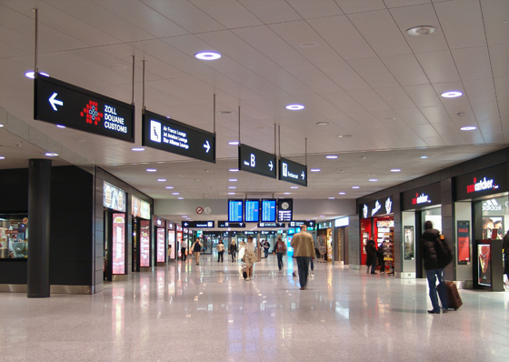
×The concept of a pared-down, white-type-out-of-black signage programme – one which stands out optically thanks to its minimal chromatic expression – had already been applied to Zurich Airport in 2005 and proven its effectiveness. Also a project implemented by BURRI in terms of product development, production and installation, the Swiss manufacturer collaborated on this occasion with renowned British office Grimshaw Architects, who were responsible for the design of the wayfinding elements as products, as well as the architecture of the airport’s impressive new terminal. Designalltag Zürich were commissioned to create the graphics.
The Zurich Airport wayfinding system, designed by internationally renowned Grimshaw Architects and built and installed by BURRI, maximises legibility through a pared-down approach: black and white graphics are teamed with a reduced formal language

The Zurich Airport wayfinding system, designed by internationally renowned Grimshaw Architects and built and installed by BURRI, maximises legibility through a pared-down approach: black and white graphics are teamed with a reduced formal language
×Suspended signage dovetails with free-standing display cases at Zurich Airport in terms both of information provision and design language. Designed by Grimshaw Architects and built and installed by BURRI

Suspended signage dovetails with free-standing display cases at Zurich Airport in terms both of information provision and design language. Designed by Grimshaw Architects and built and installed by BURRI
×_
Greater than the sum of its parts
For both the Messe Basel and Zurich Airport projects, BURRI translated the designers’ renderings into technically innovative, know-how-filled products, faithful to the vision of their creators. ‘We try to realise the designs precisely,’ says Martin Burri, ‘even though many technical challenges had to be solved.’ A key requirement of the airport brief was the ability for graphic signage panels and internal lighting elements to be changed quickly by staff, without the need for tools and certainly without the need for calling in external contractors. The result of implementing such a tool-less signage system has been a dramatic lowering of lifecycle costs.
Having proved its effectiveness, the innovative folding frame on the airport display panels (which can be snapped open and shut easily) was optimised for the Messe Basel wayfinding system, where flexibility was key. A trade-fair venue has to respond to the differing needs of its various organiser clients, which means changing layouts and circulations, and varying levels of information for visitors with regard to location and orientation. Quick turnaround is vital.
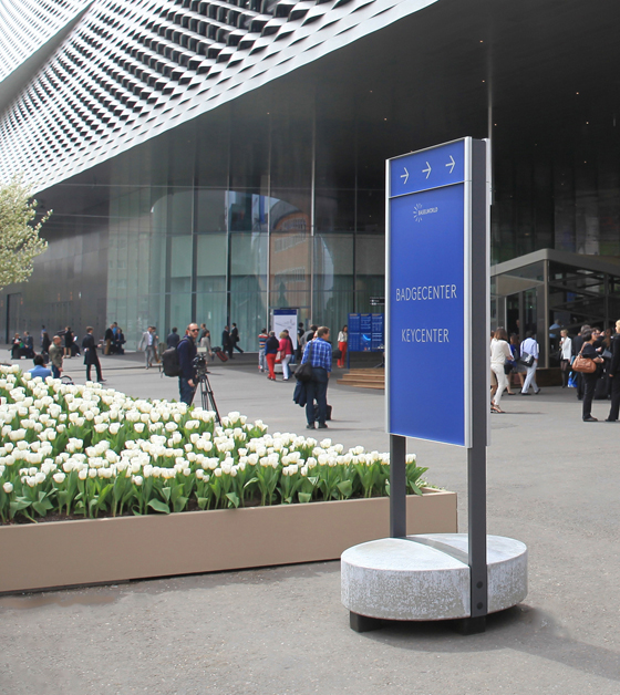
A smooth, circular concrete base provides complete stability for BURRI's outdoor display stand, while its folding frame means panels can be changed by any member of staff without the need for special tools

A smooth, circular concrete base provides complete stability for BURRI's outdoor display stand, while its folding frame means panels can be changed by any member of staff without the need for special tools
×Technical innovation can be found across the complete, modular system of products installed at Messe Basel. The robust, weather-resistant outdoor display stand features a solid, circular concrete base, which, in turn sits on rubber feet, making the whole element extremely stable, yet moveable. Mobility is transformed into an ultra-high-performing product feature, meanwhile, with the two- and three-sided indoor display stands, the bases of which conceal a highly engineered, extremely smooth double-wheel mechanism, meaning these solid, free-standing elements can be moved by just one person and very little effort involved. Rotatable even on the spot, a foot pedal locks the stands into position. They may be easy to push around, yet they’re anything but a push-over.
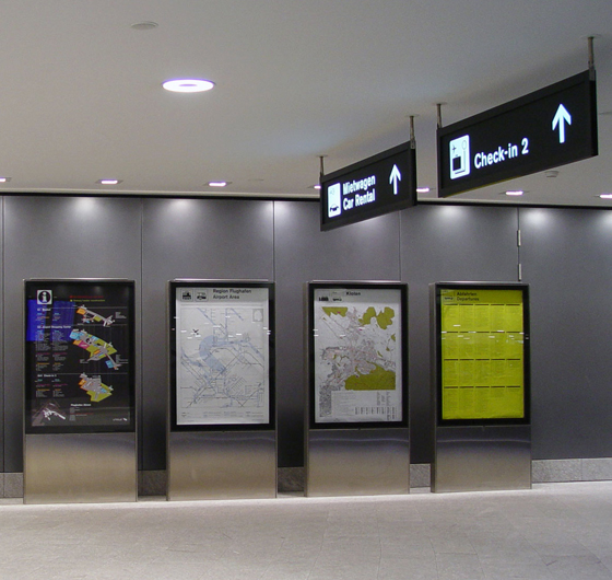
With modularity built-in, BURRI's wayfinding elements (such as its suspended signage and its three-sided, mobile display stand, shown here) are a sustainable proposition

With modularity built-in, BURRI's wayfinding elements (such as its suspended signage and its three-sided, mobile display stand, shown here) are a sustainable proposition
×All three stands, together with a multi-directional signpost for exterior use and a suite of signs and cubes for wall-mounting and suspension, share a common formal language, characterised by clean lines and an economy of material usage, which dovetails with the reduced expression of the graphics they carry. Beyond the modular design of a number of the products, the system as a whole embraces modularity, with an emphasis on reconfiguration and expansion to meet the requirements of the ever-changing fair landscape.
Such a sustainable way of doing things requires a certain investment, of course, but, thanks to the products' ruggedness and easy handling in an often demanding fair environment, it's an investment that more than pays for itself over time. ‘When it comes to signage and wayfinding,’ says Martin Burri, ‘sustainability in the long term is more important than the system in its initial iteration. The lifecycle cost of the system should be built into its initial purchase.’
Exceptional mobility as a key product feature: an innovative double-wheel mechanism allows the robust BURRI indoor 'F4' display stand to be moved effortlessly and then locked into position at the press of a foot pedal

Exceptional mobility as a key product feature: an innovative double-wheel mechanism allows the robust BURRI indoor 'F4' display stand to be moved effortlessly and then locked into position at the press of a foot pedal
×_
More is more: adding value through wayfinding
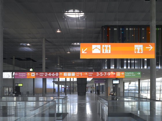
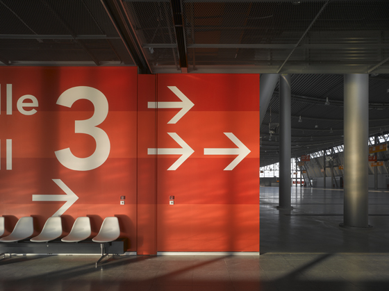
Not all wayfinding projects plough a restrained furrow, however. In contrast to Messe Basel, design studio büro uebele’s signage and directional programme for Messe Stuttgart uses colour as a key means of orientation for fair-goers. A strong palette of hues communicate, in turn, the way to the halls, the congress centre, the press centre and the outdoor fair.
Colour leads the way at Messe Stuttgart, where büro uebele’s signage and directional programme employs a diverse palette of hues to denote different spaces across the fairgrounds. Photos Christian Richters

Colour leads the way at Messe Stuttgart, where büro uebele’s signage and directional programme employs a diverse palette of hues to denote different spaces across the fairgrounds. Photos Christian Richters
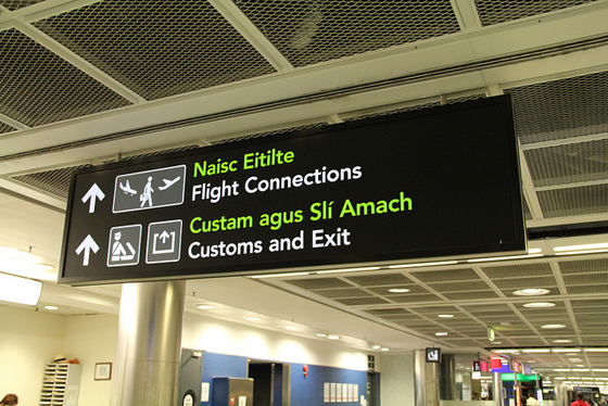
×A more judicious use of colour, meanwhile, but nonetheless a potent one, can be found in Dublin Airport’s information and directional signage programme for the second terminal, which opened at the end of 2010. Here, as at Zurich Airport, the graphic language is controlled, yet the bilingual nature of the signs sees the introduction of a sharp green to the otherwise monochromatic treatment, as means of differentiating the two languages. There is more at work here than bald functionality, however. No prizes for guessing that it is the Irish type (which sits above the English) that is picked out in green; wayfinding operates here as both utilitarian mechanism for moving passengers through the airport space, and as expression of national identity.
Passengers at Dublin Airport are guided by a wayfinding system that, through its judicious use of colour, more specifically green, makes clear the distinction between the signage's two languages, while serving as an expression of national identity

Passengers at Dublin Airport are guided by a wayfinding system that, through its judicious use of colour, more specifically green, makes clear the distinction between the signage's two languages, while serving as an expression of national identity
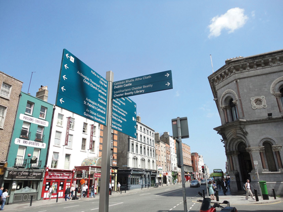
×In Dublin City, meanwhile, London-based studio fwdesign have delivered an elaborate, bilingual wayfinding system, comprising over 100 individual elements, which makes the city legible to its many cultural tourists

In Dublin City, meanwhile, London-based studio fwdesign have delivered an elaborate, bilingual wayfinding system, comprising over 100 individual elements, which makes the city legible to its many cultural tourists
×Exit the airport and into the city. 2011 saw Dublin receive its first public-realm, integrated wayfinding system, with over 100 dual-language information panels and finger posts creating sign chains for pedestrians wanting to reap the cultural benefits that the Irish capital has to offer. Just as James Joyce’s iconic novel ‘Ulysses’ mapped out the city in prose, London-based studio fwdesign’s orientation scheme, developed in collaboration with JCDecaux, makes the city legible to visitors, using maps with architectural reference points and journey times to make the urban landscape recognisable and traversable.
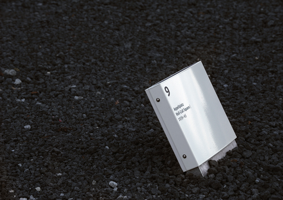
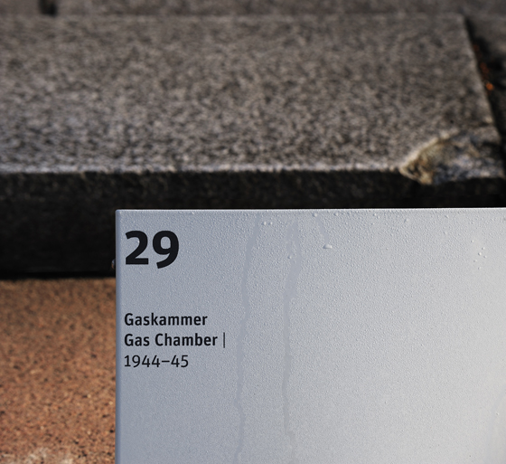
«unit-design»'s signage for visitors to the Mahn- und Gedenkstätte Ravensbrück, Germany, the site of a former Nazi concentration camp, proves how impactful information can be when expressed with sobriety

«unit-design»'s signage for visitors to the Mahn- und Gedenkstätte Ravensbrück, Germany, the site of a former Nazi concentration camp, proves how impactful information can be when expressed with sobriety
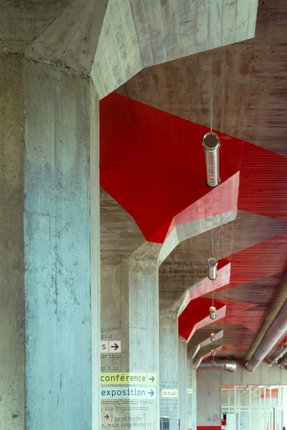
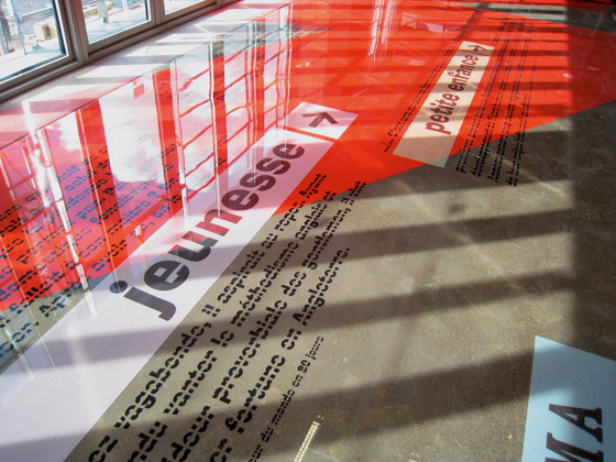
×But if there’s one creative who is truly pushing the boundaries of wayfinding (as well as indicating where they lie, of course), it’s Zurich- and Paris-based Ruedi Baur of eponymous design studio Intégral Ruedi Baur, whose consistently original projects for, among other environments, airports, hospitals and offices, prove that a strong concept, if cleverly applied, isn’t at odds with utilitarian performance. An emphatic example of this is Baur’s highly expressive graphic scheme for the Médiathèque André Malraux Library in Strasbourg, which combines typography with striking bands of red (designed by the architects), to create a total spatial skin that shrouds every plane – including floors and ceilings – within the converted grain warehouse’s interior. Part wayfinding system, part amplification of Paris-based office Jean Marc Ibos Myrto Vitart’s architectural design (such is the integrated nature of the two), the strong graphic presence also serves as metaphor for the stock-in-trade of the library – text. Set in different typographic styles, directional signage is expressed purely through word and in continuous prose. The use of symbols is confidently eschewed.
It’s just all too easy for boy scouts these days.
Ruedi Baur Intégral's wayfinding system for Strasbourg's Médiathèque André Malraux sets directions within paragraphs of prose, marrying concept with function. Photos George Fessy (top) and Valentin Abad and Simon Burkart (above)

Ruedi Baur Intégral's wayfinding system for Strasbourg's Médiathèque André Malraux sets directions within paragraphs of prose, marrying concept with function. Photos George Fessy (top) and Valentin Abad and Simon Burkart (above)
×
