The Architecture of Presentation
Scritto da Christina Barthelmie
Zürich, Germania
07.05.08
Because our attention is fully focussed on new products and old acquaintances we frequently overlook the architecture of the stands themselves, which is often of high quality and great elaboration.
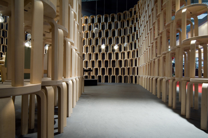
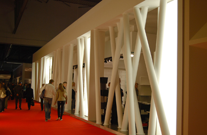
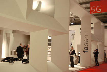
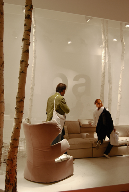
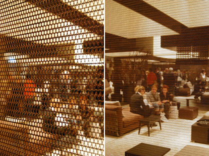
Because our attention is fully focussed on new products and old acquaintances we frequently overlook the architecture of the stands themselves, which is often of high quality and great elaboration. In order to provide the right setting for their brand and their new products, many exhibitors seem to spare no costs when it comes to creating an inspiring space for their presentation. Accordingly we have collected some impressions for you of new materials and atmospheric settings.
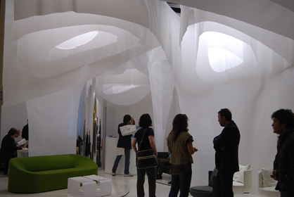
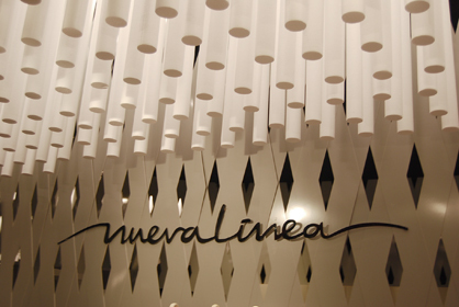
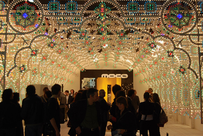
Our Favourite: Simple but impressing – the three dimensional illuminated ceiling of the B&T stand
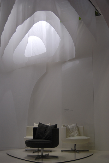
Soft devision with transluscient textile membrane: the Gervasoni stand
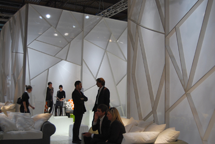
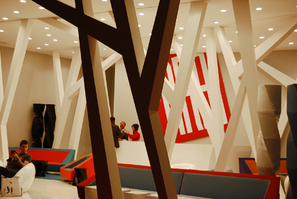
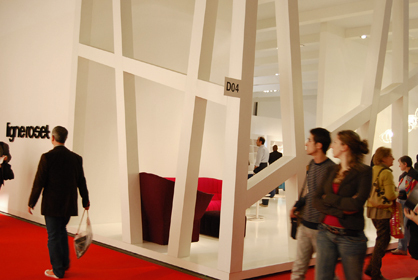
Organische Raumstrukturen und vielschichtige Perspektiven prägten das Bild vieler Stände
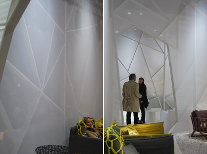
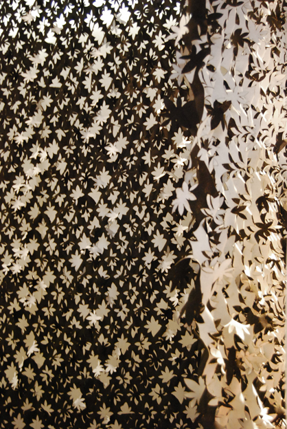
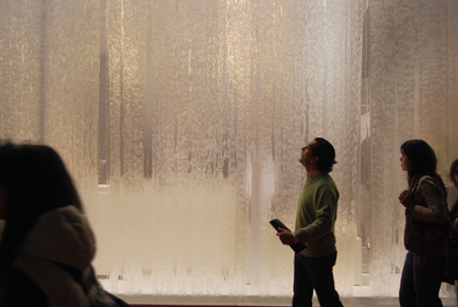
Delicate, translucent textures like at the Adrenaline stand
