Small spaces, big impact: restaurants that maximise their limited footprints
Storia del Marchio di Claire Brodka
04.09.24
These four European restaurants manage to transform their spatial limitations into interior opportunities that reflect creativity, character and charm.
In small restaurants, design professionals must balance functionality and style to maximise space, ensure efficient flow and build a unique and recognisable brand.

In small restaurants, design professionals must balance functionality and style to maximise space, ensure efficient flow and build a unique and recognisable brand.
×When design measures shape a limited square footage, the equation of spatial efficiency and effect can be overthrown by even the most trivial seeming choices. Leonardo da Vinci may have been right in saying that small rooms ‘discipline the mind’, but on a scaled-down stage, every stylistic decision carries exacerbated weight. Here, interior design is not merely about aesthetics; it's about crafting an environment that transforms potential limitations into opportunities for creativity, character and charm.
This rings particularly true in the world of hospitality. Small restaurants offer an intimate and unique dining experience, often distinguished by their personalised service, creative menus and sense of community connection. Creating memorable atmospheres within their lean spatial confines, however, is no small feat. Design professionals must navigate the balance of functionality and style to maximise space, ensure efficient flow for staff and customers alike and build a unique and recognisable brand.
Limited space often means limited seating, adding the challenge of producing an efficient layout that accommodates comfort without feeling cramped. Further considerations must go to acoustics, lighting and colour schemes to ensure a welcoming and engaging atmosphere. An impossible task? Not for these four European restaurants – all under 60m2 – that outperform their structural shackles with a clever mix of precision and imagination.
aerde's 'interiors exemplify a commitment to elevating the fundamental while preserving an inherent authenticity and approachability'.

aerde's 'interiors exemplify a commitment to elevating the fundamental while preserving an inherent authenticity and approachability'.
×aerde in Berlin, Germany, by fortyeight
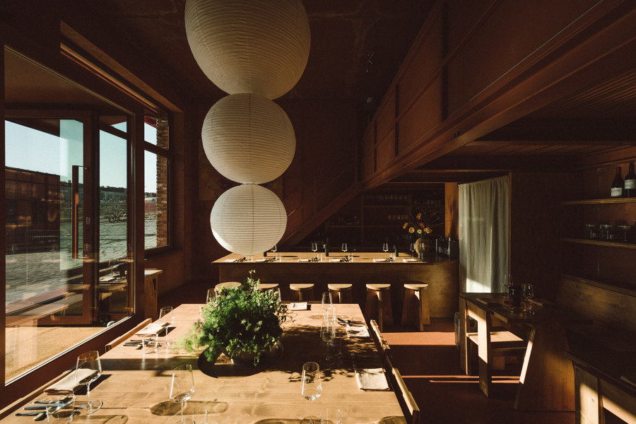
Located in ROBERTNEUN’s iconic Am Lokdepot 123 complex in the German capital’s Viktoria-Quartier, aerde’s 20-seat interior draws inspiration from the Japanese art of transforming modest spaces into immersive experiences. The resulting design, crafted by Keenan Rush and Anselmo Custer under their collective name fortyeight, places emphasis on streamlined materiality and visual lines. ‘Our interiors exemplify a commitment to elevating the fundamental while preserving an inherent authenticity and approachability’, says Rush of the project.
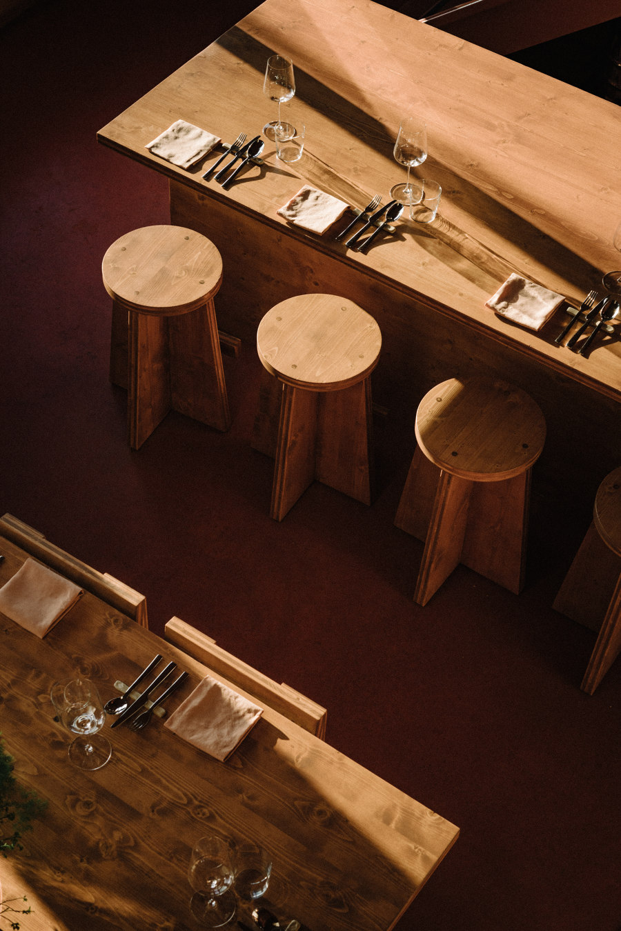
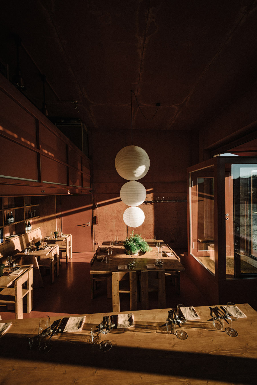
aerde’s double-height ceilings and large glass facade accommodate a compact mezzanine kitchen that belies the complexity and innovation of its regional gastronomic output. An oversized chef’s table and custom rice paper chandelier ground the main dining space, where decorative input is kept to a minimum and a homogenous, earthy colour palette references the building exterior. The bespoke wood furniture offers distinct seating options without overpowering the 40m2 small footprint thanks to a unified material approach, and hidden light sources along the clay-coloured walls and built-in shelving transform the space with warmth and sophistication for dinner service.
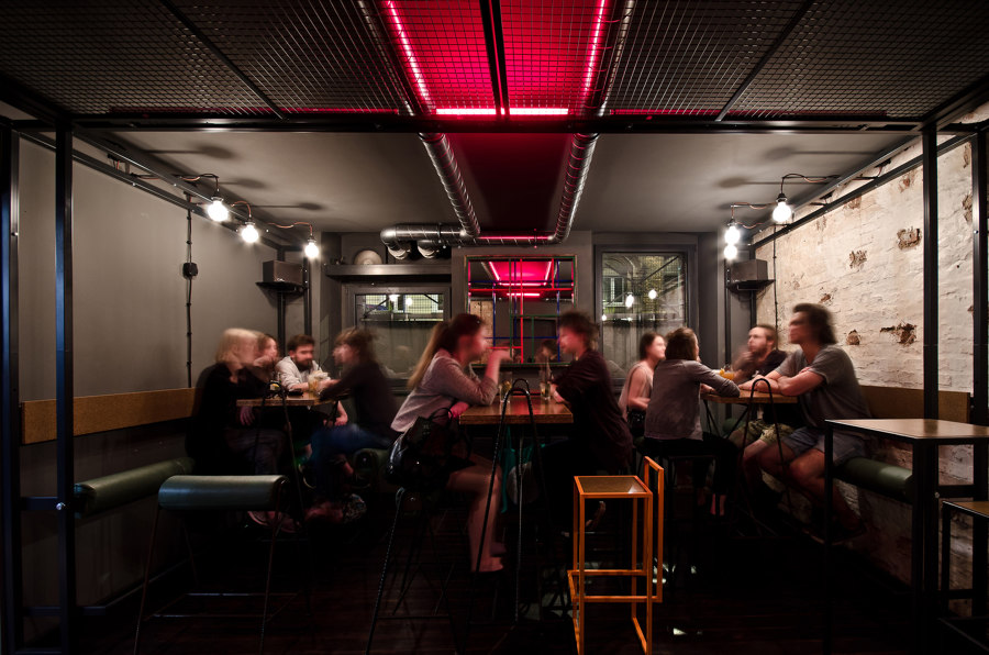
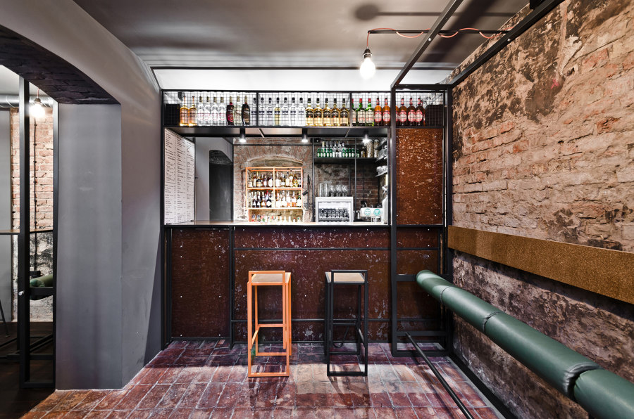
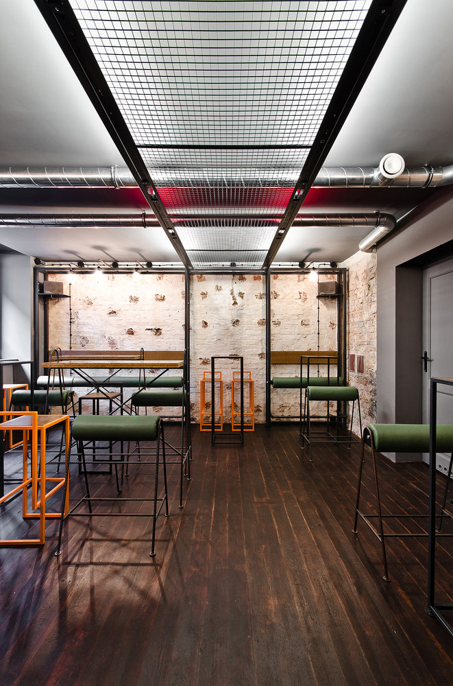
Industrial characteristics were maintained throughout Zrodlo Bar and each interior element, including light and furniture, was designed individually.

Industrial characteristics were maintained throughout Zrodlo Bar and each interior element, including light and furniture, was designed individually.
×Zrodlo Bar in Poznán, Poland, by wiercinski-studio
Zrodlo Bar was transformed by wiercinski-studio from the basement of a tenement house with minimally invasive design measures that preserved the original brick walls and wooden-brick floors. New, independent structures were added in an effort to add visual complexity while maintaining the 45m2 space’s character. Subtle graphites with orange accents make up the colour scheme and complement the existing materials and intense brick hues of the interior.
Industrial characteristics were maintained throughout the bar and restaurant and each interior element, including light and furniture, was designed individually. There are three steel structures total that hold all of the seating and lighting elements in order to keep the original walls untouched. In the second room, there is the largest construction – a steel frame with seats connected together by a steel 'bridge' with net and lights. The 'bridge' is placed on the line of the former door and highlights the transition between rooms. The idea of rollers attached to frames has generated lots of space. A self-designed mirror creates additional space and is the only object that stands out with intense colours.
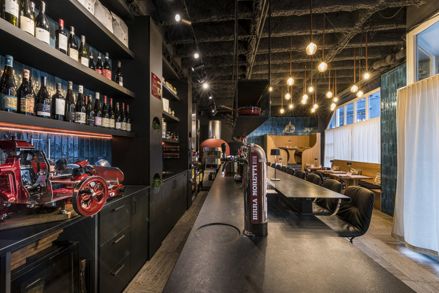
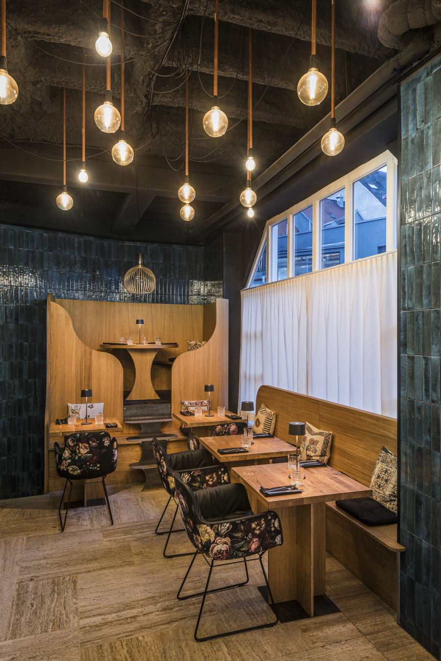
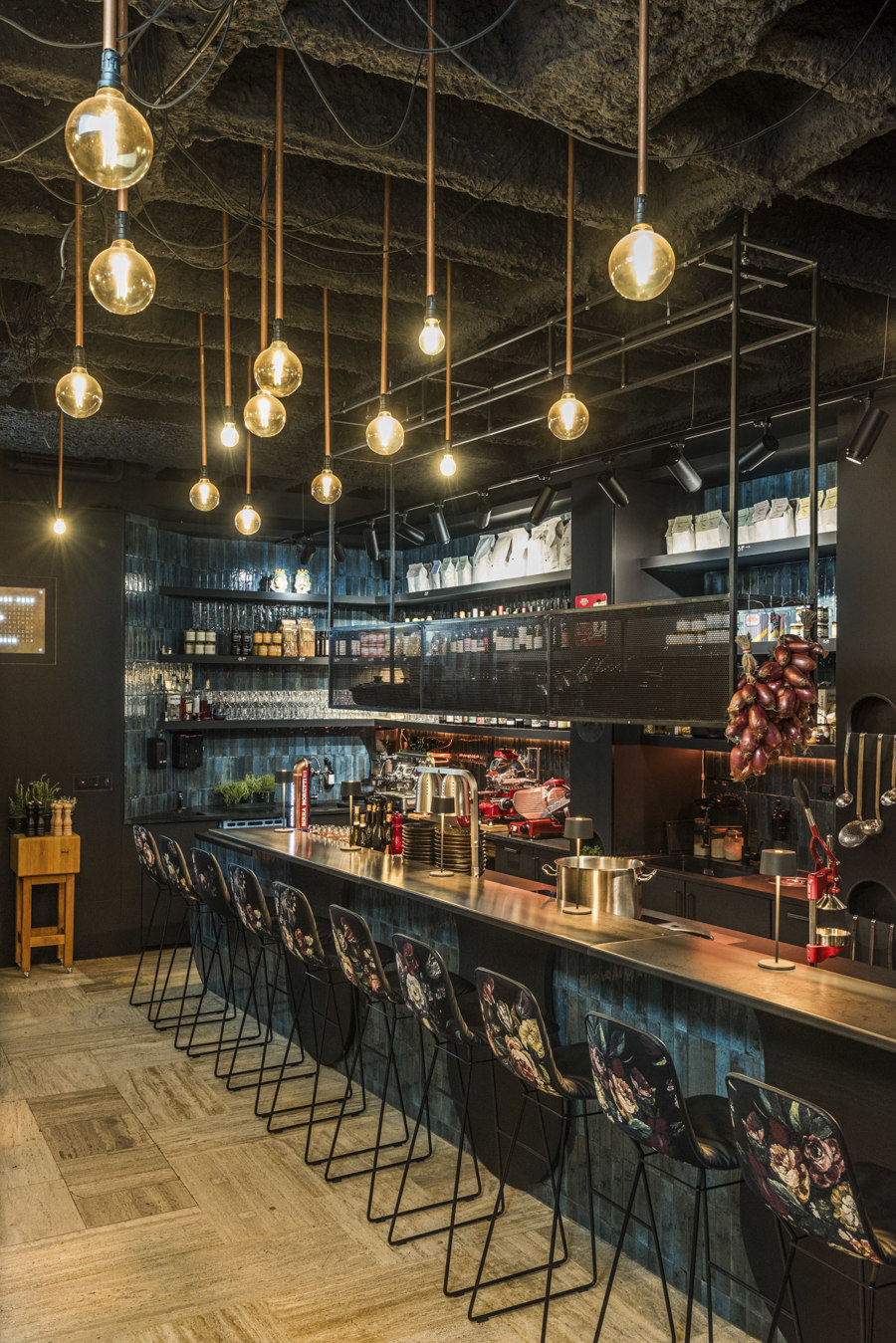
At Salzwasser restaurant, a unique culinary experience with complexity and character is developed in a confined space.

At Salzwasser restaurant, a unique culinary experience with complexity and character is developed in a confined space.
×Salzwasser in Kempten, Germany, by architektur + raum
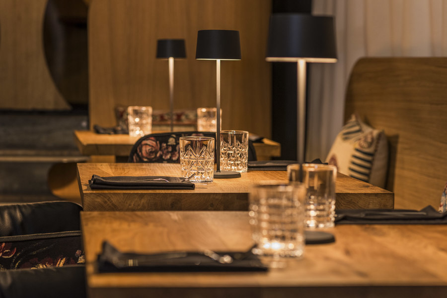
During the conversion of the Salzwasser premises by the local firm architektur + raum, the focus was on exposing existing structures and creating an atmospheric ambience. The natural stone floor of the former jewellery store was retained and the eye-catching concrete ribbed ceiling was given a spray plaster finish, which was then simply painted black. At the centre of the dining room, which measures just 40m2, is a 7.5m-long front cooking counter, through which guests can participate in the preparation of a weekly changing menu of regionally sourced dishes as well as homemade pasta and bread.
Another design coup: when folded down, additional table tops draw a wave-like ornament on the front of the counter in reference to the restaurant's name. Opposite the bar, more guests can be seated and a long oak bench and raised platform made of the same material pick up on the colour scheme of the preserved travertine floor. Sea blue tiles cover the walls and contribute to the overall deep colour scheme, which is completed by matching textiles and innovative copper ceiling lights. These were created by the owner himself and complete the warmth and hospitality of the overall concept. This creates a unique culinary experience with complexity and character in a small space, the flavours of which are only enhanced by the strength of the interior.
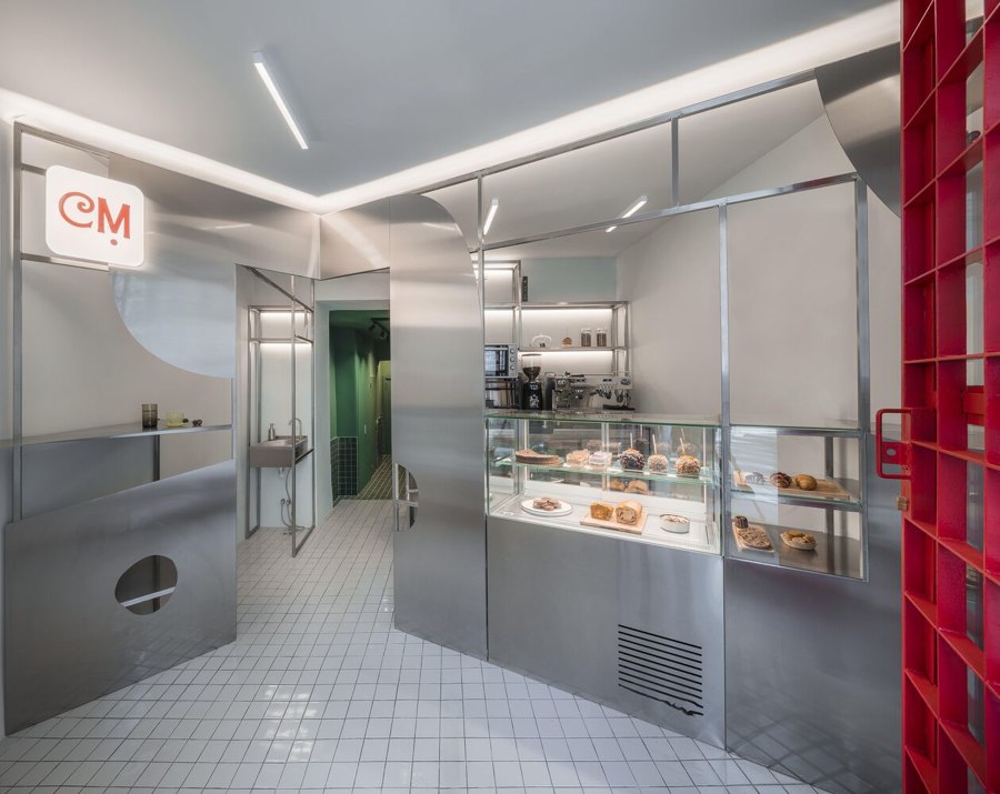
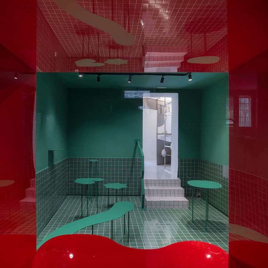
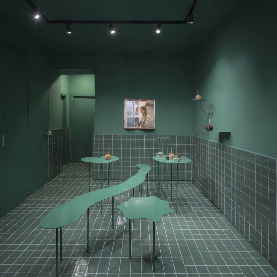
Colour and materiality are the main protagonists in the overall composition of Cara Mela Bakery.
Cara Mela Bakery in Madrid, Spain, by Casa Antillón
This specialised pastry shop is located in the Chamberí neighbourhood of Madrid. The team at Casa Antillón architecture studio worked with two opposing spatial volumes that face and confront each other in order to add visual intrigue and make the most out of the 50m2 footprint. Upon entering, guests are faced with a custom, modular furniture piece that can shift its programmatic makeup to serve as a counter, bar, warehouse or cash register and becomes a sort of interior facade that invites and spills over into the next room.
Here, forms float in a monochrome space that establishes clear lines through material play on the walls and multifunctional furniture that unfolds throughout the space. The rich colour palette enhances the small area’s dramatic effect and is complemented by a contrasting red window into the kitchen that carries on the visual narrative and further elongates existing sight lines. Once again, visitors are invited to share in the behind-the-scenes experience of cooking, not only for transparency and a sense of participation, but also in an effort to create a memorable spatial sensation within the restaurant’s limited confines.
© Architonic
Head to the Architonic Magazine for more insights on the latest products, trends and practices in architecture and design.
