Sell out: retail spaces that show off
Scritto da Dominic Lutyens
London, Regno Unito
01.10.17
Today's flagship stores are transforming existing architectural spaces into memorable physical expressions of brand identity. Top shops!
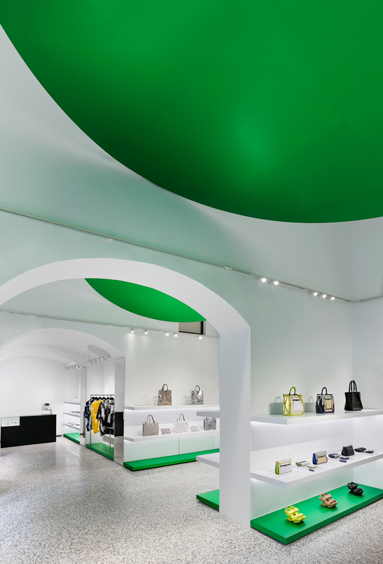
Tokujin Yoshioka’s vibrantly colourful interventions in his design for Issey Miyake’s new Milan store are bold yet the project chiefly celebrates the building’s original architecture. Photo: Olivier Baco

Tokujin Yoshioka’s vibrantly colourful interventions in his design for Issey Miyake’s new Milan store are bold yet the project chiefly celebrates the building’s original architecture. Photo: Olivier Baco
×Not long ago, competition from online shopping threatened bricks-and-mortar stores with extinction. Yet, ironically, tech and e-commerce titans Amazon and Apple are helping them to survive by opening physical shops.
And today, new flagship stores in existing buildings frequently make a feature of their architecture, which reinforces the fact that they are physical shops, not e-commerce sites. What’s more, designers of cutting-edge stores often embrace these buildings’ historical characters, while ensuring the shops’ interiors look contemporary.
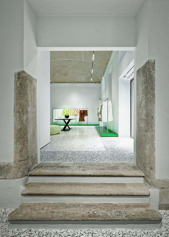
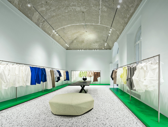
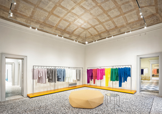
Tokujin Yoshioka’s design of Issey Miyake’s new Milan store in the 19th-century Palazzo Reina celebrates its architecture, which has been recently renovated. Indeed, the shop’s contemporary elements — including orange and green ceiling-suspended aluminium discs and apple green and kingfisher blue plinths for the clothes rails — are overshadowed by the space’s original arches and painted ceilings. Yet the shop feels contemporary thanks to its on-trend terrazzo floors and monastic white walls. ‘It expresses the contrast between history and the future,’ asserts Yoshioka.
As visitors to Issey Miyake’s Milan store proceed from one floor to the next, they’re hit by the dramatic contrast between its traditional interior and rainbow-hued clothes, starkly lit by tracklights. Photos: Olivier Baco

As visitors to Issey Miyake’s Milan store proceed from one floor to the next, they’re hit by the dramatic contrast between its traditional interior and rainbow-hued clothes, starkly lit by tracklights. Photos: Olivier Baco
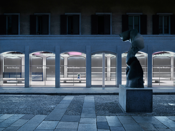
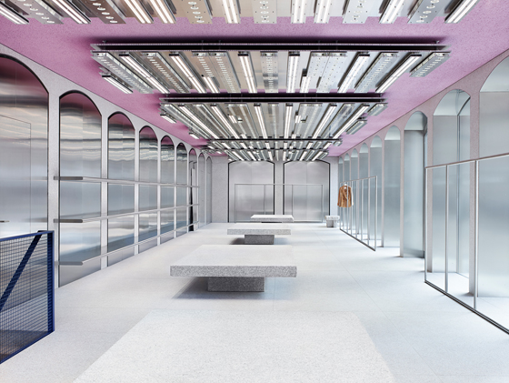
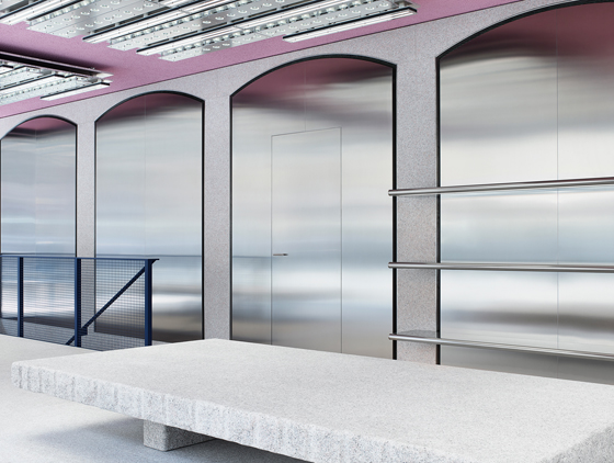
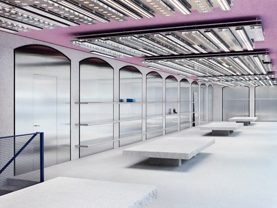
×Similarly, Acne Studios’ new Milan flagship store in the historic Brera area — renowned for its designer shops and galleries — makes a virtue of the elegant glass-filled arches fronting its facades. Yet its interior is starkly modern: it boasts stainless-steel arches and a ceiling painted a synthetic blancmange pink mounted with polished aluminium light fittings.
Acne Studios’ idiosyncratic Milan boutique aims to reflect the artistic character of its location – Brera. Its granite floor and the piazza it faces are on the same level, reinforcing the link between the shop and its context. Photos: Acne Studios

Acne Studios’ idiosyncratic Milan boutique aims to reflect the artistic character of its location – Brera. Its granite floor and the piazza it faces are on the same level, reinforcing the link between the shop and its context. Photos: Acne Studios
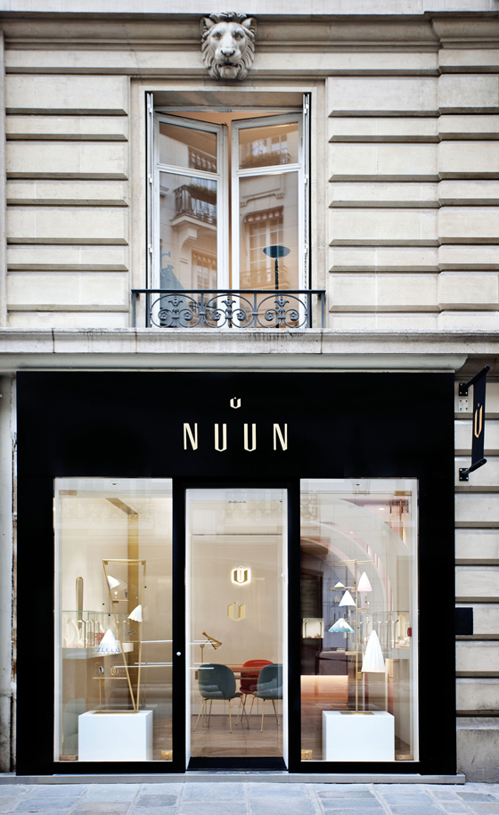
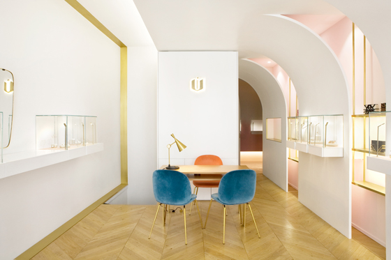
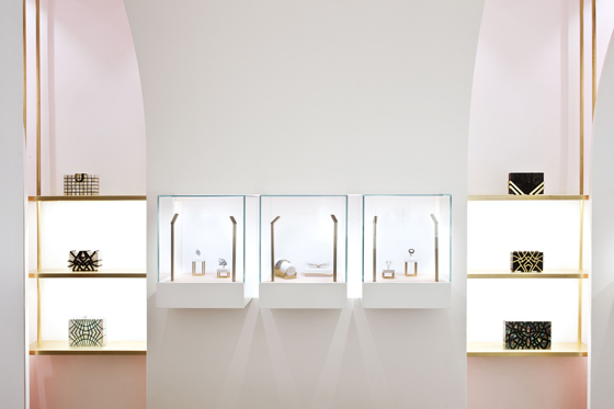
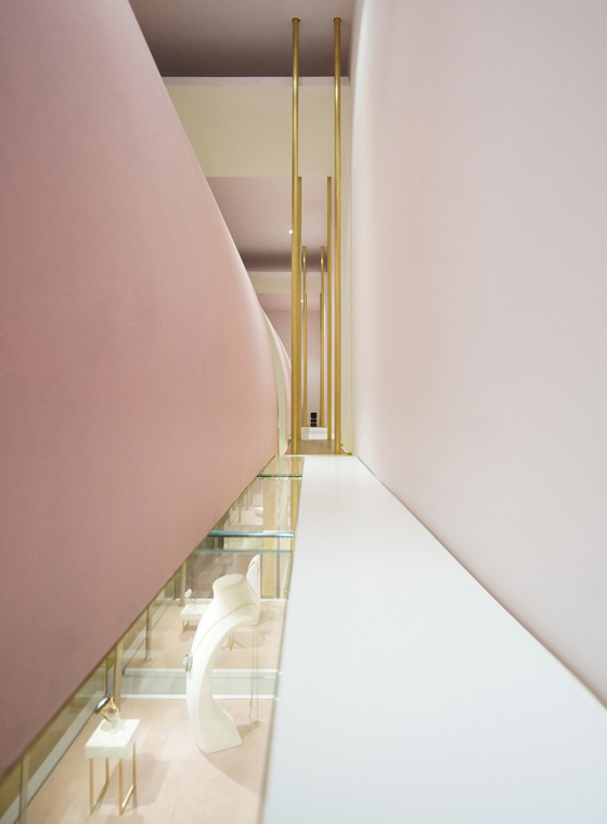
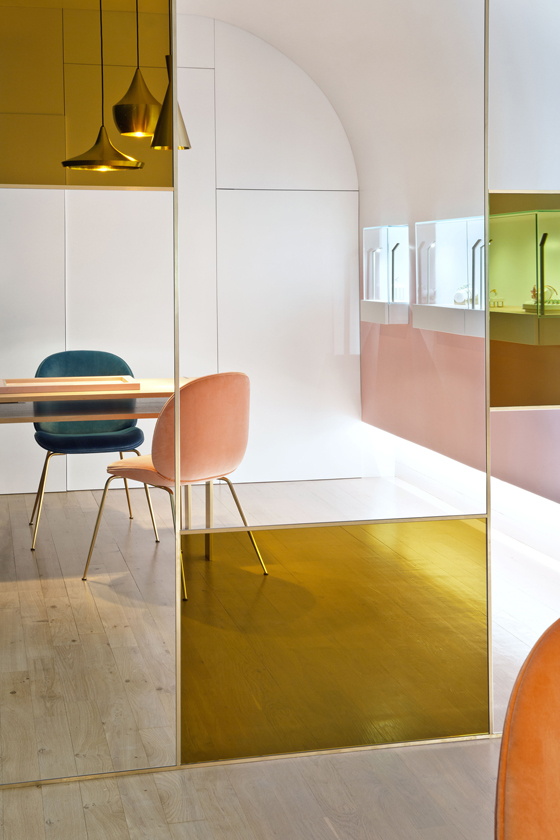
×Pink is one of the coolest shades in interiors right now — especially that flesh tone, blush, which French studios Java Architecture and Atelier Brunoir have used in their design for jewellery store Nuun in Paris. While hinting at opulence and tradition with its brass accents, parquet floors, cocooning, curved ceiling and pink walls softly lit by indirect lighting, its interior looks restrained and modern.
Java Architecture and Atelier Brunoir satisfy Nuun founder Nourah Al Faisal’s craving for 'rose gold' in her Paris jewellery store, with peachy pink tones and understated brass fixtures. Photos: Nuun Jewels (1,3,5), Alexandra Mocanu (2,4)

Java Architecture and Atelier Brunoir satisfy Nuun founder Nourah Al Faisal’s craving for 'rose gold' in her Paris jewellery store, with peachy pink tones and understated brass fixtures. Photos: Nuun Jewels (1,3,5), Alexandra Mocanu (2,4)
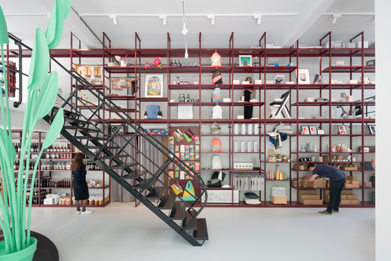
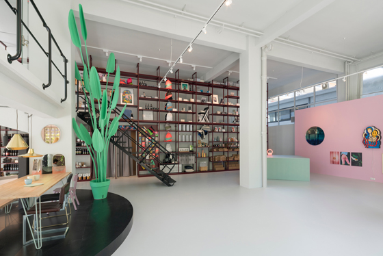
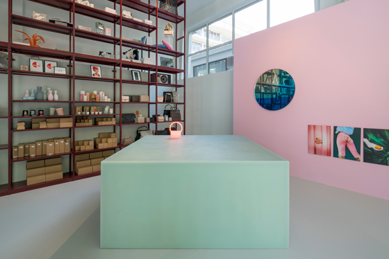
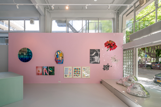
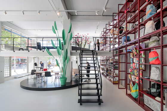
×Dutch practice MVRDV was also thinking pink when creating Rotterdam’s design store Groos, housed in a formerly industrial space whose original features have been restored. Yet pink and peppermint green elements give the shop a playful feel, as does a bespoke floor-to-ceiling shelving unit with ever-changing displays of merchandise. Otherwise, the shop is uncluttered — consistent with the current trend in retail interiors for counterbalancing the modern and traditional.
Design store Groos’s new Rotterdam home is a restored postwar warehouse Het Industriegebouw. The shop’s interior pays homage to the building’s industrial roots, while a huge display keeps the remaining space uncluttered. Photos: Ossip van Duivenbode

Design store Groos’s new Rotterdam home is a restored postwar warehouse Het Industriegebouw. The shop’s interior pays homage to the building’s industrial roots, while a huge display keeps the remaining space uncluttered. Photos: Ossip van Duivenbode
ש Architonic
