Architonic projects of the year 2022: Retail
Scritto da James Wormald
20.12.22
Here are the five most popular new retail store openings worth queueing around the block for in 2022.
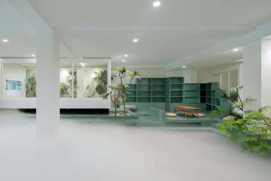
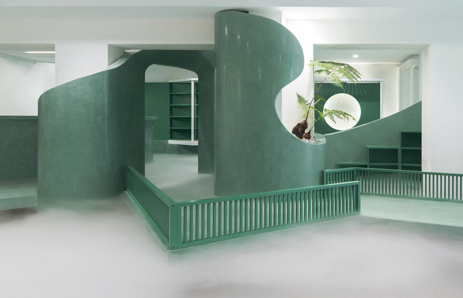
JieJie Studio’s Green Cloud House is a peaceful tea garden space inside the Sheyu World bookstore in Beijing, China. Photo: Ahi Xia

JieJie Studio’s Green Cloud House is a peaceful tea garden space inside the Sheyu World bookstore in Beijing, China. Photo: Ahi Xia
×With only a handful more shopping days left until Christmas, online stores might be the safer, easier and generally more appealing option over the hustle and bustle of the Christmas-lights-lit high street. But by relying on quality surfaces and materials, open and relaxed environments and interactive or other-worldly experiences, these most-popular new retail spaces of the past year prove the physical presence store is not quite yet out of stock.
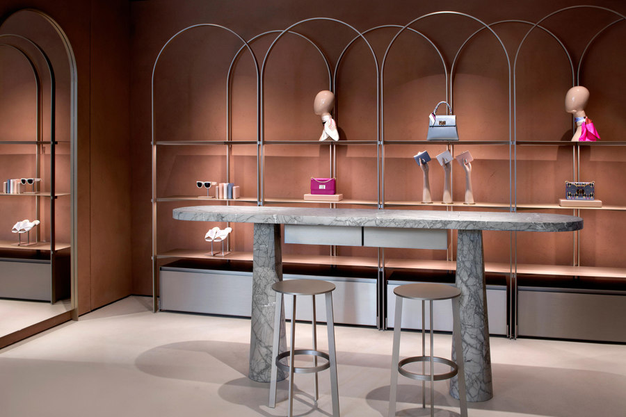
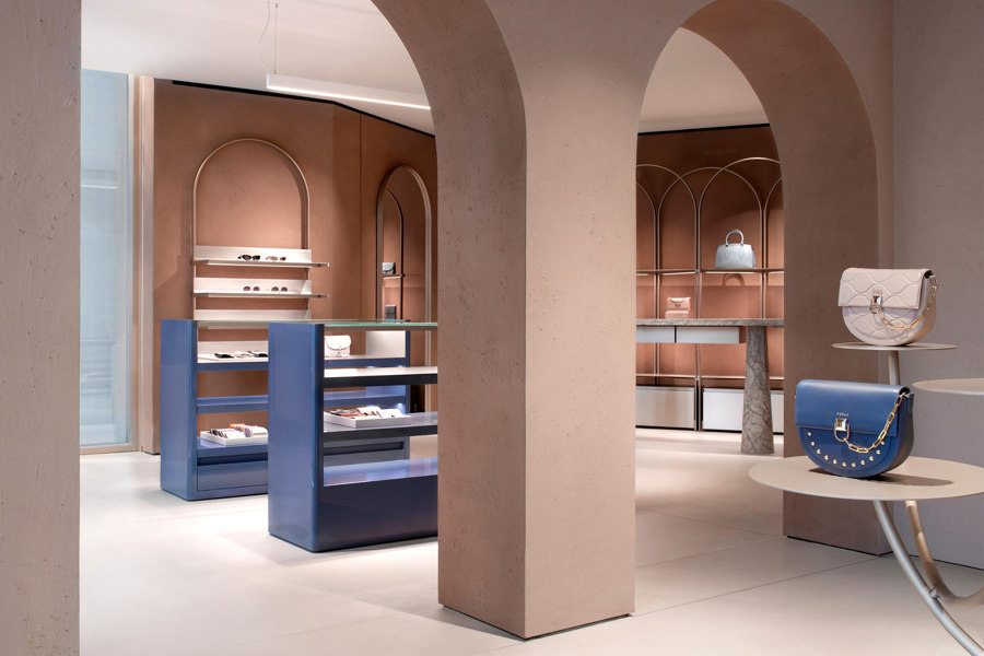
Light arched display shelving in the Furla Store Concept by David Chipperfield Architects allows the rough surfaces of the store to converse with the space. Photos: Alberto Parise

Light arched display shelving in the Furla Store Concept by David Chipperfield Architects allows the rough surfaces of the store to converse with the space. Photos: Alberto Parise
×Furla Store Concept in Milan, Italy, by David Chipperfield Architects
The first of a number of refurbished international flagship stores, Furla’s Milan home was redesigned by David Chipperfield Architects, creating an engaging space that focuses on quality rather than quantity. The luxury, cross-gender leather accessory brand now lives in a large, 240-sqm space. By ensuring the large space is only sparsely populated with product, however, means it retains a relaxed and curatorial atmosphere.
‘The recurring use of the arch inside the store celebrates the heritage of the brand, which was established in Bologna, famous for its considerable porches’, explain David Chipperfield Architects. ‘Featuring intriguing tactile textures, the walls of the store are coated with raw earth obtained by mixing different natural clays. The rough plaster walls, along with the architectural arch motif, reinforce the products’ existence as luxury treasures that the consumer is invited to unearth.
_____________________________________________
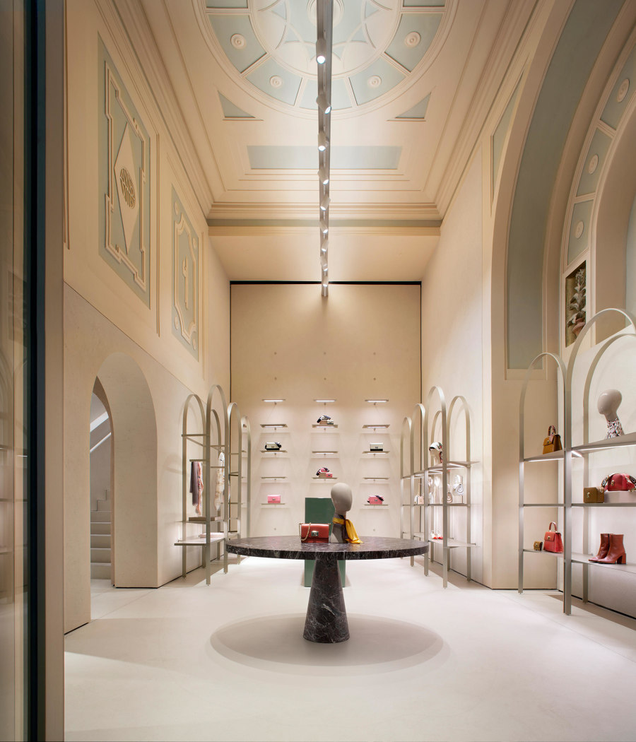
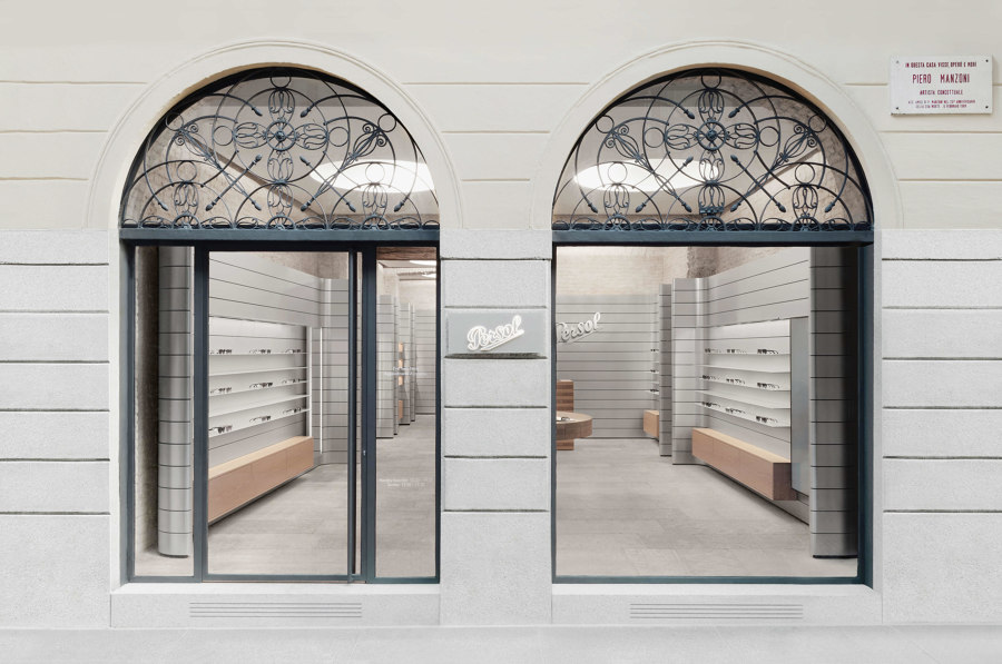
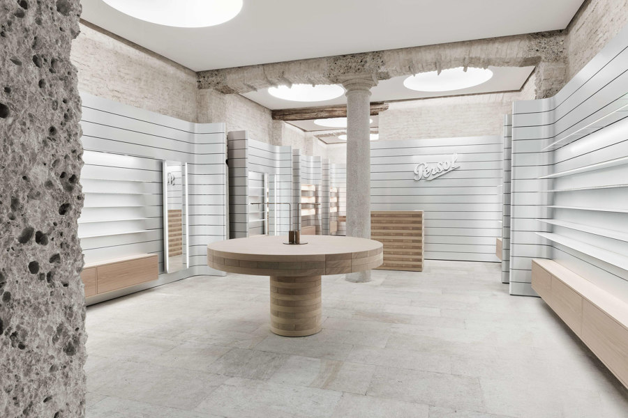
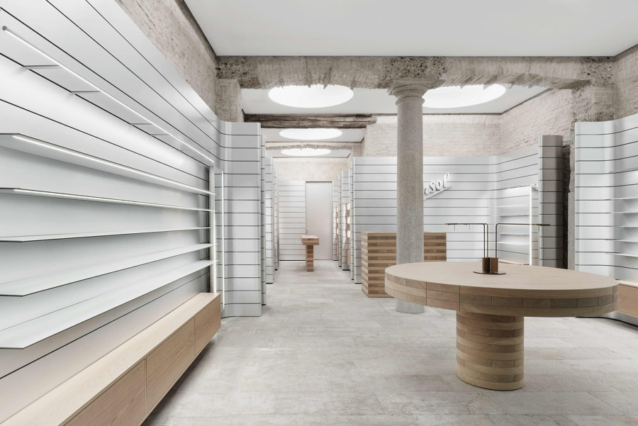
Persol’s concept store combines archaeological architecture with contemporary minimalism, referencing the brand’s authentic position between tradition and modernity. Photos: Gerhardt Kellermann

Persol’s concept store combines archaeological architecture with contemporary minimalism, referencing the brand’s authentic position between tradition and modernity. Photos: Gerhardt Kellermann
×Persol in Milan, Italy, by David Chipperfield Architects
The architectural technique of complementing archaeological-style interiors and surfaces with contemporary minimalism and technology has also been applied to a new store in the artistic and cultural Brera neighbourhood in Milan, by David Chipperfield Architects.
In the duality of its surfaces, the store spatially represents the characteristics of the luxury eyewear brand, Persol. ‘The idea at the heart of the concept is to unveil the site’s authentic architecture, by means of a recovery process, returning stratified parts of the building to the surface, rather than concealing them with new renovation works,’ explains David Chipperfield Architects. Meanwhile, ‘self-supporting aluminium fittings form a series of flats juxtaposed with the historic architecture and create a theatre setting, offering behind-the-scenes glimpses, supporting the shelves, mirrors and lighting, conveying a sense of technology in contrast with archaeology.’
______________________________________
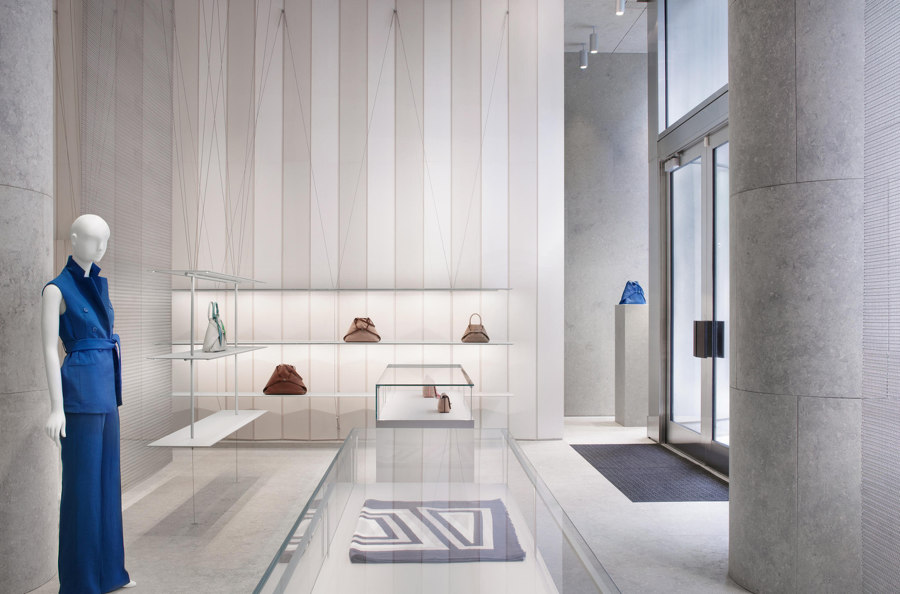
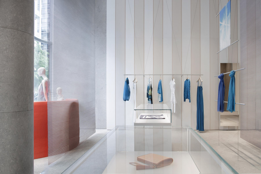
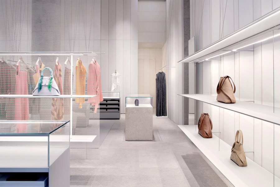
Pre-shaped wood panelling and grey limestone flooring provide the backdrop for the AKRIS concept store’s system of suspended shelves and hangers. Photos: Alberto Parise

Pre-shaped wood panelling and grey limestone flooring provide the backdrop for the AKRIS concept store’s system of suspended shelves and hangers. Photos: Alberto Parise
×AKRIS in Washington, USA, by David Chipperfield Architects
Curating quality in sparse retail spaces is not a concept exclusive to the high-end boutiques of Italy, however. David Chipperfield Architects has also applied the concept to a new store for AKRIS, a family-owned international fashion house, in Washington DC, USA.
Here, the lightness of the store’s supporting surfaces and materials is key to ensuring the products take centre stage. ‘All the display elements are intentionally reduced to the minimum and are formed by a series of taut cables that support shelves and hangers with the aim of displaying the products as if they were magically suspended within the architectural box of limestone and wood,’ explains David Chipperfield Architects.
______________________________________
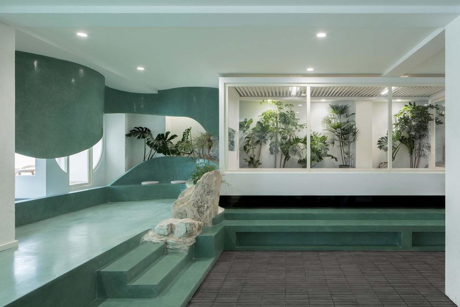
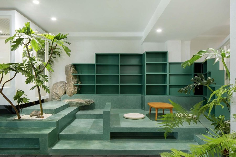
The Green Cloud House uses both realistic and figurative references, with rocks and flora adding to sculptural terraces and displays, creating a sensual garden in a mountain landscape. Photos: Zhi Xia

The Green Cloud House uses both realistic and figurative references, with rocks and flora adding to sculptural terraces and displays, creating a sensual garden in a mountain landscape. Photos: Zhi Xia
×Green Cloud House in Beijing, China, by JieJie Studio
The presence of Green Cloud House in the year’s most popular retail spaces comes with some surprise, perhaps. Books were one of the first product categories to move into online sales, the process of reading a short excerpt and finding other, similar authors being so well suited to the digital landscape. It’s clear from the first page, however, that the nature-inspired environment of Green Cloud House is no ordinary bookstore.
‘Green Cloud House is not only a design practice of gardening in the room, but also an attempt to build a landscape garden in a narrow interior space,’ explain the architects JieJie Studio. As if part of some strange, lucid dream, book lovers are presented with the concept of a literary tea garden, with reading seats dotted around a relaxing and spiritual environment, enveloped by a mountainous soundtrack and scenery with multi-level terraces, bridges, pavilions and water features, ‘the architecture with a pond in the cloud and mist is just the poetic place I want to present.’
_________________________________________
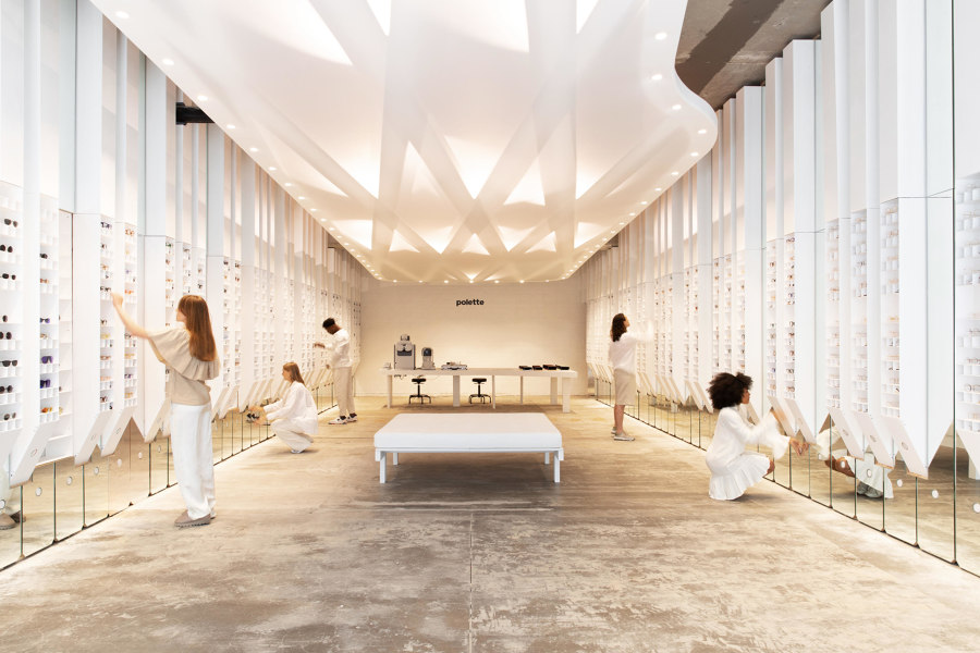
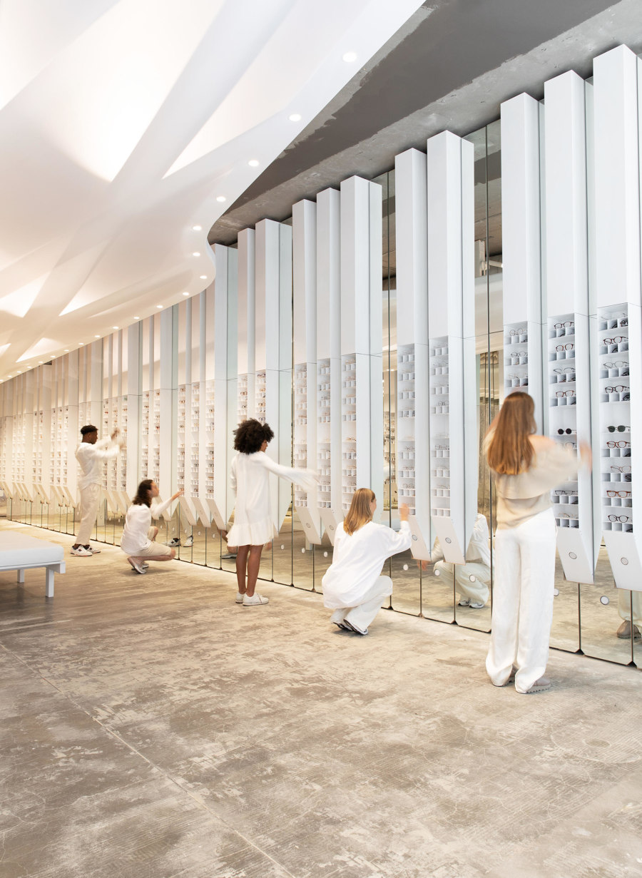
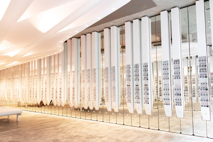
zU-Studio founder, Javier Zubiria, states the musically interactive Polette store is ‘a moment in time where not only are you here to shop, but also to share an instant.’ Photos: polette photography team

zU-Studio founder, Javier Zubiria, states the musically interactive Polette store is ‘a moment in time where not only are you here to shop, but also to share an instant.’ Photos: polette photography team
×Imagine Polette in Antwerp, Belgium, by zU-Studio
The experience of trying on glasses can be a monotonous and tiring one, with consumers quickly giving in to decision fatigue. The Imagine Polette store in Antwerp however, by zU-Studio, reacts to this by turning the process into a fun and interactive game. Rather than simply providing consumers with a process of false self-assessment, Polette encourages inhibitions to fly, seeing each other through a more realistic lens.
By turning product stands into black piano keys and mirrors into white, a working, grand-scale piano invites shoppers to work together to bang out a tune. ‘A light signal indicates when to press the designated key so that people, whether alone or in groups, can all play together in perfect harmony,’ explains zU-Studio on how it works.
______________________________________
© Architonic
Head to the Architonic Magazine for more insights on the latest products, trends and practices in architecture and design.
