End of Year Team Picks: the architecture and design stories we loved in 2023
Scritto da James Wormald
21.12.23
In this special edition of Team Picks, we showcase the must-see projects and articles you may have missed in 2023. Featuring projects that de-urbanise the city, a treetop walk that urbanises nature and a therapeutic chair to sit back and enjoy it all.
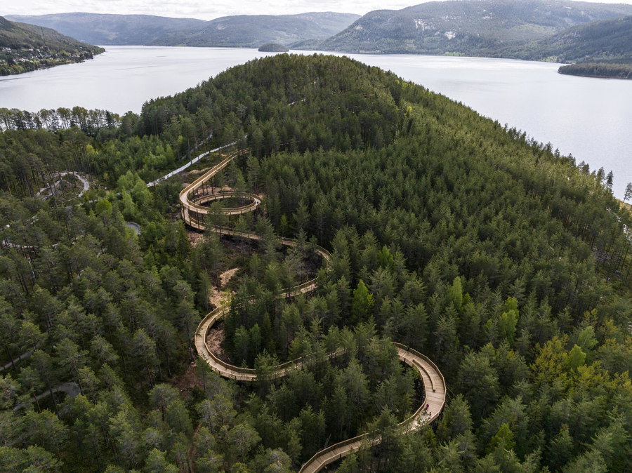
Treetop Walk Hamaren Activity Park by EFFEKT. Photo: Rasmus Hjortshøj
The wooden boardwalk structure is carefully designed as a response to the curvature of the mountain, sometimes following the mountain’s ridges and slopes, and sometimes bending out, creating viewpoints and dramatic drops where visitors can feel the wind in the treetops. The walking trail, universally designed with a gentle incline, is suitable for pedestrians, cyclists, pushchairs and wheelchairs. It grew out out of a heartfelt desire to give all people, regardless of physical abilities, the sensational feeling of walking amongst the treetops.
Camila Prieto, Content Editor:
‘With a simple yet remarkable design, this recreational walkway beckons me to experience it. Built with organic curves using local timber and traditional craftsmanship techniques, its design seamlessly integrates with the natural surroundings. Surrounded by tree trunks, the walkway's curves and slopes create a peaceful and unique experience. Furthermore, the design engages with two distinct perspectives: one for those walking through and another for those observing it from the outside.’
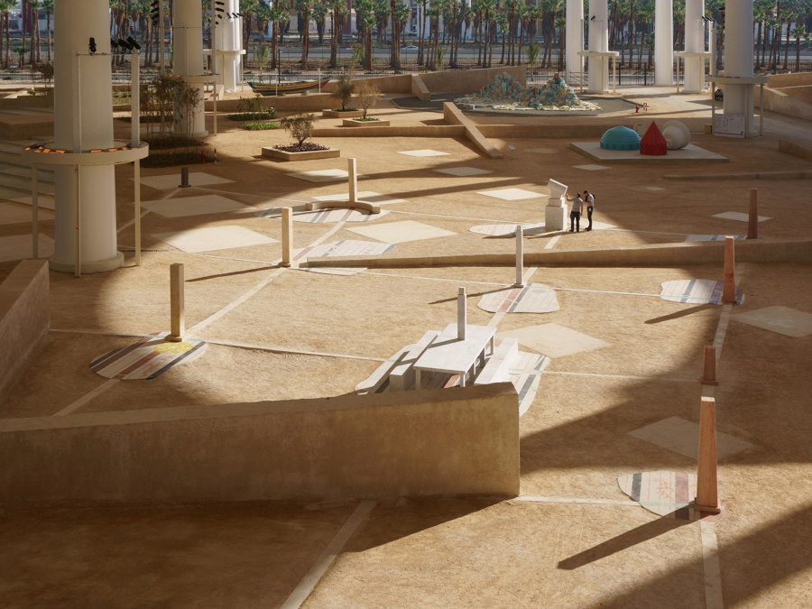
Sun Path, Rajab to Shawwal 1444 by Civil Architecture. Photo: Laurian Ghinitoiu, Ali Ismail Karimi

Sun Path, Rajab to Shawwal 1444 by Civil Architecture. Photo: Laurian Ghinitoiu, Ali Ismail Karimi
×Traditionally, mosque courtyards featured a sundial that indicated the time of the five daily prayers, and mosques served as spaces where the general public could align their sense of time with the movement of the heavenly bodies. The round opening (oculus) in each unit of the terminal’s canopy, which limits the amount of direct sunlight passing into the space below, acts as an inverted sundial. The installation in turn tracks the movement of a beam of sunlight rather than a cast shadow.
Enrique Tovar, Brands & Materials Content Editor:
‘Reimagining concepts has always represented one of the most complex challenges within the field of architectural expression for me. When reinterpreting a concept, the question arises: How can a new narrative be developed? Within the framework of the Islamic Art Biennial 2023, this installation exhibits a delicate balance between the structure that houses it and the Islamic cultural identity, all under the reinterpretation of a powerful yet simple element: a sundial. In the future, I hope that proposals like this one, firmly rooted in its architectural and historical heritage, will continue to thrive and expand in upcoming art biennials and everyday projects alike.'
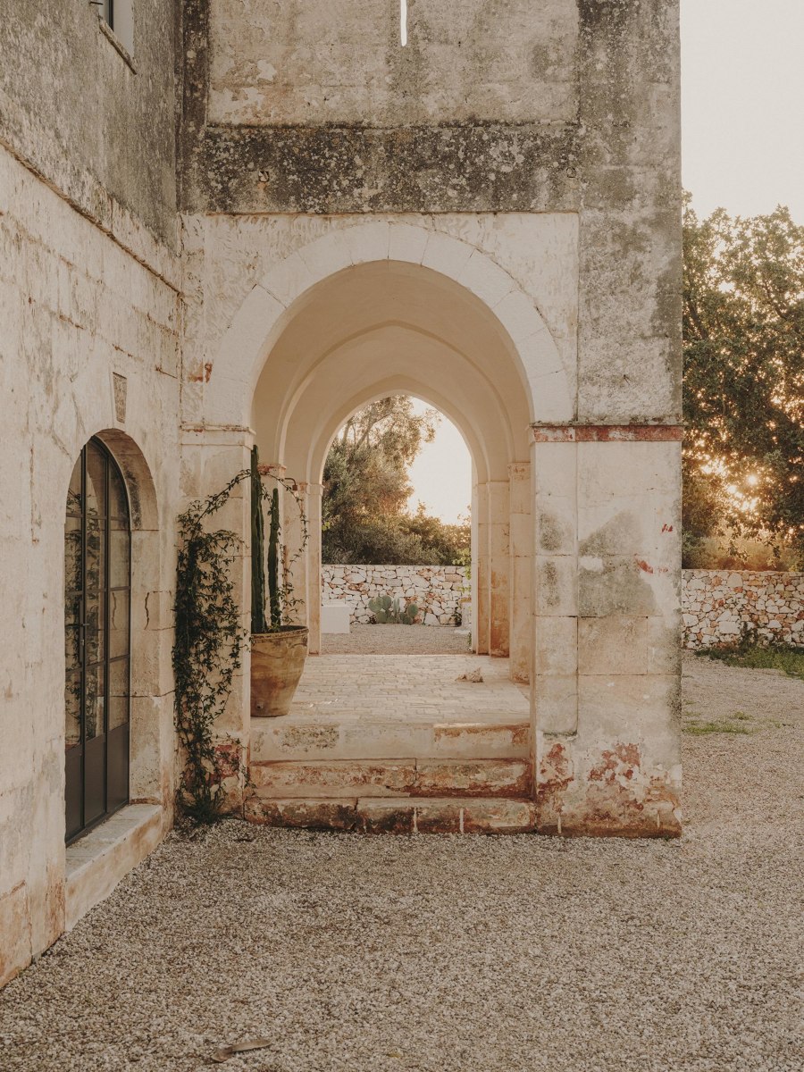
Casolare Scarani House by Studio Andrew Trotter. Photo: Salva López
It was quite unusual to come across a building that had the style of a masseria, but the size of a small villa. We tried as hard as possible to leave the exterior patina where we could. We spent days scraping off flaky paint, to reveal the beautiful stone of the portico. The inside needed to be fully plastered, so we brought in an artisan who makes his own lime plaster and lime paints. All the stones were repositioned, and we also added a new chianca to the floors that matched the old ones perfectly.
Valeria Montjoy, Senior Content Editor:
‘At times, I’ve felt that in this industry there’s an urgency to create more, to emphasise the new, to build from scratch. However, sometimes true beauty (and sustainability) lies in rescuing something that already exists, repurposing it to fit current needs while acknowledging and preserving its past. This project beautifully illustrates this concept. Recognizing its inherent value, architects renovated an abandoned school from the 1960s, transforming it into a home rich in character, material quality and history.’
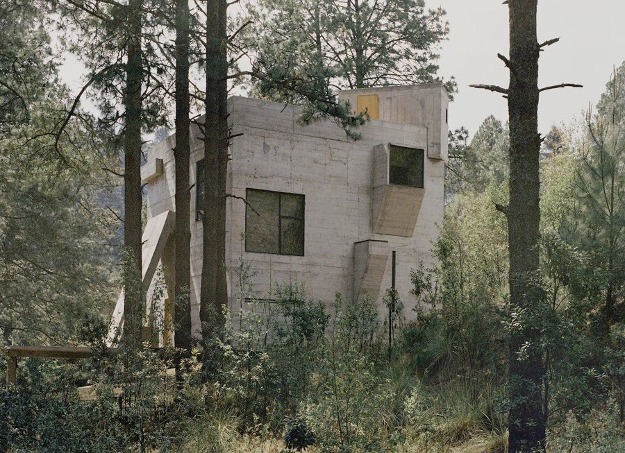
Casa Alférez by Ludwig Godfrey Architecture. Photo: Rory Gardiner
The house takes its origin from the concept of a cabin and the romantic idea of a protective shelter in the middle of the forest. The design of the house is developed based on three main points. 1: The idea of an isolated house in the forest, with a strong sense of security; a house as a safe, made of concrete that defends and takes care of its inhabitants. 2: As compact as possible, with a footprint as small as possible, to avoid a complex and costly foundation. 3: The house increases its height to seek the light among the trees, and a relationship with the top of those majestic pines.
Daniela Porto, Content Operations Manager:
‘This contemporary Mexican home is a twist on the concept of a romantic cabin in the woods. The wide-open interiors, clad in exposed concrete, give it an expansive feel despite its relatively small footprint. Features such as the sunken living room sofa, the simple and almost rustic kitchen, and the integrated concrete elements throughout the house make it an architectural gem nestled in the Mexican forest.’
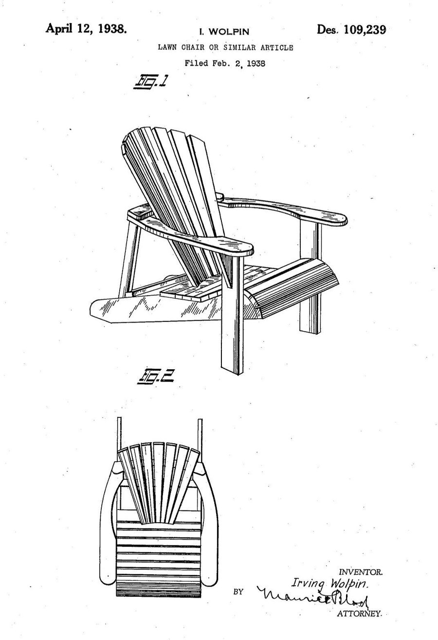
'How the Adirondack chair got its name and restorative reputation'. Photo: US Design Patent 109,239

'How the Adirondack chair got its name and restorative reputation'. Photo: US Design Patent 109,239
×It all began when wealthy city dwellers in late 19th-century New York looked to escape the smog in favour of the restorative mountain air upstate. During a time when tuberculosis had a tight grip on the city, visiting sanatoria to take in the cold, dry air in the mountainous Adirondacks region became known as the ‘Wilderness Cure’ as specialist reclining convalescent chairs were developed as ‘Cure Chairs’. When Thomas Lee designed a chair he and his family could use to sit outside and experience nature in comfort, the resulting chair and its groundbreaking design features went on to become one of the most popular of the new typology.
James Wormald, Organic Content Editor:
'The decision to write this article was based on a personal journey I’d been on ever since I first laid my naive eyes on the classic Adirondack chair. Recalling the surprise I felt on that first sit, I wanted to find out exactly why the hard wooden contraption was, despite appearances, so comfortable. By breaking apart the constituent parts of the chair’s design, it can be argued that sitting – one of my favourite pastimes – is good for you.’
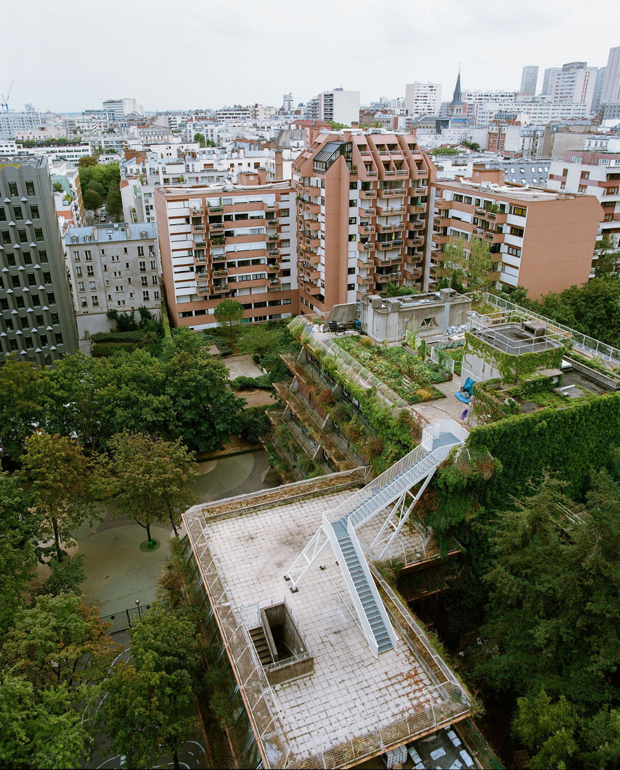
'Urban rewilding: the fight is on to retake green space'. Belvedere Stairs in Paris, France, by Bertrand Taquet Architectes. Photo: Antoine Sequin

'Urban rewilding: the fight is on to retake green space'. Belvedere Stairs in Paris, France, by Bertrand Taquet Architectes. Photo: Antoine Sequin
×To control the urbanisation boom of the mid-20th century, greenbelt policies across many European cities literally ring-fenced the natural environments surrounding them, making air quality and easier access to nature a part of city life. The post-pandemic city, however, is a new breed of conurbation, and these city parks and greenbelts are no longer enough. As we migrate away in search of greener, healthier climes, the cities we’re leaving are evolving, proving they can be green too by exchanging lesser-used black surfaces of roads and structures for natural grass- and parkland.
José Tomás Franco, Head of Brands & Materials:
‘Urgent matter: urban green spaces are key to promoting physical activity, reducing pollution, and improving the mental health of citizens. It has even been stated that green areas are directly associated with a decrease in mortality in cities. In this article, James Wormald presents a series of notable and exemplary projects in Europe that transform disused urban spaces or infrastructures to create new natural green environments, regenerating neighbourhoods, and exponentially improving people's quality of life.’
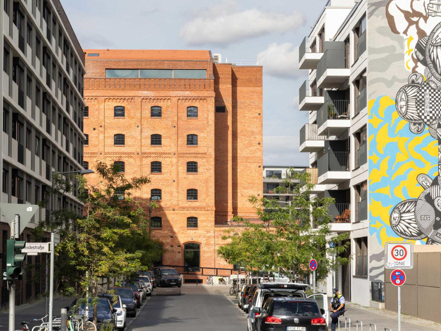
'An industrial landmark offering new perspectives'. Kornversuchsspeicher Extension
In order to secure the food supply for Berlin’s rapidly growing population at the end of the 19th century, the Kornversuchsspeicher was built in 1898 on the former site of the Hamburger and Lehrter freight depots. A building with a scientific mission, it served to research new storage methods for grain. After years of vacancy and then interim use as a creative space, the brick building has been carefully renovated in recent years by AFF Architected, extended with the addition of a seventh floor and transformed into a modern event, gastronomy and office building, with a focus on fully preserving its industrial charm.
Shtiliana Andonova, Project Editor:
‘I really like such transformations of former buildings. It suits Berlin well. No need to build new if we have such an architecture from the past.’
…
© Architonic
Head to the Architonic Magazine for more insights on the latest products, trends and practices in architecture and design, or find inspiration in a whole world of projects from around the globe through ArchDaily’s architecture catalogue.
