Five projects that top it all off with unique ceiling designs
Scritto da James Wormald
07.04.22
These five projects encourage visitors to keep looking up. Using different materials and techniques, they turn the mundanity of flat, boring ceilings into special, individual surfaces to gaze up at.
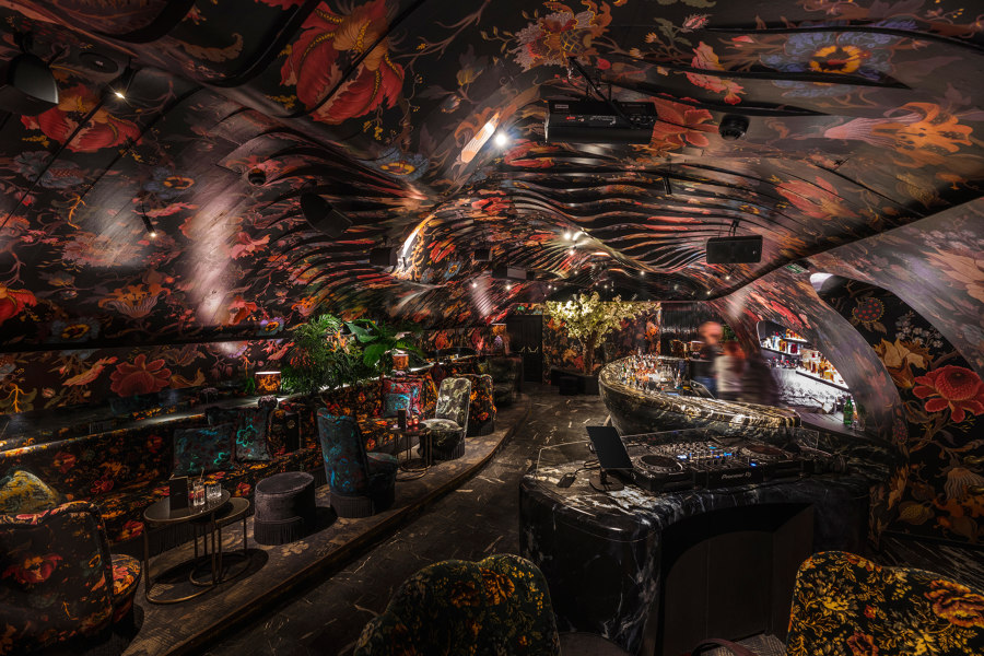
Söhne&Partner Architects' undulating lenticular ceiling at the Sechser bar and nightclub in Vienna, Austria. Photo: Severin Wurnig

Söhne&Partner Architects' undulating lenticular ceiling at the Sechser bar and nightclub in Vienna, Austria. Photo: Severin Wurnig
×Making up a third of the visible interior, ceilings are an axis unaffected by distracting furniture or architectural elements such as doors or windows, yet are rarely considered as a creative design element.
Often left exposed in an honest architectural style with pipework and rigging out for all to see, modern ceilings are at least treated with respect for their exposed location, so influential to a building’s heating, cooling, airflow and acoustics. But in all that science, some of the artistry has been lost. These five recent interior projects show just what’s possible to achieve with creative ceiling design, encouraging visitors to look up and take in the surroundings above them.
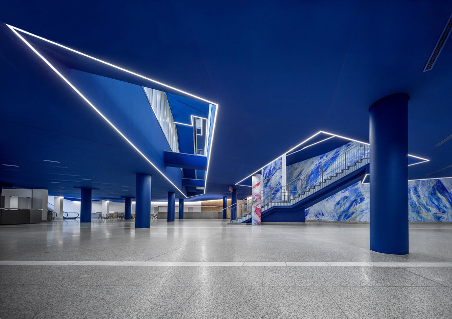
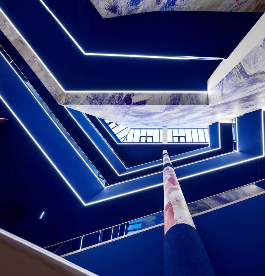
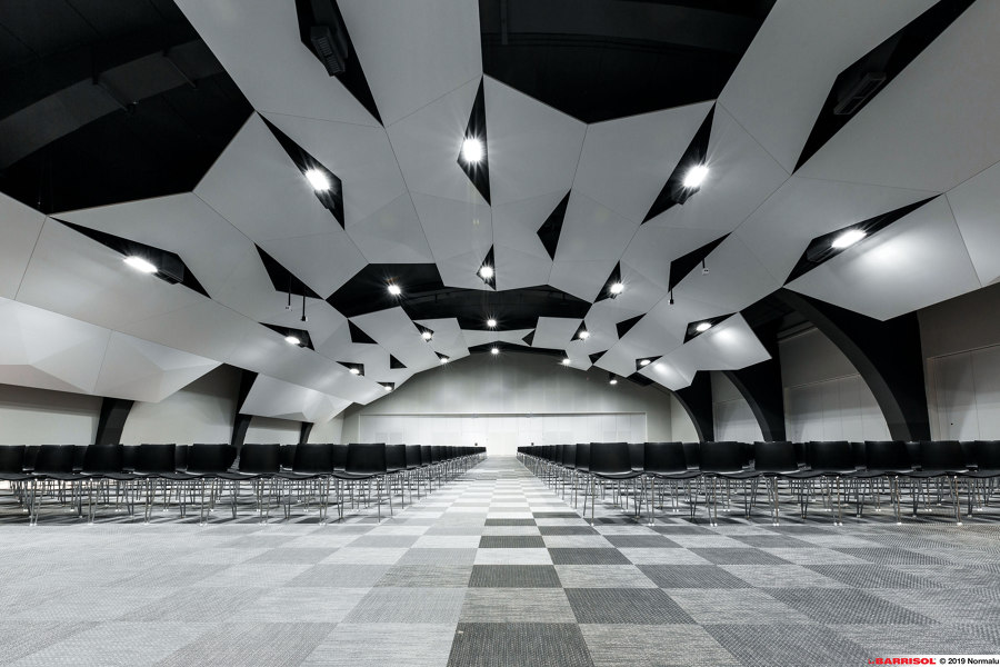
The Liederhall Culture and Conference Centre outlines its blue ceiling voids with LED strips (top, middle) and Barrisol's stretched membrane ceiling panels (bottom). Photo: Florian Selig, Berlin (top, middle)

The Liederhall Culture and Conference Centre outlines its blue ceiling voids with LED strips (top, middle) and Barrisol's stretched membrane ceiling panels (bottom). Photo: Florian Selig, Berlin (top, middle)
×Light
Vibrant, colourful interiors are often combined with stark white ceilings to give rooms the effect of more height. At the Liederhall Culture and Conference Centre, however, lighting designers pfarré lighting design have employed an opposing tactic. The bright blue ceiling and pillars are interrupted by voids in the ceiling, exposing the rest of the building’s upper levels to the foyer, with LED strips embedded into the ceiling surface to enhance its geometric negative space.
The effect creates a unique atrium that blends natural light and secondary light from above, with the more immediate and precise artificial light on the ground floor. The combination of light and negative space can enhance a ceiling without the need to expose the rest of the building, however. Barrisol’s range of bespoke or modular ceiling-mounted membranes, for example, can take any shape, leaving the remaining negative space behind.
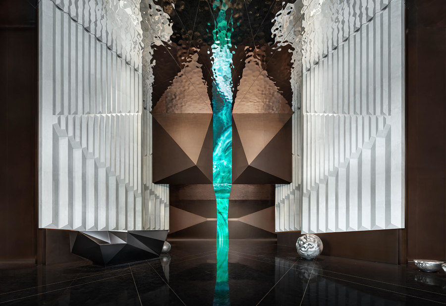
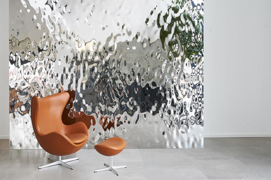
The W Changsha hotel's rippling liquid ceiling panels (top) and similar solutions from Lindner Group's TOUCHdesign range (bottom). Photo: Wang Ting (top)

The W Changsha hotel's rippling liquid ceiling panels (top) and similar solutions from Lindner Group's TOUCHdesign range (bottom). Photo: Wang Ting (top)
×Liquid
When is a light source not really a light source? When it’s reflective. While some mirrored ceilings can bring connotations of seedy hotel rooms, the reality of an honest reflection is far less interesting, only serving to frame the ubiquitous but tedious scene below. Natural-looking warped liquid ceilings, however, like those created by Lindner Group’s TOUCHdesign range, reflect light but leave the rest to the imagination.
The luxurious liquid ceiling featuring prominently at CCD / Cheng Chung Design’s W Changsha hotel in Changsha, Hong Kong, meanwhile, is just one solution in a project full of intriguingly experimental surfaces including perforated, parametric, backlit and diagrid walls and ceilings. It’s the shimmering, distorted reflection of the liquid ceiling, however, that makes the hotel’s communal spaces really shine.
Budapest's House of Music (top) and its decorative metal leaf ceiling, and REDFORT's Lace Fence panels provide intricately decorated ceiling panels of their own. Photo: ©LIGET BUDAPEST_Palkó György

Budapest's House of Music (top) and its decorative metal leaf ceiling, and REDFORT's Lace Fence panels provide intricately decorated ceiling panels of their own. Photo: ©LIGET BUDAPEST_Palkó György
×Metal
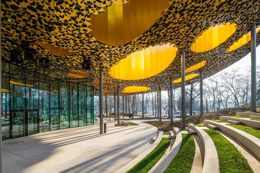
Using the same industrial material to create an intricate imitation of nature, Sou Fujimoto Architects filled the underside of the House of Music’s huge lid in Budapest, Hungary, with 30,000 decorative metal leaves. ‘We were enchanted by the multitude of trees in the City Park and inspired by the space created by them,’ shares lead architect Sou Fujimoto, ‘whilst the thick and rich canopy covers and protects its surroundings, it also allows the sun’s rays to reach the ground.’
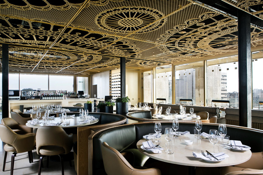
Another way to create ceiling patterns with intricate three-dimensional detailing, is with two-dimensional line patterns. REDFORT’s bespoke Lace Fence panels can form suspended ceilings that also catch and distribute the light in magical ways.
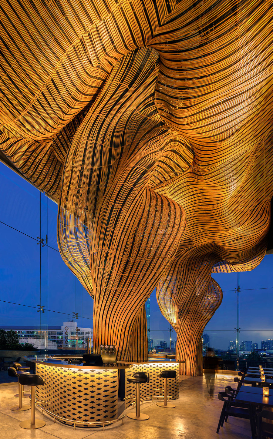
Spice and Barley's twin rattan vortexes, twisting themselves together into a stormy wooden ceiling (top, middle) and Lindner Group's COMPwood panels. Photo: William Barrington Binns (top, middle)

Spice and Barley's twin rattan vortexes, twisting themselves together into a stormy wooden ceiling (top, middle) and Lindner Group's COMPwood panels. Photo: William Barrington Binns (top, middle)
×Wood
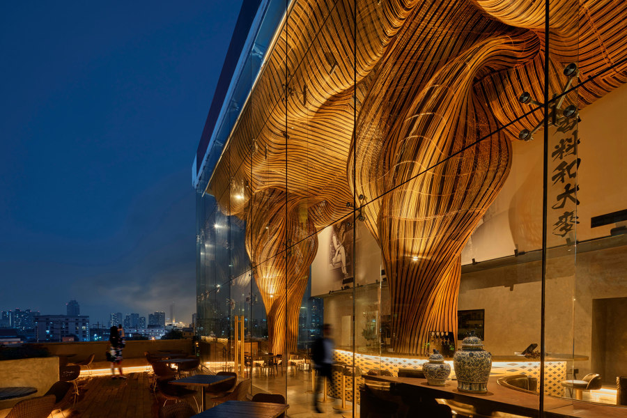
You don’t always need to imitate nature to appreciate it. The Spice and Barley bar and restaurant in Bangkok, Thailand, marries Belgian craft beers together with complementary Sichuan cuisine, while the ambient space’s imposing wooden ceiling similarly combines two functions. The two swirling vortexes of strong yet pliable rattan construction encase the bar’s beer and air-conditioning pipes, before rising up to flood the ceiling with their twisting, dancing form and blend together both light and shadow.
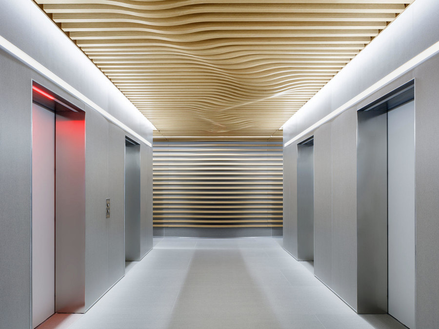
By combining both wood and metal, meanwhile, Lindner Group’s COMPwood panels create flowing, undulating forms of their own, combining lightweight aluminium panels with real wood veneers to achieve dimensional stability.
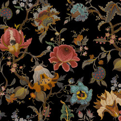
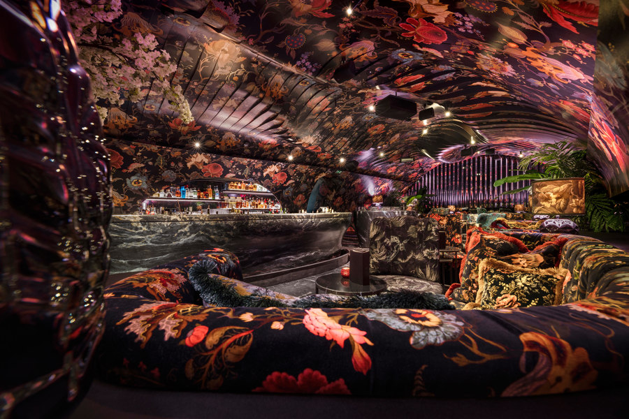
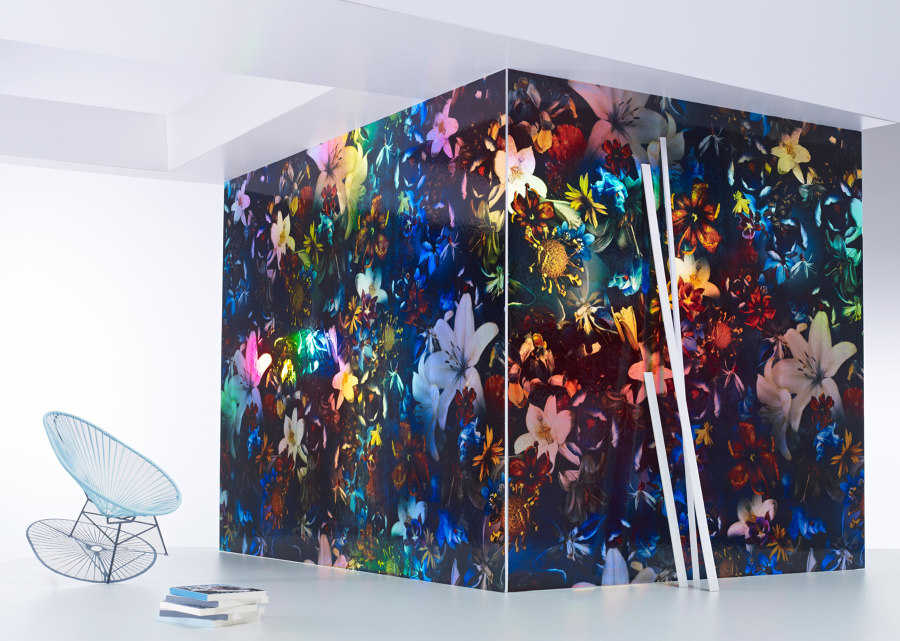
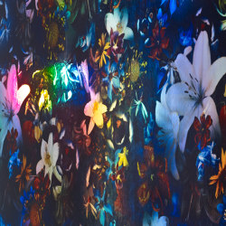
The Sechser's House of Hackney printed ceiling, walls and fabric (top) and Jakob Schlaepfer's Holo Faye digitally printed wallpaper and ceiling covering (bottom). Photo: Severin Wurnig (top)

The Sechser's House of Hackney printed ceiling, walls and fabric (top) and Jakob Schlaepfer's Holo Faye digitally printed wallpaper and ceiling covering (bottom). Photo: Severin Wurnig (top)
×A similar rippling ceiling has been used by Söhne&Partner Architects to enclose revellers in an underground level of the Sechser bar and nightclub in Vienna, Austria. A three-dimensional lenticular image is created by printing onto the separated sections, and this feature changes each visitors’ impression of the space in tune with their movement.
When the venue’s walls and furniture are adorned with the same House of Hackney printed wallpapers and fabrics, Artemis, a cave of wonders is created in the sub-surface environment. Along with House of Hackney’s sumptuous and fertile prints, manufacturers like Jakob Schlaepfer also create lavish and vibrant designs, such as Holo Faye, for fabrics and coverings for walls and ceilings.
© Architonic
