How to get the most out of maximalism
Scritto da James Wormald
07.06.22
A tricky style to achieve, maximalism is as unique to each user as their own personality. Get it wrong and it’s easy to feel exposed and unfulfilled. Here are some examples that get it right.
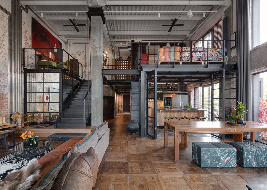
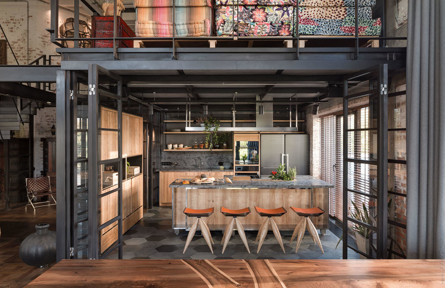
Loft buro’s Hayloft interior combines various textures, materials, finishes and styles that attack the senses. Photo: Andrey Avdeenko

Loft buro’s Hayloft interior combines various textures, materials, finishes and styles that attack the senses. Photo: Andrey Avdeenko
×Home interiors are a useful outlet for the style-conscious to present themselves to others in the way they want to be seen, from employing the most opulent fabrics and colours, to housing exotic, curated treasures and showcasing the latest tech innovations. For those with the confidence to present themselves as they truly are, however, the personalised comfort of maximalism awaits.
Maximalism is the positive affirmation of our personality and character. It’s having the bravery to say this is who I am, and this is what I like
What is maximalism?
If minimalism was born from a desire to present our lives as sleek and effortless, hiding away our hectic lifestyles, maximalism is alternatively, the positive affirmation of our personality and character. It’s having the bravery to say this is who I am, and this is what I like.
How do you make maximalism work?
The answer is simple – do what you like – the practice is not. The first step to achieving maximalism success is to accept it as a style choice, not just an excuse to clutter. Knowing, respecting and having the confidence in your own design choices is at the heart of the maximalism movement, but the theory is far easier than the practical part, and it can be hard to know where to start. Here are some considerations and relative examples:
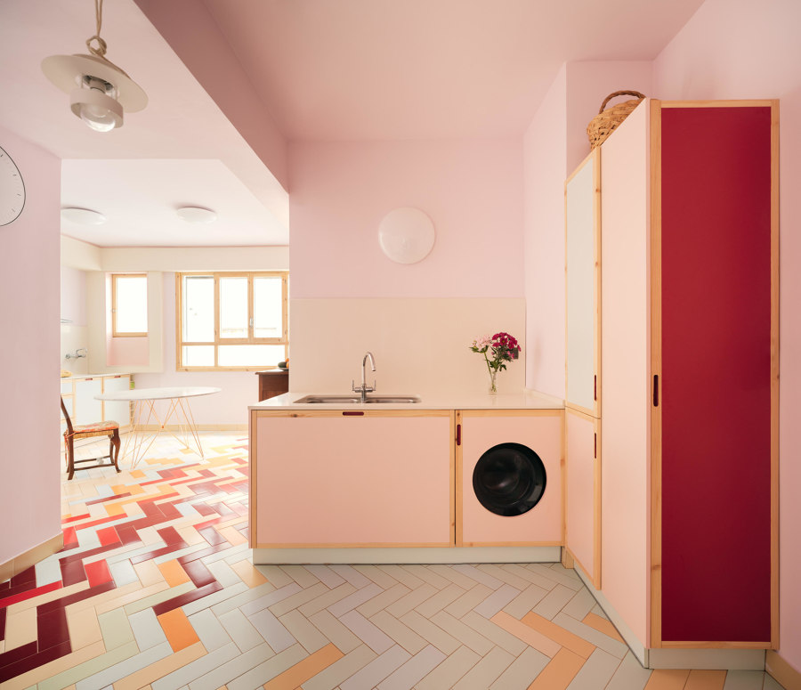
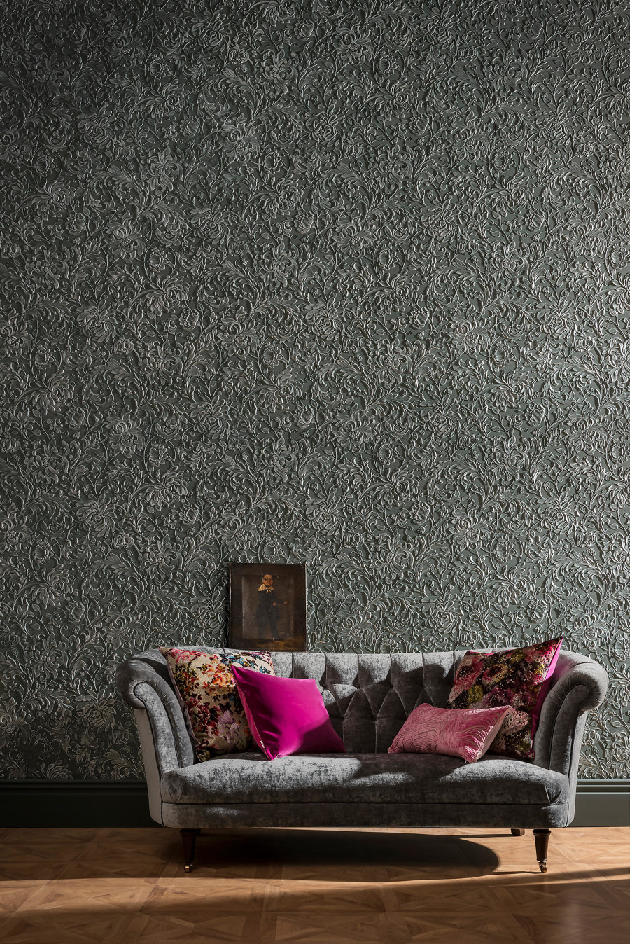
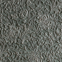
AZAB’s Mixtape apartment (top) with customised patterns in the floor tiles, and Lincrusta’s Kelmscott relief wallpaper bringing rich flavour to the walls (bottom). Photo: Luis Díaz Díaz (top)

AZAB’s Mixtape apartment (top) with customised patterns in the floor tiles, and Lincrusta’s Kelmscott relief wallpaper bringing rich flavour to the walls (bottom). Photo: Luis Díaz Díaz (top)
×Play with patterns
Rules? Where we’re going, we don’t need rules.
One of the biggest lessons of maximalist design is to rip up the rule book on what you ‘thought’ was acceptable. Colour? Pattern? Texture? Yes, yes and yes, please! As long as it’s right for you, the bolder, brighter and more extravagant the better, just don’t hold back. By dismissing the calming, neutral walls rule with darker relief wallpaper such as Kelmscott by Lincrusta, for example, specifiers give rooms a rich flavour that welcomes the addition of even bolder colours or patterned accents.
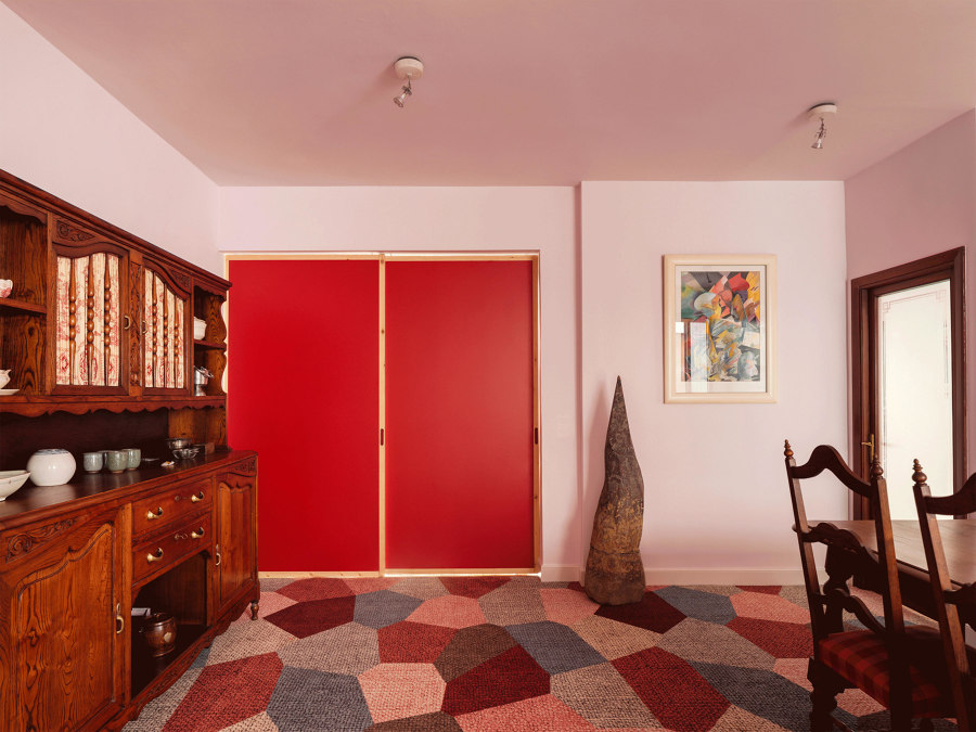
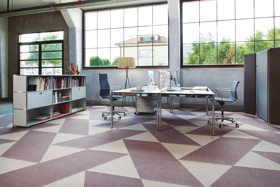
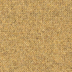
The Mixtape apartment combines intricate antique furniture with contemporary colourful sliding doors and geometric carpet tiles (top) like Rollerwool from Ruckstuhl (bottom). Photo: Luis Díaz Díaz

The Mixtape apartment combines intricate antique furniture with contemporary colourful sliding doors and geometric carpet tiles (top) like Rollerwool from Ruckstuhl (bottom). Photo: Luis Díaz Díaz
×As another example, the Mixtape apartment by AZAB combines the intricate detail of traditional furnishings with the reserved simplicity of colourful kitchen cabinets and sliding doors. Both colour and design palettes, meanwhile, are connected through various flooring from original parquet to customised tile patterns and carpet tiles like Ruckstuhl’s Rollerwool with geometric patterns.
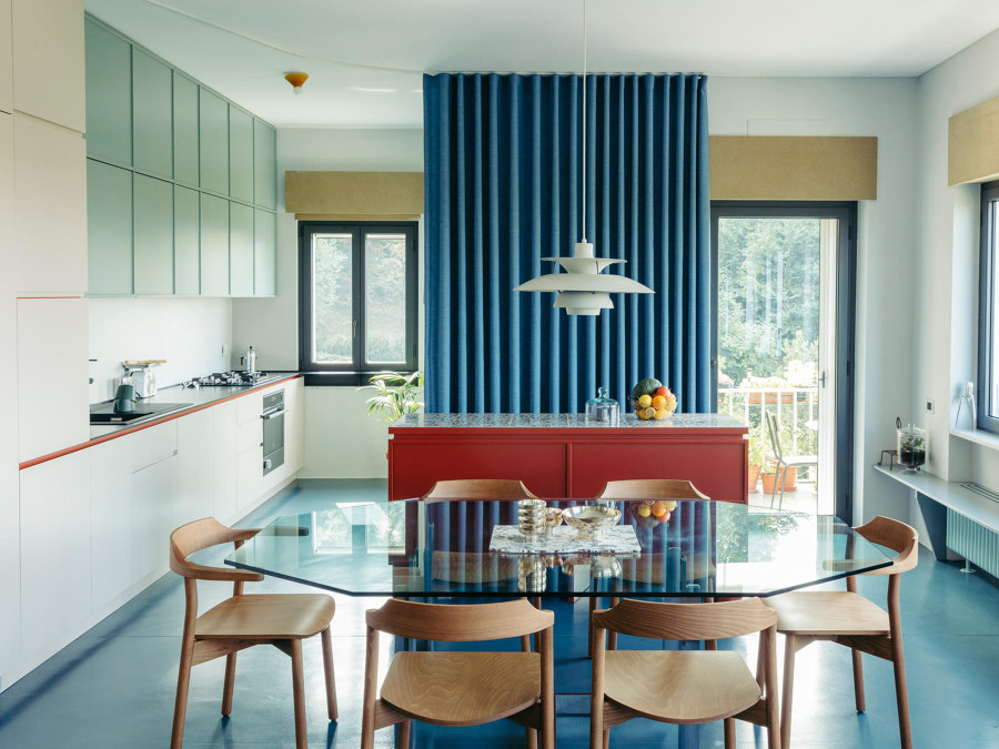
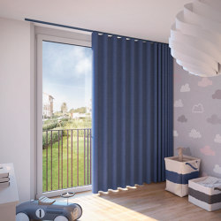
The curtains at Plac - Plateau Collaboratif’s Casa Tre Viste separate areas and cover walls (top), while Silent Gliss curtains (bottom) can be used for the same purpose. Photo: Mattia Balsamini (top)

The curtains at Plac - Plateau Collaboratif’s Casa Tre Viste separate areas and cover walls (top), while Silent Gliss curtains (bottom) can be used for the same purpose. Photo: Mattia Balsamini (top)
×Unexpected materials
Another way to think outside the box, is to change what’s in front of it. Designers Plac - Plateau Collaboratif had a lot of fun with colour and materials at Casa Tre Viste, using thick, soft curtains in bold colours to hide and reveal specific areas, storage or even just bare walls. With ceiling-recessed curtain tracks like this from Silent Gliss, users can alternate any scene with a backdrop of three-dimensional fabric.
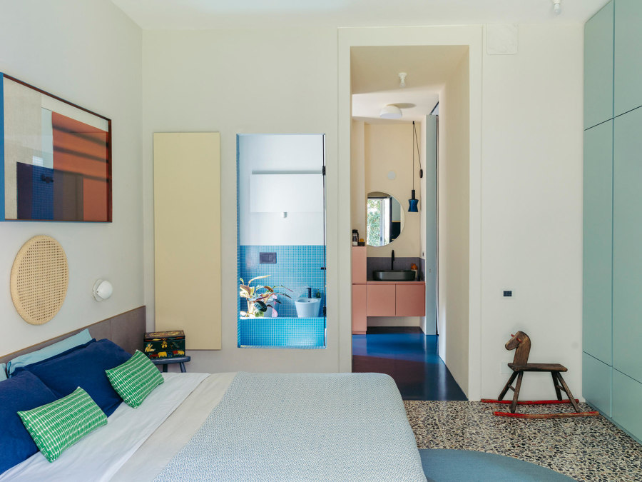
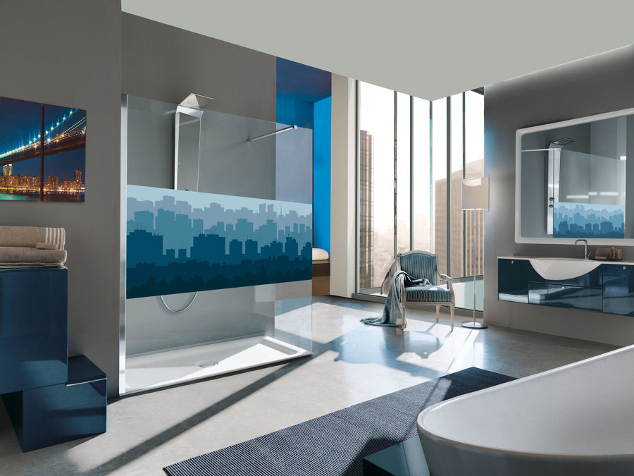
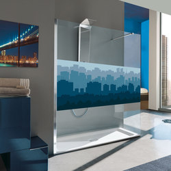
Casa Tre Viste’s wall-set shower door connects the bedroom to its ensuite’s shower space (top) and Samo’s digital-printed screens (bottom) both cover and decorate. Photo: Mattia Balsamini (top)

Casa Tre Viste’s wall-set shower door connects the bedroom to its ensuite’s shower space (top) and Samo’s digital-printed screens (bottom) both cover and decorate. Photo: Mattia Balsamini (top)
×Elsewhere in the home, a shower door invites the ensuite’s vibrant blue mosaic into the adjoining bedroom, giving access on both sides of the shower. Samo’s digital-printed shower screens similarly keep users’ modesty intact while allowing the fixture’s door to provide an additional decorative element.
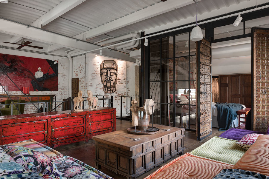
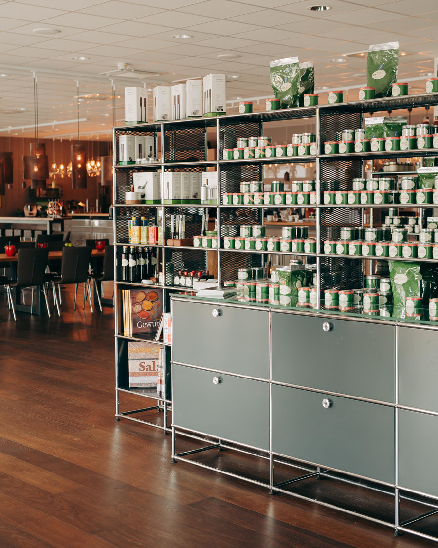
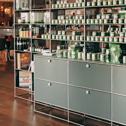
Loft Buro’s open-plan Hayloft (top, middle) combines textures, materials and finishes, and USM’s Haller shelving exemplifies open and closed storage. Photos: Andrey Avdeenko (top, middle)

Loft Buro’s open-plan Hayloft (top, middle) combines textures, materials and finishes, and USM’s Haller shelving exemplifies open and closed storage. Photos: Andrey Avdeenko (top, middle)
×Layer upon layer
Specifiers seeking credibility combine preferred styles and personal objects across multiple layers for authentic visual depth. Loft Buro’s Hayloft in Kyiv, for example, uses raw black ironwork to form a skeleton room structure, keeping the home’s individual decor in view and inspiring the project’s palette of exposed surfaces.
We’re all complicated, three-dimensional characters, and our tastes are no different
An eclectic mix of raw, weathered and textured colours, patterns, materials and finishes form an initial layer, behind collections of accumulated sculptures and treasured antiques that sit humbly in the middle ground. By combining open and closed storage like USM’s Haller shelving in the kitchen, for example, selected dinnerware pieces are highlighted while the more unseemly items remain hidden. A third layer of eye-catching artworks, one-off pieces and sculptures jump into the interior to snatch the attention of visitors, often using furniture surfaces as plinths.
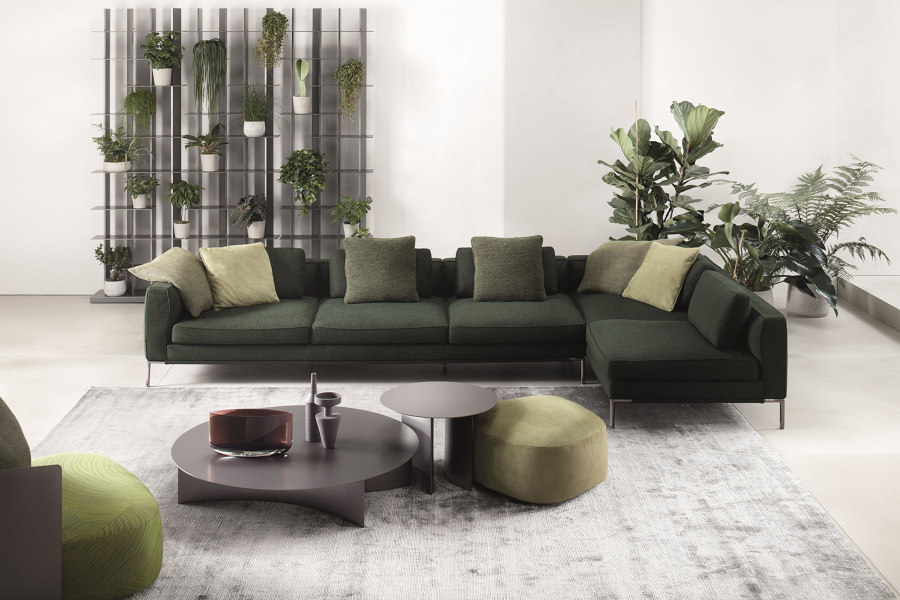
Superlimão’s RF Apartment (top) mixes modular seating like flou’s icon sofa (bottom) with other contemporary, traditional and local styles. Photo: Maíra Acayaba (top)

Superlimão’s RF Apartment (top) mixes modular seating like flou’s icon sofa (bottom) with other contemporary, traditional and local styles. Photo: Maíra Acayaba (top)
×Mix not match
We’re all complicated, three-dimensional characters, and our tastes are no different. In order to be true to yourself and your personal style, a diverse range of styles, colours and eras must be followed. So if you like the simplicity of a low, modular sofa, for example, don’t be afraid to combine it with additional, more intricate or classic options.
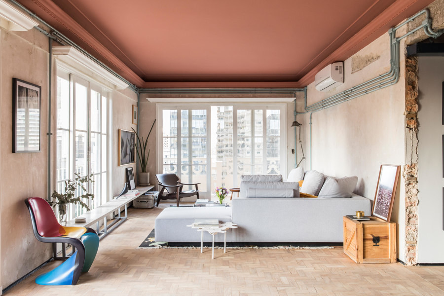
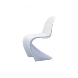
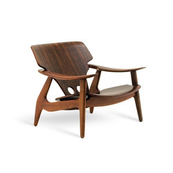
This free combination of favoured styles is one that the RF Apartment in Brazil achieves with expert ease, complementing its modular sofa, itself similar to the icon sofa from flou, with a modern take on a traditional rug, the sensual lines of Vitra’s classic Panton chair and even a local hero in LinBrasil’s wooden diz armchair.
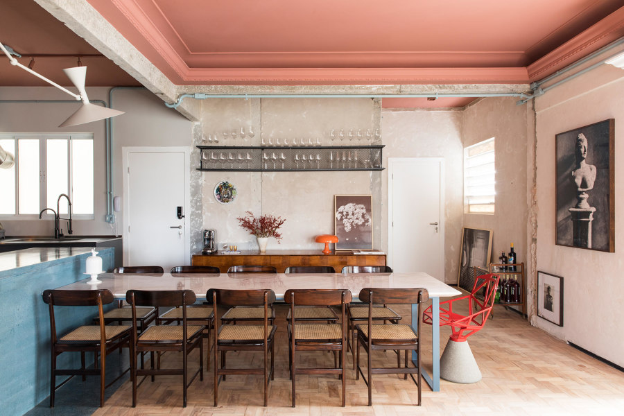
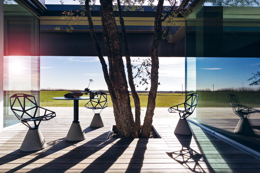
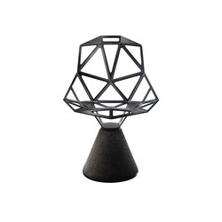
Unexpectedly paired at RF Apartment’s dining table (top) are the local craft of LinBrasil’s Lucio chairs alongside Magis’ die-cast One chair (bottom). Photo: Maíra Acayaba (top)

Unexpectedly paired at RF Apartment’s dining table (top) are the local craft of LinBrasil’s Lucio chairs alongside Magis’ die-cast One chair (bottom). Photo: Maíra Acayaba (top)
×Similarly juxtaposed combinations can be found wherever you care to look in the project, with colourful, detailed ceilings joining exposed pipework, sanded walls and stripped brickwork, and the woven seat of LinBrasil’s simple wooden Lucio chairs seated alongside Magis’ futuristic die-cast One chair.
It’s the places others don’t like, that we really love
Some may say it’s a gaudy, untidy clash of messy styles, colours, patterns and textures, a tactile cacophony that attacks the senses from all sides, and gives them nothing but a headache. But that’s OK. Not everyone has to like it and not everyone will. It’s the places others don’t like, that we really love.
© Architonic
