How to organise a kitchen with good design
Scritto da James Wormald
15.08.22
More than just cookware and food storage, kitchens hold all manner of essential household items. Here’s how to keep on top of it all, with places for everything, and everything in its place.
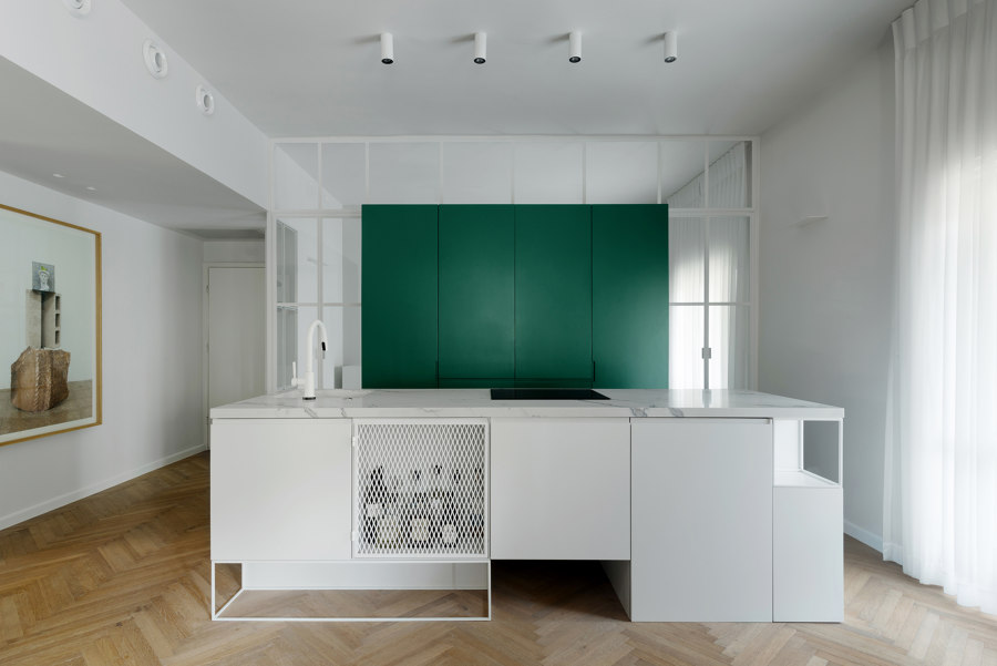
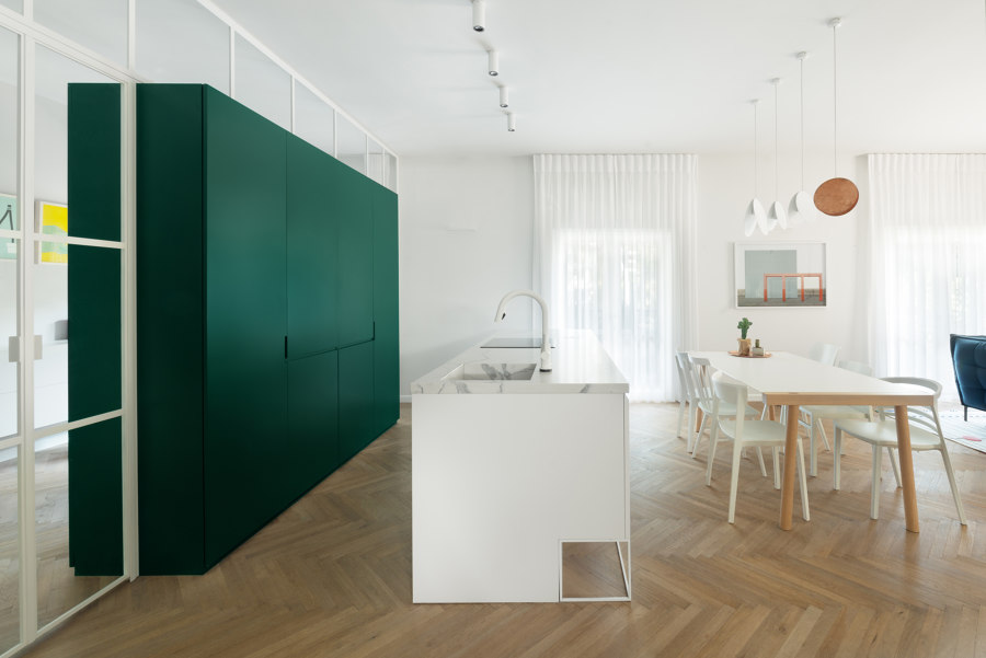
This Tel-Aviv apartment sections off an additional family area with full-height kitchen storage serving as partitioning. Photo: Gidon Levin

This Tel-Aviv apartment sections off an additional family area with full-height kitchen storage serving as partitioning. Photo: Gidon Levin
×Whether for large multi-generational families, cohabiting cohorts or retired couples, the kitchen is the heart of our homes. It’s where we spend most of our time and, therefore, where we keep all our stuff. Along with the usual food and cookware, kitchens are also resting places for household utility essentials like cleaning products, laundry facilities and the infamous ‘everything drawer’.
It is possible, however, to achieve organisational nirvana in the kitchen without living the monk-like lifestyle of an extreme minimalist. Here’s how to design a kitchen that’s well organised and, more importantly, stays that way.
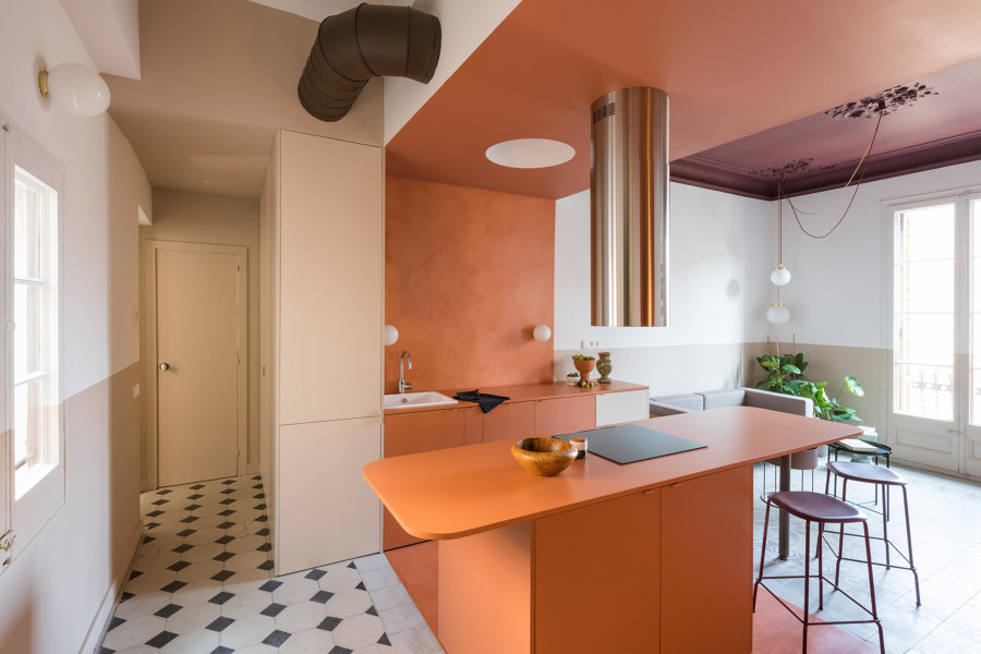
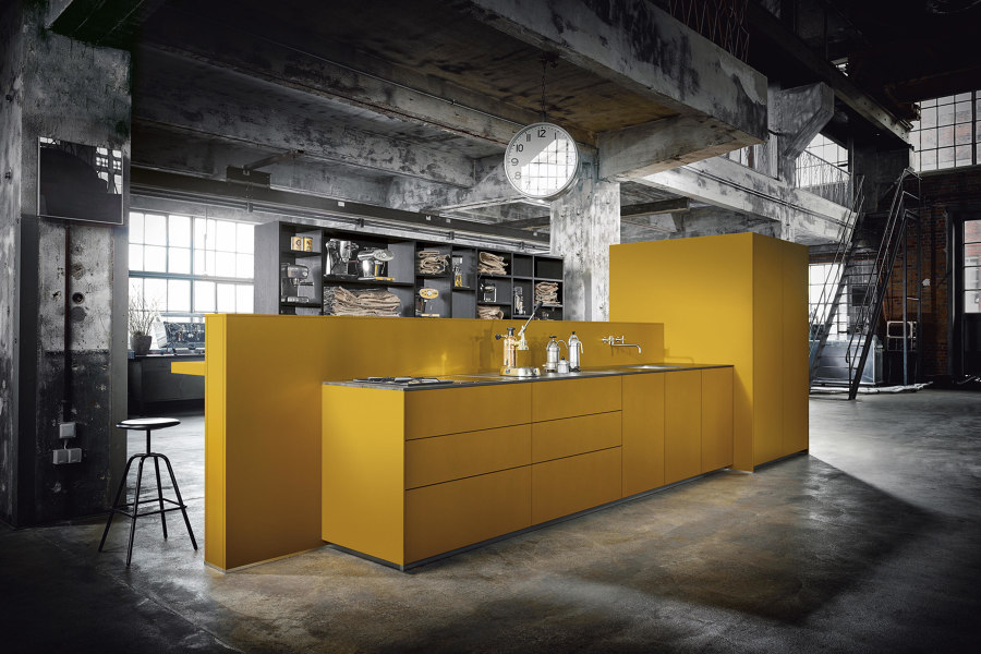
The Klinker apartment splits storage with contrasting colours (top), while Next125’s vibrant colours for NX 505 include Saffron yellow (middle), Jaguar green (bottom) and others. Photo: Roberto Ruiz

The Klinker apartment splits storage with contrasting colours (top), while Next125’s vibrant colours for NX 505 include Saffron yellow (middle), Jaguar green (bottom) and others. Photo: Roberto Ruiz
×Divide and conquer: separate space by function
First, categorise items based on how often, and for what purpose, they’re used. Then, position them closest to where they’re needed. Keeping food and prepware near the counter, cookware beside the hob and tableware pointed at the table sounds simple and obvious and it is but keeping to the system is not.
At the Klinkers’ family vacation apartment in Barcelona, the kitchen has been naturally divided from the rest of the open space by applying a central strip of terracotta through the floor plan. With little room to store the few objects required for a short stay, the Californian family are quickly reminded where things go, with cupboards on the outer edges of the kitchen units kept chromatically separated.
The family are quickly reminded where things go, with cupboards on the outer edges of the kitchen units kept chromatically separated
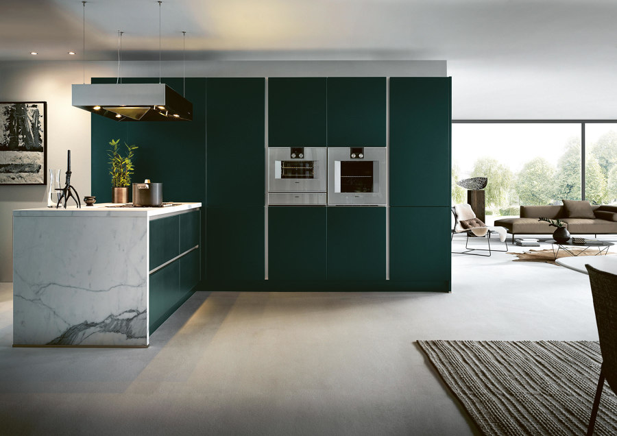
Serving this requirement for colour-coded kitchen storage, Next125’s NX 505 range is available in bright shades of satin lacquer, while Samsung has even released a fridge/freezer with interchangeable coloured doors.
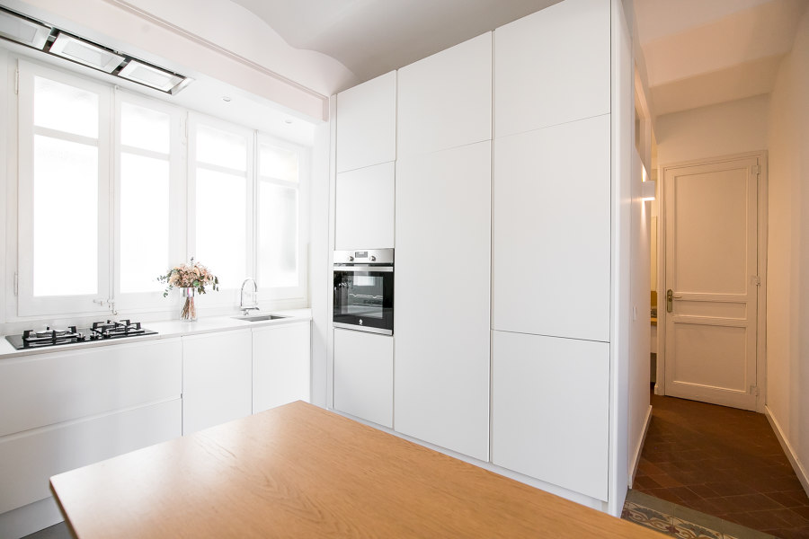
Both the Tel-Aviv (top) and Gracia (bottom) apartments choose full-height storage cabinets beside a worktop island or table. Photos: Gidon Levin (top), Nina Cortadellas (bottom)

Both the Tel-Aviv (top) and Gracia (bottom) apartments choose full-height storage cabinets beside a worktop island or table. Photos: Gidon Levin (top), Nina Cortadellas (bottom)
×Island life: move workspace off the wall
The best way to improve the functionality of kitchen storage, is to have more of it. It sounds simple, and frustratingly unattainable, but most kitchens actually lose storage space cheaply by cutting it out to replace with worktops. Take this small apartment in Tel-Aviv as an example: in an awkwardly long, thin open plan, the architects have used floor-to-ceiling cabinetry as partitioning, forming an additional family room by moving the kitchen to its central location. Set in contrasting dark green, storage is kept all together, while an island points the kitchen’s workspace affably towards the main living area.
The best way to improve the functionality of kitchen storage is to have more of it
In the even smaller Gracia apartment in Barcelona, meanwhile, the L-shaped kitchen worktop has been sacrificed for more storage, while a multi-functioning dining table/island makes it up elsewhere. With integrated storage, the table can usefully keep its own wares close at hand, helping it transform quickly, from one vocation to another.
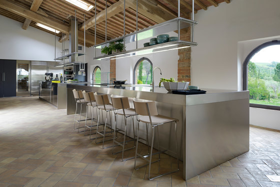
Cesar’s 22cm-deep Dressup kitchen cabinets (top) and drop-down over-island storage from Arclinea in Tuscany (bottom) both provide additional storage solutions for kitchen islands

Cesar’s 22cm-deep Dressup kitchen cabinets (top) and drop-down over-island storage from Arclinea in Tuscany (bottom) both provide additional storage solutions for kitchen islands
×Access all areas
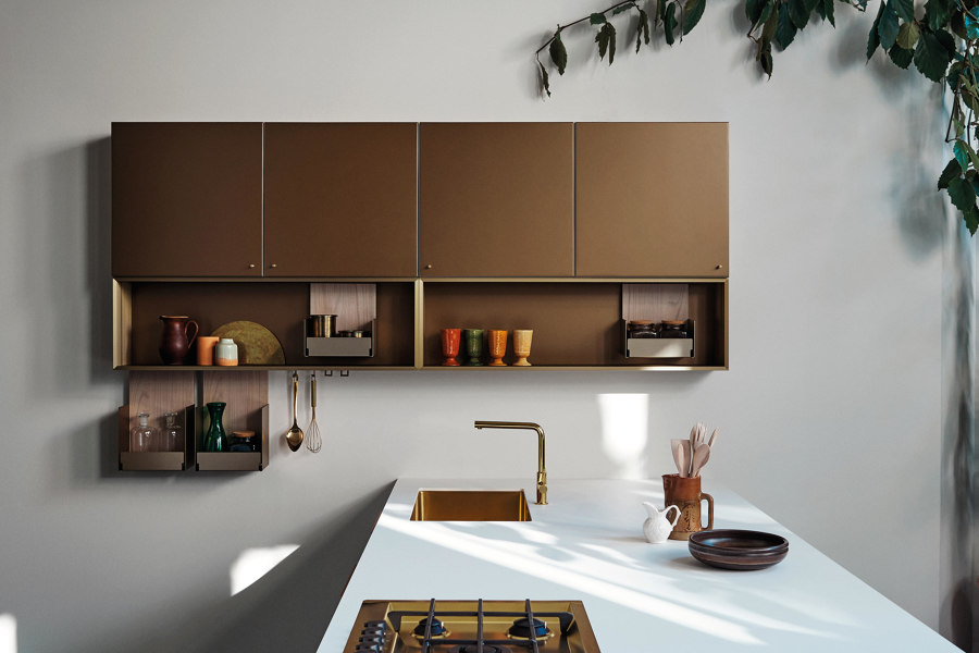
The kitchen-island lifestyle is in high demand, even in smaller projects, leaving some to push the boundaries of what’s comfortably usable. If kitchen width is minimal, consider saving a few inches with shallow cabinetry like Dressup from Cesar, measuring just 22 cm, back to front. While there’s a reduction in sqm, the visual and easily accessible first layer remains the same. To counter the lost storage space for larger objects, meanwhile, double shelf over-island storage keeps items right where they’re needed most in this private Tuscan home, for example, with shelved cookware and the most common ingredients at the users’ fingertips.
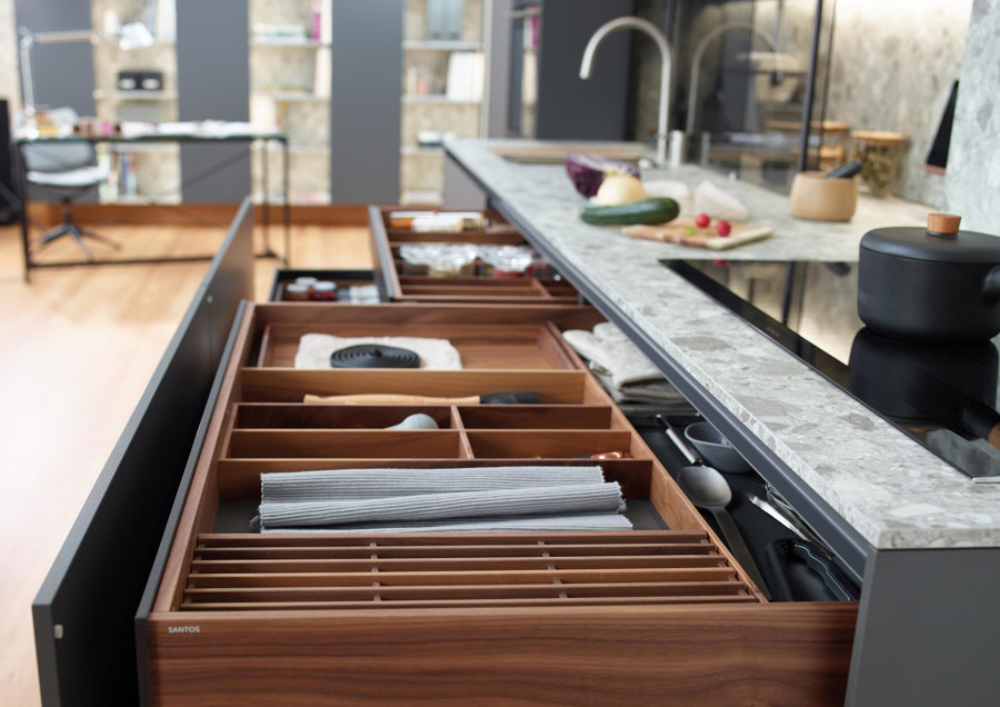
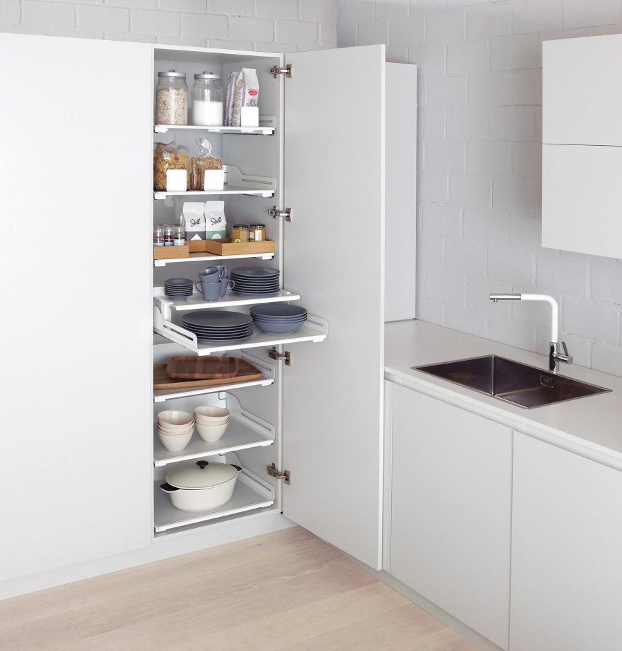
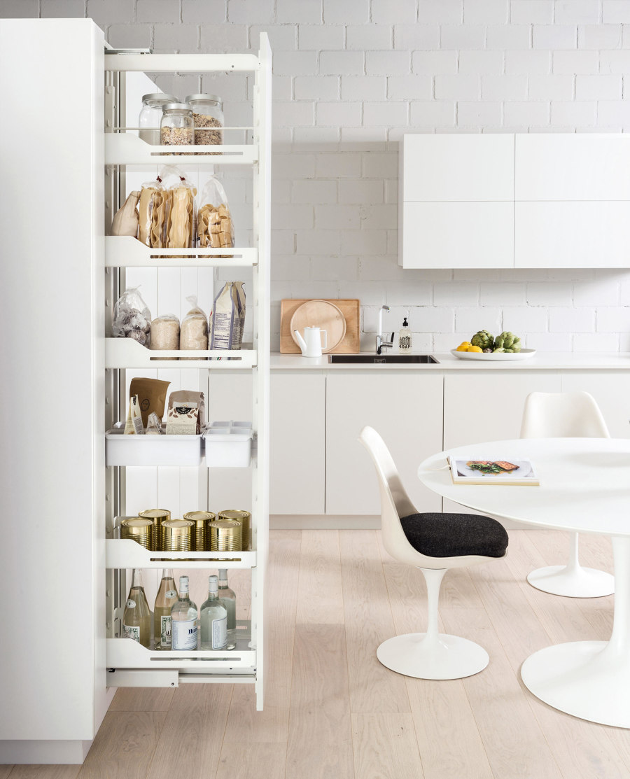
Santos’ FINE customisable drawer inserts (top) as well as Peka-system’s Extendo pull-out shelves (middle) and Hochschrank pull-out cabinets (bottom) bring easy access to all objects

Santos’ FINE customisable drawer inserts (top) as well as Peka-system’s Extendo pull-out shelves (middle) and Hochschrank pull-out cabinets (bottom) bring easy access to all objects
×Sometimes, however, the issue is not too little storage, but too much. Most of the additional space in deeper cupboards is out of sight and hard to reach, making it a breeding ground for forgotten foodstuffs and thriving potato farms. But customisable in-drawer organisational structures like FINE Customisable from Santos ensure everything stays in the right place, while Peka-System’s pull-out larders make space for everything, giving access to even the darkest depths of the cupboard. The Swiss brand’s Extendo unit features individual pull-out shelves, while the slim Hochschrank doors pull an entire unit out at once.
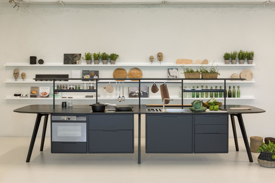
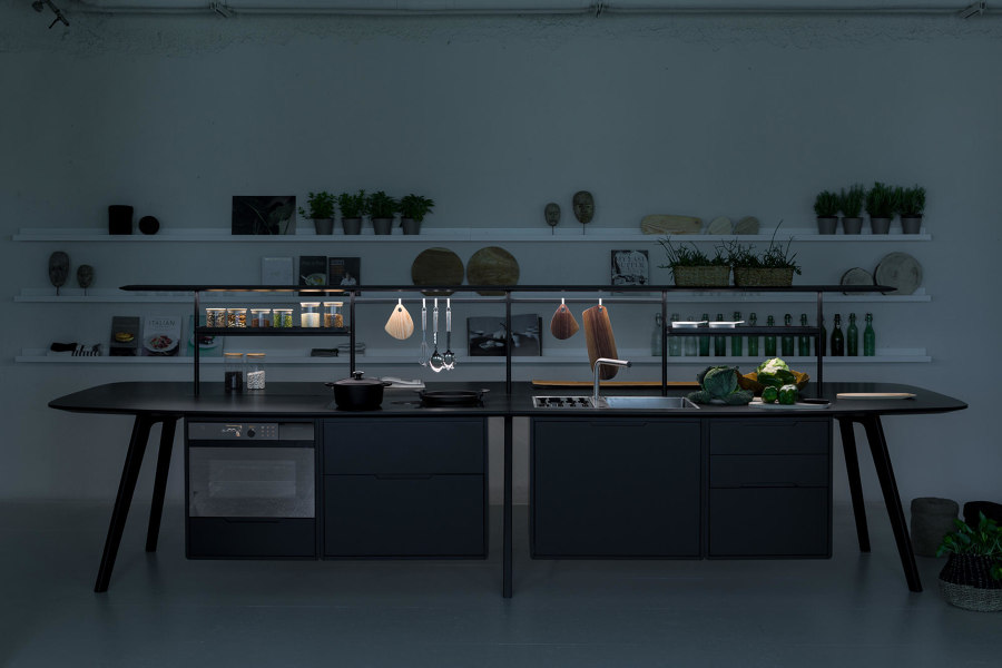
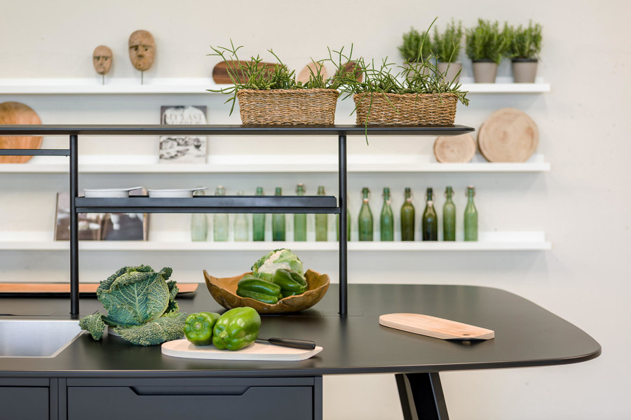
Bora’s Wing Kitchen uses the central channel of its office desk to position shelving, lighting and power, re-categorising the product as a kitchen island. Photos: True Design | Parisotto+Formenton

Bora’s Wing Kitchen uses the central channel of its office desk to position shelving, lighting and power, re-categorising the product as a kitchen island. Photos: True Design | Parisotto+Formenton
×Treat kitchens like workspaces
We can improve the functionality of the kitchen space, meanwhile, by applying the same design knowledge from highly efficient office workspaces, to improve the cooking experience. Commonly used desks in office environments feature a central reservation to house power cables and attach acoustic screens, but the clean, obstacle-free work area that remains is also a fit-for-purpose worktop surface. Bora’s Wing kitchen concept island, originally designed as an office desk, uses this narrow channel to place a shelving unit with power outlets and integrated lighting, and spaces for commonly used ingredients and vital tools, like spice racks, knives and chopping boards.
© Architonic
