White kitchens that leave their mark in changing Spanish homes
Scritto da James Wormald
05.06.23
These white, light and bright Spanish kitchen renovations are effortlessly clean and simple, proving a lack of colour doesn’t have to mean a lack of flavour.
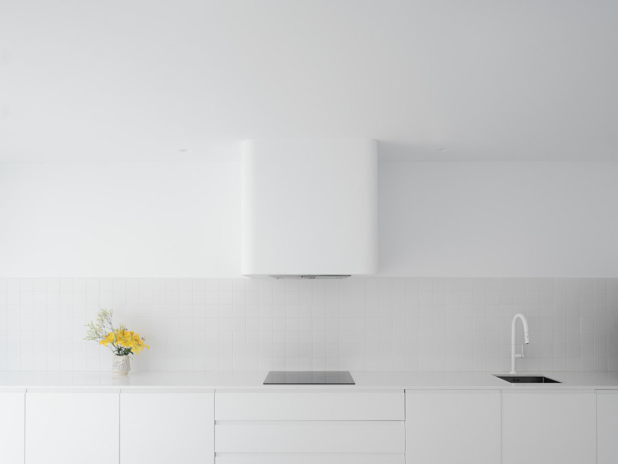
The Gozona House’s obsessive white-on-white kitchen palette helps it to hide the depth of its presence in the slim open-plan home. Photo: Luis Díaz Díaz

The Gozona House’s obsessive white-on-white kitchen palette helps it to hide the depth of its presence in the slim open-plan home. Photo: Luis Díaz Díaz
×As the most poker-faced of neutral colours, white may seem least suitable when it comes to characterful kitchen decor. In the crisis-hit Spanish housing market, however, where prices are expanding and floor plans shrinking at almost the same rate, first-time buyers are desperate to get a foothold, and in a one- or two-person household, kitchen space is one of the first casualties.
White surfaces continuously reflect natural light, providing a clean, fresh space
While darker surfaces simply absorb and waste the little natural light that reaches them, white surfaces continuously reflect it instead, providing a clean, fresh space it’s a joy to spend time in. These four projects from both urban and rural Spain evidence the welcoming and surprisingly warm tone of an expanded white kitchen.
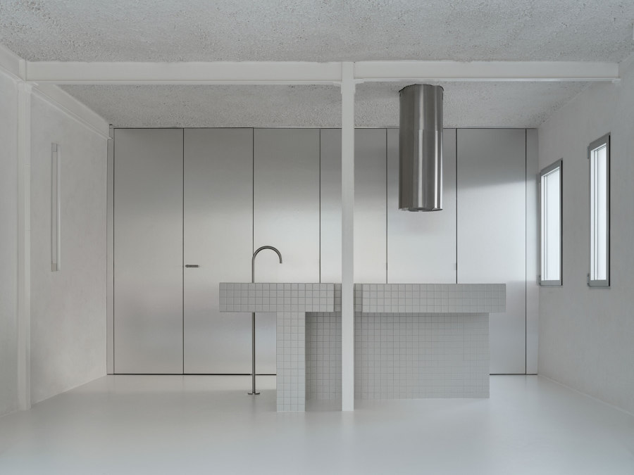
The Rio House’s seemingly Total Minimalism style is born from a desire to create a blank canvas, making it simpler and more affordable for future owners to renovate. Photos: Luis Díaz Díaz

The Rio House’s seemingly Total Minimalism style is born from a desire to create a blank canvas, making it simpler and more affordable for future owners to renovate. Photos: Luis Díaz Díaz
×Rio House in Madrid, by HANGHAR
‘The average cost of a home in Madrid is beyond the reach of most people,’ reveal the Rio House architects, HANGHAR, on the focus of their project. Everything from the layout to the material and even colour choices in the small apartment is centred around driving down costs for those who move in. ‘The project tackles the situation by providing a raw, unfinished setting that allows the inhabitants to renovate their home within a limited budget.’
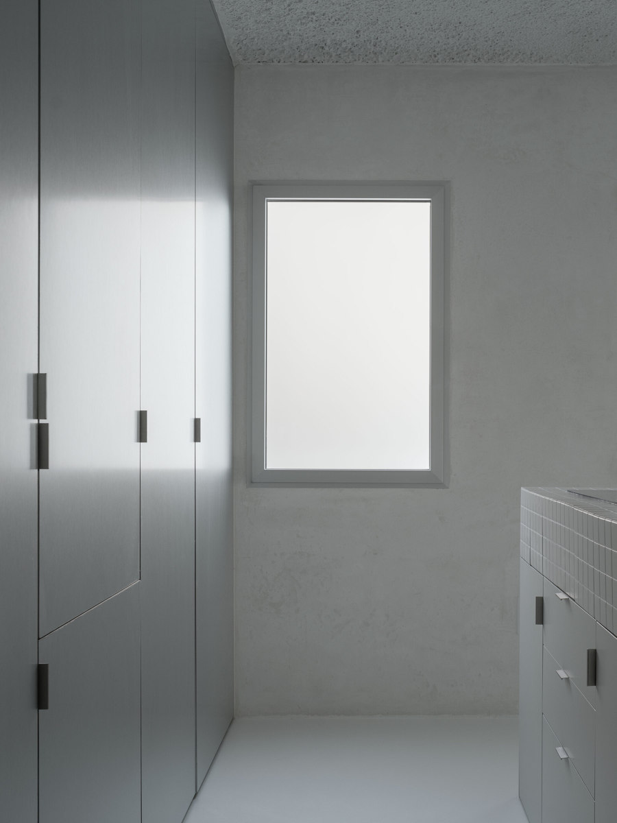
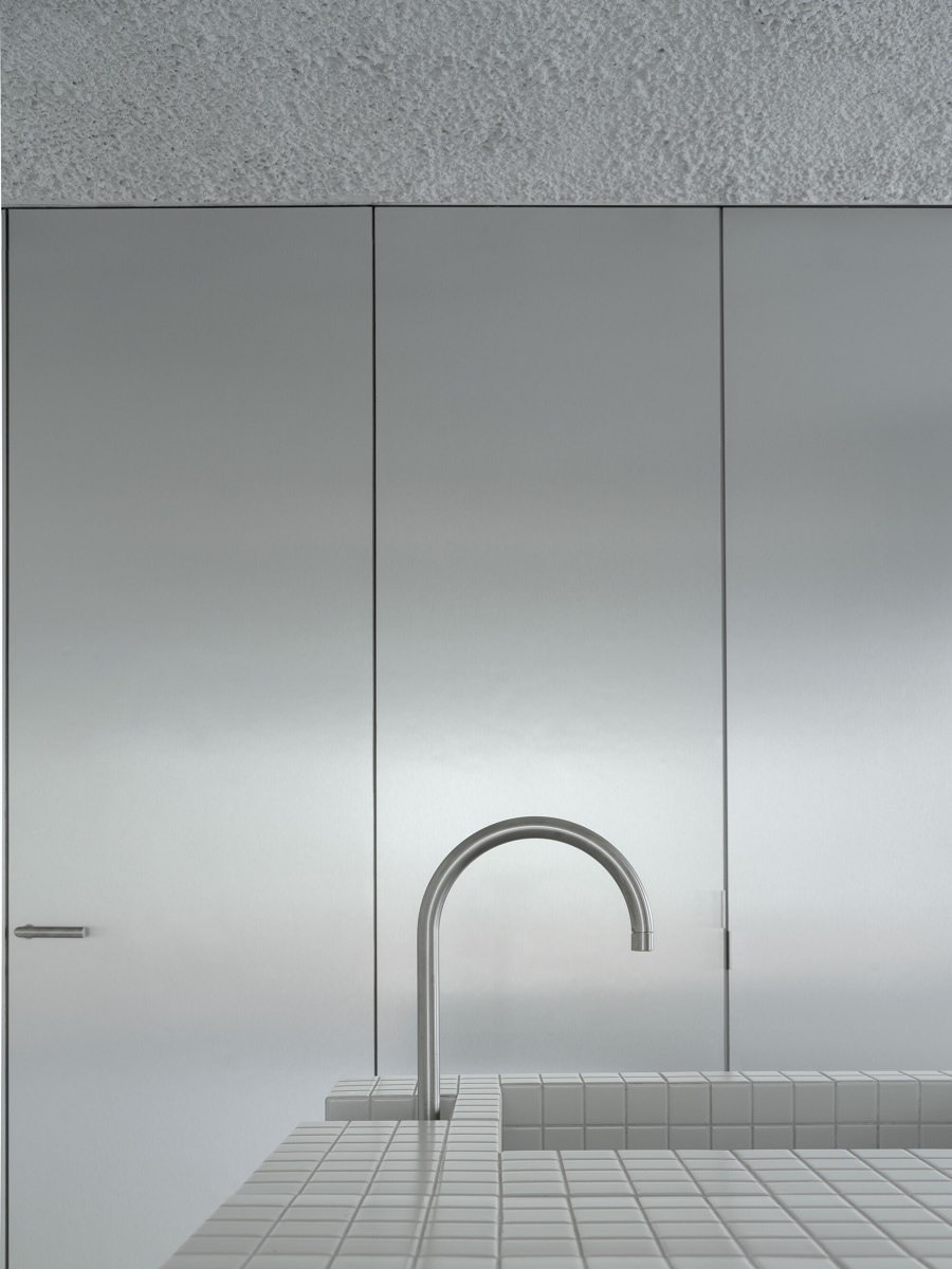
‘The naked scenario poses the possibility of allowing future interventions to occur’ explains HANGHAR. Because while the raw white, grey and aluminium surfaces may not be to everyone’s taste, they present a blank canvas on which new residents can stamp their own personality and style, without ripping it all out to expensively start again.
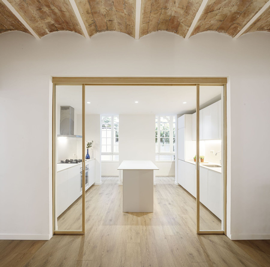
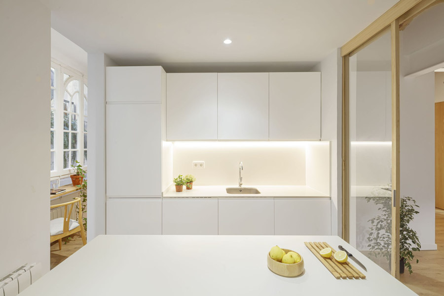
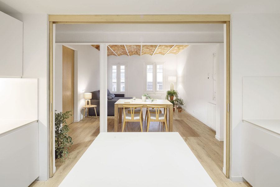
Although the Gracia House’s kitchen is isolated in the centre of the apartment, natural light floods in through open and sliding doorways, before being reflected around the space. Photos: Adrià Goula

Although the Gracia House’s kitchen is isolated in the centre of the apartment, natural light floods in through open and sliding doorways, before being reflected around the space. Photos: Adrià Goula
×Gracia House in Barcelona, by Roman Izquierdo Bouldstridge
As if to exemplify exactly where the Rio House succeeds, the Gracia House renovation highlights its own previous failures. The couple living in the home wanted to make the small space suitable for their growing family and workplace. In order to open up into a modern, flexible space for the couple’s modern lifestyle, architects Roman Izquierdo Bouldstridge set out to demolish the interior barriers, refreshing and renewing the environment.
'Gracia seeks to promote the incidence of natural light in the deepest areas of the dwelling’
‘Seeking to promote the incidence of natural light in the deepest areas of the dwelling,’ as the architects explain, slender wood-framed glass sliding doors provide acoustic and olfactive insulation from the kitchen, while enclosing the space between wooden floors and a ceramic Catalan ceiling, providing a light yet warm atmosphere.
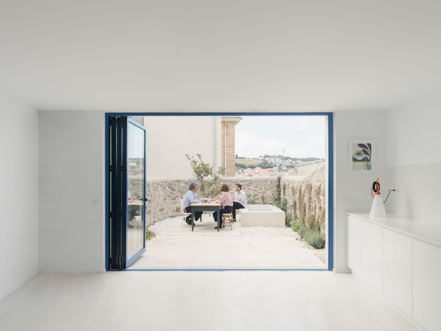
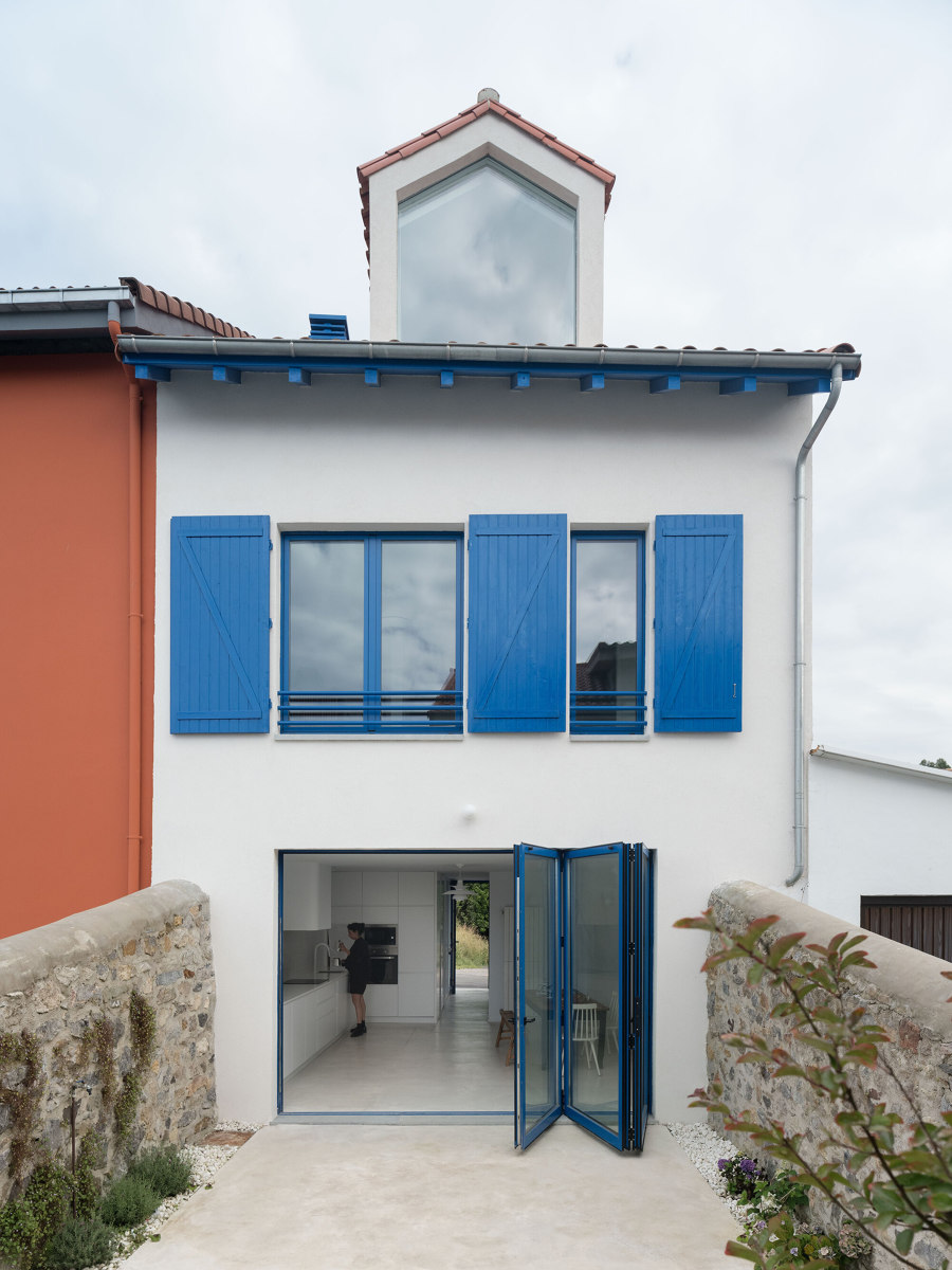
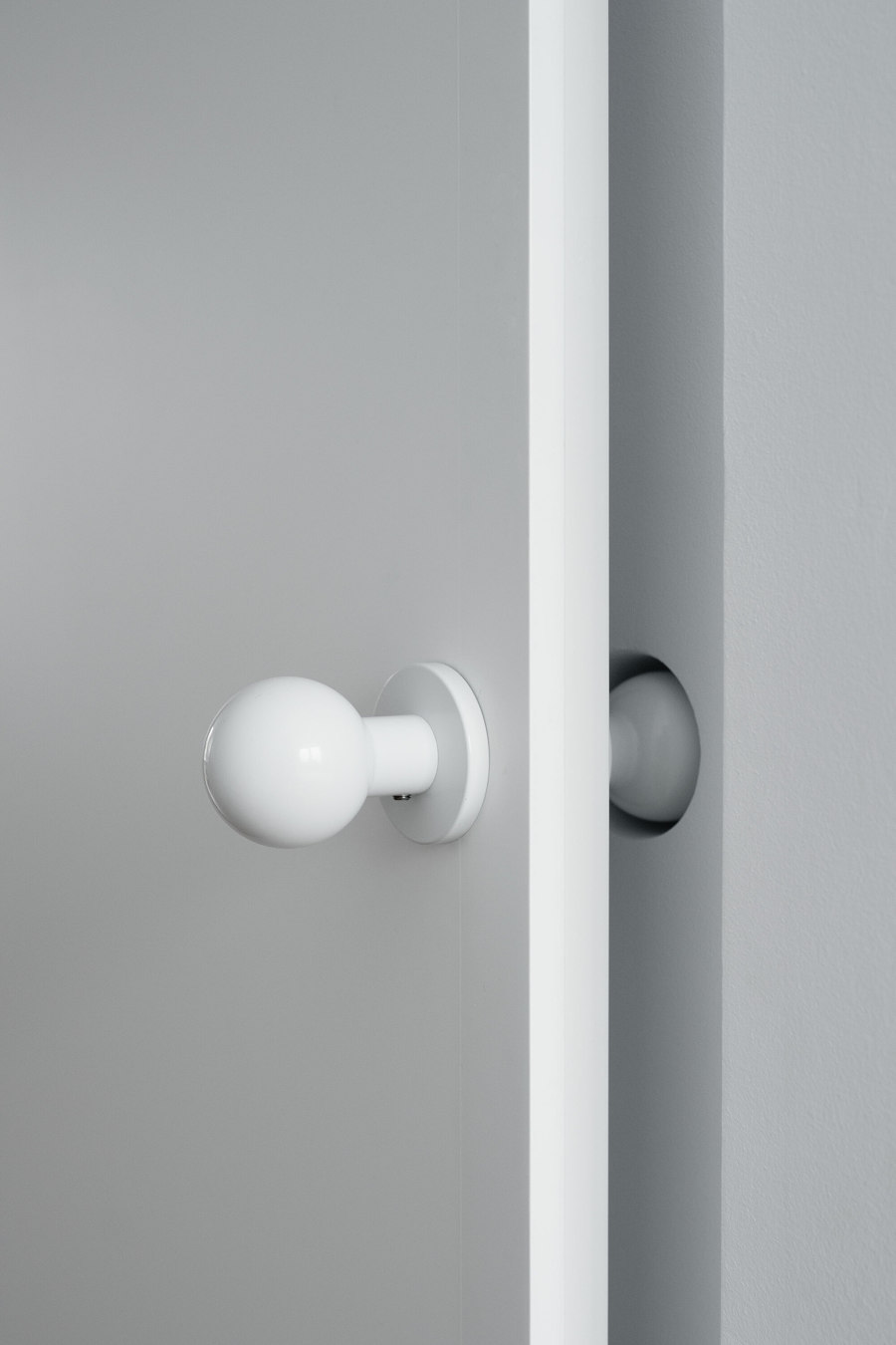
From doorknob-shaped holes in the wall to all-white kitchen surfaces and eye-catching blue bi-fold door frames, everything in the Gozona House expands its narrow footprint. Photos: Luis Díaz Díaz

From doorknob-shaped holes in the wall to all-white kitchen surfaces and eye-catching blue bi-fold door frames, everything in the Gozona House expands its narrow footprint. Photos: Luis Díaz Díaz
×Gozona House in Luanco, by Isla Architects + More Meana Architecture
In the small Spanish fishing village of Luanco, the Gozana House is heavily restricted by its narrow half-size plot. With only this thin footprint to work with, Isla Architects and Mori Meana Architecture set about expanding the space visually, instead of physically. By almost obsessively ensuring each kitchen surface – from the cabinet fronts to the tiled splash backs, and even the extractor and kitchen tap – was finished in ice white, the kitchen melts away into the wall when not in use, hiding its proximity to the rest of the room.
The white-on-white kitchen is accented perfectly with bi-fold door frames painted in a deep blue, drawing the eye out towards the open exterior and away from the interior space, ‘blurring the limit between interior and exterior,’ as the architects explain.
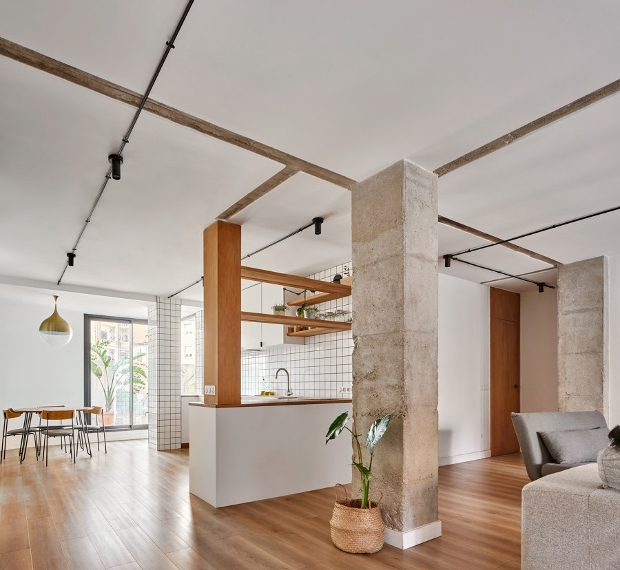
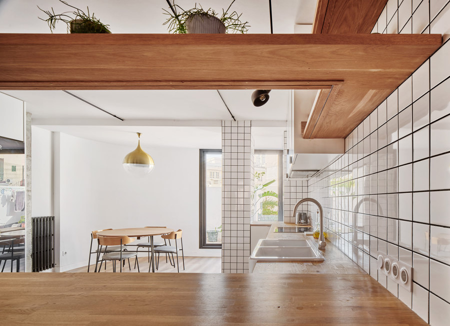
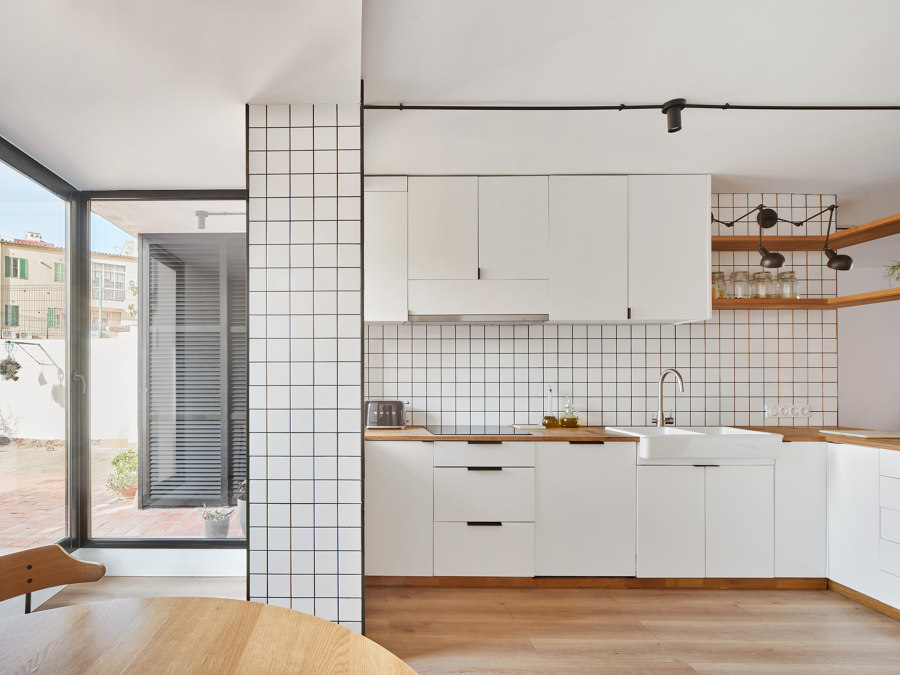
The Langdon House’s white open-plan kitchen helps to accent the memories of the property, retained in the old partition marks prominent on the ceiling. Photos: Jose Hevia

The Langdon House’s white open-plan kitchen helps to accent the memories of the property, retained in the old partition marks prominent on the ceiling. Photos: Jose Hevia
×Langdon House in Palma de Mallorca, by Estudi E. Torres Pujol
The Langdon House renovation doesn’t claim to be the end of the building’s story, it is merely another chapter. Currently a family home for four, but previously a paediatrician’s office, and who knows what will come next? In order to make the house suitable for its current needs, a large, central open space was connected to the outdoor terrace by ‘eliminating several partitions that excessively compartmentalised the property,’ explain the architects.
The Langdon House renovation doesn’t claim to be the end of the building’s story, it is merely another chapter
Instead of literally plastering over the past in an attempt to cover the marks made by these previous partitions, it was agreed instead to celebrate and highlight them by applying a white palette throughout the open-concept kitchen. A complementing materials palette includes white ceramics made locally on Mallorca, along with sustainable forest management-certified wood that adds a natural warmth to the story, too.
© Architonic
Head to the Architonic Magazine for more insights on the latest products, trends and practices in architecture and design.
