Show-offs!: the latest showroom projects
Scritto da Peter Smisek
02.12.20
Showrooms represent an ideal setting for a brand to present its products to the public, but, with the right design team on board, they can also create longer-lasting, more meaningful consumer experiences.
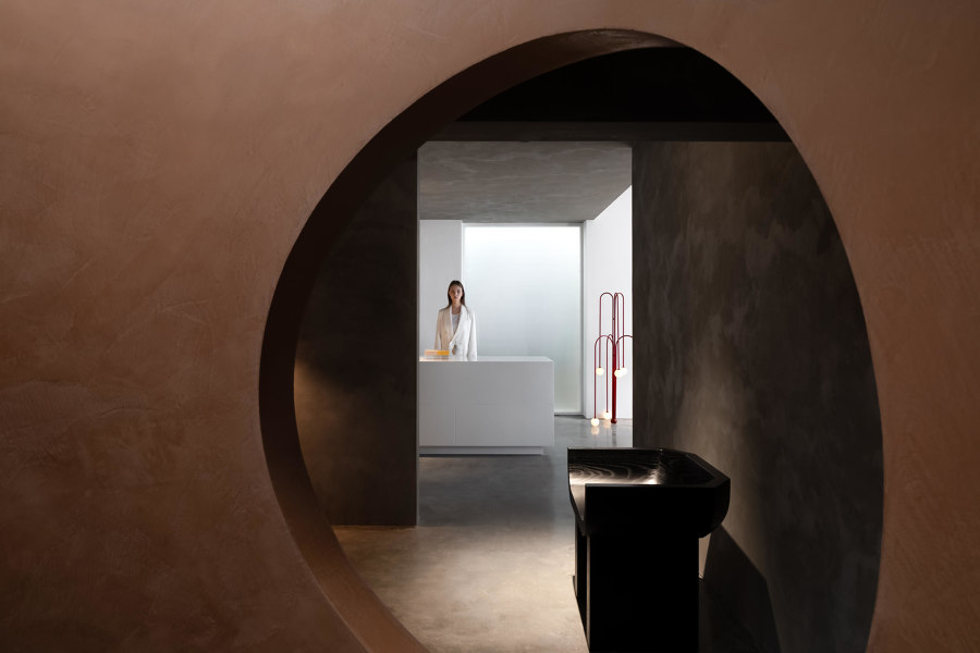
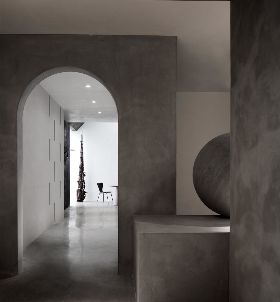
The new Danilo Paint Showroom by Jingu Phoenix Space Planning Organisation is a spatially complex space set up to resemble a gallery. Photo: Yun Ouyang

The new Danilo Paint Showroom by Jingu Phoenix Space Planning Organisation is a spatially complex space set up to resemble a gallery. Photo: Yun Ouyang
×Showrooms have always provided an opportunity for brands to display their wares in an architecturally cutting-edge setting – pioneering what we now call experiential retail. This latest crop shows that the experimental spirit is very much alive, and that bricks-and-mortar retail can still provide a spatial experience that is memorable and on-brand.
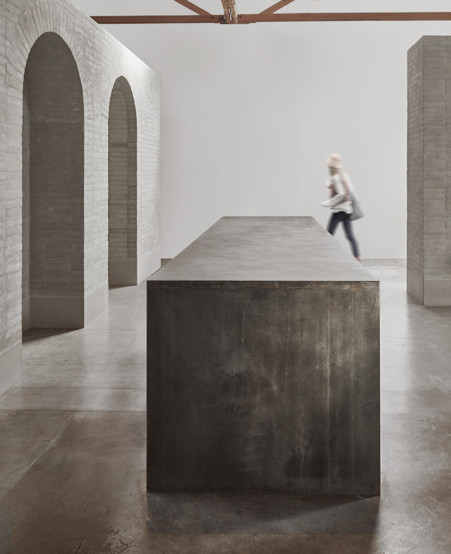
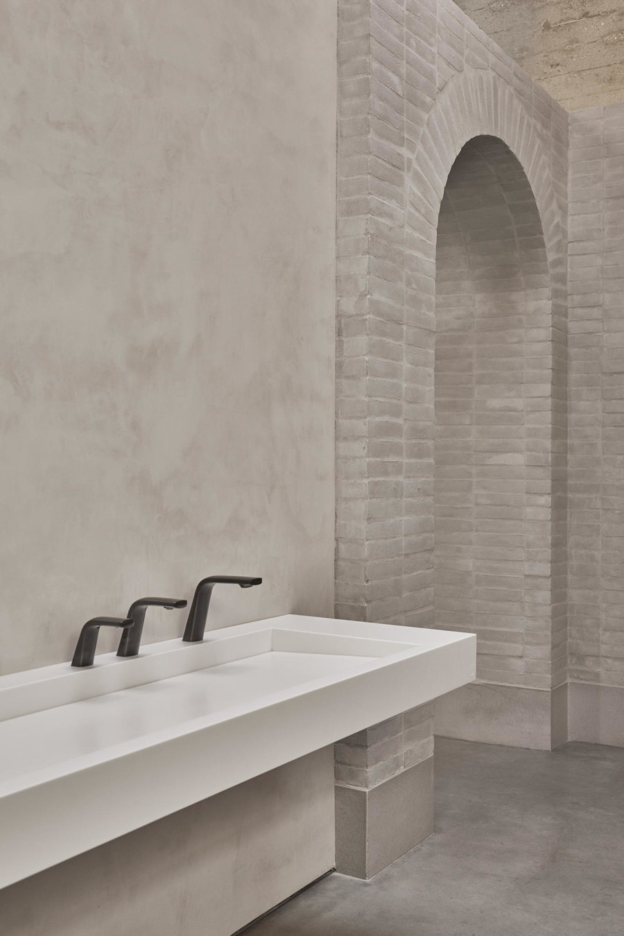
Mclaren Excell's The Splash Lab showroom in Los Angeles creates a retail experience in which the products are wholly integrated within a robust, but neutral-coloured backdrop. Photos: Jason Rueger

Mclaren Excell's The Splash Lab showroom in Los Angeles creates a retail experience in which the products are wholly integrated within a robust, but neutral-coloured backdrop. Photos: Jason Rueger
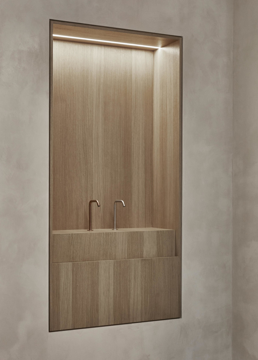
×Take The Splash Lab's new showroom in Los Angeles. Here, McLaren Excell has designed an almost church-like space that consists of a pale brick perimeter and arched apse at the end, polished concrete floors and plaster walls that show off the brand's brassware and sanitaryware products. These have been integrated within the architecture to give a sense of unity with the space, while also giving them a chance to stand out from the simple but robust design. Warm accents, such as recessed timber shelving and the timber truss structure of the roof above create a softer, more natural counterpoint within the design.
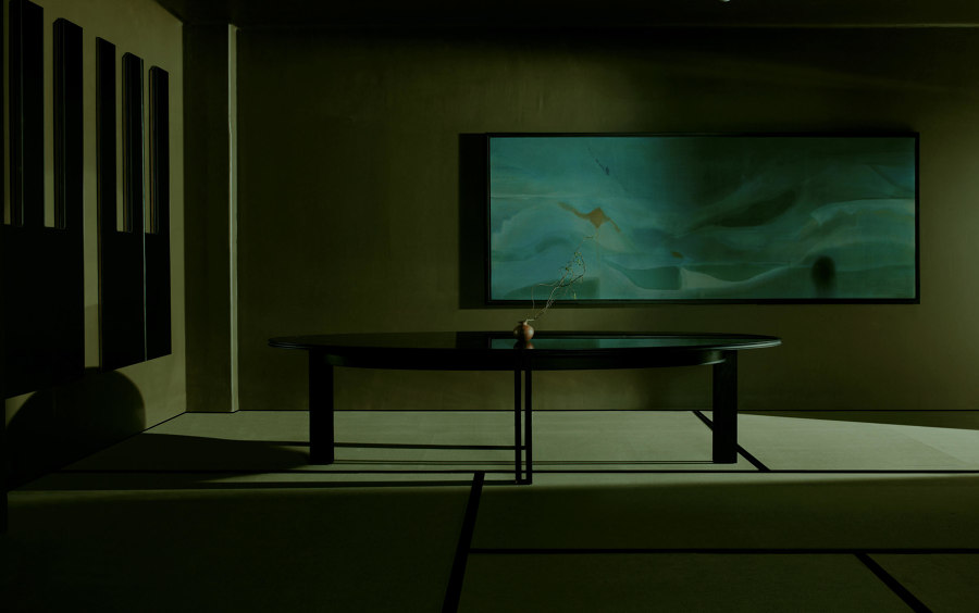
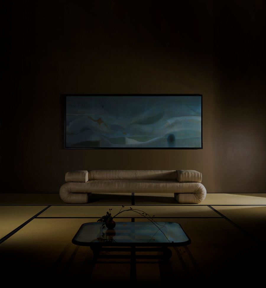
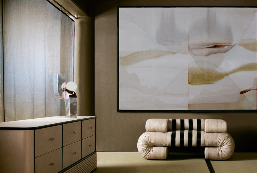
Acting as a display case, as well as an inspiration behind the pieces within it, VIDIVIXI's Mexico City Showroom lies at the intersection of retail and design. Photos: Pia Riverola

Acting as a display case, as well as an inspiration behind the pieces within it, VIDIVIXI's Mexico City Showroom lies at the intersection of retail and design. Photos: Pia Riverola
×High-end design manufacturer VIDIVIXI's Mexico City Showroom was conceived by the brand itself, and the 2020 collection within has been selected and created especially for the new retail space. The interior design itself takes cues from Japanese domestic architecture – the designers even used tatami mats on the floor – while the furnishings are distinctively curving pieces with bold forms in lacquer and velvet that complement the neutral palette.
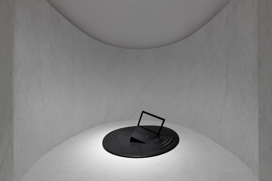
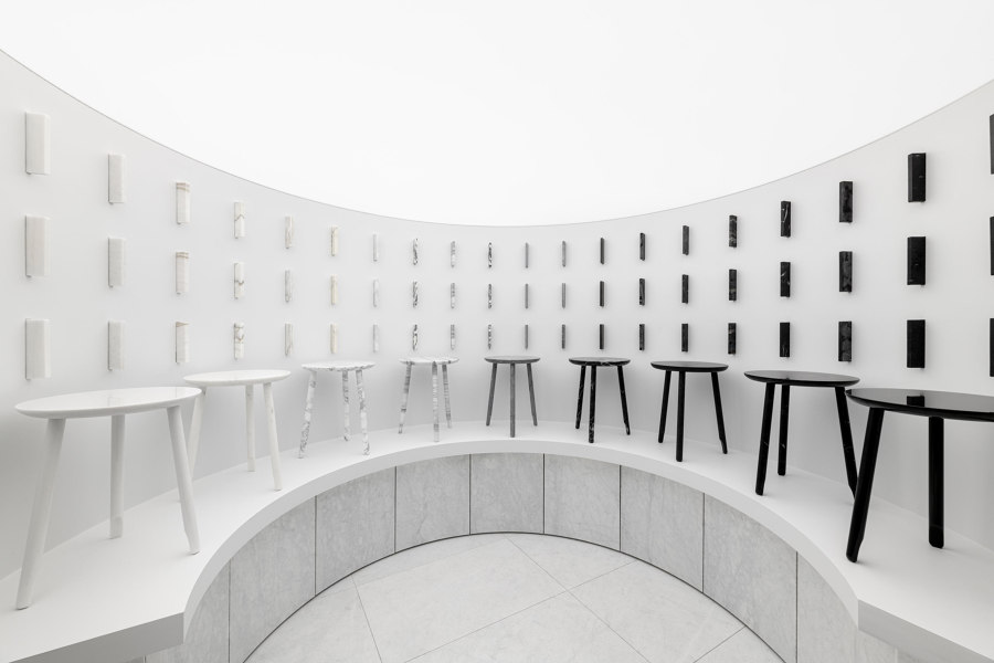
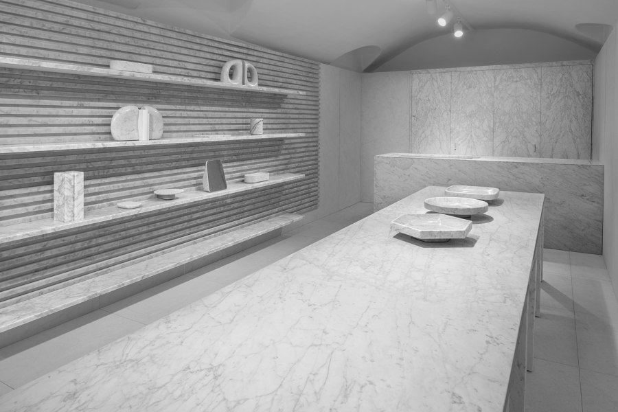
The Nendo-designed Marsotto Milan Showroom is a retail space dedicated to showcasing marble in all its glory. Photos: Hiroki Tagma

The Nendo-designed Marsotto Milan Showroom is a retail space dedicated to showcasing marble in all its glory. Photos: Hiroki Tagma
×Designed by Nendo, the newly opened Marsotto Milan Showroom takes marble to the next level. The entrance – a large rusticated white marble panel which contains a hidden door and a concave depression that offers a seat to passers-by – leads to a vaulted retail area within. Inside, the floors and the walls are, naturally, covered in the same grey-veined white marble and large elevated podia are used as displays, while auxiliary rooms contain samples and smaller displays. Backlighting is used throughout, giving the space a cavernous, otherworldly feel.
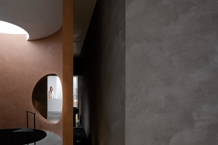
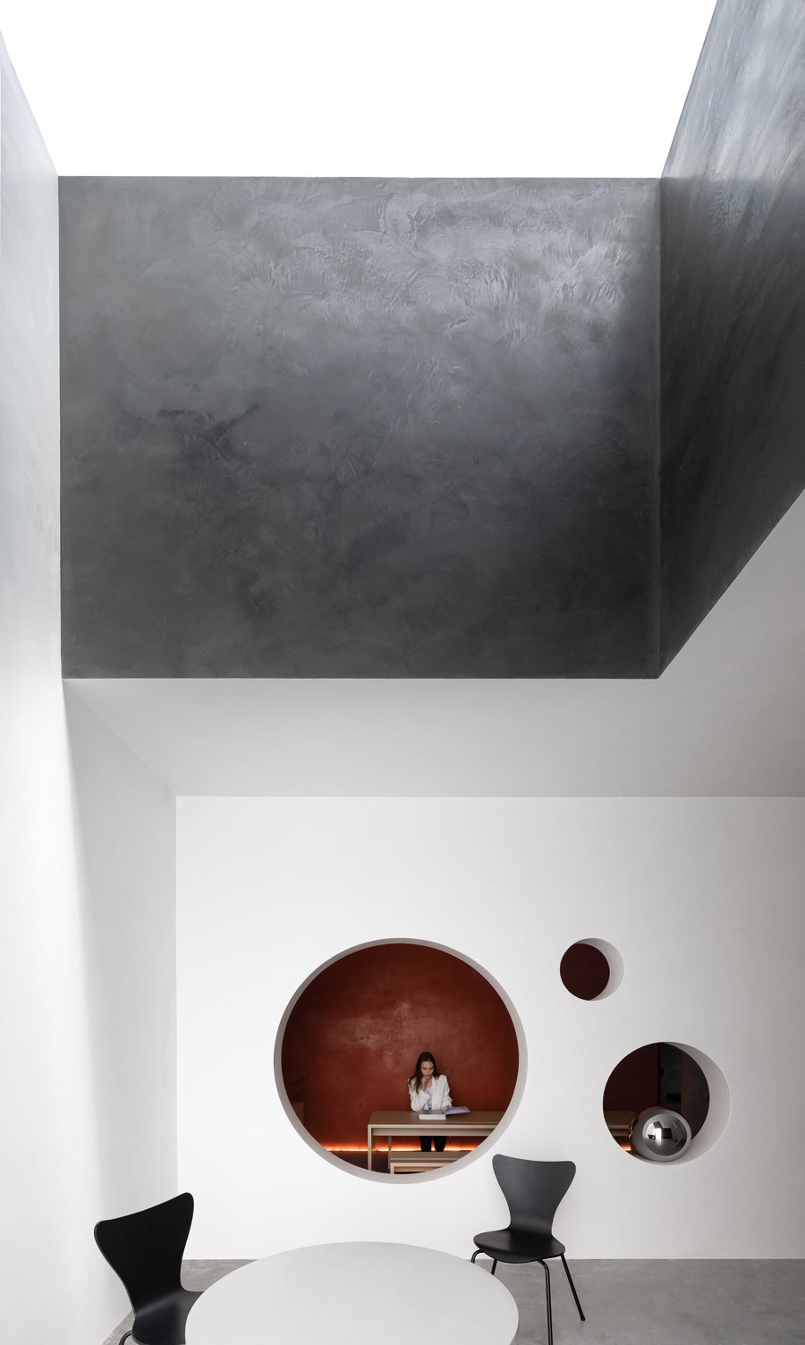
Jingu Phoenix Space Planning Organisation's Danilo Paint Showroom in Shantou, shows how retail spaces can accommodate complex spatial sequences to create different display atmospheres. Photos: Yun Ouyang

Jingu Phoenix Space Planning Organisation's Danilo Paint Showroom in Shantou, shows how retail spaces can accommodate complex spatial sequences to create different display atmospheres. Photos: Yun Ouyang
×In Shantou, a city in southeastern China, Jingu Phoenix Space Planning Organisation designed the new Danilo Paint Showroom. Spatially complex, the retail space is set up to resemble a gallery with a number of site-specific artworks, such as a ying-yang-inspired installation and more intimate areas where customers can admire colour samples. Round openings, curved textured walls and a polished concrete floor animate the space, creating layers of complexity and contemplation.
© Architonic
