Space and materiality in new restaurant design
Scritto da Peter Smisek
15.12.21
Larger spaces can pose a specific set of challenges to the architects tasked with designing for them, but equally, they of course open up rich scope for creativity, too.
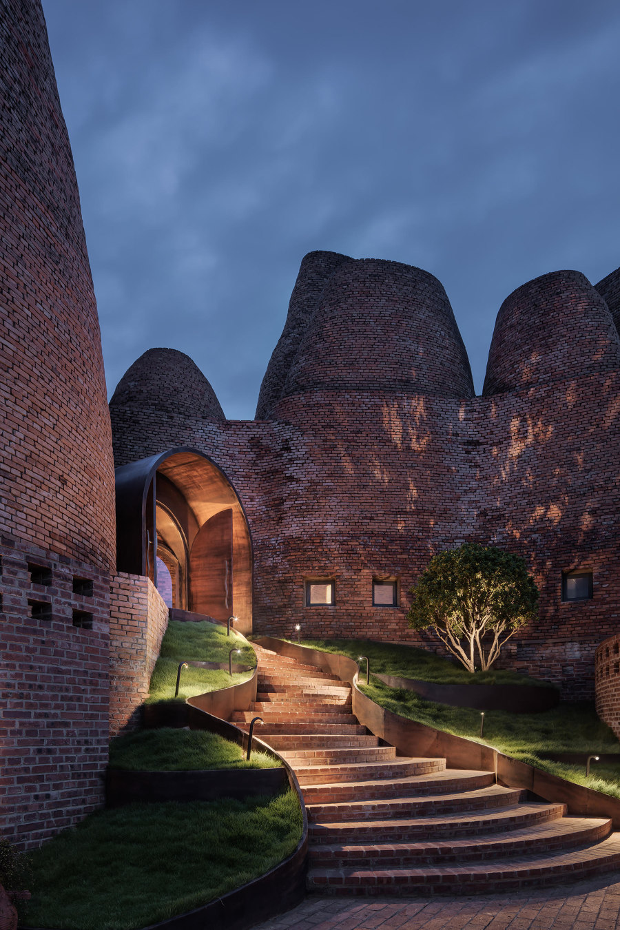
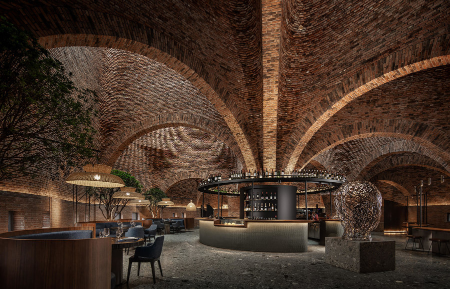
The structure of CCD's 50% Cloud Artists Lounge Restaurant in China’s Yunnan province is reminiscent of a cluster of traditional kilns. Photo: Courtesy of CCD

The structure of CCD's 50% Cloud Artists Lounge Restaurant in China’s Yunnan province is reminiscent of a cluster of traditional kilns. Photo: Courtesy of CCD
×Creating interiors for large, newly built spaces can often be just as challenging as designing within existing structures. Working with an expansive blank canvas, architects and interior designers typically introduce new kinds of materiality and spatial devices such as screens, feature walls and double-height spaces. This helps to create focal points as well as different functional zones and breathes character into generic building envelopes.
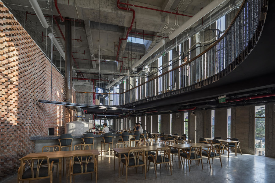
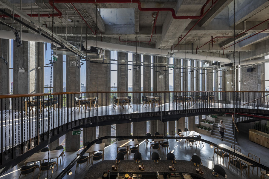
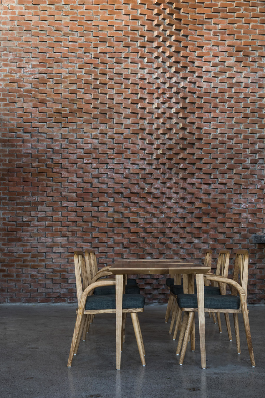
Takashi Niwa Architects combine tradition – in the form of red bricks and ovens – with contemporary spatiality in Pizza 4P’s Hai Phong. Photos: Hiroyuki Oki

Takashi Niwa Architects combine tradition – in the form of red bricks and ovens – with contemporary spatiality in Pizza 4P’s Hai Phong. Photos: Hiroyuki Oki
×In Hai Phong, Vietnam, Takashi Niwa Architects have designed Pizza 4P’s Hai Phong restaurant. Conceived as a triangular pavilion connected to a large new shopping centre, the new eatery is lifted off the ground to take in the views of the tropical surroundings. Inside, a double-height space surrounded by a mezzanine floor features an open kitchen with pizza ovens forming a focal point, while an expansive brick wall forms a backdrop to the dining experience. The columns and the ceilings are made of exposed concrete, creating a contrast with the warm materiality of the brick.
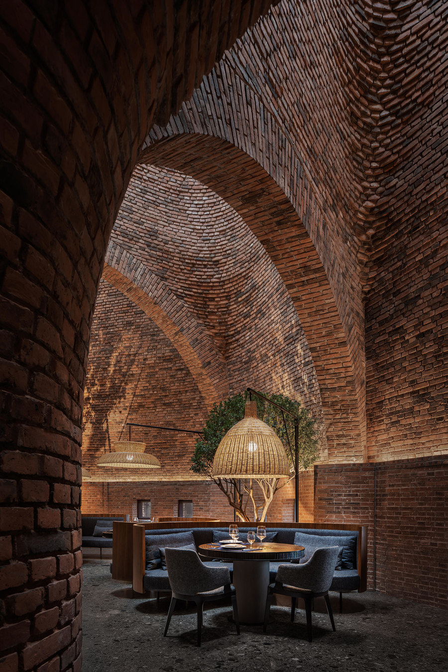
50% Cloud Artists Lounge Restaurant by CCD marries the warm materiality of brick and timber with tall, vaulted spaces and a flowing plan to create a unique and inviting spatial experience. Photos: Courtesy of CCD

50% Cloud Artists Lounge Restaurant by CCD marries the warm materiality of brick and timber with tall, vaulted spaces and a flowing plan to create a unique and inviting spatial experience. Photos: Courtesy of CCD
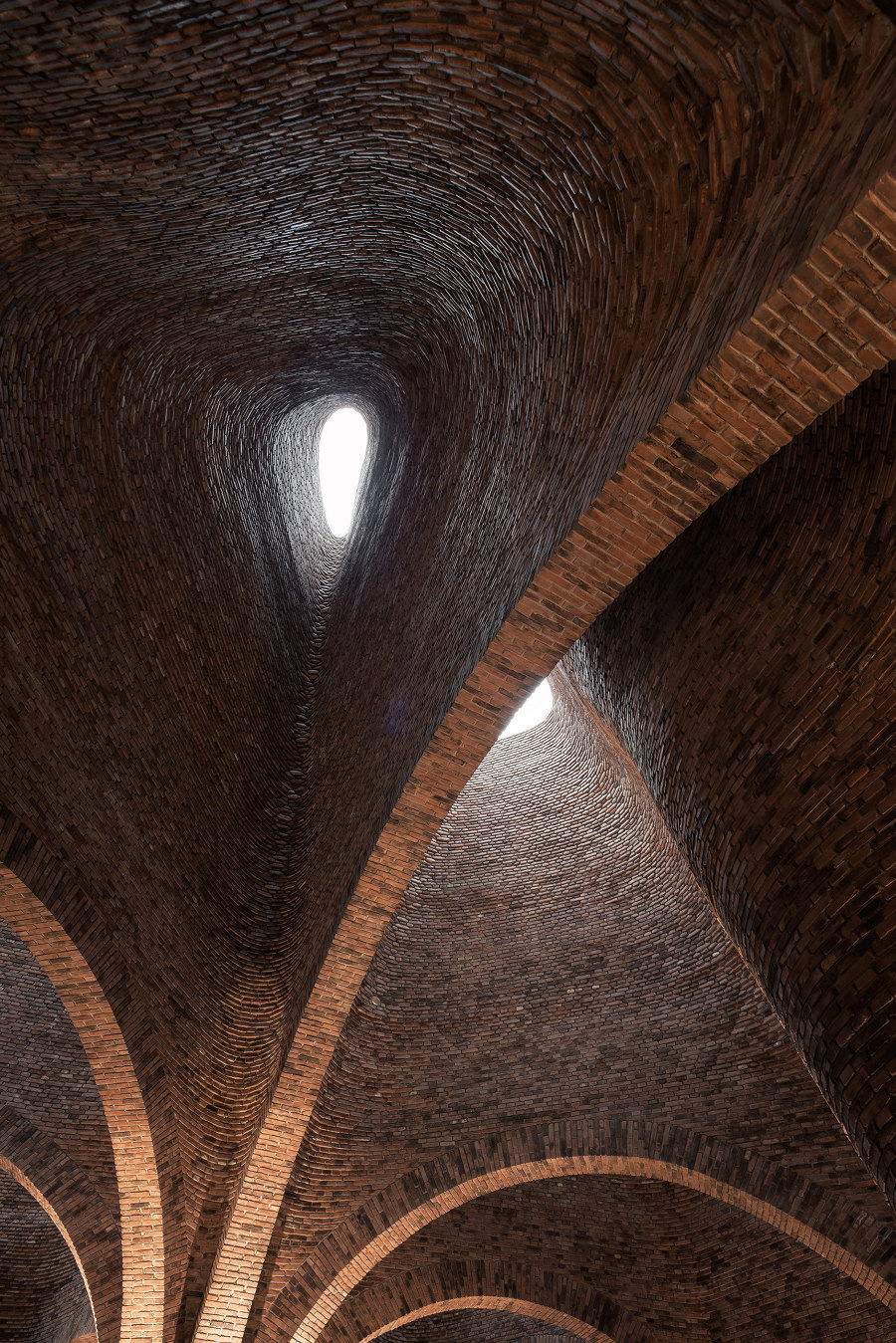
×In Mile, in China’s Yunnan province, architecture studio CCD designed the 50% Cloud Artists Lounge Restaurant. Built using traditional red bricks, the new structure is reminiscent of a cluster of traditional kilns. The tall, vaulted interiors receive natural light from the top, which reflects in the black stone polished floors. Together with comfortable upholstered banquette seating surrounded by low timber veneer partitions and integrated planters, the flowing spaces create a novel experience for diners, nurturing their curiosity and inviting them to wander.
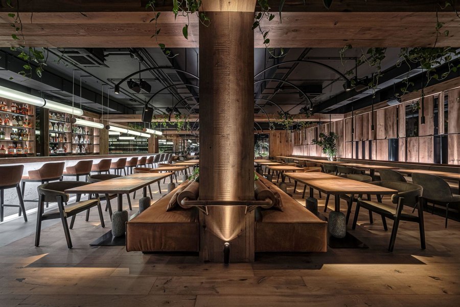
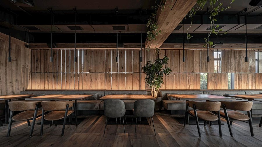
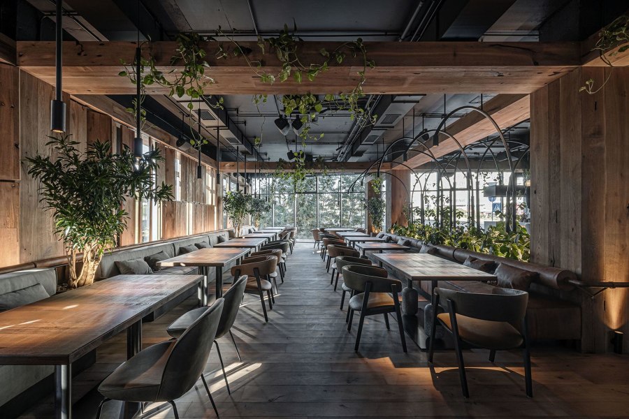
The warm materials of YoDezeen studio’s Par Bar 3 brings a little bit of spatial intimacy and nature to Kyiv’s dense, newly developing suburbs. Photos: © Andrii Shurpenkov

The warm materials of YoDezeen studio’s Par Bar 3 brings a little bit of spatial intimacy and nature to Kyiv’s dense, newly developing suburbs. Photos: © Andrii Shurpenkov
×In the suburbs of Kyiv, YoDezeen studio designed Par Bar 3, a new outpost of one of the city’s most popular cafés. Located on the ground floor of a recently completed block, the restaurant features a rustic interior that contrasts with the surrounding residential and commercial high rises. Featuring closing wooden screens and large areas of indoor plants, timber panelling as well as wooden floors, the space is more reminiscent of a high-end forest lodge with its insistence on natural materials and simple forms and subtle integration of pared-back metal light fixtures and shelving.
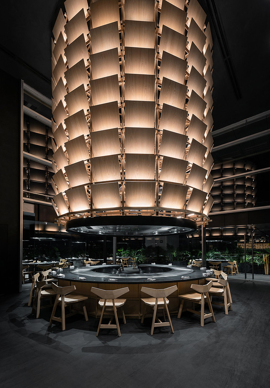
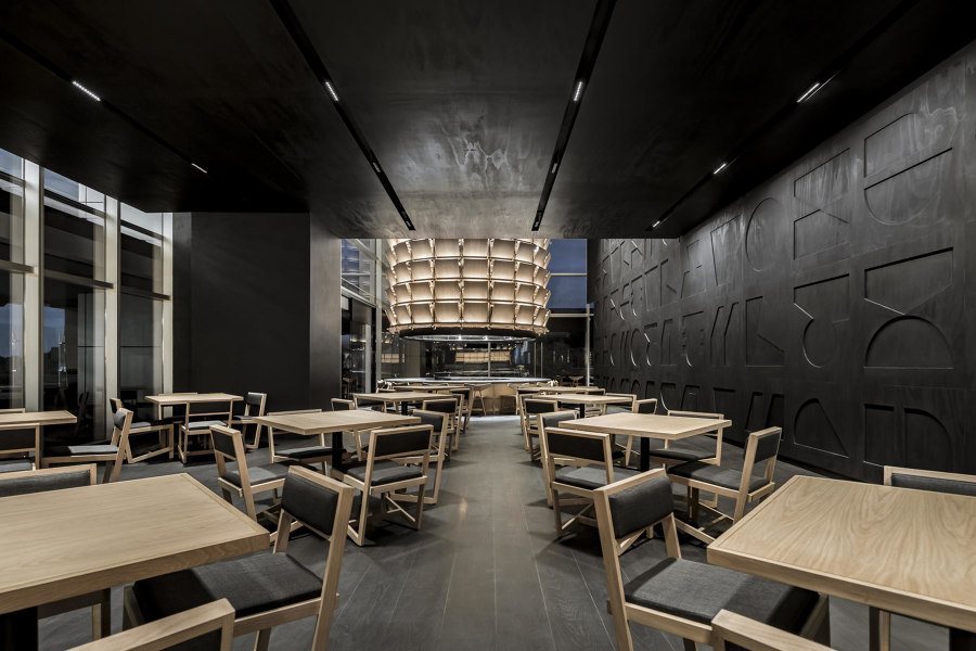
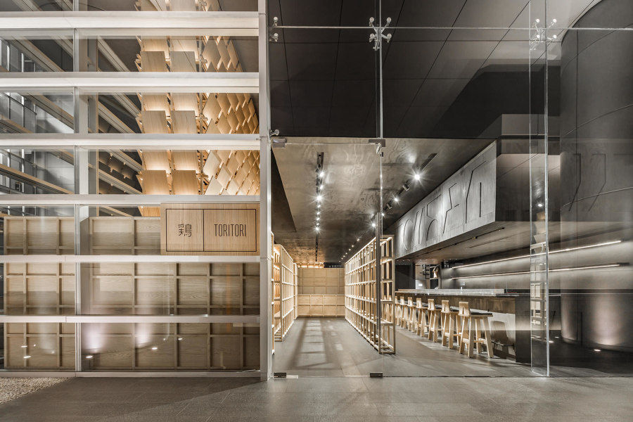
The materiality of Esrawe Studio’s Restaurant Tori Tori recalls traditional Japanese interiors, while also allowing for a more dramatic spatial experience. Photos: César Béjar

The materiality of Esrawe Studio’s Restaurant Tori Tori recalls traditional Japanese interiors, while also allowing for a more dramatic spatial experience. Photos: César Béjar
×On the outskirts of Mexico City, Esrawe Studio designed the Japanese Restaurant Tori Tori Santa Fe featuring a more varied spatial sequence. The centrepiece of the space is a double-height zone with a large circular teppanyaki grill that can serve sixteen diners at a time with a cylinder made of pale timber panels suspended above. Smaller circular grills are found at the restaurant’s perimeter while the rest of the space comprises simple square tables and angular chairs. A takeaway counter, partially hidden behind a wooden screen, allows guests to buy food and drinks to take off-site. The designers use pale timber and simple, articulated wooden joinery for the elements within the space, while the walls are clad in dark wood panels featuring a robust, minimalistic relief.
© Architonic
