'Life is important. Design is not important': Architonic goes for a walk with Alain Berteau at Interieur 2010
Scritto da Simon Keane-Cowell
Zürich, Svizzera
09.11.10
Alain Berteau is often told by journalists that he is representative of Belgian design. He's not so sure. Architonic caught up with architect-designer Berteau at the Interieur 2010 design biennale to discuss his latest work, the trouble with defining design in national terms, and why designers aren't as important as perhaps they (or, rather, we) think they are.
The narrative of contemporary Belgian design is still being written. As a country that, at the best of times, rejects the application to it of a single, irreducible identity – its internal linguistic and political divisions are well-known – Belgium is all the more exciting a prospect for design commentators keen to try to define it in terms of creative practice. One name that continues to feature in this attempted ongoing narrative is that of designer Alain Berteau.
Brussels-based Berteau, in terms of his professional identity, is also not easy to define. He's a design practitioner who collaborates with some of Belgian's leading design brands. He also works in education, teaching furniture design at the Henry van de Velde-founded La Cambre design school. But there's more. He's a trained architect, his studio Alain Berteau Designworks concerning itself as much with the built environment as with product design. Then there's his job as artistic director of Belgian design label of the moment FELD. You get the picture. Lots of fingers, lots of pies.
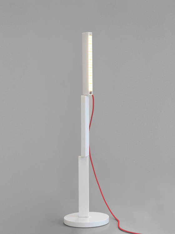
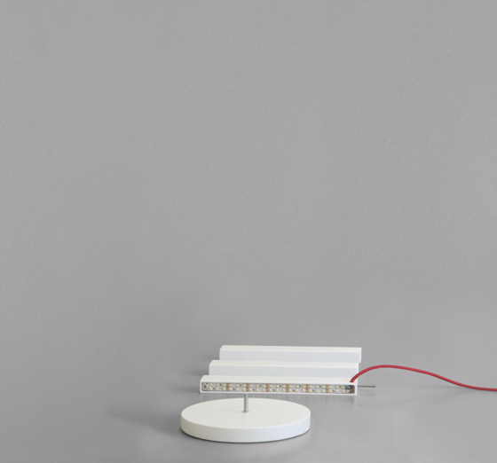
'When you switch it off, you're not looking at a dead machine': Corian prototype for Alain Berteau's new 'Twist' light for Belgian lighting manufacturer Aluci

'When you switch it off, you're not looking at a dead machine': Corian prototype for Alain Berteau's new 'Twist' light for Belgian lighting manufacturer Aluci
×Meeting up with the dynamic Berteau at the Interieur 2010 design biennale in Kortrijk, where he was recognised as Designer of the Year a few years ago, was never going to be a static affair. What better way to discuss his new work and and to tackle those perennial, thorny subjects of the role of design and of the designer, as well as to take a critical look at the contemporary 'Belgian design' story that's being sold, than to undertake a peripatetic tour together of the fair's various halls, to create our very own journey-based narrative?
What follows, dear readers, is an in-depth interview with Alain Berteau on the go. Part show-and-tell, part design philosophy. Sure, he has a lot to say, but he assures us he's 'not looking for world domination'.
***
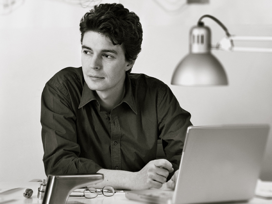
Belgian designer Alain Berteau says he is committed to designing products that 'are completely new, yet feel familiar. Like when you hear a Beatles song for the first time. You have the feeling that you always knew it.'; photo Renaud Callebau

Belgian designer Alain Berteau says he is committed to designing products that 'are completely new, yet feel familiar. Like when you hear a Beatles song for the first time. You have the feeling that you always knew it.'; photo Renaud Callebau
×As first stop on our tour of the fair here in Kortrijk, you've brought me to the Aluci stand...
It's strange. There are something like ten super-good Belgian lighting brands. And they all seem to be based near Kortrijk. This is one of them – Aluci. It's a huge lighting group. Very technical. They make money by doing these standard kinds of things like everybody else. But recently they've also decided to try to innovate with design.
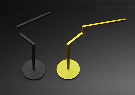
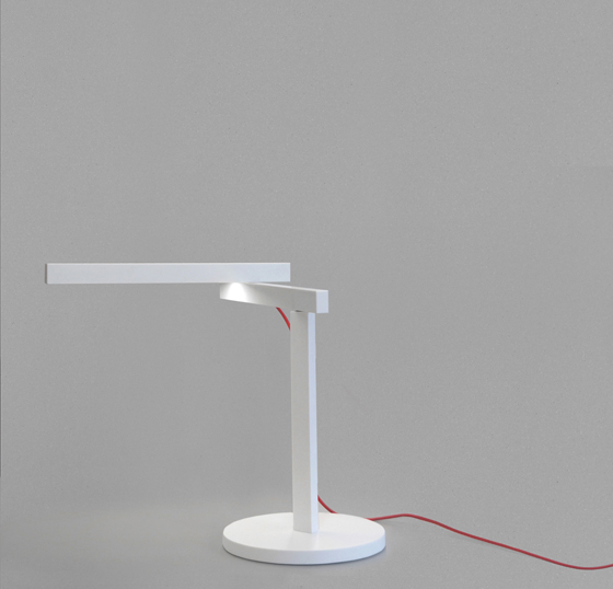
And this my new 'Swing' light. There are floor versions, integrated desk versions. Very architectural. I'm an architect. (Laughs.) Sometimes I really love to have a very simple, almost minimalistic approach, but it's never boring. Always super-economic and easy. So, it's a compact lamp, extending into a real desk lamp. When you switch it off, you're not looking at a dead machine...
...but rather something that's still working, albeit in a different way.
Exactly. And this light, 'Twist', is even better for that strategy. The lamp is designed as a system. You buy it as a flat-pack kit. It's a very nice kit, made in Germany of natural oak, but assembled in Brussels. One piece houses the LED, and there are a few other blocks. You can decide whether you make a nice table lamp out of it, or bedside lamp. Or you can extend it further, if you want a taller lamp, making a floor lamp. You articulate it. It can be completely vertical or you can decide to introduce a horizontal element.
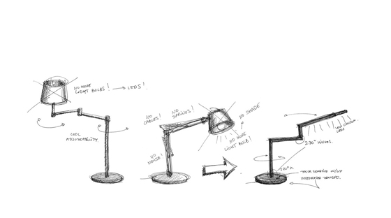
'I really love to have a very simple, almost minimalistic approach, but it's never boring': Berteau's 'Swing' lamp for Aluci, and a sketch showing his reduced, architectural approach

'I really love to have a very simple, almost minimalistic approach, but it's never boring': Berteau's 'Swing' lamp for Aluci, and a sketch showing his reduced, architectural approach
×This kind of system type of approach to designing a lamp. How much of it comes from your background as an architect?
Two things. First I noticed that, for some reason, almost every single desk lamp I admired was a 'robot'. By that I mean full of mechanics. Springs, cables, twenty different materials, endless etails, and so on. I wanted to have a lo-tech approach, offering great value in a really nice object, super-easy to use, in a lasting material, very eco-friendly, etc. But extremely lo-tech and simple. A few pieces of wood. Two bars of aluminium. Two smart hinges. A very simple pivoting detail and that 's it.
The lamp has one LED component that is completely standard and can be replaced easily. LED technology is changing all the time. I really don't like the idea of blocking a design around one component.
You talk about extending the function of an object type like a lamp beyond its purpose as a light source. It strikes me that play is one of the functions of both your 'Twist' and 'Swing' lamps.
Play, composing, moving it...
Berteau's new flat-pack 'Twist' light for Belgian lighting label Aluci: 'Extremely lo-tech and simple,' is how the designer describes it. 'A few pieces of wood. Two bars of aluminium. Two smart hinges. A very simple pivoting detail. And that's it.'

Berteau's new flat-pack 'Twist' light for Belgian lighting label Aluci: 'Extremely lo-tech and simple,' is how the designer describes it. 'A few pieces of wood. Two bars of aluminium. Two smart hinges. A very simple pivoting detail. And that's it.'
×Design, really, if the user is involved in the composition of the piece.
Absolutely. We lost something in the lighting market, I think. A good example of how things should be is Tom Dixon's 'Spin Table Candelabra'. It's a beautiful piece for five candles. Historically, these types of objects are nice to look at even when you are not using them. They are not just commodities. I'm not interested in designing a complex and expensive commodity. I like the idea that my objects are completely versatile. Not multifunctional. If you don't use it, that's OK. But you don't have a dead object on the table. You can play with it, you can view it as a beautiful sculpture. It's not intrusive and it's not a robot. It's just a few pieces of wood. I like that. A lasting approach. I hope that this product will still look simple in 20 years...
Well, these lights are distinctly unfashionable, almost eschewing a style.
I take that as the best compliment. I hate the idea of design being on a seasonable rhythm. That makes no sense.
Perhaps you could argue that it's slightly immoral to go about designing and consuming in that way nowadays.
Of course it is. You don't change your lights every year. No one has to do that. Same for your shelving system, your sofa, your bed... But, OK. You don't have to be boring. The message isn't 'You must buy one super-expensive sofa and that's it for the rest of your life.' The message is rather that a product, such as a light, can be a playful object that you are happy to own and it's affordable.
I'll take two.
(Laughs.)
Shall we move on to our next stop?
***
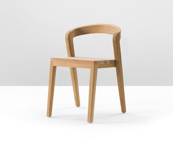
'Play' chair in teak by Alain Berteau for Belgian design label Wildspirit
[En route...]
There's my 'Play' chair for Wildspirit. The teak one. But it's not new. (Laughs.) When we talk to the press, there is this fascination only with the new. But we're talking about design, not about fashion. It's not a t-shirt, it's a chair. It's impossible to work like that. You can not consider design as an entertainment channel. We should not do that. It can be fun and playful and interesting, but I mean it's not about entertaining people, it's about solving problems, giving solutions.
What would you say then about the work of designer-entertainers like Marcel Wanders, for example?
Well, I'm not doing Moooi-like things, but I really admire the ability of Marcel Wanders as a designer and as a creative director. Marcel Wanders is selling emotions and he's doing that very well. The problem isn't Marcel Wanders. It's the 10,000 students who want to be the next Marcel Wanders and don't have his talent. They are trying to sell anecdotes and completely stupid things, to be honest, trying to be the next Wanders or the next Campana Brothers. Let's be honest: it's easier and funnier to try to do that than to be the next Jasper Morrison. That's not easy. I admire Jasper Morrison, but his work is not funny.
It's decidedly un-funny, which, I agree, is admirable.
I also teach furniture design in Brussels and I have a very hard time explaining good design to younger guys. The point is not to be original. The point is to design a super-good, relevant chair. Affordable, stronger. Something that works with your client's production capabilities and market. That's it. Then you're doing your job. And maybe, if you're really good, it becomes a really good chair, and then it's sculpture, then it's great design. It's not the other way. Not trying to create sculptural things and trying to sell it as a design item. That's not my approach.
***
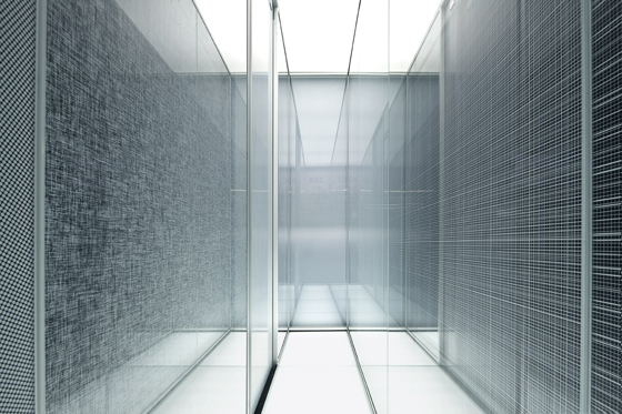
Innovative printing onto glass: Alain Berteau's new 'Functional Patterns' collection for AGC Glass Europe

Innovative printing onto glass: Alain Berteau's new 'Functional Patterns' collection for AGC Glass Europe
×We're now at the AGC Glass Europe stand. What are we looking at?
This new glass-product collection was designed for architecture and design, and for industry too. It's uses a new technology, printing onto glass with amazing precision. We came to the project with the concept that ornament is itself function. Being decorative, being nice-looking, being pleasant as an ornament is a function, is an emotion. Here you see a design like a measurement grid. Lines that come from typical classroom black- and whiteboards, random stripes that double to become a screen. Various levels of density. Beautiful grids that give an impression of depth, but which are completely flat of course. And suddenly you can combine them.
And what's innovative about the production process?
We spent five years developing this. We first tried a new plant in Prague. It wasn't working. So the production capabilities came back to Belgium, where it was easier to manage. The big innovation is the precision of the printing onto the glass. And the speed. Because it's a printer. You don't have to deal with films or masks. You print directly onto the glass and then it's cooked. It's really rapid. You don't have six different production stages, like you had before.
Where to next, Alain?
Let's go to the FELD stand. FELD is a great story.
***
Designed by one of Berteau's students, Patrick Seha, the 'Piano' coat-hanger is manufactured by Belgian label FELD
Here we are at FELD's stand and I have to say it's a very strong collection that's being shown here. Very graphic. You could almost show all the pieces in one colour and let the forms speak for themselves.
Well, for a company that was almost dead two years ago, it's great. FELD was an success from the start, but they lacked the money in order to develop the company correctly. Now, with an investor, we have a very good, reliable, professional base for production, logistics and everything. As artistic director, it's easy to summarise what we are trying to achieve: FELD's goal is to bring new standards, new kinds of updated classic typologies. Things are not timeless. Life evolves.
Let's talk about this coat hanger ('Piano'), for example. It was designed by one of my students, Patrick Seha, at La Cambre in Brussels. It was the result of a study that asked a single question: 'What do you need at home or in your office to handle everything you want to hang up when you arrive?' Do you really need a big piece that stands in the middle of your room, offering just three or four hooks? Patrick came with this idea of a beautiful pattern with a great material – oak – and that's it. You just unfold the desired number of hooks. You can put your shoes here, your bags there. It's amazingly convenient. But in the end it's really lo-tech. Just some bits of wood brought together.
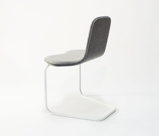
Alain Berteau's new 'Trefle' chair for FELD, with either a stackable or swivel base
But this goes back to what we were saying about objects that work harder. This is a functional piece, but it's also sculptural. And there's the added element of play here. You need to interact with the product before you can use it. You're invited to create the hook before you can place something on it.
There's an emotional interaction there. In the end, we're not IKEA. It's not made in China. It's not expensive, but it's also not cheap. If you buy it, you will have an emotional connection with it. A fair relationship with it. Not some kind of crazy relationship based on ownership. It's not about that. Why do you buy this piece instead of that one? Firstly, because you're comfortable living with something for the next ten years or more, which is the first required emotion. And then because you understand it. You don't need a manual to figure out how it works.
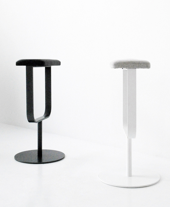
'I'm proud of the fact that we've tried to improve the bar-stool typology': new 'Slim' barstool by Alain Berteau for FELD

'I'm proud of the fact that we've tried to improve the bar-stool typology': new 'Slim' barstool by Alain Berteau for FELD
×It's this that Jasper Morrison often talks about. In a world polluted by design, it's increasingly important for objects to speak of their usefulness, for their function to be legible and easily understandable.
Life is important. Design is not important. Designers aren't important. They may be important if they do a great job. I mean, this is a stupid coat-hanger. What's important is the life that is around it. Not the coat-hanger. It can be fun, it can be different. But, in the end, it's just a coat-hanger. So our goal is to offer a really good and super product, but that is it.
It's interesting that while you've been talking, I've not been able to stop playing with the product.
(Laughs.)
Does it occupy you a lot, the idea of really analysing an object type, really trying to push it?
That's what we should always do. The form of a piece is something you should think about at the very end of the development. Take this barstool ('Slim') for example. Who cares if it is round or square? I don't care about that at all. In this case, I'm proud of the fact that we've tried to improve the bar-stool typology in the sense that it's easy to construct, super-strong and super-convenient. That's it. What's interesting about this stool isn't the styling.
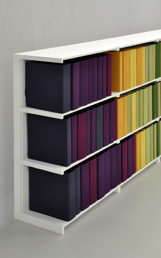
Berteau's new 'Instant Shelving Unit' with his colourful sound-absorbing ring-binder jackets, both for FELD

Berteau's new 'Instant Shelving Unit' with his colourful sound-absorbing ring-binder jackets, both for FELD
×Do you want to tell me about your new shelving system for FELD?
It was really designed to be exact opposite of IKEA'S 'Billy' shelf. I almost called it 'William'. (Laughs.) But that would have been a bit too provocative. So I called it 'Instant Shelving Unit' instead.
Yes, trouble with IKEA could be rather expensive, I imagine.
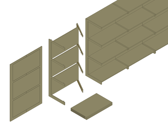
I think so, too. (Laughs.) So, you can assemble the shelving unit without tools. It comes as a flat panel. And pivots allow you to open it out. It's completely tool-less. You just need your hands. And it's strong. And when you move, you just fold it up. Twenty times. One hundred times...
A schematic of Berteau's 'Instant Shelving Unit' for FELD: no tools are required for its construction, just a pair of hands

A schematic of Berteau's 'Instant Shelving Unit' for FELD: no tools are required for its construction, just a pair of hands
×How important is it to produce in Belgium?
Well, all of our products are produced either here or in Germany. We tried working with the Far East for one product, but never again. You spend your time trying to get quality and a good price, and, in the end, it's a big waste of time. We're not looking for world domination with millions of pieces. We're not trying to compete with IKEA. We're just trying to make decent money with fantastic pieces of furniture. IKEA have their market. I honestly believe they've killed the medium-range market with their crazy prices and now there is little place for decent medium-range products that are affordable.
We have to tell a story, a narrative, that is clear about why are products are worth it in terms of quality, knowing where they are made and so on, in spite of the fact that they might be a little be more expensive. Products that are completely new, yet feel familiar. Like when you hear a Beatles song for the first time. You have the feeling that you always knew it. I love that. It's an amazing quality.
And what about the current state of design in Belgium? A lot of design column inches are being given over to the discussion of Belgium as new creative hotspot. Do you actively buy into this?
Well, it's a very hot topic now. Everyone has the feeling that something's happening in Belgium. Most journalists say things like 'You're a Belgian designer. You represent Belgian design...'
Also for Belgian design label FELD, Berteau's 'Airline' mirror, designed with Sarah T Kang
'So, Alain, what does it feel like to be Belgian designer?' (Laughs.)
(Laughs.) To be honest, I'm completely uncomfortable with the idea of a design nationality. When I work for an American company who has factories in American and has an American market, am I doing American design? Am I doing Belgian design because I'm Belgian? What does it mean? When Jasper Morrison, who is British, has an office in Paris and is working for an Italian brand, what is it? Italian? French?
Sometimes you have contexts, with some schools, industries, craftsmanships, which might be typical for a specific area. It makes sense in this case to be associated with others with are similar in some way. But is Scandinavian design supposed to be in wood? Is Dutch design supposed to be funny and arty? I hate that.
I'm not sure how helpful it is to even think about design along national lines anymore.
But to be fair there is something very interesting about design in Belgium. It has to do with geography. The country's location is amazingly convenient. Cologne, Paris, Amsterdam are so close. Milan a short flight away. But does it mean we are a mix of emotional Italian design, conceptual French and supposedly functional German design? Again, it makes no sense. It's not even relevant to try to define it.
National governments like to try to use design as an identity-building activity and you can understand why. Design is easier to understand than contemporary art. Everyone can understand a chair or a light. It talks to everybody. It's a bit like cinema. But, like I said, it shouldn't be fashion. Take Patrick Seha's coat-hanger. The point isn't whether you like it or not, or whether it's trendy. The important thing is it works.
Alain, many thanks.
.....
