Right on So Many Levels: innovative car-park design
Scritto da Simon Keane-Cowell
Zürich, Svizzera
18.08.10
When Joni Mitchell sang that 'they paved paradise and put up a parking lot', she neatly expressed our none-too-positive relationship with that most modern of building types, the car park. Architonic invites you to pull up to the bumper and take a look at a number of recent parking-garage projects that attempt to put a bit of love back into it all.
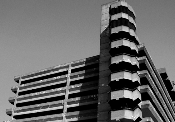
Trinity Square car park in Gateshead, England, designed by the Owen Luder Partnership and completed in 1967; the structure was immortalised on film in 1971 in the British gangster classic 'Get Carter', but it is now, sadly, due for demolition

Trinity Square car park in Gateshead, England, designed by the Owen Luder Partnership and completed in 1967; the structure was immortalised on film in 1971 in the British gangster classic 'Get Carter', but it is now, sadly, due for demolition
×The news that preservationists have finally lost their protracted battle to save Gateshead's Trinity Square car park from demolition will, no doubt, sadden the hearts of the architecturally inclined. The brutalist, multi-storey garage, designed by the Owen Luder Partnership and completed in 1967, has enjoyed an iconic status ever since it featured in the British cult film classic 'Get Carter' of 1971. Trinity Square was guaranteed a place in the popular-cultural imagination the moment Jack Carter (played by Michael Caine) was first seen throwing developer Cliff Brumby to his death from one of the structure's stair towers, Simon Henley reminds us in his book 'The Architecture of Parking'.
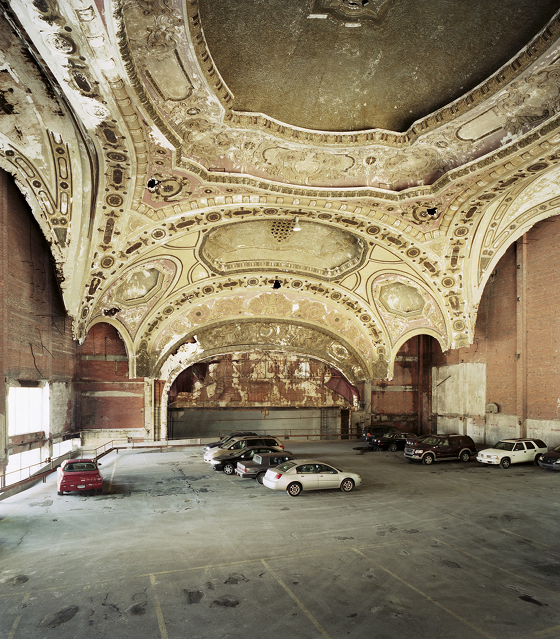
The 1929 Michigan Theater in Detroit now serves as a parking lot, the disonnance between its architecture and current usage symptomatic of the former industrial boom city's inexorable decline; photo Sean Hemmerle

The 1929 Michigan Theater in Detroit now serves as a parking lot, the disonnance between its architecture and current usage symptomatic of the former industrial boom city's inexorable decline; photo Sean Hemmerle
×The seamy underworld of English gangsters aside, it's fair to say that, as far as building types go, car parks rank fairly low on the list of structures loved by the public at large – particularly when expressed in an above-ground, monolithic, concrete form. Maybe it's something to do with their bald, singular function, their necessary evilness. You park your car there, because you need to park it somewhere. But do we really need to look at them? Comments on design blogs like Dezeen that describe architectural projects as looking like garages come, then, as no surprise. (A certain blogger called James recently likened internationally renowned Basel-based practice Herzog & de Meuron's proposed design for a new apartment block in Beirut as looking like a 'multi story carpark with a few windows'.)
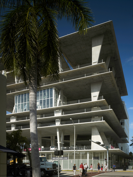
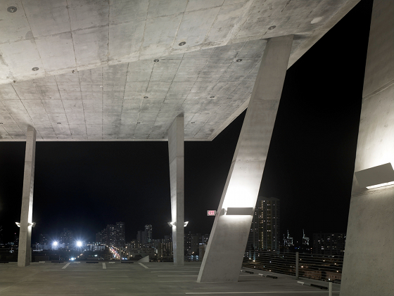
Herzog & de Meuron's multi-storey parking garage at 1111 Lincoln Road, Miami Beach; photo Christian Richters

Herzog & de Meuron's multi-storey parking garage at 1111 Lincoln Road, Miami Beach; photo Christian Richters
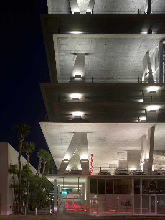
×Herzog & de Meuron's 1111 Lincoln Road takes a cue from its immediate, highly vibrant environs; photo Christian Richters

Herzog & de Meuron's 1111 Lincoln Road takes a cue from its immediate, highly vibrant environs; photo Christian Richters
×Car parks often seem to be regarded as ill-considered interventions in the urban landscape, material signs of how far we, as a society, have fallen in our placing of machine over man. They paved paradise and put up a parking lot, in the words of Joni Mitchell. The architectural hackles were up again recently – this time in opposition to a car park – when Swedish low-cost furniture giant Ikea decided to knock down part of Marcel Breuer's 1969 Armstrong (aka Pirelli) Building in New Haven, Connecticut, to create car-parking space for its customers. And perhaps nothing signifies our imagined fall from grace as much as seeing the splendid interior of Detroit's Michigan Theater (1929) used as a parking lot – in spite of the natural logic that Motor Town's cars should one day come to trump its people.
1111 Lincoln Road's expressive form is resolutely open; photo Christian Richters
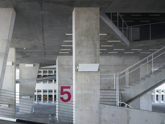
The decks, columns and ramps at 1111 Lincoln Road are all formed from concrete slabs; photo Christian Richters

The decks, columns and ramps at 1111 Lincoln Road are all formed from concrete slabs; photo Christian Richters
×Inside 1111 Lincoln Road parking garage, designed by Basel-based Herzog & de Meuron; photo Christian Richters

Inside 1111 Lincoln Road parking garage, designed by Basel-based Herzog & de Meuron; photo Christian Richters
×A number of architects have over the last few years attempted to renegotiate our relationship with the car park, imbuing it with a greater sense of architectural value, either through formal experimentation, the use of unexpected materials, or a more considered user experience – or a combination of all three. Car parks may not be buildings of desire (when was the last time you saw an 'I love car parks' t-shirt?), but there is certainly an opportunity to extend their function beyond the mere utilitarian. When Herzog & de Meuron, known for such projects as London's Tate Modern and, more recently, the VitraHaus in Weil am Rhein, responded to the brief to create a mixed-use development called 1111 Lincoln Road in Miami Beach, they took a highly expressive approach to the parking-garage element of the scheme. (This time it was supposed to look like a car park.)
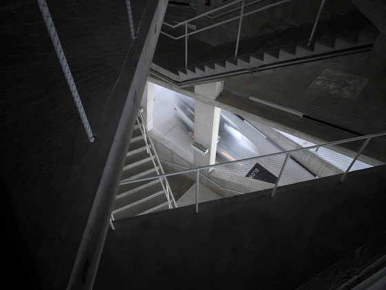
An open, centrally placed staircase affords visitors views in all directions, as well as making the experience of ascending and descending somewhat ceremonial; photo Christian Richters

An open, centrally placed staircase affords visitors views in all directions, as well as making the experience of ascending and descending somewhat ceremonial; photo Christian Richters
×'The structure is the architecture', say Herzog & de Meuron of 1111 Lincoln Road; photo Christian Richters

'The structure is the architecture', say Herzog & de Meuron of 1111 Lincoln Road; photo Christian Richters
×The completely open concrete structure takes a cue from the urban dynamism of its immediate surroundings. Lincoln Road is a destination as well as a thoroughfare, featuring a number of bars and restaurants that are patronised night and day throughout the year. The garage's varied ceiling heights – standard parking height, double and triple – not only increase the sense of structural openness and allow users panoramic views out of the building, they also mean the structure can be used as a location for photo and film shoots, and a venue for parties, concerts and other social activities. As a space where man isn't displaced by machine, 1111 Lincoln Road's car park transcends its primary function as storage.
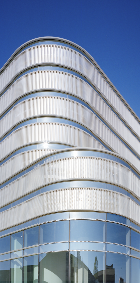
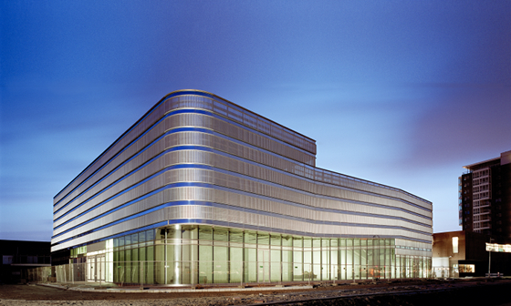
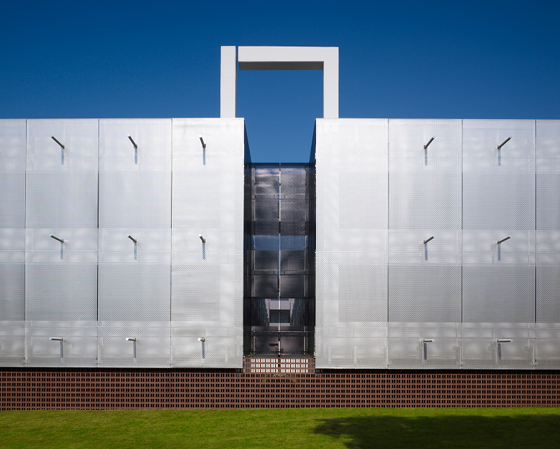
The façade of Dutch practice Paul de Ruiter's Veranda car park in Rotterdam; photo Rien van Rijthoven

The façade of Dutch practice Paul de Ruiter's Veranda car park in Rotterdam; photo Rien van Rijthoven
×The perforated-aluminium and mirrored-glass façade means that the structure glows 'like a lantern' at night; photo Rien van Rijthoven

The perforated-aluminium and mirrored-glass façade means that the structure glows 'like a lantern' at night; photo Rien van Rijthoven
×'The structure is the architecture,' say Herzog & de Meuron of their Miami project. The language used to articulate the building as a whole is a consistent, schematic one; concrete slabs form the 2,500-square-metre car park's various elements – floor plates, columns and ramps. The sense that this really is a space with an aesthetic, experiential value is underscored by the treatment of pedestrian circulation. An open staircase rises sculpturally through the centre of the structure, inviting views in all directions of the architecture and beyond. This car park, with all its ceremony, is a secular cathedral for our times.
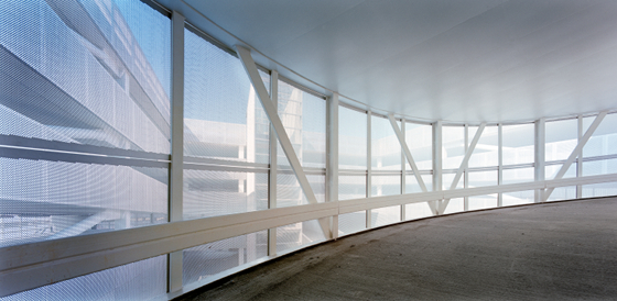
Inside the Veranda car park, designed by Paul de Ruiter; photo Rien van Rijthoven
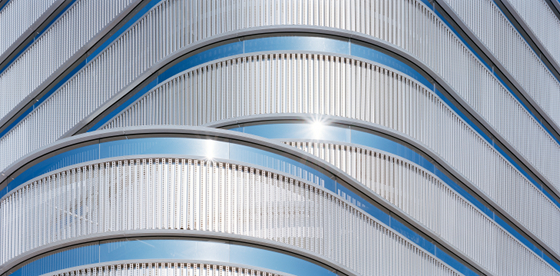
Alternating aluminium ribbons and strips of mirrored glass form the Veranda car park's façade; photo Rien van Rijthoven

Alternating aluminium ribbons and strips of mirrored glass form the Veranda car park's façade; photo Rien van Rijthoven
×'Instead of cars, people are the issue of the design,' says Amsterdam practice Paul de Ruiter of its Rotterdam Veranda car-park project. Placing aesthetics high on the creative brief's list of priorities has translated into a confidently expressive structure that, like Herzog & de Meuron's Miami garage, challenges our received ideas of what such a building type should look like. Built in response to the need for parking near the city's Feyenoord Stadium, the 650-place car park assigns its façade as much of a functional value as its interior, the function being its visual appeal. Composed of horizontal ribbons of perforated aluminium, alternated with small strips of mirrored glass, all housed in extruded aluminium profiles, the façade diffuses daylight on the inside of the structure, while, from the outside at night, allowing artificial light through it, creating an effect the architect likens to a lantern.
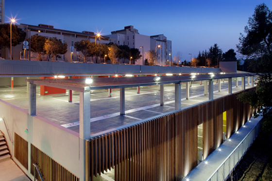
N+B Architects' Carros car park, located in front of the Forum Jacques Prevert, just outside Nice; photo Paul Kozlowski

N+B Architects' Carros car park, located in front of the Forum Jacques Prevert, just outside Nice; photo Paul Kozlowski
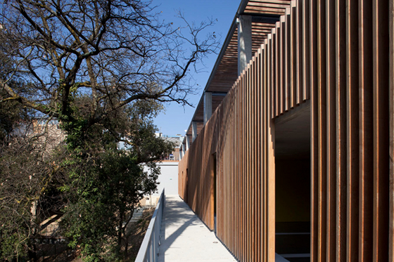
×The Carros car park's wooden skin serves to achieve a visual harmony with the tree-rich landscape in which it sits; photo Paul Kozlowski

The Carros car park's wooden skin serves to achieve a visual harmony with the tree-rich landscape in which it sits; photo Paul Kozlowski
×Light in general plays an important part in the project, ensuring that the interior of the building isn't, from an experiential point of view, an anti-climax after having seen the car park from the outside. With four of the eight park levels underground, a large, central open area allows light, and, of course, air, to penetrate down to these lower levels, making them just as easy to navigate and pleasurable to use as the upper ones.
Inside N+B Architects' Carros car park; photo Paul Kozlowski
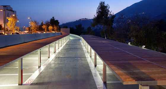
N+B Architects' Carros car park treads a fine line between responding to the need for a significant number of new parking places and respecting its environs; photo Paul Kozlowski

N+B Architects' Carros car park treads a fine line between responding to the need for a significant number of new parking places and respecting its environs; photo Paul Kozlowski
×N+B Architects' Carros car park, located in front of the Forum Jacques Prevert, not far from Nice, also presents a highly considered façade. The application to the structure of a wooden skin, however, serves a different purpose. Whereas the Veranda car park, with its quasi-mirrored effect, invites a lingering gaze, the French project attempts a visual harmony with the tree-rich landscape into which it has been placed (or, as N+B Architects put it, 'registering an identity of the place in agreement with its environment').
Situated on a slope, the Carros car park treads a fine balance between between responding to the need for car space, which, until the completion of the project, had had a negative impact on the town, and ensuring that such an architectural answer is measured in terms of scale and visibility. In short, it seeks to add value, but not to dominate. This is a design is meant to be seen. Just not seen too much.
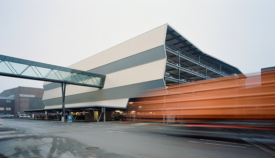
Austrian practice X Architekten's formally expressive car park for Linz-based steel company voestalpine; photo David Schreyer

Austrian practice X Architekten's formally expressive car park for Linz-based steel company voestalpine; photo David Schreyer
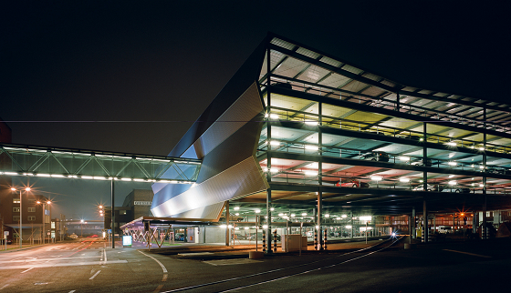
×The voestalpine car park demonstrates a virtuoso use of the client's stock-in-trade: steel; photo David Schreyer

The voestalpine car park demonstrates a virtuoso use of the client's stock-in-trade: steel; photo David Schreyer
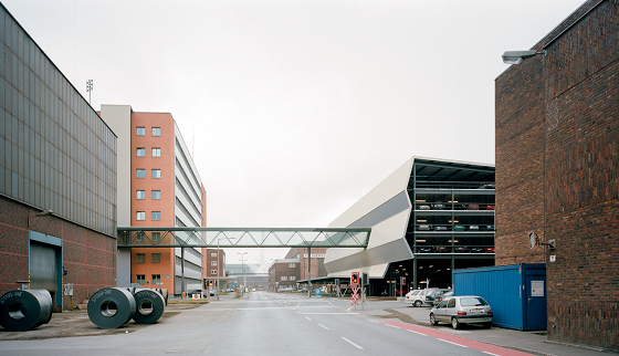
×Austrian architectural office X Architekten's multi-storey car park for Linz steel company voestalpine deals with a completely different context. The issue here wasn't one of how to insert a parking structure into a landscape with great sensitivity, but, rather, how to produce a formally expressive building that functions as an advertisement almost for its owner's business. Initially driven (no pun intended) by the need to save space on site by centralising the works' hitherto dispersed car-parking spaces, X Architekten delivered a garage that displays a virtuoso use of voestalpine's stock-in-trade: steel. 'We succeeded conceptually and constructively in highlighting the processing of metal within its own factory buildings,' says the practice.
Trapezoidal sheet metal, with a series of angular bends in it, forms one of the structure's elevations; photo David Schreyer

Trapezoidal sheet metal, with a series of angular bends in it, forms one of the structure's elevations; photo David Schreyer
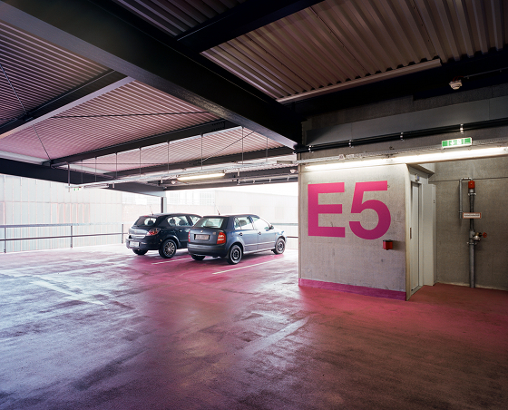
×Colour-coding inside the voestalpine parking garage aids orientation; photo David Schreyer
Steel company voestalpine's new car park centralises the industrial site's hitherto dispersed parking spaces; photo David Schreyer

Steel company voestalpine's new car park centralises the industrial site's hitherto dispersed parking spaces; photo David Schreyer
×This was achieved through the creation of a façade made of trapezoidal sheet metal with a series of highly angular bends in it, the bend nearest ground level forming the porch for a bus stop. Inside the structure, which can house up to 800 cars over five storeys, steel is given further expression in the form of undisguised steel beams and uprights, which work to create a relatively slender framework that can be best appreciated at night when internal artificial lighting foregrounds it in silhouette.
The central atrium at Elliott + Associates Architects' Car Park One for Oklahoman energy company Chesapeake Energy; photo Scott McDonald and Hedrich Blessing

The central atrium at Elliott + Associates Architects' Car Park One for Oklahoman energy company Chesapeake Energy; photo Scott McDonald and Hedrich Blessing
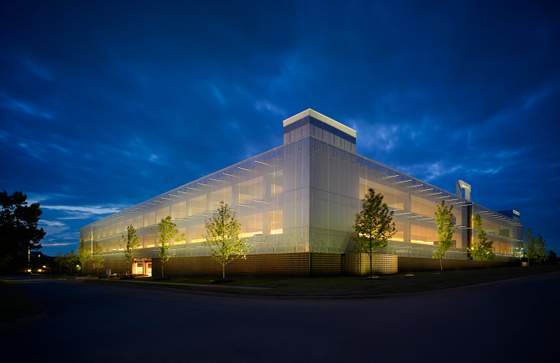
×Car Park One is wrapped in a stainless-steel mesh, whose open weave allows natural light and air into the structure; photo Scott McDonald and Hedrich Blessing

Car Park One is wrapped in a stainless-steel mesh, whose open weave allows natural light and air into the structure; photo Scott McDonald and Hedrich Blessing
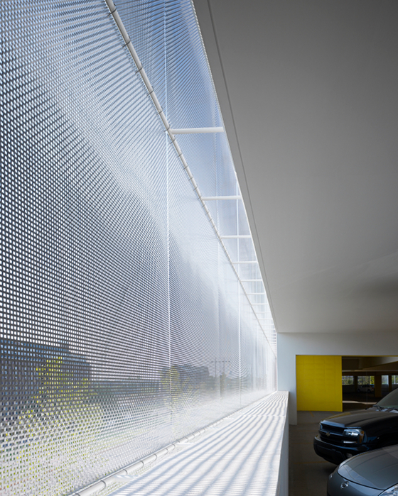
×'Parking as art' is how Elliott + Associates Architects choose to describe their Car Park One parking garage for Oklahoma energy concern Chesapeake Energy. Built on the corporation's campus, the structure is an out and out attempt to displace users' expectations of what a car park should look like and feel like. Moreover, it's a conscious piece of archi-branding, projecting a highly considered image of what the company stands for, at a time when the energy business doesn't enjoy a particularly good reputation.
Car Park One's mesh skin, reflecting the sun; photo Scott McDonald and Hedrich Blessing
Vehicles are screened from passers-by at Car Park One by high concrete bumpers; photo Scott McDonald and Hedrich Blessing

Vehicles are screened from passers-by at Car Park One by high concrete bumpers; photo Scott McDonald and Hedrich Blessing
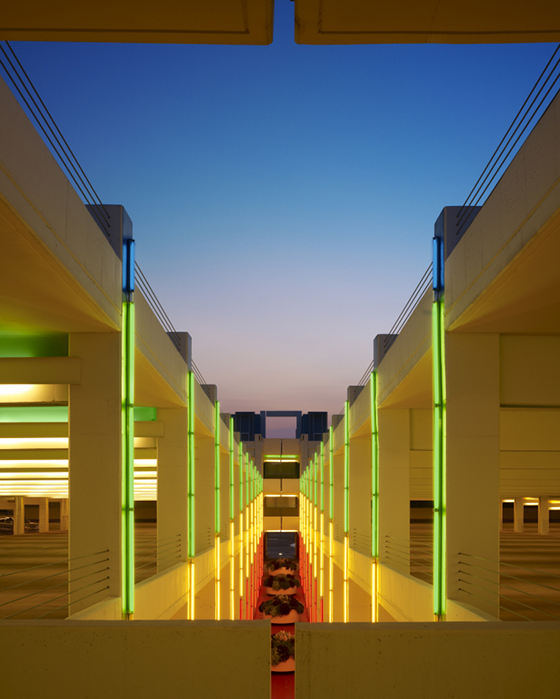
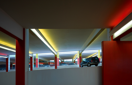
×Inside Car Park One, designed by Elliott + Associates Architects; photo Scott McDonald and Hedrich Blessing

Inside Car Park One, designed by Elliott + Associates Architects; photo Scott McDonald and Hedrich Blessing
×With capacity for 791 vehicles, Car Park One features a stainless-steel mesh skin, whose open weave allows both light and air into the structure, while reflecting the changing Oklahoman sun when viewed from the outside. Concrete bumpers, over a metre in height, screen parked cars from passers-by, maintaining the aesthetic unity of the project. Inside the garage, users are aided in navigation through colour-coded levels and such details as coloured fluorescent lighting, strong graphics and confident typography. A full-height, four-metre-wide atrium, which encourages air circulation, also helps orientation.
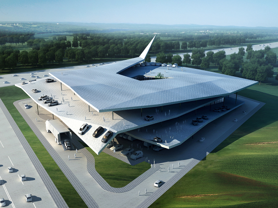
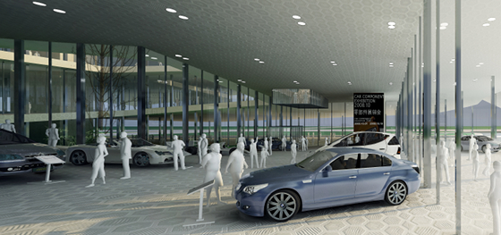
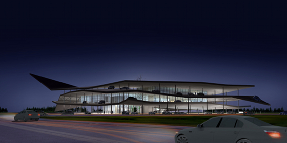
3Gatti's design for a new Automobile Museum in Nanjing
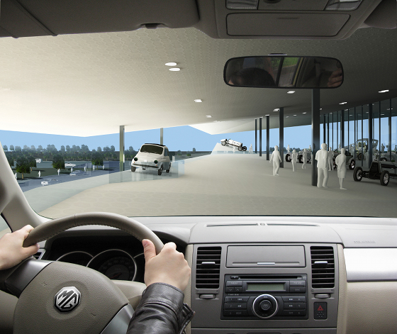
Visitors to the Automobile Museum actually drive through part of the exhibition in their cars, safari-style

Visitors to the Automobile Museum actually drive through part of the exhibition in their cars, safari-style
×Not exactly a car park, but more of an homage to all things automobile, is Rome- and Shanghai-based architects 3Gatti's design for a new Automobile Museum in Nanjing. Centred on the notion of the structure's space in its entirety being navigable by car, separate floors, walls and lifts are displaced by a ramp that winds continuously upwards. 'The car is the point of reference,' say 3Gatti, who like to use the medium of film as an analogy when discussing the logic of the building. 'The building's typology develops sequentially,' they explain, 'its structure similar to that of a film where the undisputed protagonist is the automobile. In fact the visitor, as the spectator of the film, is obliged, frame by frame, to follow the physical and psychological route as dictated by the museum's architect.'
'The car is the point of reference', say 3Gatti of their design for a new Automobile Museum in Nanjing

'The car is the point of reference', say 3Gatti of their design for a new Automobile Museum in Nanjing
×3Gatti's Automobile Museum design makes us consider the relation between movement and architectural space

3Gatti's Automobile Museum design makes us consider the relation between movement and architectural space
×Visitors to Nanjing are invited to locate themselves within the conceptual framework of the place by driving their own vehicles up through the exhibition, via the ramp (whose incline and evenness changes frequently), to the top floor; then proceeding, by foot, back down to ground level. They themselves become, therefore, exhibits within the highly spectacular museum space. (Parked cars can be retrieved by means of a lift that returns drivers to the top of the building, in case you were wondering.) Such practise-what-you-preach circulation might appear a bit gimmicky at first ('Drive through a car museum? But, of course!'), but what a project like 3Gatti's actually does is to make us conscious of the relation between movement, driving, walking and architectural space. Given the ubiquity of car parks whose design fails to understand this relation fully, and, moreover, manages to short-change us in terms of a decent user experience and of aesthetics, Nanjing should be on the list of places to visit for any architect or developer planning to put up a parking lot. Sing it, Joni. But this time with pride.
.....
Simon Henley's fascinating study 'The Architecture of Parking' (2007) is published in English by Thames & Hudson (www.thamesandhudson.com) and in German (as 'Parkhaus-Architekturen') by Niggli (www.niggli.ch)
