Selling Spaces: new directions in retail design
Scritto da Simon Keane-Cowell
Zürich, Svizzera
12.12.12
In spite of the rise of e-commerce, the physical point of sale is still with us. That said, the traditional store is having to up its game in terms of the experience and brand relevance it offers consumers – not only to compete with online shopping but also to support it. Architonic goes all secret shopper to investigate.
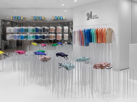
Japanese design studio Nendo takes a concept-led approach to the design of the 24 Issey Miyake store in Tokyo’s Shibuya Parco, using clusters of steel rods to turn the functional display of goods into something far more sculptural

Japanese design studio Nendo takes a concept-led approach to the design of the 24 Issey Miyake store in Tokyo’s Shibuya Parco, using clusters of steel rods to turn the functional display of goods into something far more sculptural
×It’s not uncommon these days to hear about a high-street retail brand going to the wall. And long-standing ones at that. No surprise really, given the less than favourable financial straits most national economies are currently in. Internet shopping – although not unaffected by sluggish, if indeed negative, sales growth – continues to gain ground at the expense of its analogue counterpart, the physical point of sale.
Yet, we’re far from witnessing the end for the traditional, non-virtual shop. Retail footfall may ebb and flow, but stores, as real-time spaces to which consumers deliver themselves and where they – if things go according to plan – part with their money, continue to serve a purpose.
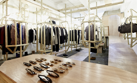
The LN-CC (Late Night Chameleon Café) store in Dalston, London, takes a theatrical, highly curated approach to retail design. Conceived of by set designer Gary Card, the shop delivers visitors to its product rooms via a wooden tunnel

The LN-CC (Late Night Chameleon Café) store in Dalston, London, takes a theatrical, highly curated approach to retail design. Conceived of by set designer Gary Card, the shop delivers visitors to its product rooms via a wooden tunnel
×But what is that purpose exactly in 2012? If anything’s clear, it’s that the point of sale, as we know it, is moving beyond its historical function as a quasi-public space for the mere display and provision of goods and services to something altogether more sophisticated and plural. And the internet is without a doubt playing a key role in this evolution.
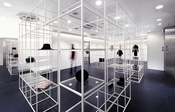
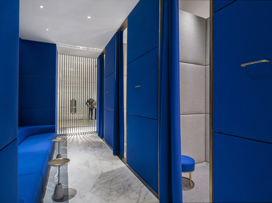
What’s the key difference between online and in-store shopping? Physical space. Japanese office NI&Co. Architects’ micro-architectural design for the Bianco Nero boutique in Osaka treats visitors to a memorable spatial experience; photo Yuko Tada

What’s the key difference between online and in-store shopping? Physical space. Japanese office NI&Co. Architects’ micro-architectural design for the Bianco Nero boutique in Osaka treats visitors to a memorable spatial experience; photo Yuko Tada
×Smart brands, however, don’t consider this to be the death-knell of the physical point of sale – the store – but rather as a challenge to reimagine its meaning. If everything’s cheaper on the internet, how do you make real-time, real-place shops meaningful? How do you turn online brand fans back into analogue consumers?
As human interaction becomes increasingly abstracted and virtual thanks to the rise of social media, interaction brings with it transaction. E-commerce seems to offer the perfect package: competitive pricing, convenience in terms of where and when you can shop, and a reduced environmental impact (allegedly).
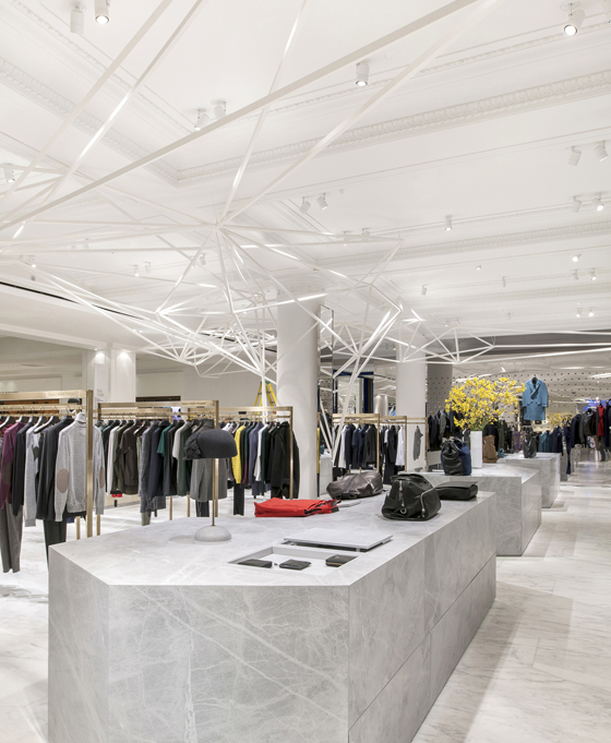
Commissioned by established London department store Selfridges to design its new designer menswear space, architect Alex Cochrane has created, as part of its scheme, a geometric sculpture that stretches across the room’s ceiling

Commissioned by established London department store Selfridges to design its new designer menswear space, architect Alex Cochrane has created, as part of its scheme, a geometric sculpture that stretches across the room’s ceiling
×One answer is to get all architectural on your shoppers, to transform the conventional store visit into a memorable spatial encounter that truly engages, delights and challenges. Such an approach – the concept-led, interior-architecturally considered retail space – is perhaps nowhere more in evidence than in Japan, where a number of architecture and design offices, such as celebrated practice Nendo, have realised retail environments that elicit emotional and even intellectual responses on the part of consumers, producing a conscious awareness of being-in-space.
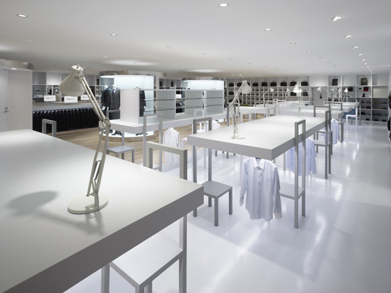
Japanese design studio Nendo have delivered a memorable concept for men’s suit brand Halsuit’s Okayama store, conflating retail space with office space. Its display system is made up playfully of conference tables, chairs and task lamps

Japanese design studio Nendo have delivered a memorable concept for men’s suit brand Halsuit’s Okayama store, conflating retail space with office space. Its display system is made up playfully of conference tables, chairs and task lamps
×Nendo’s retail designs for fashion brands Issey Mikaye or Halsuit are just two examples of what Nicole Srock-Stanley, managing director of the Berlin-based brand-architecture agency dan Pearlman describes as ‘the authentic’: playful, added-value environments that seduce, reconnecting visitors with the idea of offline consumption.
But to think of the traditional point of sale on the one hand and e-commerce on the other as some kind of binary, both somehow in competition, would be to misunderstand the mutually informing relation that these two channels or environments increasingly share. Take the British luxury brand Burberry, for example, which Business Weekly ranks in the top 100 most valuable brands globally.
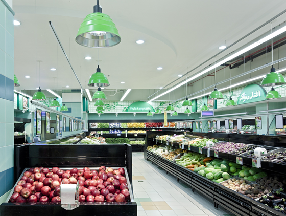
Colour-coded, contemporary metal pendant lights punctuate the space throughout the Lulu Hypermarket in Abu Dhabi, designed by the Emke Group with light planning by Ansorg. Green for fresh produce, blue for fish, red for the meat section and so on

Colour-coded, contemporary metal pendant lights punctuate the space throughout the Lulu Hypermarket in Abu Dhabi, designed by the Emke Group with light planning by Ansorg. Green for fresh produce, blue for fish, red for the meat section and so on
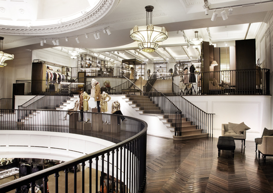
×When it came to launching a 44,000-square-foot (4,100-square-metre) flagship store on London’s Regent Street recently, the company chose not only, as one might expect, to specify a range of premium materials for the fit-out, such as bronze, hand-made glass and wood-panelling, but to embed the latest digital technology into the building as a central part of the user experience – indeed, to view the store as an extension of the brand’s online presence. It’s no accident that the official Burberry press release chooses to describe the store as ‘the largest Burberry brand experience in the world’.
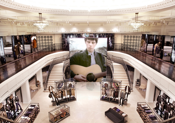
Online communities of fans are invited to become in-house, real-time patrons at Burberry’s new flagship store on London’s Regent Street. Seamlessly integrated digital technology includes a 7-metre-high laser-phosphor screen for live web streaming…

Online communities of fans are invited to become in-house, real-time patrons at Burberry’s new flagship store on London’s Regent Street. Seamlessly integrated digital technology includes a 7-metre-high laser-phosphor screen for live web streaming…
×…and embedded radio-frequency identification technology, woven into selected garments and accessories, which triggers relevant multimedia content (such as footage from catwalk shows) on screens that double as changing-room mirrors

…and embedded radio-frequency identification technology, woven into selected garments and accessories, which triggers relevant multimedia content (such as footage from catwalk shows) on screens that double as changing-room mirrors
×Visitors to the Regent Street brand temple (or ‘retail theatre concept’, as Burberry would also have it) are subjected to – if that’s the right expression – brand content delivered via 500 speakers and 100 screens throughout the space, as well as a 7-metre-high laser-phosphor display, the largest of its kind in the world. Satellite technology allows the live-streaming of events directly into the store and vice versa: an uplink facility enables events from the store, such as gigs, screenings and talks, to be broadcast live online.
Torafu Architects’ design for the Nike 1Love store in Tokyo employs a cylindrical, glass display wall to define its interior space. Its transparency gives the impression that the products it houses are floating in air; photo Daici Ano

Torafu Architects’ design for the Nike 1Love store in Tokyo employs a cylindrical, glass display wall to define its interior space. Its transparency gives the impression that the products it houses are floating in air; photo Daici Ano
×The strategy here would seem to be fairly clear: to try to get Burberry’s online community of fans to take up residence as an in-house, embodied public. Just hang out for a while, why don’t you?
But there’s more to it than this. Getting your consumers to enter your stores is an effective means of profiling them, tracking them in-situ as they make their way through the decision-making process of what to buy and what not to. Embedded digital technology comes into play here; at Burberry’s London store, for example, radio-frequency identification technology (or RFID) is woven into selected garments and accessories, triggering relevant multimedia content, such as catwalk footage, on mirrors that turn into screens for example.
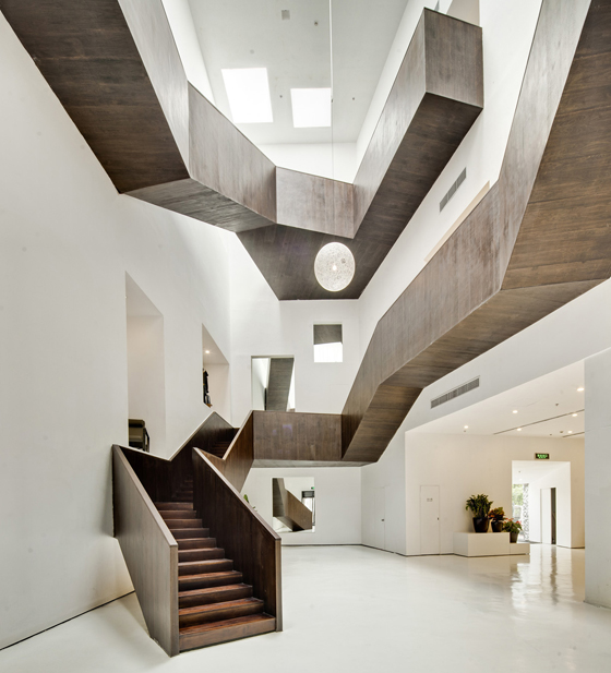
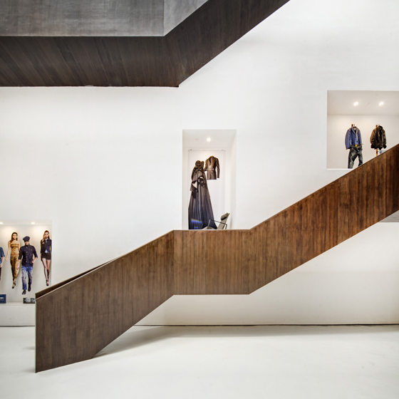
Shanghai architects Neri&Hu’s design for Design Republic’s Design Collective store, also in Shanghai, took the opportunity while refurbishing an existing building of installing a show-stopping wrap-around staircase within the main exhibition space

Shanghai architects Neri&Hu’s design for Design Republic’s Design Collective store, also in Shanghai, took the opportunity while refurbishing an existing building of installing a show-stopping wrap-around staircase within the main exhibition space
×Beyond the customer experience that such wizardry creates, data gathering is the name of the game, and consumer data, as we know, can be a company’s greatest asset.
With the flow of information and content working in both directions – from the digital realm to the point of sale and the other way round, as in-store customer tracking is used in later online follow-up contact – retail spaces become, in effect, just another platform for brand activity. The German Design Council’s CEO, Andrej Kupetz, hit the nail on the head at a recent retail-design conference hosted by the foundation, describing the future of the physical retail environment as a ‘marketing device’.
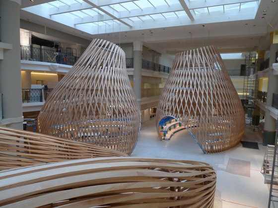
Hermès’ flagship store on Paris’s Rue de Sévres plays with architectural space, turning the experience of shopping into one of discovery. Freestanding ash pavilions sit within the fashion brand’s new Left Bank home in an old 1930s swimming pool

Hermès’ flagship store on Paris’s Rue de Sévres plays with architectural space, turning the experience of shopping into one of discovery. Freestanding ash pavilions sit within the fashion brand’s new Left Bank home in an old 1930s swimming pool
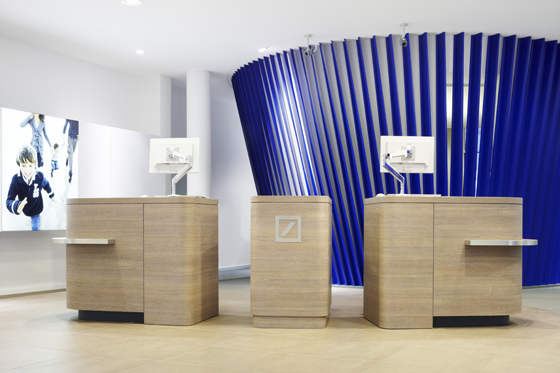
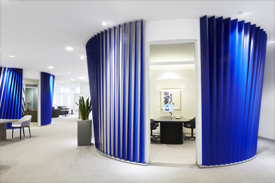
×If retail design in its physical expression is as much about presenting a brand narrative, its values and attributes, as it is about a place for selling stuff, then an interesting example of this convergence of interior architecture with brand architecture is Deutsche Bank’s recent redesign of its branches through Europe. Following an architectural competition, the bank commissioned Vienna-based office BEHF Architects to develop a design concept that expressed a key offering of the bank to its clients – its advisory services – in a highly visual and legible way.
Interior architecture as brand architecture: Deutsche Bank’s redesign of its branches across Europe features ‘cones’ that function on two levels: as discreet spaces for advising clients and as abstract expressions of the institution’s 2-D logo

Interior architecture as brand architecture: Deutsche Bank’s redesign of its branches across Europe features ‘cones’ that function on two levels: as discreet spaces for advising clients and as abstract expressions of the institution’s 2-D logo
×The result is a modular system (it can tailored to branches to meet their specific requirements and their floor space), which, in addition to eschewing the traditional client-versus-consultant counter that keeps the two parties apart, introduces a strongly architectural, free-standing spatial element: the consultation space. Audibly private, yet visually semi-open, this inverted ‘cone’, as Deutsche Bank calls it, makes a confident optical statement, while cleverly reinforcing the brand’s visual identity. The diagonally positioned Yves-Klein-like-blue blades that surround it, performing a partial screening effect, are a clear graphic reference to the institution’s highly recognisable logo. This is three-dimensional space in the service of two-dimensional visual communication, in the service of brand reinforcement.
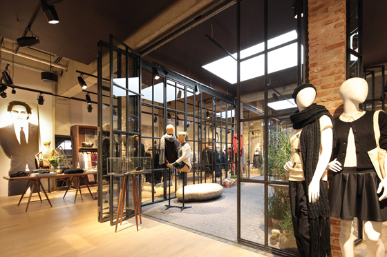
Dusseldorf-based office Reich und Wamser’s design for the Esprit Lighthouse store in Cologne makes visitors conscious of the space as they move through its differentiated areas; at its heart is a the winter garden, shown here

Dusseldorf-based office Reich und Wamser’s design for the Esprit Lighthouse store in Cologne makes visitors conscious of the space as they move through its differentiated areas; at its heart is a the winter garden, shown here
×Deutsche Bank is just one of a number of high-equity brands to have rethought the significance of their retail spaces, treating them with the same brand-focused consideration as their other brand collateral. The only way such spaces work for consumers, however, is if that aforementioned feeling of ‘authenticity’ in terms of how one experiences the retail environment is delivered. Too much ham-fisted, in-your-face brand-pushing will turn even the most enthusiastic brand fan off.
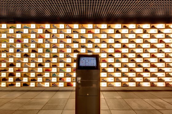
The science of footwear is the name of the game at Sydney’s Sneakerology, designed by Facet Studio, where information on the products displayed in-store is delivered digitally on a series of touch panels; photo Katherine Lu

The science of footwear is the name of the game at Sydney’s Sneakerology, designed by Facet Studio, where information on the products displayed in-store is delivered digitally on a series of touch panels; photo Katherine Lu
×On the one hand, as the rise of social media has shown us, we’re happy to sign up to a bit of fandom, to be one of many hundreds of thousands who choose to ‘like’ a brand. But if our encounter with the physical point of sale doesn’t leave us feeling good about ourselves – and central to this is feeling like an intelligent individual, capable of making our own choices as consumer – then this can only be to a brand’s detriment. When it comes to retail, we don’t like to sell ourselves short.
