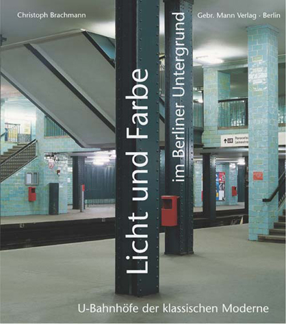
Licht und Farbe im Berliner Untergrund (Light and colour in the Berlin subway)
Scritto da Susanne Junker
Berlin, Germania
15.07.08
U-Bahnhöfe der klassischen Moderne (Underground stations in the classical modern style)
Whenever we want to give our visitors a big-city reality shock after the customary 'Berlin is cool and sexy' tour, we take them for a trip on the U8 subway line. This underground link between the Wedding, Mitte, Kreuzberg and Neukölln districts offers the greatest density of fighting dogs, body builders smelling of deodorant and displaying their oiled and tattooed biceps, emaciated drug addicts with an unsteady gaze, heavily veiled women burdened with prams and discount-store carrier bags filled to bursting point, gangs of cocky youths with a testosterone imbalance and beer-drinking homeless drunks who look as if they haven't seen daylight for months. The smell of sweat, urine, dirt, beer and stale fat from frying seems to have congealed in indefinable puddles – but when we consider the architectural spaces through which this grimy line travels it becomes clear that the U8, a linked ensemble of 15 stations, is unjustly neglected as an unloved stepchild.
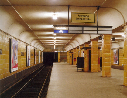
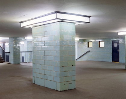
Under the management of architects Alfred Grenander and Peter Behrens, who designed the Moritzplatz station, a range of functional buildings was created along the line between 1927 and 1930. These still operate perfectly from a technical transport point of view and at the same time feature architectural designs which in all their formal reductionism represent outstanding examples of so-called 'Neues Bauen' (the new style of building). In design terms some of the stations are simple, extended rectangles while others, for example Hermannplatz, are resplendent lofty halls with imposing stairways. The Alexanderplatz station is a model for the organisation of a number of lines crossing one another and well managed guidance of passenger flows through intermediate hallways.
For hygienic reasons the walls were mainly faced with architectural ceramics and even the selection of colours is a feast for the eye: a luminous cobalt blue, blue green with bluish glazing, sulphur yellow against the matt glow of beige gray, cream with bright yellow green, dusky pink with dark brown. The colour reflections and glazing effects vary from station to station, with Peter Behrens’ Moritzplatz even offering associations of mother of pearl. The stations between Moritzplatz and Voltastraße in particular benefit from the fact that - because of the partition of Berlin between 1961 and 1989 - they were ghost stations through which trains from the western side passed without stopping. Fortunately the GDR soldiers patrolling in the twilight had other things on their mind than making running repairs which in the long term would probably have led to the destruction of the original design and materials instead of their preservation.
On the basis of a survey made for preservation purposes art historian Christoph Brachmann has presented a carefully researched and almost comprehensive documentation of the U8 underground line. However, he goes well beyond the U8 and looks at the history of the Berlin subway as a whole with its companies, architects and other protagonists from an urban planning, transport, socio-political, architectural and art history point of view. Without pulling any punches he also documents how, in the case of the repair and maintenance of the U8 line in particular, the current operating company BVG diminishes or botches significant details as a result of negligence or lack of respect, or replaces them by superfluous decorations, with the result that carefully composed architectural effects are irreparably destroyed. The outstanding photos by Gisela Kohrmann from the 'Projektgruppe Licht + Farbe' (Project Group Light + Colour), which we are unfortunately unable to publish in this review for legal reasons, are therefore unfortunately not just vivid illustrations of Christoph Brachmann's text, but also in themselves form an independent historical record.
Wouldn't it be nice if the "new" Berlin, in addition to the current discussion of traffic infrastructure facilities such as the main railway station, the new international airport and the Kanzler-U-Bahn (chancellor's subway), were also prepare to look after and care for all those facilities from the old "new" Berlin which go almost unnoticed in everyday transport operations …
Christoph Brachmann
292 pages, 251 illustrations,
24.0 x 27.0 cm, hard cover,
Publishers: Gebrüder Mann Verlag Berlin 2003
Recommended price:144.- CHF, 88.- EUR
ISBN 978-3-7861-2477-1 - German
