Layer up: multi-purpose buildings with multi-layered facade solutions
These recent projects use open and layered facades to protect themselves while wearing history and purpose on their sleeves. Featuring c+d Design Center, allmannwappner, PAU – Practice for Architecture and Urbanism and Wutopia Lab.
febrero 4, 2024 | 11:00 pm CUT

While some equal the wearing of a mask to acting ‘fake’ or two-faced’, depending on which side of the generational line you fall, as humans, most of us regularly – and often unwittingly – change the masks we wear. It’s natural for us to sell the best version of ourselves to others, and to transform into whatever version we think they’re most comfortable with.
Facade plays a crucial role in defining a building’s use and character
As a building’s mask, its facade plays a crucial role in defining its use and character, and in turn the characters of its visitors – the employees, residents, students, shoppers and audiences – who define a little part of themselves with the buildings they frequent. Unable to change their masks as easily as humans, however, a building’s facade is a more constant, honest reflection of itself. These large buildings use facades with multiple layers not to hide themselves away underneath a mask, but instead as opportunities to reveal the hidden depths of their history and character.


Asian Games Athlete Village in Hangzhou, China, by c+d Design Center
‘To interpret traditional culture in modern times as a window for cultural transmission’ was one of the key briefs the newly-built Asian Games Athletes Village complex by c+d Design Center was tasked with in the lead-up to the event at the end of 2023, as project architects recall.
In response, a facade of glazed turquoise pottery clay was selected as the main material for one of the most prominent sections, adding ‘both celadon colour and a feeling of jade-like warmness and smoothness’ to the site, as c+d Design Center explains.
A layered facade of louvre blades meant a landscape map could be abstractly deduced
Using the clay to create a layered facade of louvre blades, along with digital design practices, meant ‘a complicated landscape map could be abstractly deduced and presented with the graceful angle and rotation of the blades, and the resulting subtleties between chromatic aberration and shade,’ detail the architects, who used the technique to bring the ‘cultural characteristics of the region south of the Yangtze River’ to the facade.


Texoversum Innovation Center in Reutlingen, Germany, by allmannwappner, Menges Scheffler Architekten and Jan Knippers Ingenieure
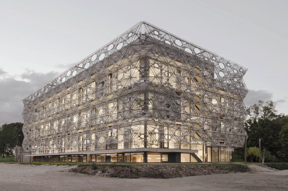
As part of the Reutlingen University of Applied Sciences – the part that researches, teaches and ultimately innovates cross-cutting technologies in the textile industry – the aptly named Texoversum is clearly not shy about what it is and what it does. Along with using a suitable portmanteau of ‘textile universe’ as the building’s name, the Innovation Center has been wrapped in a ‘facade of woven carbon and glass fibre tiles,’ explain the architects.
A woven carbon and glass fibre facade is a symbol of the future potential of innovative materials and textile techniques
‘A symbol of the future potential of innovative fibre-based materials and textile techniques,’ describe the architects, the building’s spider’s web skin is created from individual, self-supporting tiles without the need for a load-bearing frame. But while the textile facade is both aesthetically and symbolically applied, it’s also an extremely functional aspect of the building’s design.
The multi-layered appearance and arrangement of the tiles are designed to follow the path of the sun and their staggered arrangement also provides the protected balcony with unobstructed views of the surrounding landscape.


Domino Sugar Refinery in Brooklyn, NY, USA, by PAU – Practice for Architecture and Urbanism
As an iconic part of both Brooklyn’s skyline and waterfront, the Domino Sugar Refinery’s brownstone facade and dominating smokestack – built in 1882 – was made a protected New York City Landmark in 2007 due to its historical significance. Because of the enormous scale of the required equipment, however, the open-level factory’s protected facade features irregularly sized stories that were impossible to match up with contemporary standards.
‘By pulling pack from the original walls, a 10-12 ft gap between new and old allows standardised floor heights to be achieved’
Although perhaps the simplest and most obvious solution, PAU – Practice for Architecture and Urbanism’s plan for its redevelopment to ‘nest a brand-new building inside the existing envelope,’ as the architects explain, was also the most adventurous. By ‘pulling back from the original walls, a 10-12 ft gap between new and old allows standardised floor heights to be achieved.’
The fully-glazed inner facade of the new building ensures there’s no loss of natural light to its interior, and by filling the gap with considerately-applied greenery and architectural lighting, a magical world is created in the space – providing a glorious accompaniment to the ever-rising Brooklyn and Manhattan skyline.


DoBe WE @Shanghai Book City in Shanghai, China, by Wutopia Lab
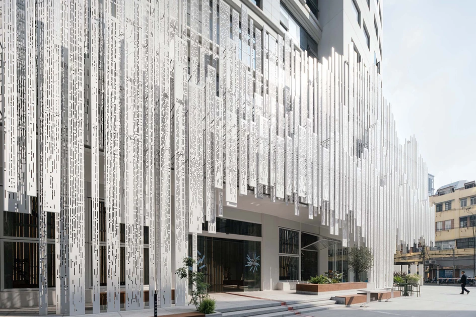
Using art installation as its face, the DoBe WE @Shanghai Book City store fixes ‘500 white aluminium plates of three different widths to create a randomised pattern, simulating a downpour,’ explains the project architects, Wutopia Lab. From the other side of the street, meanwhile, the lit-up, low-level facade creates an iconic feature of dancing fountains reminiscent of the famous Fountains of Bellagio in Las Vegas. However, as visitors are beckoned closer to the store entrance, the ‘steel rain’ facade ‘cascades like a waterfall,’ explains the architects, providing the experiential depth of heavy rainfall.
The ‘steel rain’ facade cascades like a waterfall, providing the experiential depth of heavy rainfall
Inside the store, meanwhile, the perforated facade creates flickering light effects inside the building’s lower levels, encouraging visitors who pass through the waterfall to feel like they’re entering a secret world. With steady rainfall outside, the store’s interior is filled with a cosy, protected feeling. Similar to being lost in the pages of a book.
© Architonic
Head to the Architonic Magazine for more insights on the latest products, trends and practices in architecture and design.
Galería de proyectos


