Boxed in: rectilinear architecture gets back its edge
These four square-edged homes and residential projects prove boxy doesn’t have to mean boring with unique and characterful takes on geometricised architecture. Featuring one-aftr, QBO3 Arquitectos, Plan:b arquitectos and WE-S architecten.
janvier 21, 2024 | 11:00 pm CUT

Sometimes combined with negative connotations of boring and featureless architecture, ‘boxy’ is not a term commonly used by estate agents. Although the contemporary architectural style is still considered by many to be eternally ahead of its time – burying character and creativity deep in the poured concrete foundations of homes with few identifiable features, the clean lines, minimalist aesthetic and bold simplicity of the cuboid mean the look is steadily growing in popularity.
"
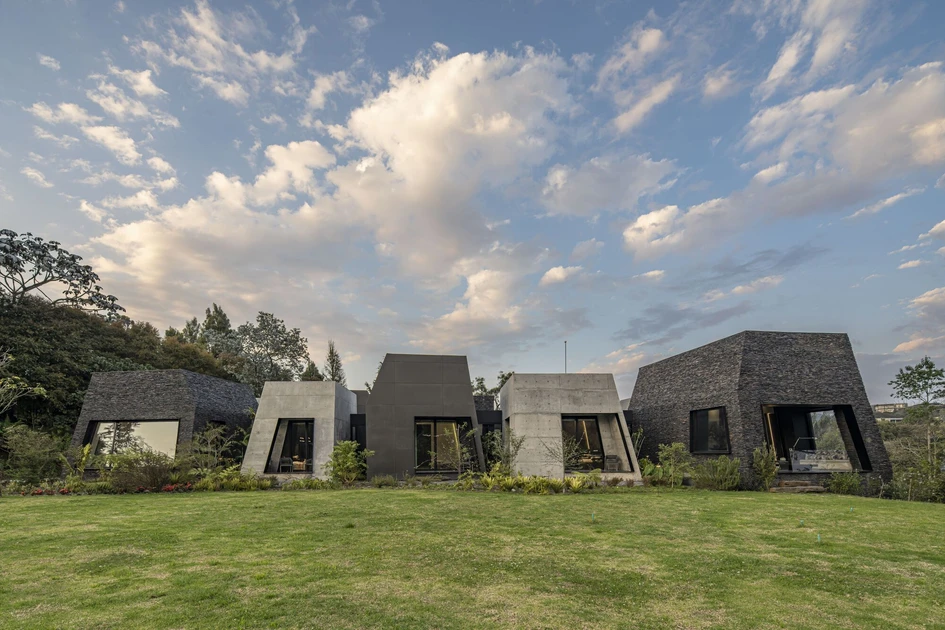
Using blocky geometrics, the home takes the stance of an ancient rock formation
Architects and clients alike in all corners of the world are realising there’s a lot of fun to be had, either by strictly keeping inside the lines or by drawing up the rules before daringly breaking them. These four new homes and residential projects represent completely varied takes on the theme of the box.


Doldam House in Sokcho-Si, South Korea, by one-aftr
‘The rocks excavated during construction were recycled and used to fill the front yard,’ explains one-aftr, architects of the Doldam House in Mt. Seorak National Park, an area renowned for its landscape’s identifiable boulder formations. But as well as simply redistributing some of the local environment as building materials, the look and feel of the structure itself ‘seamlessly integrated with its natural environment, creating an immersive experience for its occupants,’ as the architects attest.
Like a rare geode, the home’s subtle and unassuming exterior reveals little about the drama hidden within. Only flashes of bright, almost volcanic orange colour burst free from cracks and fissures that form the home’s doorways, windows and a terrace and courtyard area exposed from above. By hinting at its colourful and dramatic story, the Doldam House creates a ‘unique vantage point that offers a different landscape perspective,’ describe one-aftr, ‘the design makes a tranquil retreat that is both harmonious and visually captivating.’


Black Pearl House in Costa Rica, by QBO3 Arquitectos
While the Doldam House takes its simple exterior form and surprises its occupants with a colourful, almost liquid centre, the Black Pearl House instead transforms its exterior geometry for all to see. Starting with a basic square, QBO3 Arquitectos combines additional aspects to the house’s form through either addition or subtraction. By remaining within a simple set of rules, the result ‘highlights the purity of form through the use of rationalist features such as right angles and precise decompositions,’ explains the architects.
"
‘By remaining within a simple set of rules, the Black Pearl House uses rationalist features such as right angles and precise decompositions’
‘The careful application of innovative micro-cement techniques, along with the elegant and subtle use of metal and glass, results in a harmonious fusion of materials and textures,’ describes QBO3 Arquitectos. And by combining various materials as well as opacities and directional positioning across both the vertical and horizontal, new viewpoints emerge through each change. The result, much like the work of the Cubist king, Picasso, is a unique rendering born from the original form, but strongly identified by its own inimitable character.


Amaluna House in Envigado, Colombia, by Plan:b arquitecos
Although definitively contemporary in style, the Amaluna House is seemingly inspired by far older architectural arrangements. Using blocky geometrics, the home takes the stance of an ancient rock formation. Positioned as if part of a mystical prehistoric henge site, the project hides a central corridor that both separates and connects 11 individual forms that become the distinct room typologies of a functional home.
Through the use of subtle differences in their precise size, form, positioning and the materials of their facades, each volume is gifted its own character, yet still clearly belongs in the same connected family. ‘Although their rotation is erratic,’ explains architects Plan:B arquitectos, ‘they are all located along a circulation that moves in an east-west direction,’ meaning the main living spaces face south and the service spaces face north, with the house’s central section providing well-lit and well-ventilated space for terraces and interior gardens to serve the home’s functional corridors and lobby.


Ten Boomgaard Housing in Bruges, Belgium, by WE-S architecten
While the above three projects prove there is creative flexibility to be found by bending and stretching the regimental rules of the cube, the Ten Boomgaard Housing project is a good example of the beauty and comfort that can be found within the shared experiences and shared environments of uniformity, with the development’s two volumes both functionally separated into squares.
"
Beauty and comfort can be found within the shared experiences and environments of uniformity
The project includes seven similarly shaped, almost-square homes set around collective indoor and outdoor amenities such as bicycle parking as well as a paved courtyard and landscaped garden. ‘The project attempts in various ways to update the typology of the traditional beguinage with small-scale houses, grouped around a collective garden,’ explains the architects WE-S architecten, while the development’s community atmosphere is aided by the positioning of each home’s entrance and expansive windows towards the central area.
© Architonic
Galerie de projets


